Improving coverage by using a lead ranking mechanism in Nimbus - Unacademy’s CRM tool
At Unacademy we have made an In-house CRM tool called ‘Nimbus’. The Customer relationship management (CRM) is a system for managing all of your company's interactions with current and potential customers. The main goal of a CRM tool is to improve relationships to grow the business. Nimbus helps the sales team to stay connected to customers, streamline processes, and improve profitability.
This project highlights a new feature called ‘lead position’ which aims to simplify the process of prioritising leads based on their likelihood of converting, allowing BDEs (Business Development Executives) to focus their efforts on the most promising opportunities.
Year
2023
Category
Professional
Duration
16 Weeks
Platform
Web
Problem statement
The sales team would dial a certain number of leads every day. The coverage of the leads (connecting to the available leads) was downwards of 50% which ideally means that we were missing out on the potential leads that were not connected. With limited number of workforces it has become evident that to increase the number of conversions there were two possible ways.
1. Increase the coverage. i.e. dial more number of leads. This was not possible without changing the workforce.
2. Out of the available leads, find the leads that have high potential to convert and use the available workforce to cover the leads that have higher potential to convert
Business needs
- Improve efficiency of the sales team by have a system to prioritise high-scoring leads and making it easier for the user sort and find leads with higher scoring.
- Increase the rate of conversion by increasing the coverage of high quality leads.
- Enhance data-driven decision making for sales efforts by having a simplified and Explainable Lead score
User stories
User 1- Mohan (Sales Executive)
Background: Mohan is a sales executive at Unacademy. He manages a large volume of leads daily and needs to prioritise his outreach efforts effectively.
Pain Points:
• Time management: Struggling to identify which leads to focus on first.
• Efficiency: Spending too much time on low-potential leads.
• Performance: Missing out on high-value opportunities due to poor prioritization
User Need: Mohan wants to see a lead score displayed on each lead record on the lead list page to quickly assess the potential value of each lead.
User 2- Nitisha (Sales Executive)
Nitisha is a sales executive at Unacademy. She manages a large number of leads for IIT JEE and NEET UG categories and is responsible for converting them into paying customers.
Pain Points
• Difficulty in prioritizing and organizing a high volume of leads from various sources
• Inefficient process for identifying the most promising leads
• Lack of customized approach for different lead segments
• Time wasted on low-potential leads
As a sales executive, Nitisha wants to segregate leads based on query filters so that she can effectively prioritize her outreach and tailor her sales approach to different lead segments.
Potential Features from the user studies
- Integration with lead scoring system for dynamic filtering
- Customizable dashboard showing key metrics for different lead segments
- One-click actions to initiate personalized outreach based on segment characteristics
- AI-powered recommendations for best filter combinations based on past success rates
- Calendar integration to schedule follow-ups based on lead segment prioritie
Functional needs from the feature
1. Lead position along with the other details ( like, probability to convert) should update real time with the activity update
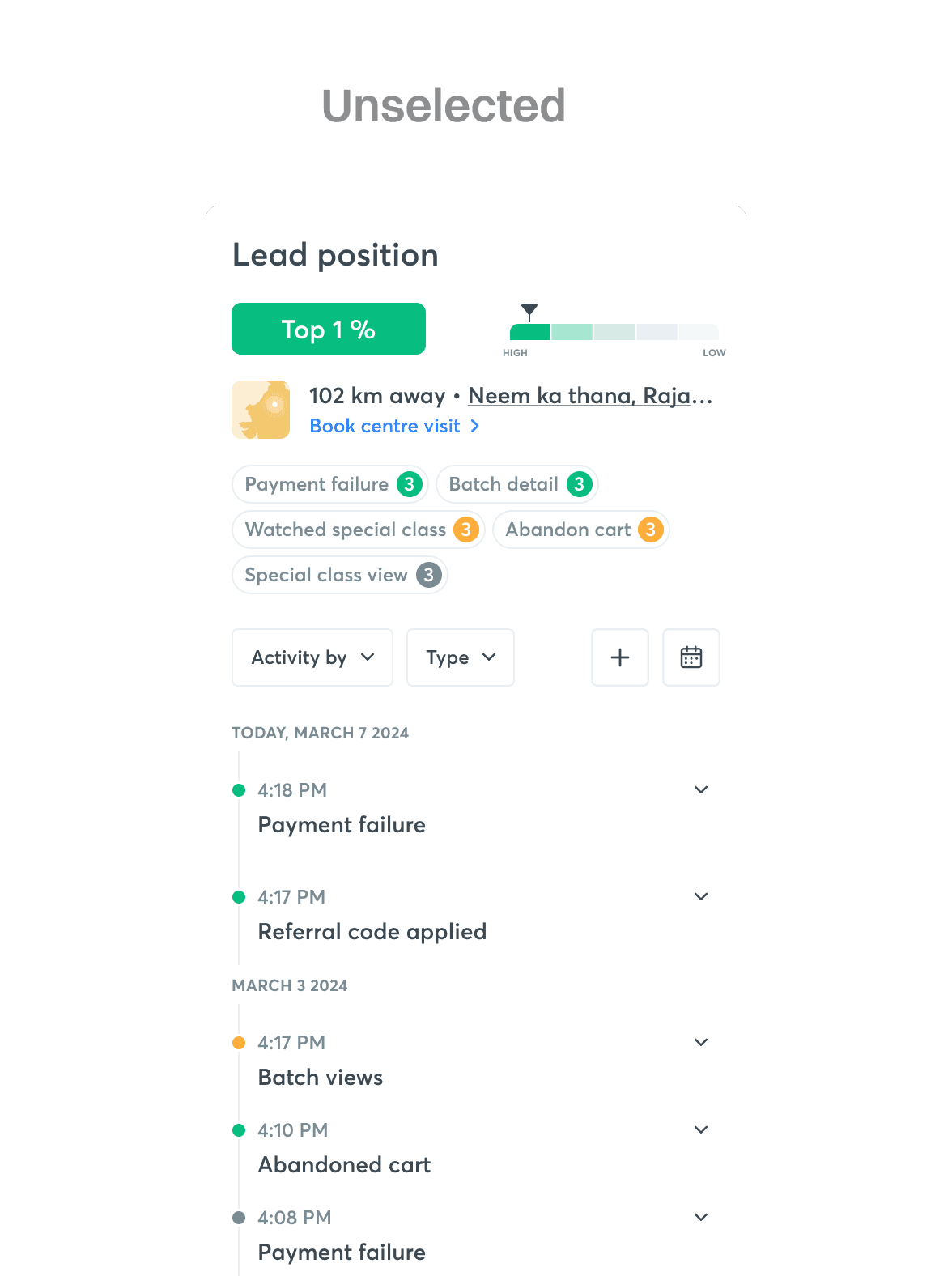
2. Top activities which were a part of the lead scoring model should show up along with the lead position. This will help the sales executive to better understand which specific activity have made the lead rank higher and eventually use this information to understand the lead better.
3. Activity shown with the lead position should be color coded to make it easier for the user to segregate the activities on the basis of their priority.This color coding to be done based on the bucketing done on activity conversion rate.
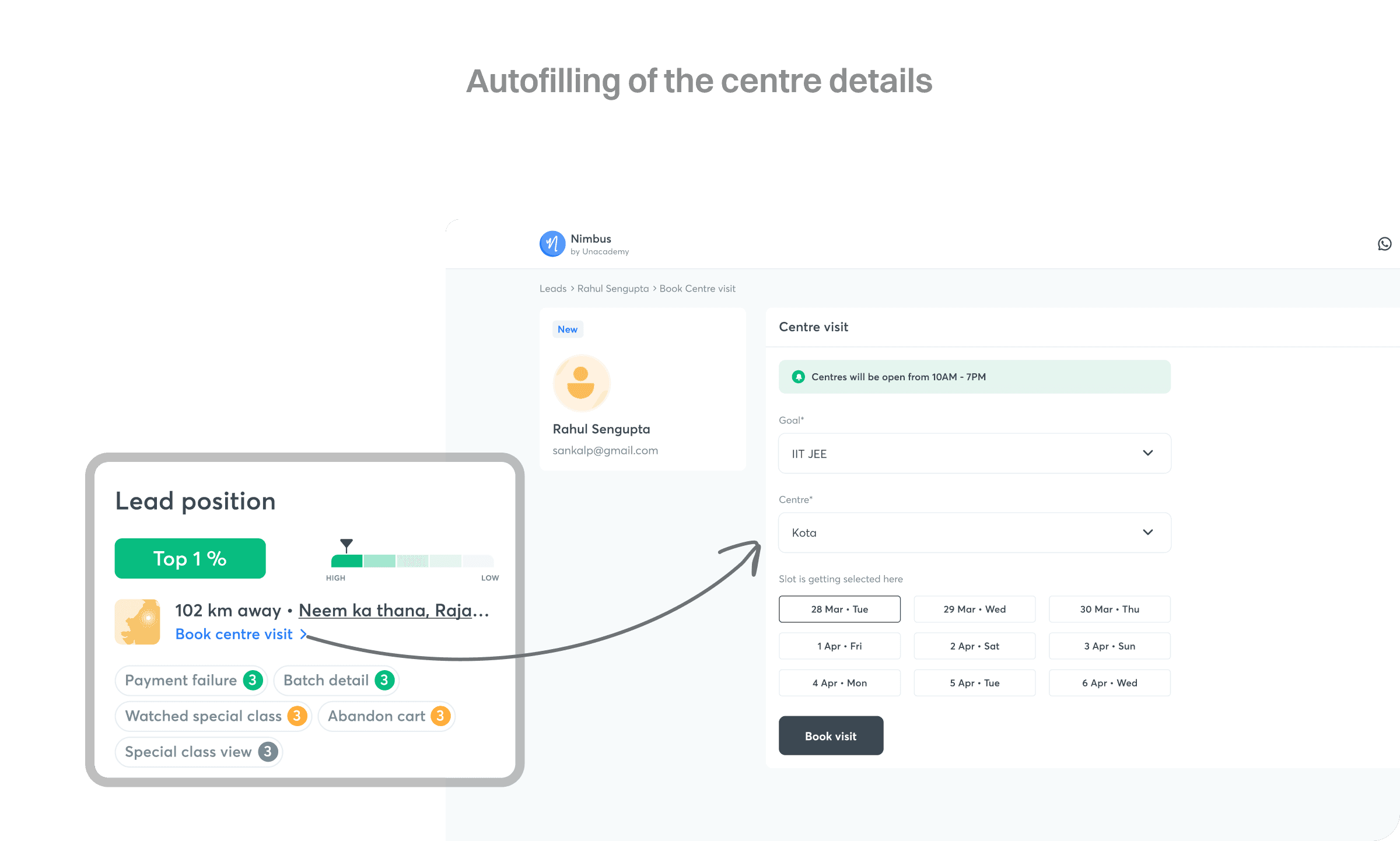
4. Show the nearest centre information with the functionality to book a centre visit directly from this section.
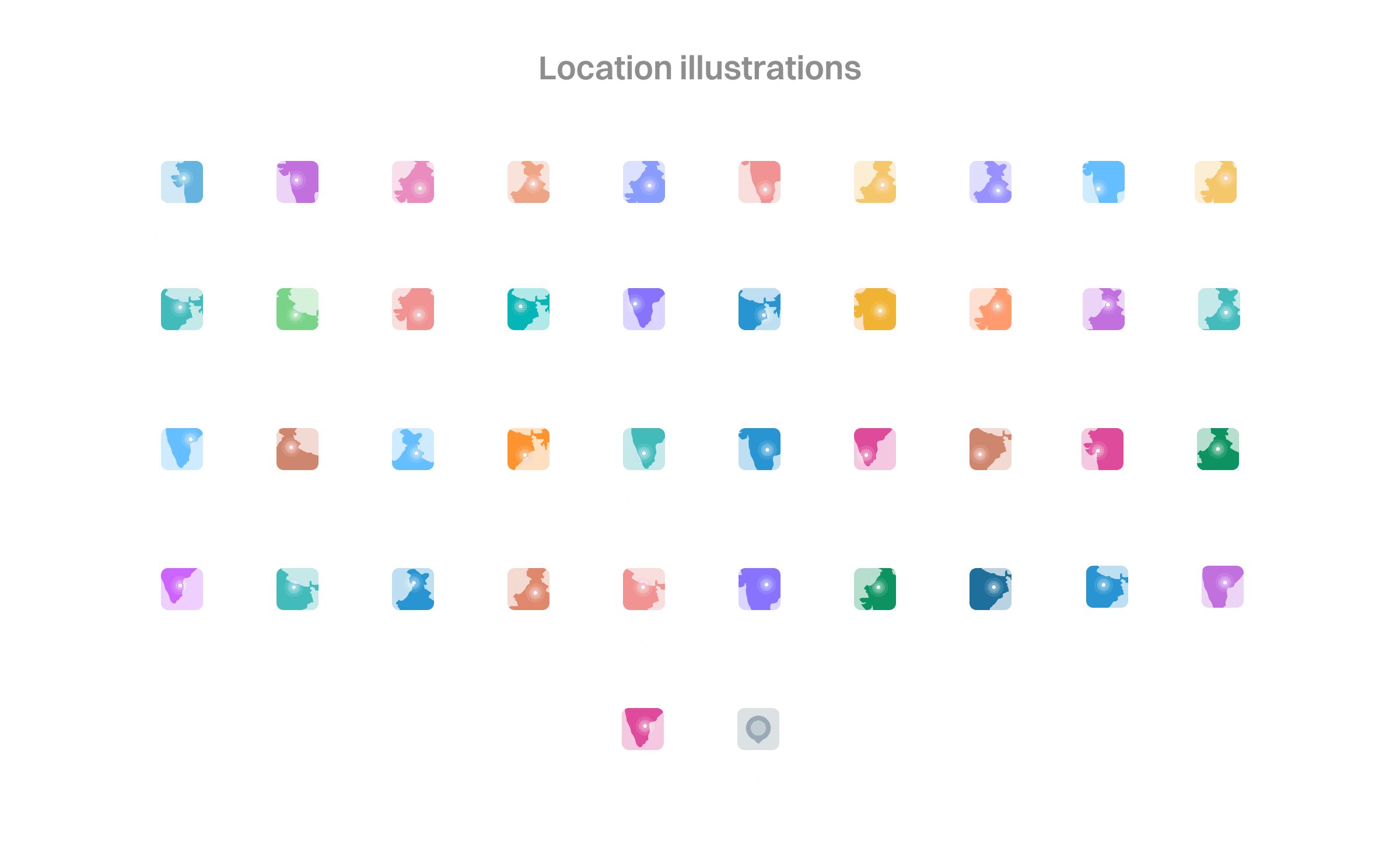
• The thumbnail should show the centre location based on geo location of the user.
• There should be different design components for each centre.
• In case we are not able to fetch the geo location (no IP location as well and the value is null), we should add a fallback location image (generic - India map for example)
5. The color for each activity should remain the same in the lead score tab and activity classification.
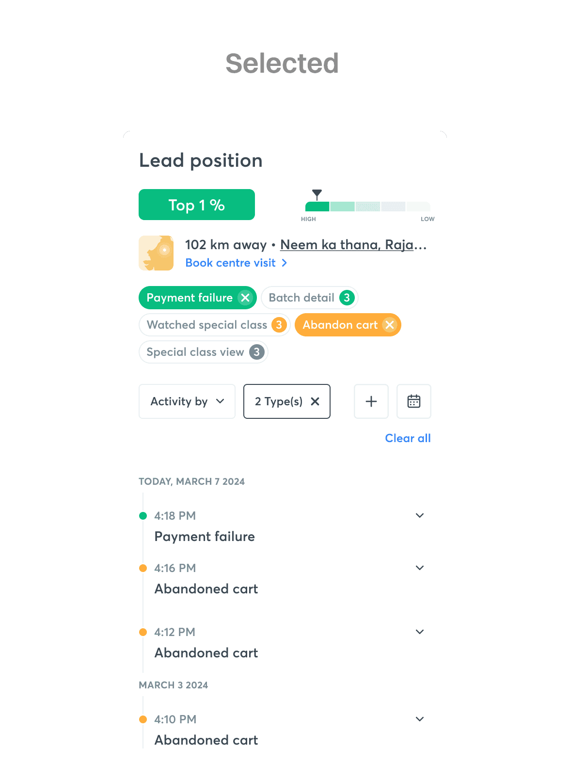
6. Clicking on a particular activity in the lead score tab should filter the same in the activity curtain as well. Multiple selection should be enabled.
7. Calculating count of activities to be shown in the lead score curtain to be handled at nimbus end. The activity count should be based on rolling 7 days. Tool-tip to be added to show this information.
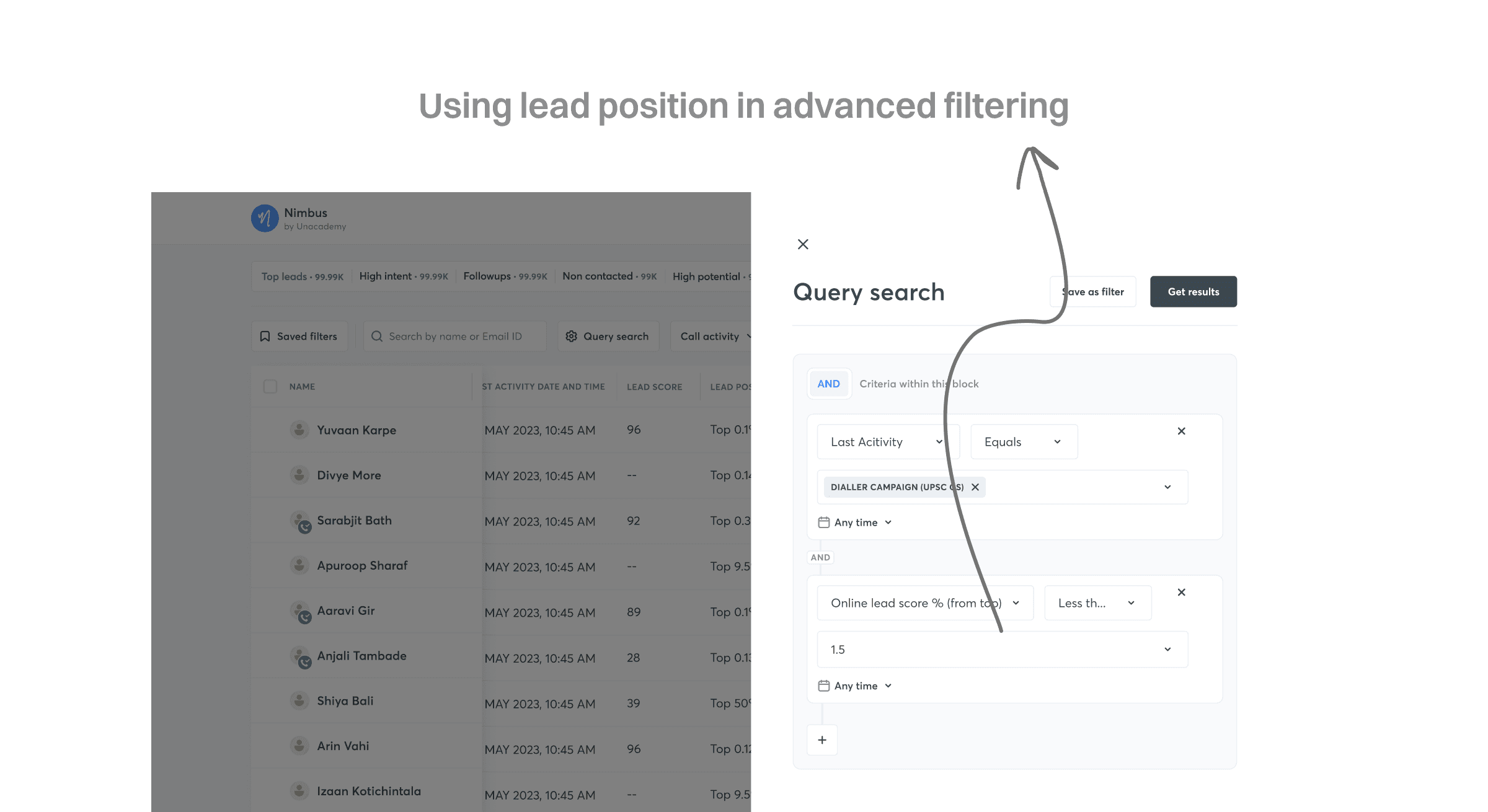
8. Query search changes : Two new attributes to be added in lead query search (Main Lead page + Dialer Campaign)
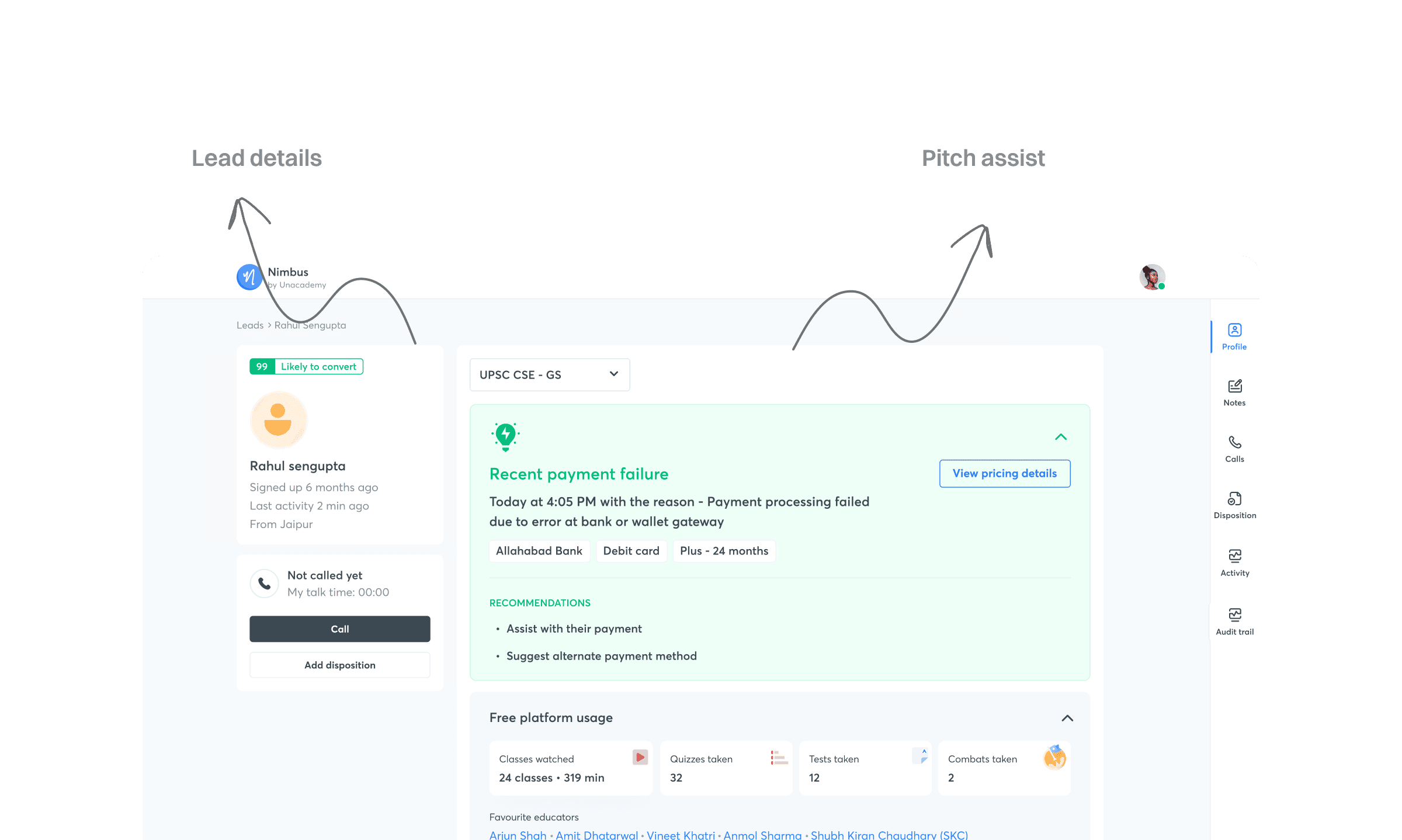
Existing navigation and layout
The existing user flow for a sales executive on Nimbus would be
- Login to nimbus
- Land on one of the tabs of the lead list page where you view the list of all the leads assigned to you
- Select a particular lead to go to their lead detail page
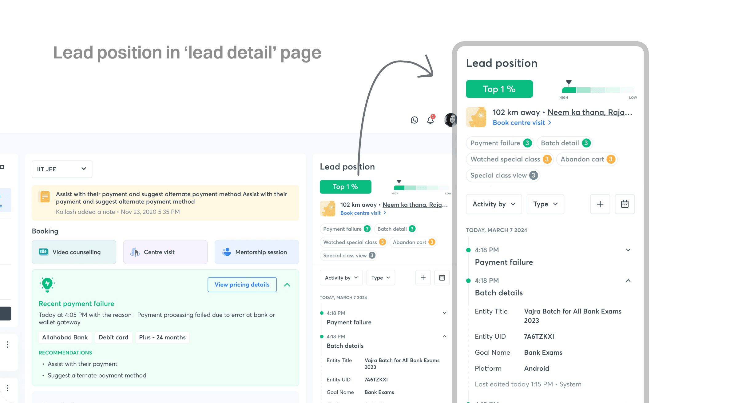
Change in the layout of the lead detail page
The existing UI was not efficient for the BDEs to glance upon the important activities performed by the leads on the platform. After the introduction of Lead position, it has become more important than ever to have the option to view activities with the lead details in context.
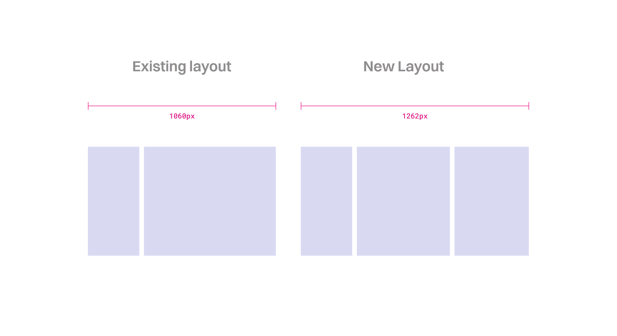
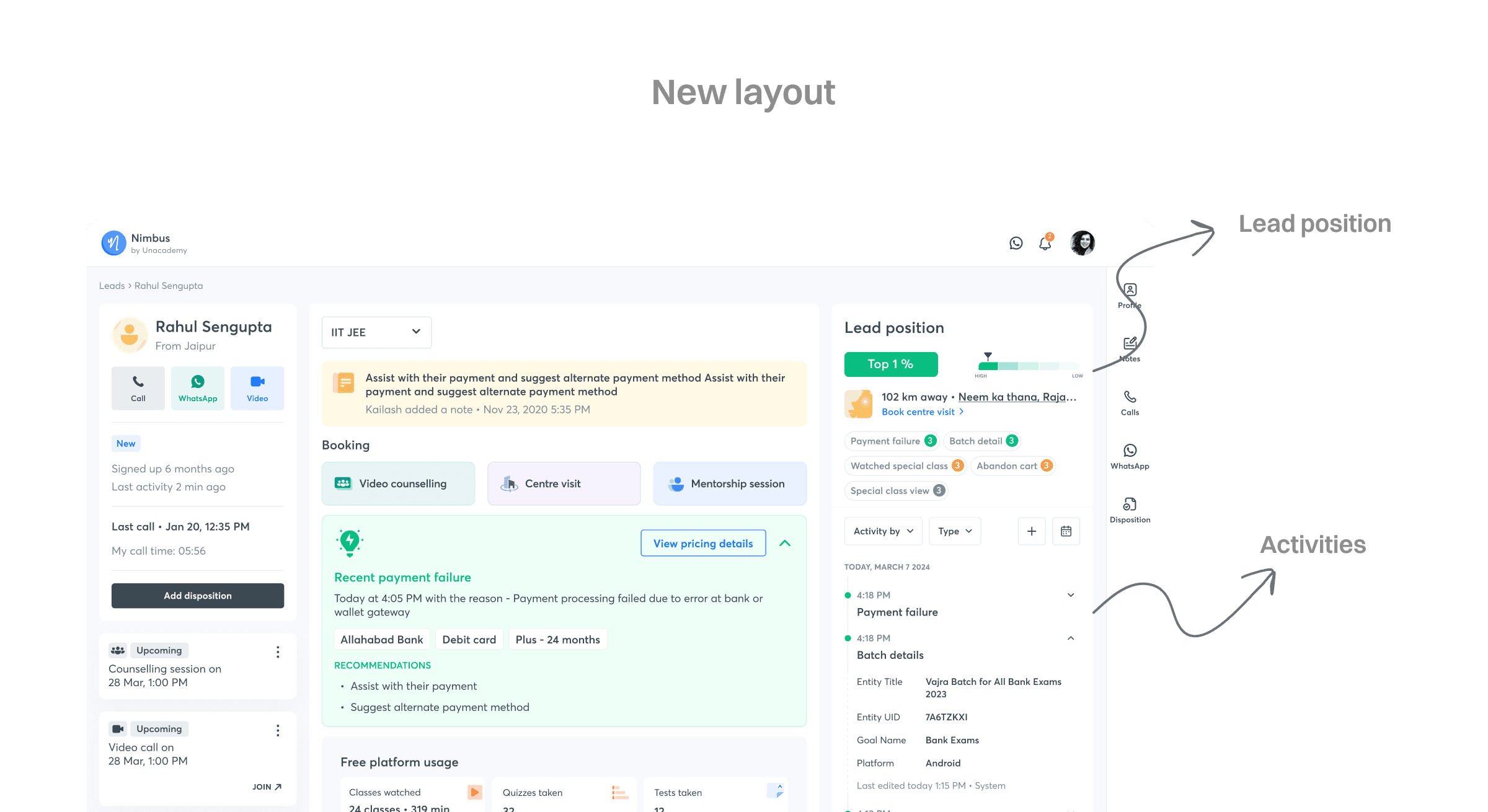
In order to have this we changed the old 2 column layout to the new 3 column layout.
• The left column containing the info about the lead and CTAs was kept unchanged in both IA and UI.
• The mid column was reduced in width in order to make some space for the activity and lead position to become a part of the layout.
• The new column was introduced on the right side of the screen which contained the activities and the lead position.
•The old layout was had a fixed width of 1060px which was increased to 1272px based on the data available for the screens used by the BDEs
Lead position
The lead position has to be shown in two different places i.e.
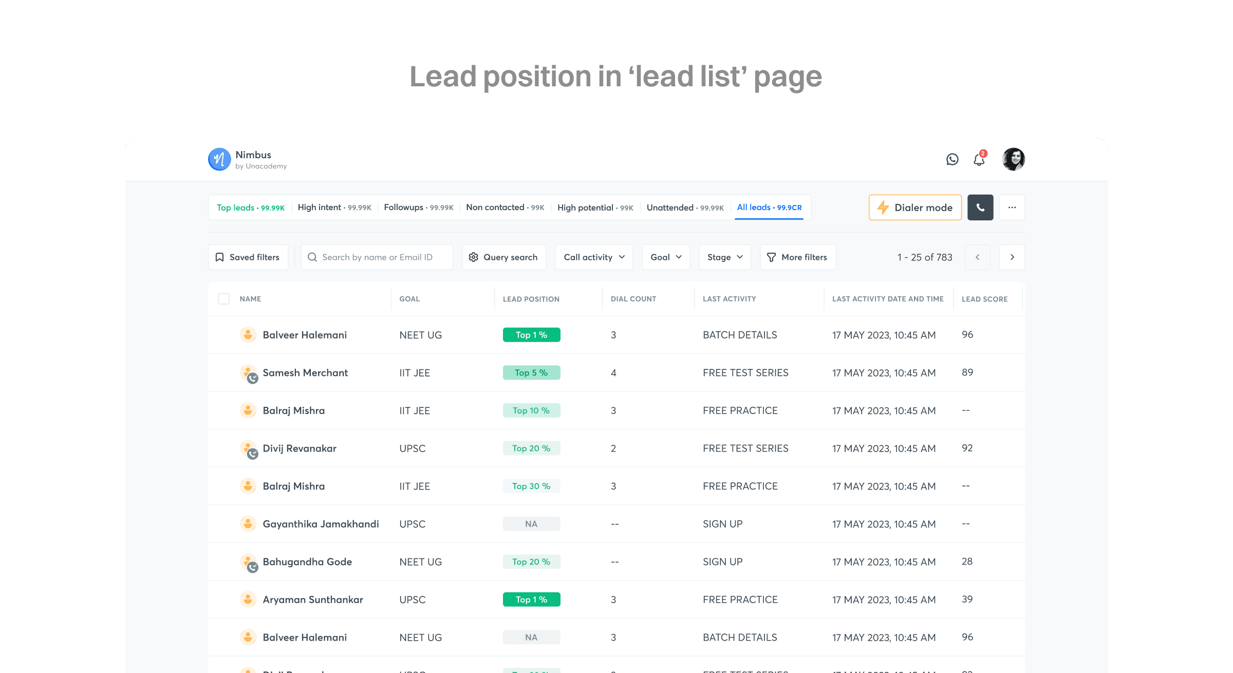
1. Lead list page - to show the position of the leads and see how they compare among themselves. Here it was shown in a new column that has the ability to be sorted basis the lead position. There were a few leads here that needed to be handled separately as that did not have a score. These leads were either who signed-up very recently or have signed-up and not performed any activities that were considered for generating the lead position or the leads that have already paid to buy a subscription.
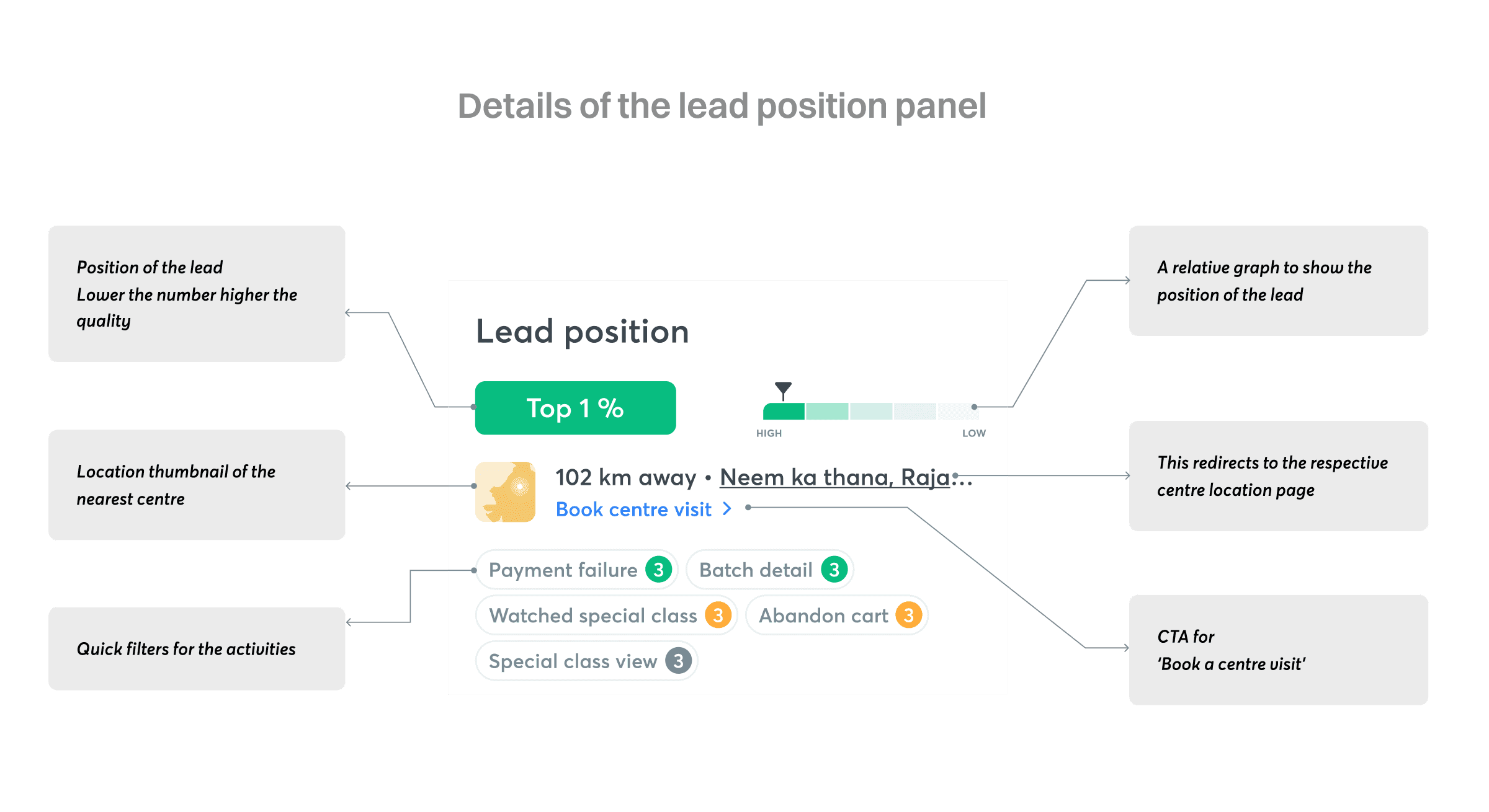
2. Lead detail page - to show the lead position of that individual lead. These were shown as a color coded container that had a number mentioned where the number is the position where the lead stands and the color coding(covered later) is the color defined for that particular bucket of leads. This is accompanied with a visual indicator to show the bucket as a fail safe if the BDEs loose context of the relative colors from the previous page or the displays do not show the colors correctly. Having a marker reinforsed that the user have a fair idea of the position of the lead even without the color being displayed correctly.
Color coding lead position
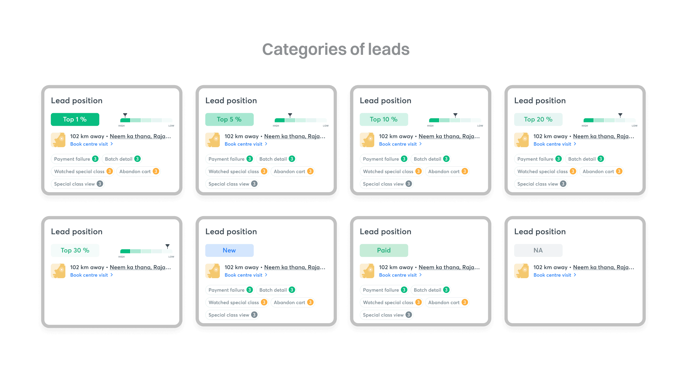
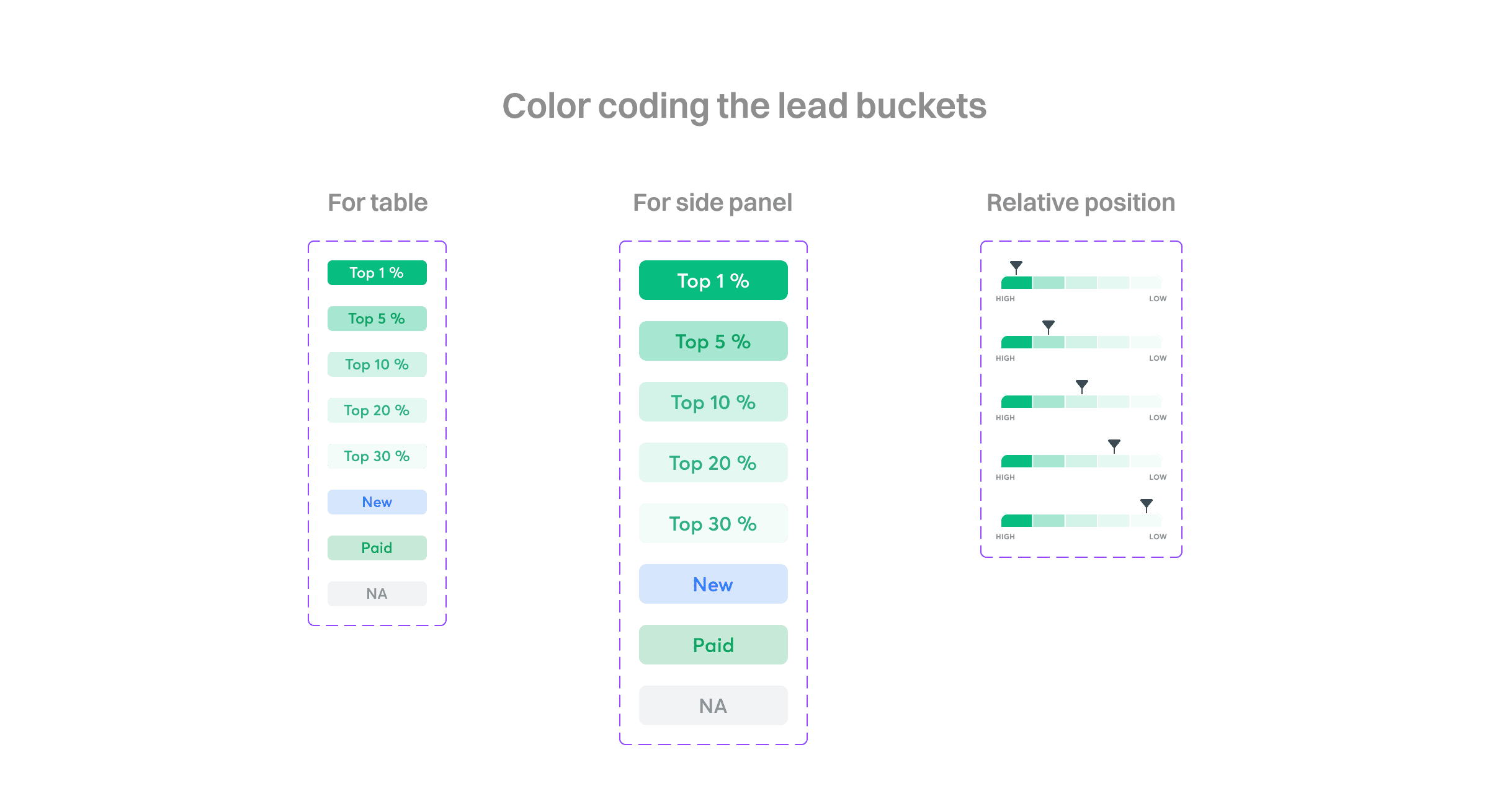
For color coding the leads the leads were classified into 4 different categories
1. Leads that have a lead position number. They were showing using a monochromatic color scheme with a varying contrast where the top lead gets the highest contract making them easier to scan in a large list and vice versa for the bottom leads. The top 1% leads were given an extra level of contrast by having a white text to make them distinct from all the other buckets as the conversion rates of these leads were calculate to be ~63% higher than the next category of leads.
2. Leads who signed up recently. These leads are shown using blue text on blue fill to make them distinct from other leads having a lead position as the number of these leads can be high.
3. Leads who have paid already. There were shown using a different hue for the green with green text. These leads were very less in number as they move from the list to a separate list after a cron job.
4. Leads who don’t have a lead position yet. These were classified using a grey text on a grey fill making it easier to ignore.
Showing the location of the nearest centre
Since Unacademy has a major share of revenue from the offline subscription, it became important for us to make it easy for the BDEs to be able to book an offline centre visit for the leads who have activities specific to offline SKUs. This section is goal controlled as the offline subscription is available for 3 exams i.e. IIT JEE, NEET UG, UPSC.
There can be 2 scenarios for the leads for this section
1. The lead have shared their GPS location: In this case we have the ability to triangulate the location of the lead and show the distance of the nearest location available to the lead. If teh BDE clicks on the ‘book centre visit’ CTA then the information gets pre filled in the form to make the booking faster.
2. The lead have not shard their GPS location: In this case we show the location of the centre in their city based on the IP location or show a generic thumbnail from where the CTA will return an empty location if the BDE clicks on the ‘book centre visit’ and then fill this based on the conversation with the lead.
Quick filter pills for the activities
These were the new components introduced to have a quick filtering of activities done by the lead. These pills have the name of the activity along with the number of times that activity have been performed. This was limited to be the activities performed in T-7 days. The activities are categorised in three categories i.e. high intent activities (coded with green), medium intent activities (coded with orange), low intent activities (coded with grey).
The intent of the activity is defined with past data basis the rate of conversion of the leads if they have performed that activity. For example if the lead have performed ACPF (Abandoned card payment failure) activity then it can be.
Showing activities of a lead
On the Unacademy platform events are triggered if the lead perform a certain task. These are used to understand customers better. The activity helps the sales executive help the leads to navigate through their customer journey better. Take an instance where a customer is trying to purchase an SKU from Unacademy. The lead goes into the checkout page and tries to apply for a loan but the payment failed because of some reason. The Sales executive can reach out to the lead and instead of starting from the beginning about what the lead wants, the sales executive now have a fair idea of what problem the lead might be facing. This is how activity can help in saving time for both the parties.
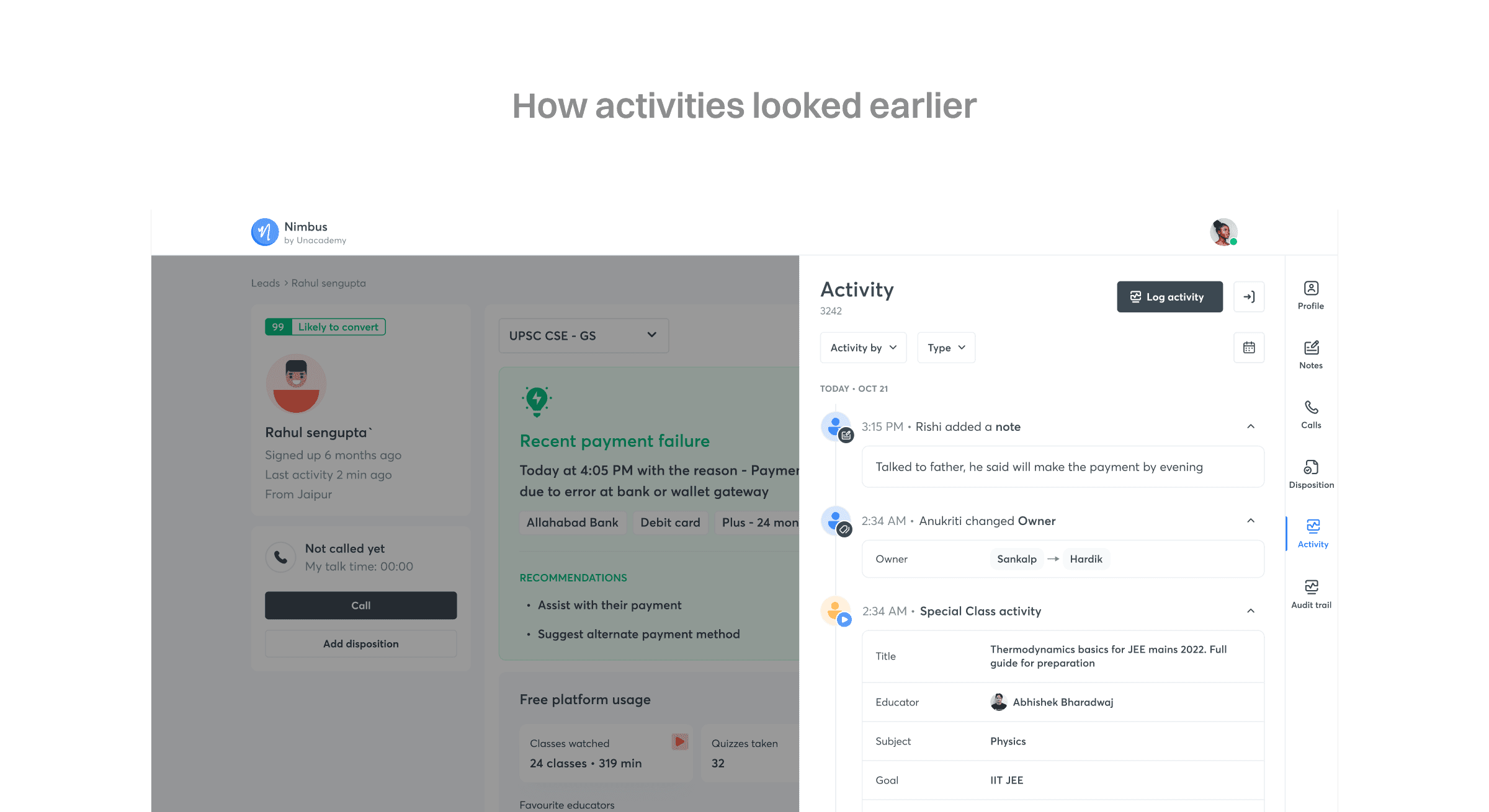
Earlier, the activities were hidden two clicks away. To view the activities, the executives had to click the activity icon on the right navigation and view the activities in the side panel. This had two problems
1. The activities were hidden so the lost the value that they added for an executive.
2. Since the side panel was an overlay there was some loss of context when the BDEs would try to view the activity and other lead information at once.
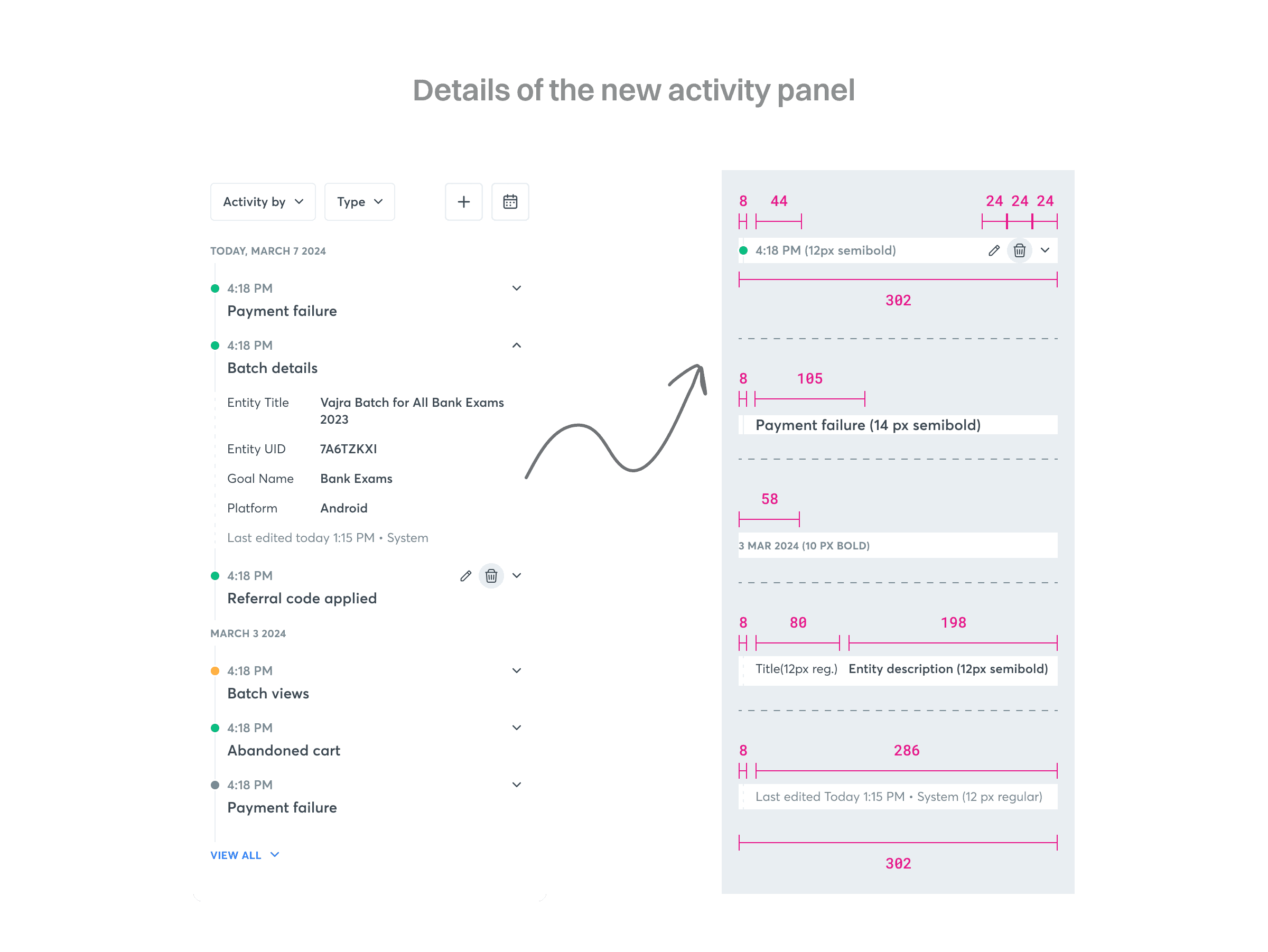
As mentioned in the previous sections, to bring the activities out of the side panel the new third column was added in the page layout. Since the whole purpose of the activities were to make it easy for the executives to view as many activities at a glance, there were a few thing that was modified in the UI.
- The earlier activity panel would have avatars. Since the avatars were generic across the platform they were remove to save some space.
- The font sizes for the headings and the internal content were reduced.
- The bullets used for chronology were color coded with the same logic for used to classify the importance of the activities. This made it easier for the user to scan the important activities without applying any filter
- Since it was very rare that any activity will be edited or deleted, the buttons for both the functions were hidden and would show up only on hover.
- These buttons were added in line with the time stamp to make it easier to read the activity name while browsing through the activity panel.
Query filtering
Since the lead position was added in the lead list. It was also made available for advance filtering. The sales executives can now filter the leads with lead position as a parameter.
Impact
- The coverage of high intent leads was increased from 63% to 87%.
- Since the leads were now classified into buckets, there was reduction in time spent by BDEs on unqualified leads. With an average talk time of 3 mins per leads each BDE was saving ~81 mins per day, utilising that time higher quality lead.
- Conversion rate of the leads were up by 6% from the previous conversion rates

