IDC Aasada Odia, an Odia typeface for body text
With the increase in use of digital communication during the pandemic, there has been a great surge in consumption of information in all forms, be it for entertainment or education. Entertainment in regional languages is not highly dependent on text but the regional education has experienced a significant (need based) trans formation and would continue to experience the transition into digital mode of instruction during and beyond the pandemic.
Year
2021
Category
Academic
Duration
24 Weeks
Platform
Multi
The availability of open source Odia typefaces are scarce. Out of the available ones, the major ones are intended to be display fonts, which are not suitable for body texts. The developments in the Odia typefaces have not caught up with the existing technologies as it can be seen that out of the available fonts hardly any could be found to have variable characteristics. The project aims at creating a monolinear Odia typeface that would be able to aid the requirements of the current digital transformation.
Why make a odia font
Making a new open source Odia font can have significant impact in the way the information in regional language in being made available online. It can increase the scope of making information digitally available in regional language. It can also facilitate in making the existing regional content and instruction on web/screens visually rich.
Current Scenario of Digital Publications in Odia
Unfortunately, none of the Odia newspapers have their publications in Unicode at this moment. This, practically does not allow any reader to search, access, reuse and quote any content. Same is the case for all other published resources like books and magazines. More than 80 per cent of the published content is not even released online and also not archived.
Odia is still to be used as a medium for official communication in all of the government offices. Despite these challenges, the number of Odia dailies is slowly growing. There are around 100 newspapers published daily from various regions of Odisha.* It is essential to note that news archives, unlike literary writings, have much of any kind of high commercial value.
So is in the case of scholarly and research publications. If all of these publications could be made available online in digital form that will take Odia literature to the global audience. This triggers the need of
• Making sure the forthcoming publications are not just typed in Unicode but made available online.
• Digitization of published books and making them available free on the internet.
Growing Potential of the online Readership
Sambad, Odisha’s leading vernacular daily, continued to retain top slot once again in the state, IRS 2019 Q4 data revealed. According to last quarters of Indian Readership Survey (IRS) 2019 reports, the total readership of the Sambad newspaper has increased by 44,000 to 65.94 lakh in Q4 as compared to IRS 2019 Q3. The Samaj continued to retain second position with readership of 56.93 lakh.
It can be observed that there is a great disparity based on the languagein the quality of published digital content despite of a huge potential readership.
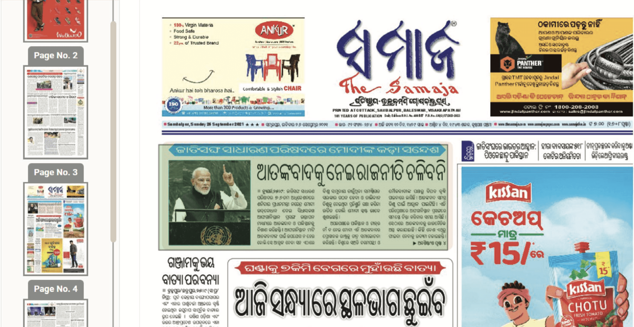
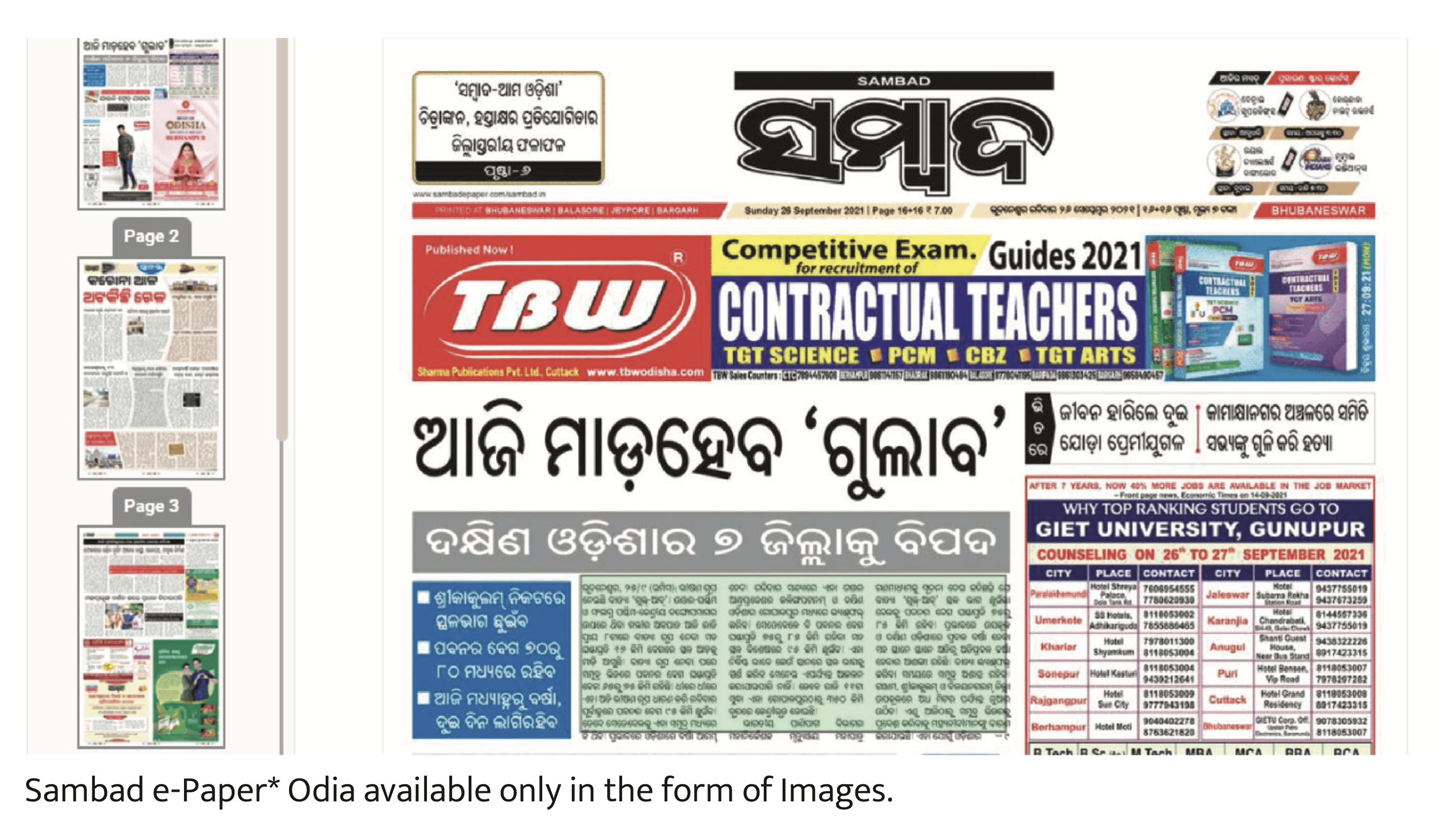
Sambada, the leading news publication publishes news digitally in bothEnglish and Odia, but as it can be seen in the images the Odia e paper is a scanned version of the printed papers whereas the English site has the content in unicode which makes it much more usable across different device sizes and also helps in referencing and sharing.
Evolution of Odia Script
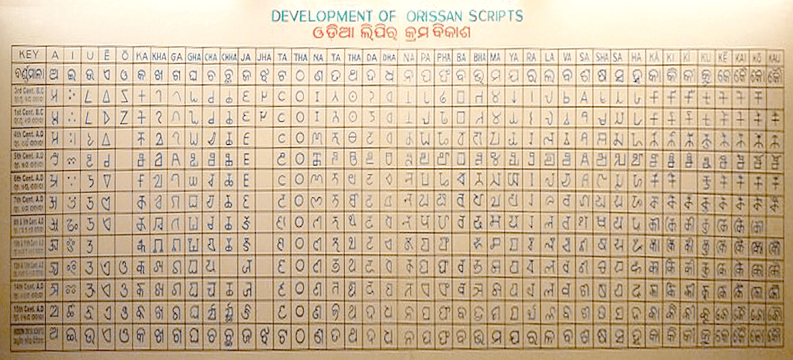
The Oriya (Odia) script is derived from the Brahmi script of the Ashokan inscriptions; in Odisha state, specimens are found in the Dhauli and Jaugar inscriptions of the Emperor Ashoka (3rd century B.C.) and the Khandagiri
inscriptions of King Kharabela (1st century C.E.). However, unlike these inscriptions, the language of which was Prakrit, the earliest inscription in Oriya is the Urjam inscription of 105 1 c.e. This inscription is in Kalinga script, the variety of Brahmi from which modern Oriya script has evolved. It is syllabically based on the unit called the aksava in Sanskrit, [Dkhyoro] in Oriya.
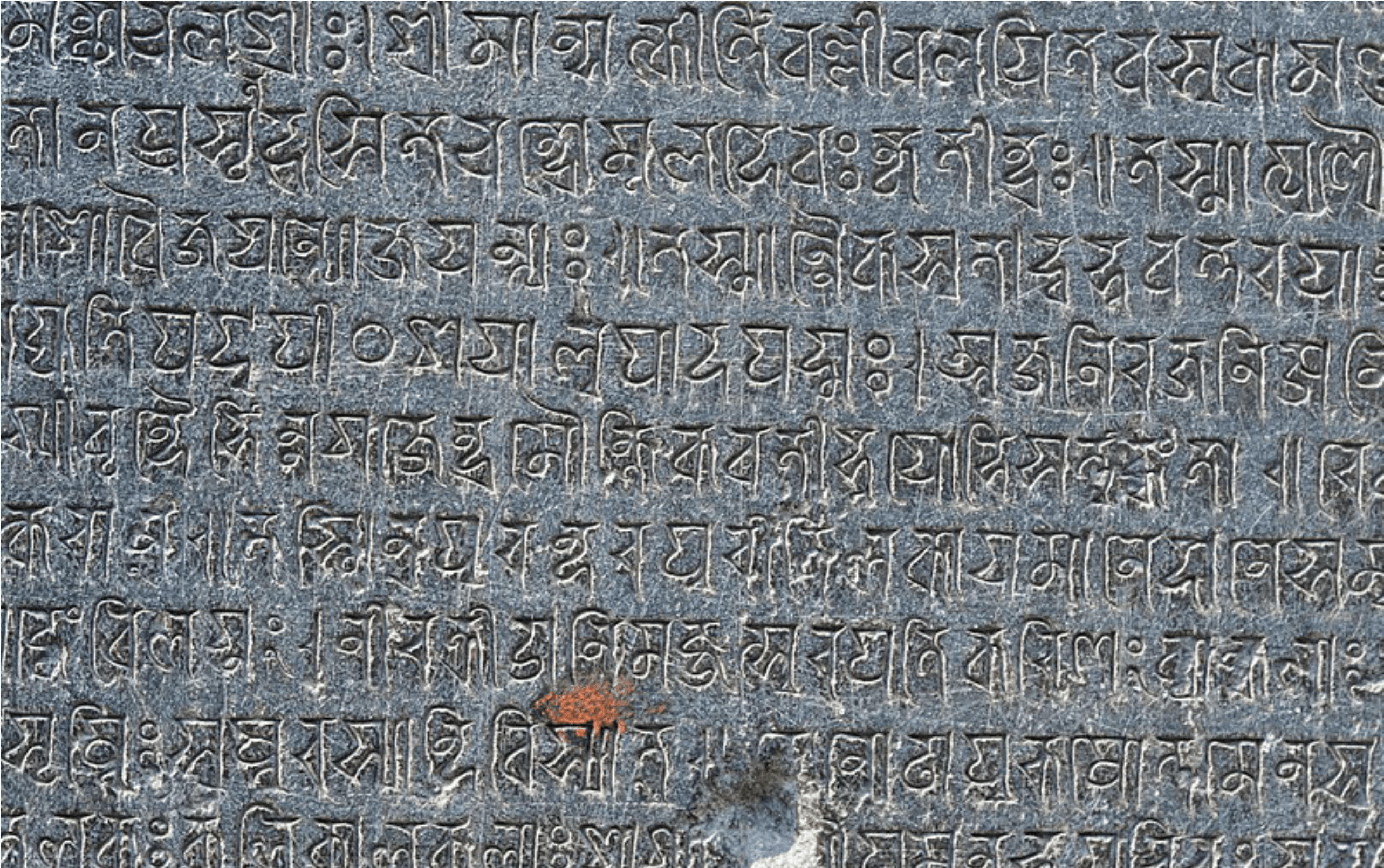
Temple inscription showing 13th century Siddhaṃ script variant ancestor of modern Odia script at Ananta Vasudeva Temple. Prateek Pattanaik, Jan 2018
The script is written from left to right. Since a large number of triballanguages, of both the Dravidian and Munda families, are spoken within the geopolitical limits of Orissa state,Many of these languages have adopted
the Oriya script in writing their languages. Sanskrit too is written in Oriya script in Orissa. The specific features of the Oriya script are as follows. The vowel a, is inherent in each consonant symbol, whether simple or conjunct,
unless the letter is modified by the bottom stroke called halanta. Odia is a syllabic alphabet or an abugida wherein all consonants have an inherent vowel embedded within. Diacritics (which can appear above, below, before, or after the consonant they belong to) are used to change the form of the inherent vowel. When vowels appear at the beginning of a syllable, they are written as independent letters. Also, when certain consonants occur together, special conjunct symbols are used to combine the essential parts of each consonant symbol.
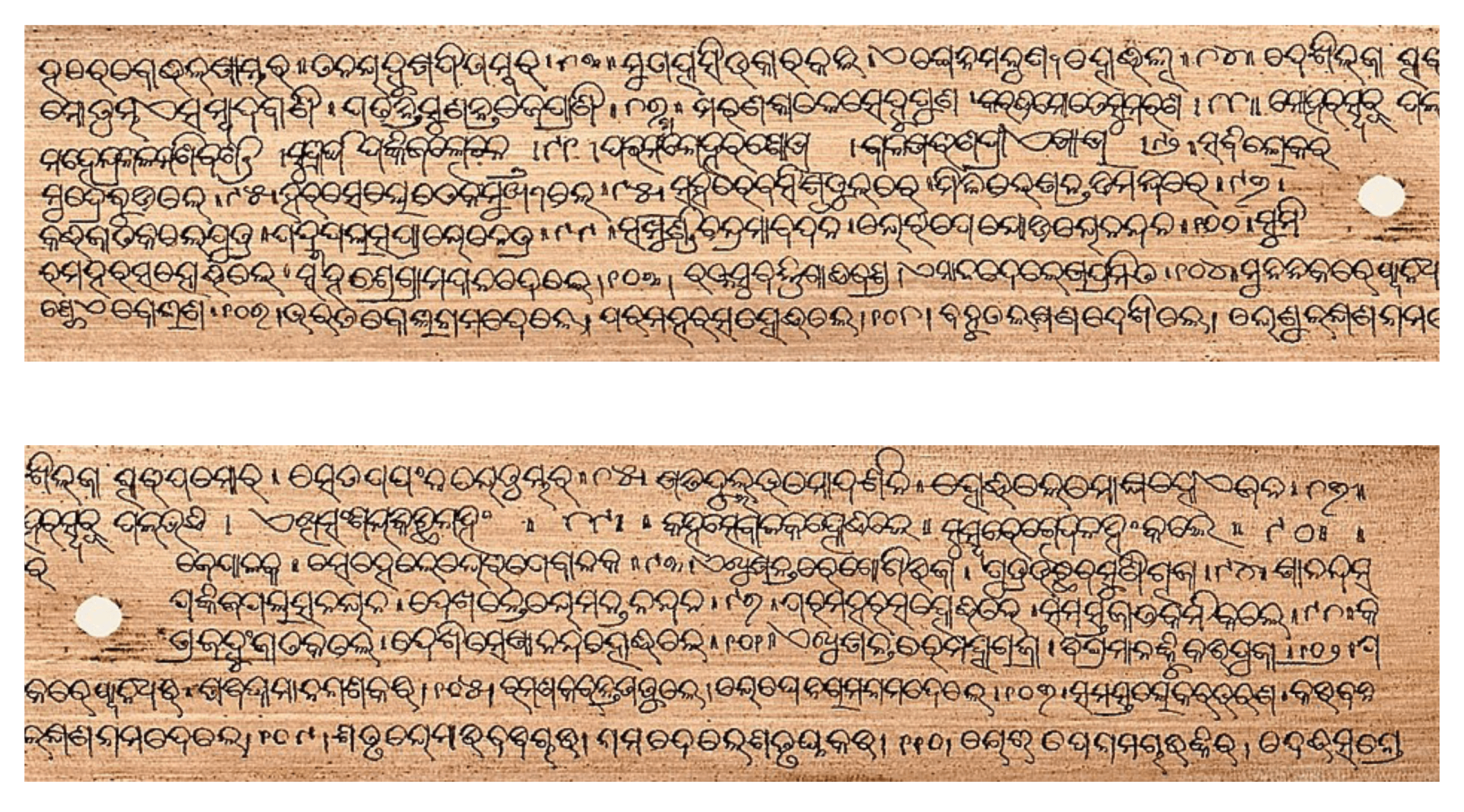
Over 600 Year Old manuscript showing Adhyatma Ramayana written on a palmleaf. Image by: Sarah Welch 1982,
Overview of the Odia Script
Oriya has syllabic alphabets wherein all consonants have an inherent vowel embedded within. Diacritics, which can appear above, below, before or after the consonant they belong to, are used to change the form of the inherent vowel. When the diacritics appear at the beginning of a syllable, vowels are written as independent letters. Also, when certain consonants occur together, special conjunct symbols are used which combine the essential parts of each letter
A limited number of ligatures are possible since all the consonants cannotbe combined with all others. Vowels can either be independent or dependent upon a consonant or consonant cluster. A large number of “consonant + vowel” and “consonant + consonant” combinations have various alternative representations. A standard is perceived to be evolving. content in unicode which makes it much more usable across different device sizes and also helps in referencing and sharing.
Development of Odia scripts, State Museum Bhubaneswar
Text and Display Fonts
Display Fonts
Display Fonts are designed primarily for heads. They usually have complexforms or extreme proportions which become tiresome for reading in large quantiies. Display fonts are like garnish and spice for the meat and
potatoes of basic body text. (Lupton, 2014, 18-19). They are made to grab reader’s attention and to add to the character/mood of the written text. These types of fonts are not suited for sizes below 14 points. Display typefaces can have various genres like hand-drawn, such as script fonts, three dimensional fonts that replicate a shadow or engraving or a beveled edge. Abstract designs of letters, colored fonts showing a particular lettering style, fonts with very high contrast or extreme weight characteristics. Other examples could be the typefaces replicating some
writing system or a technique, like calligraphic fonts or fonts that reverse the notion of contrast.
Text Fonts
Some fonts are designed specifically for body text. These are created using subtle, well-crafted forms and evenly spaced characters to make reading the reading experience better for longer texts. Such fonts are called Text Fonts . A font with appealing details can also be used for heads, its character usually changes as it moves up in size.
Text fonts are easier to read in long blocks of texts. They are not made for the purpose of grabbing attention to themselves and have been designed to perform best between 6-point and 14-point.
Characteristics of text fonts
Text fonts as intended to be used in smaller sizes, are generally optimized for the same .In metal type, almost every point size of a given type style had subtly different proportions. The stroke contrast decreases as the size becomes smaller. The thin parts of a character became proportionally heavier as the point size decreased in a Serif Typeface. If left unchanged the contrast between thick and thin would have been too great, causing an effect called “dazzling” which makes text copy difficult to read.
The lowercase x-height is also generally larger in text sizes than in display designs, and serifs are more pronounced. In addition, inter-character spacing is more open in text faces. All of these characteristics optimize
the typeface for reading at small sizes.
Choosing between ‘mono linear and ‘modulated’ typeface
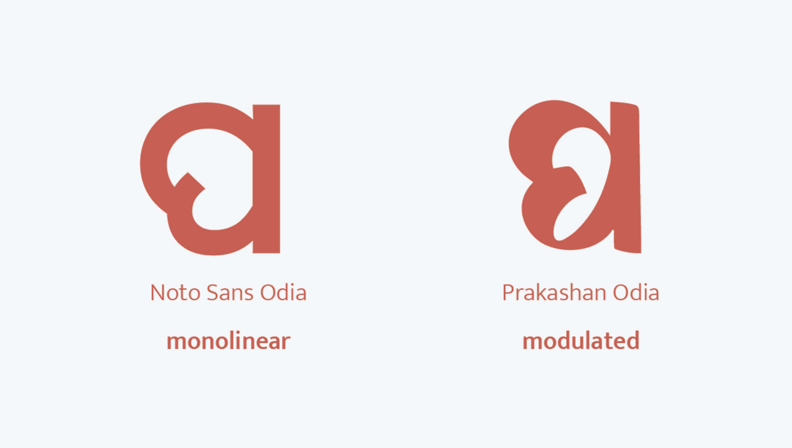
Based on the form, the typefaces could be broadly classified into two categories i.e. mono linear and modulated.
Monolinear typefaces are the ones which have or at least appear to have similar thickness of strokes. These includes many sans serif typefaces like Helvetica, Montserrat, Poppins, Futura, etc. Modulated typefaces are the ones that have significant difference in their stroke thickness like Garamond. These have resemblance to the strokes that are produced from an angle cut/ chizeled writing tool.
The above image shows the examples of both monolinear & modulated Odia font. The one on the left is Noto Sans Odia by Google, which is an example of monolinear Odia font whereas the one on the right is Prakashan Odia by Alessia Maz zarella, which greatly demonstrates the modulated nature of the font. The current project would be focusing on the monolinear type - text font as the final outcome is intended to be used on web and it would be easier to pair with the existing monolinear webfonts. The other reason for choosing to make a monolinear type is it’s better usability across weights and sizes on the web.
Odia fonts: Existing scenario
As far as open source fonts are concerned, the most common distributor is google fonts. Till date google fonts has only 2 fonts supporting Odia script i.e. Baloo Bhaina by ektype and Noto Sans Odia by Google Noto Project.
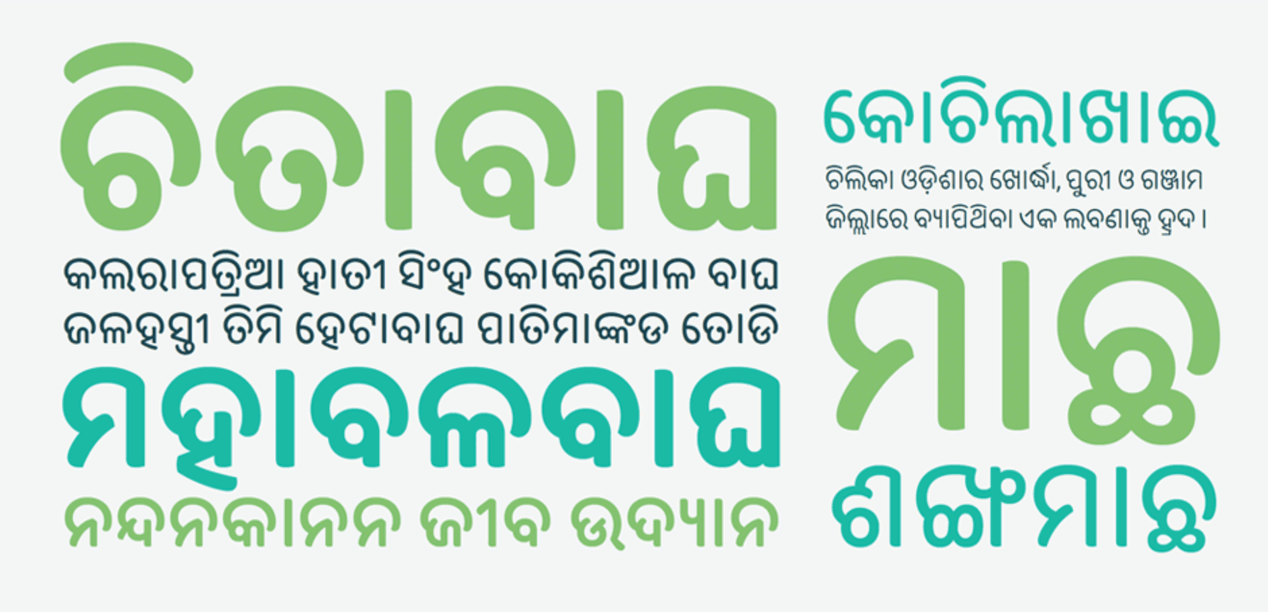
Baloo Bhaina By Ek Type
Apart from this one of the most commonly used odia font is Nirmala UI which was commissioned by Microsoft for being used. Apart from the openly available fonts, the other significant examples include Akhand and Ashoka Odia by Indian Type Foundary. Out of the available mentioned fonts none of them have a variable property.
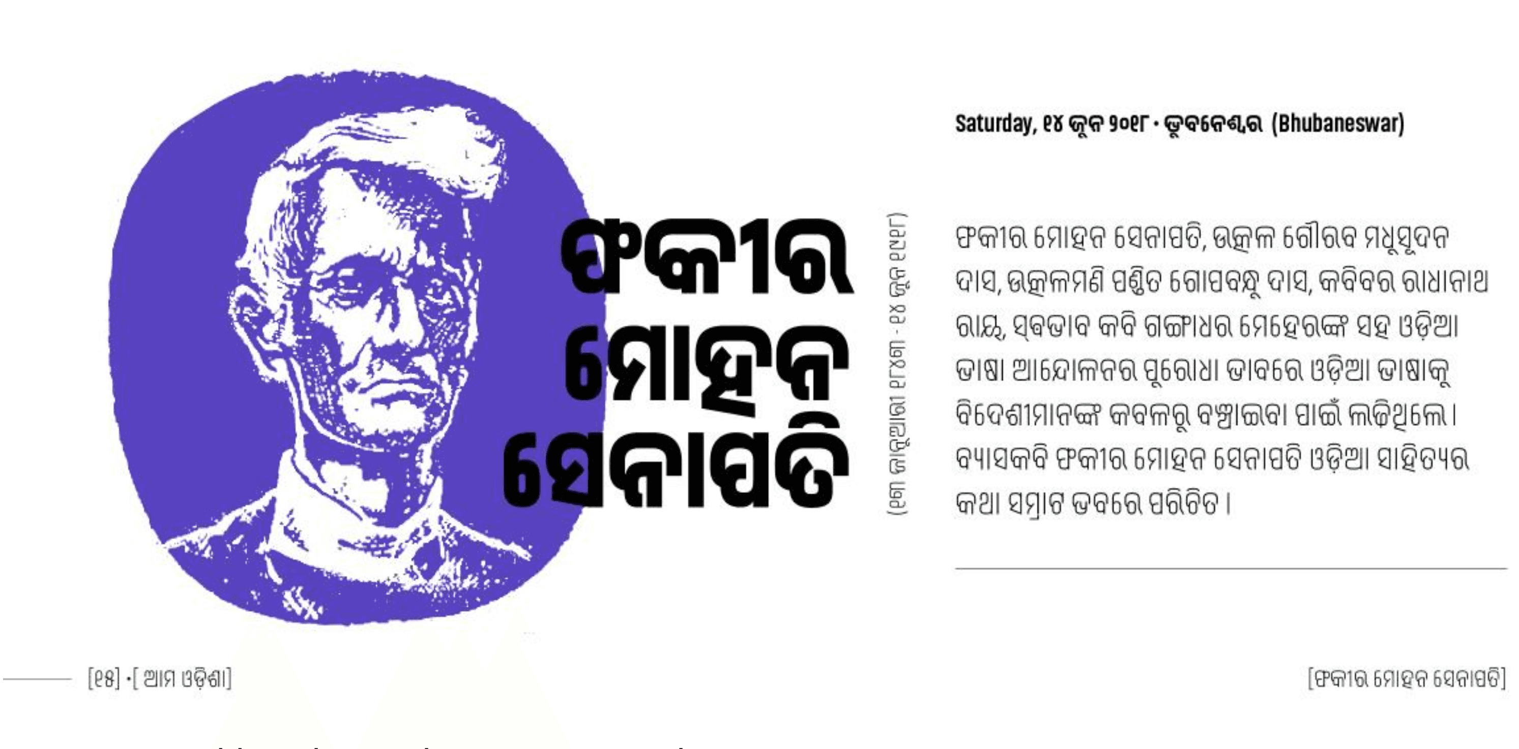
Akhand By Indian Type Foundry
Analysing existing Odia Fonts
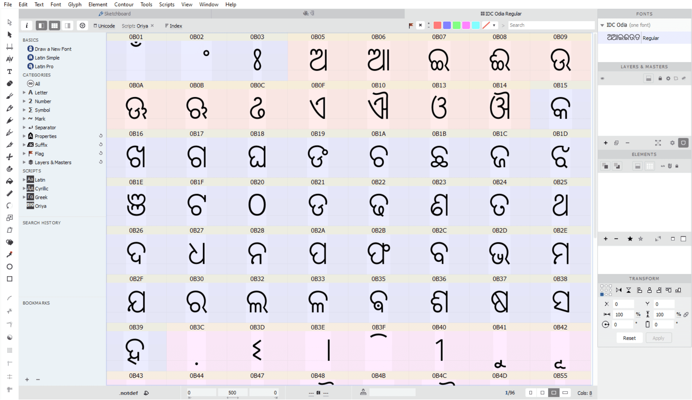
Before starting the design process, the Unicode glyph chart for Odia script was studied to make a list of the glyph set that was needed to be designed in a the form of a comparative chart which has the same letters in 100pt size from ‘Nirmala UI’, ‘Noto sans Odia’ and ‘Baloo Bhaina’ along with their Unicode number codes, unicode names, their cateogry like vowel, consonants, digits etc. The charts having the vowels have their equivalents diacritics and also Devanagari equivalent for easier comprehension.
Baloo Bhaina By Ek Type
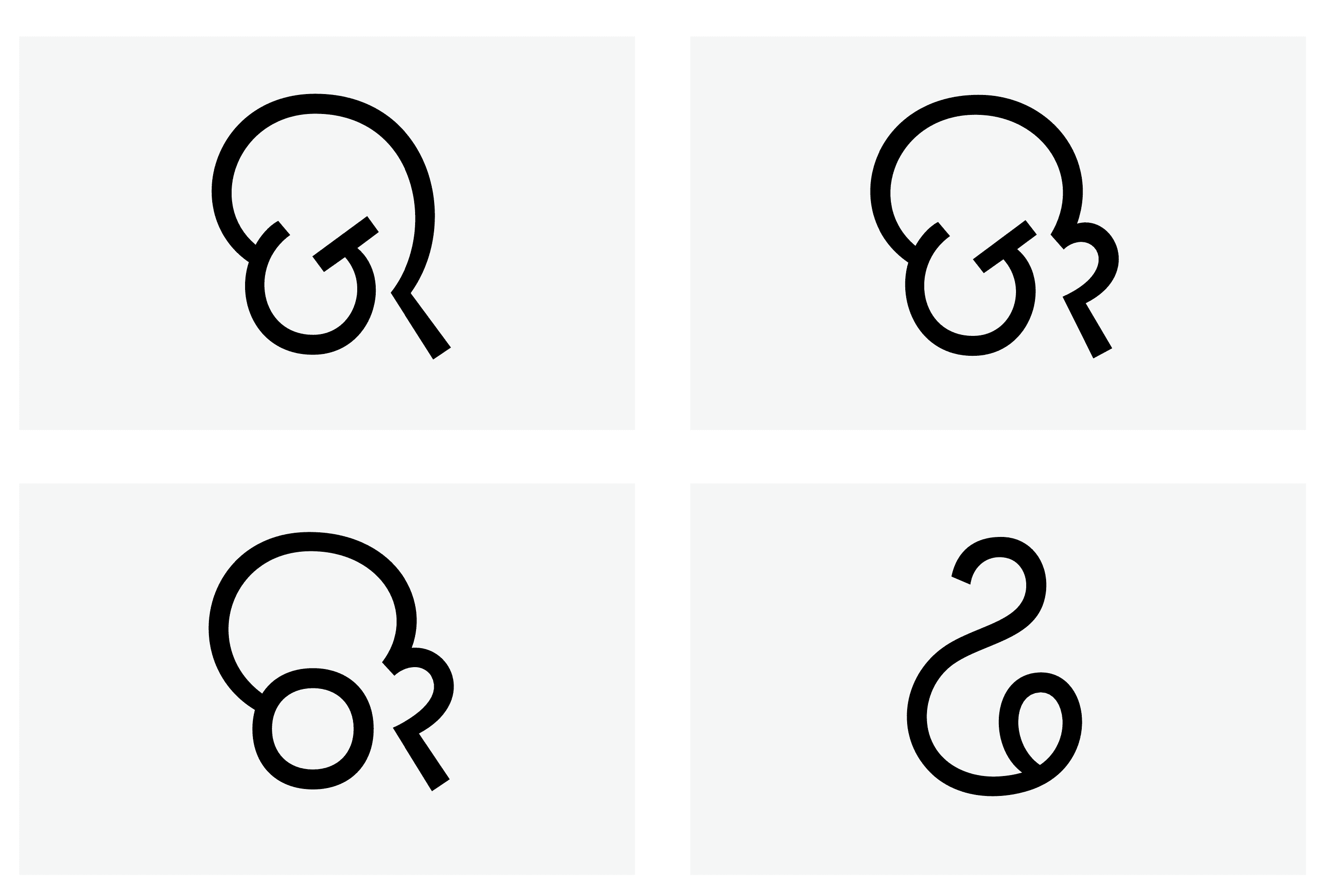
The comparison charts contains: 34 consonants, 12 independent vowels, 10 digits, 09 dependent vowel signs (one part) and 02 dependent vowel signs (two parts). The one part vowel signs gets placed either on the left like the ‘a’ matra or the right of the letters like the ‘aa’ matra. The two part signs get placed on both the sides of the letters like the ‘ai’ and the ‘ou’ matras.
Grouping letters based on visual form
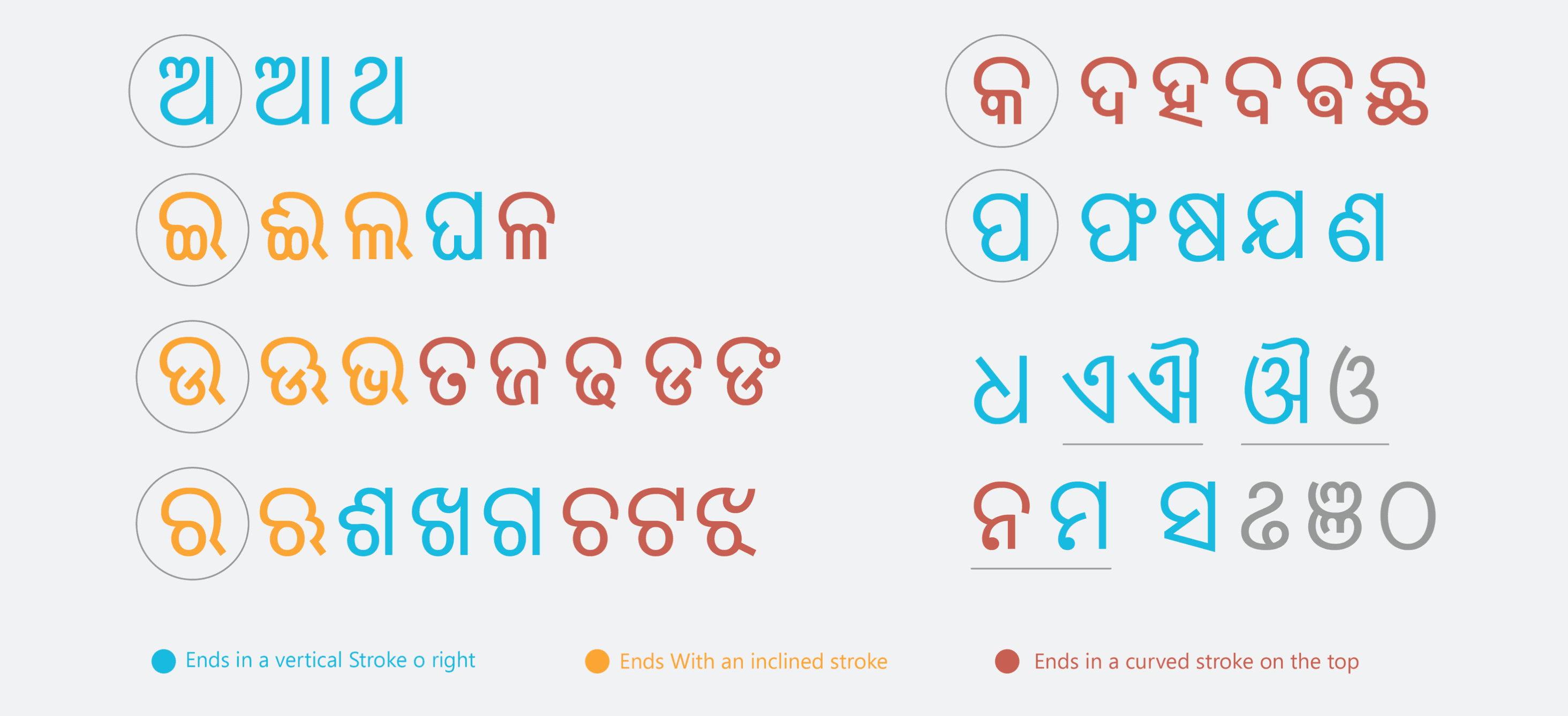
The Odia letters we grouped based on their visual form. In the image below the visually similar letters are places in similar groups which are then color coded based on their terminals. It was found that there are majorly three types of endings i.e. ending with a vertical stroke like in the etter ‘aa’ or the letter ‘m’ , the second category ending with an inclined stroke (generally an extension of a curved stroke) touching or even slightly extending the baseline like in the letters ‘ee’ or ‘la’ and the last where the letters end with a curved stroke like in the letters ‘ka’ or ‘va’.
Analysing the Existing grid
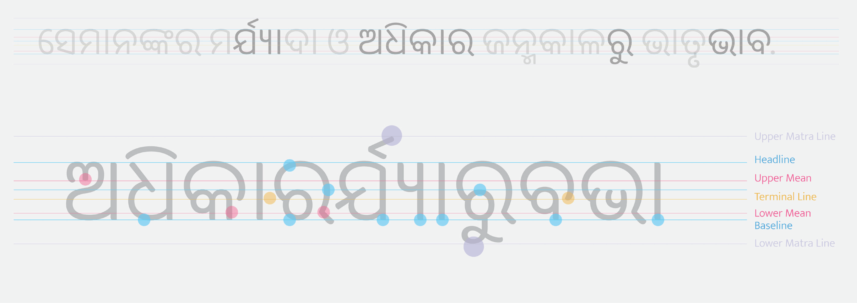
For getting an idea of the existing grid, a sentence was chosen and a fewletters that had distinct characteristics were picked. These letters were then composed into a long word and the grid lines were drawn for the same. There were 7 vertical divisions that were seen.
The Baseline on which the base of the letters sit. The head-line which depicts the heights of the letters. Then there is an upper mean line which denotes the start of some of the letters like the letter ‘a’ (denoted with pink). The lower mean line is the one where the change of stroke happens or some letters like the letter ‘ka’ or the letter ‘ba’ rests. The there is a terminal line where the letters with the curved ending stroke on top ends. The ‘matras’ in Odia can appear on both the sides and also on top and bottom. The Lower matra line and the upper is where these matras would exist. Therewould a lso be a deeper line in case of special conjuncts
Types of Joineries
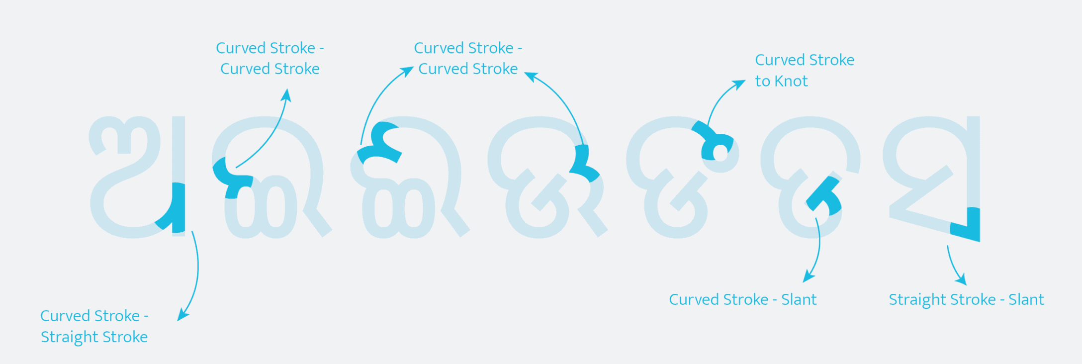
There are a few different kinds of joineries in the Odia script. The first one is where the curved stroke joins with a vertical stroke like in the letter ‘a’ or ‘pa’. The second type is the one in which the curved stroke joins with
another curved stroke like in the letter Odia letter ‘e’. The third one is the one in which two curved stroke join but appear as folds like int the letters ‘ee’ or ‘oo’. The fourth one is where the curved stroke joins with a knot,
the fifth one is where the curved stroke joins with an inclined stroke like in the letter ‘dda’ and the last one is where two straight strokes join at an angle like in the letter ‘sha’
Types of knots
There are majorly two types of knots that could be found in Odia script. The first one is a filled knot (letters on the left in image 9.5) that can be found in letters like ‘ma’, ‘na’, ‘ta’ etc. The second one is a closed knot that can be found in the letter ‘nga’
Initial letterform explorations
The initial explorations started as a part of ‘63 Days of Odia Type’ which then inspired me to do some explorations of the Odia letters with different forms and techniques.
To get a better sense of the letter-forms and their composition as sentences, I wrote a few paragraphs on different papers with ink pen and felt tip pen to see how the letters get synchronized with each other.
Outline Sketching
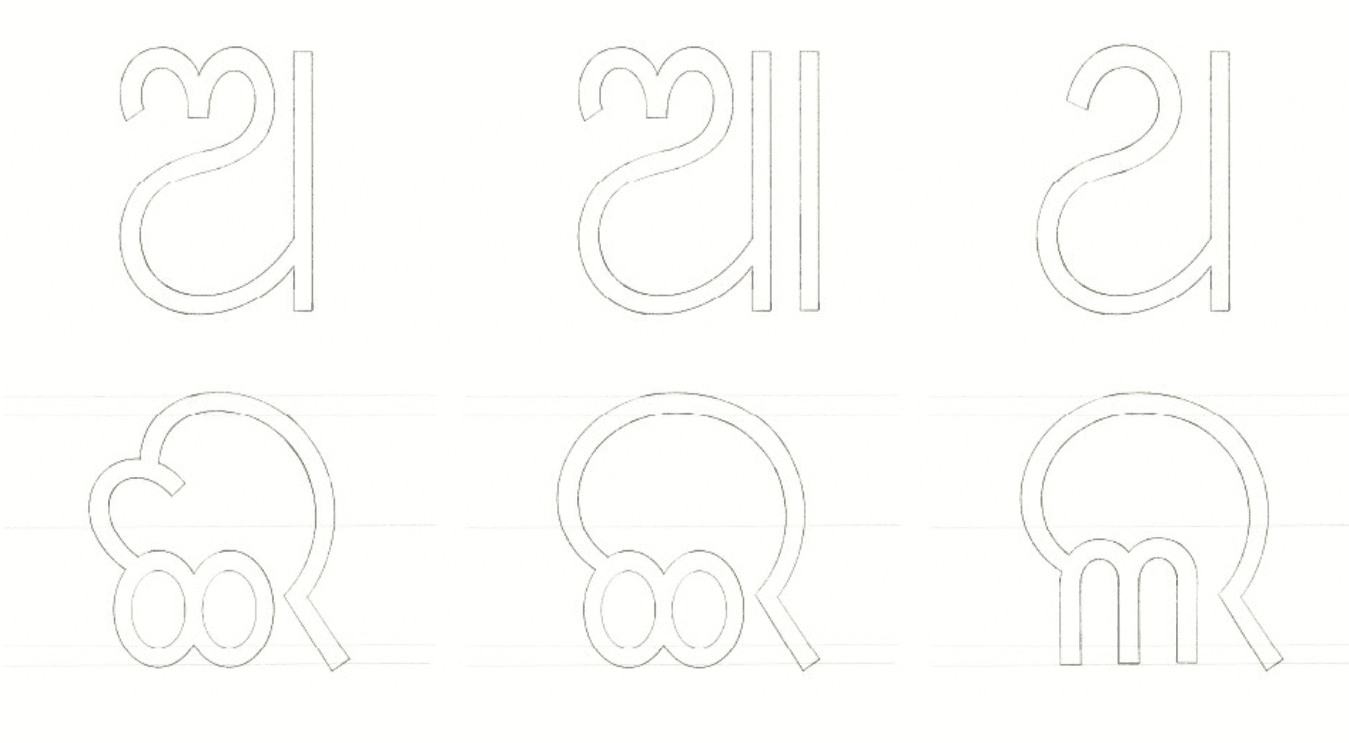
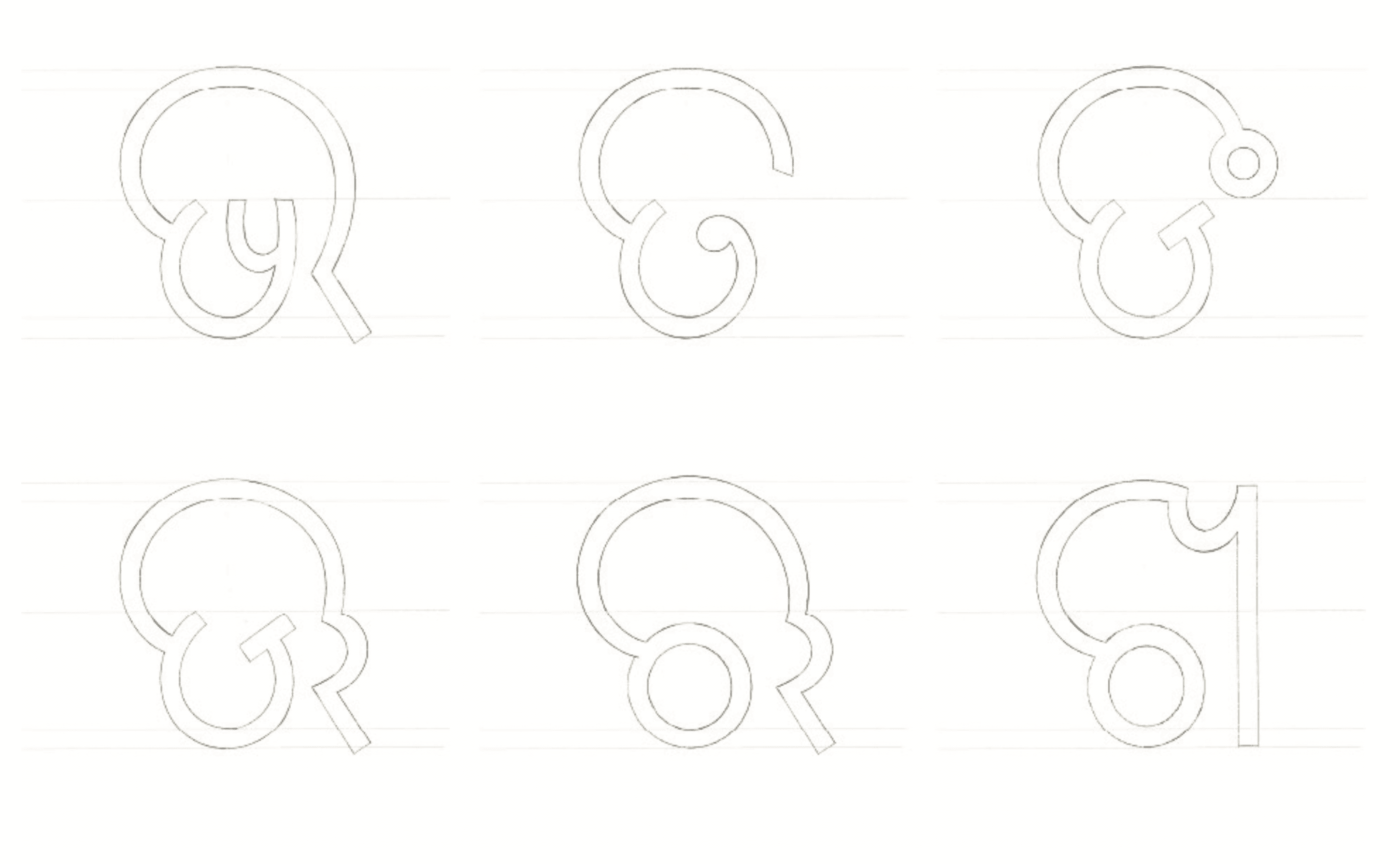
After the letter drawings, each character was sketched in the sequence of their uniqueness of the form, i.e. based on the grouping shown earlier in which the primary characters were sketched first and then the similar characters were derived from them with the help of transparent sheets.
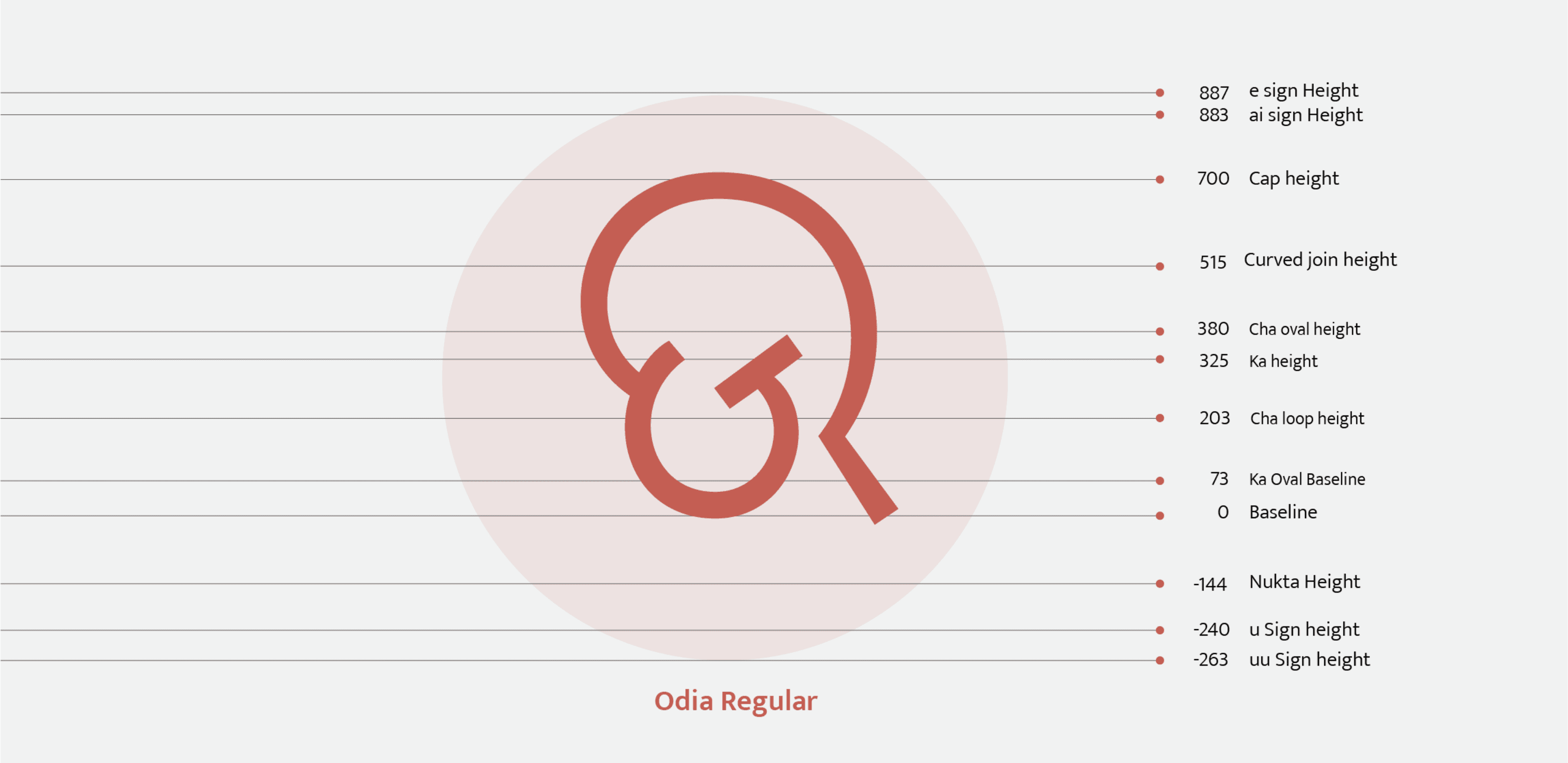
Vertical Grid
After completing the outline sketches of the major characters the characters were then used to derive a vertical grid to make the further process more efficient. For the convenience of the further process of vector drawings the
vertical grid was calculated in UPM. Given the baseline set at 0 the cap height was taken at 700.
Vector Drawing (1st Draft)
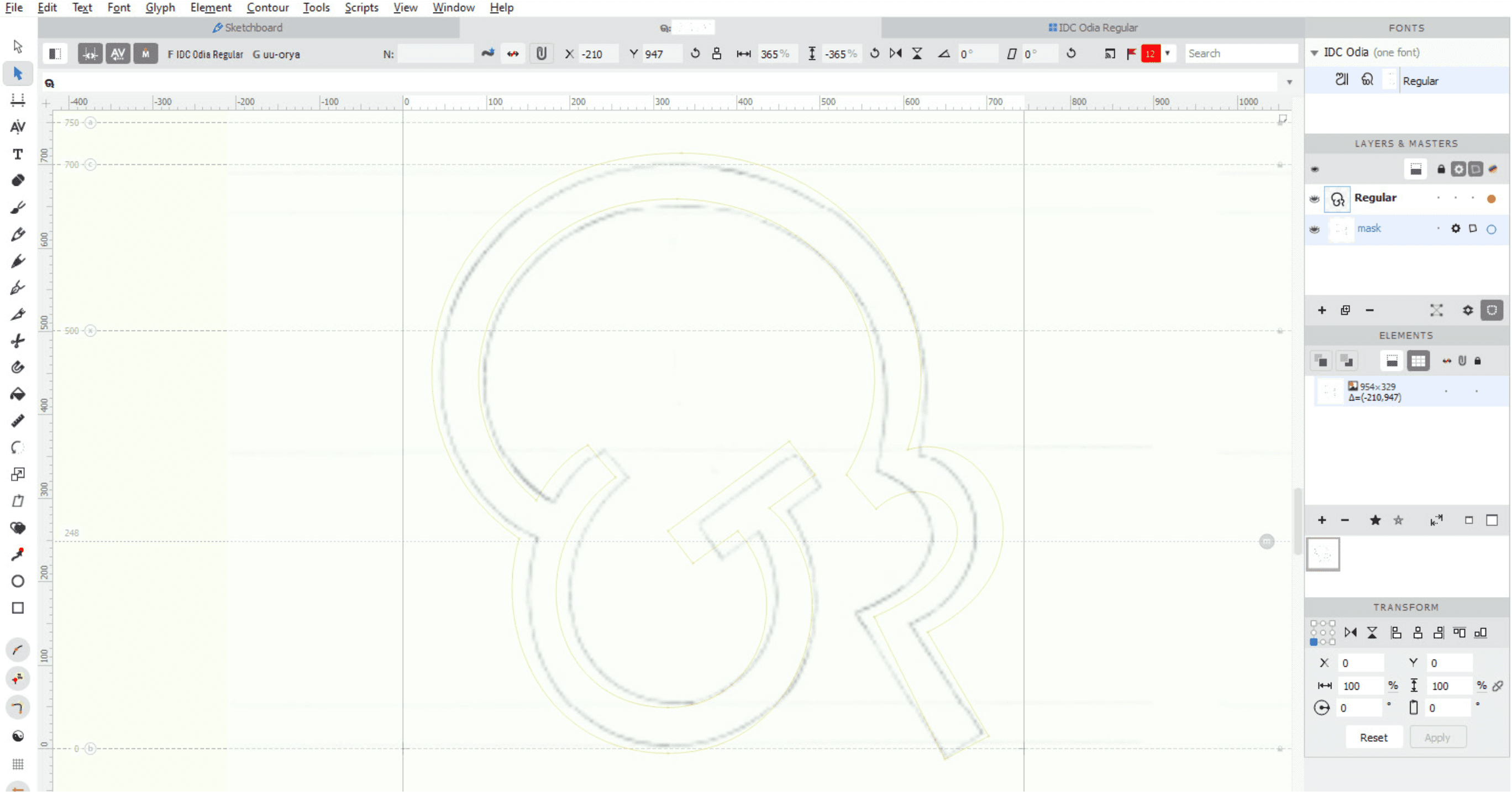
The outline sketches drawn earlier were used as a reference for starting the letter drawing process. Each sketch was imported in the masked background layer of the respective glyph. The letters were then drawn based on the decided vertical grid and the irregularities of the hand drawings were subsided digitally. The glyph chart of the first draft can be seen in the next image.
Composing names
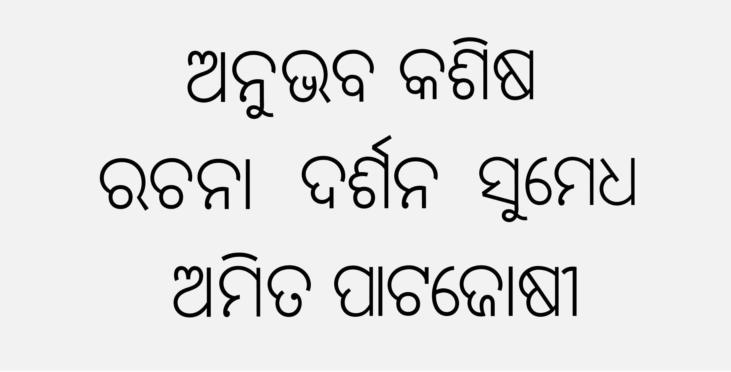
After the first draft was finished the letters were composed in the form of a few names and these were then put in different scales to check how these behaved once printed. To achieve the Width consistency a few letters were then modified based on the findings from the analysis
Final Glyphs and Sampler
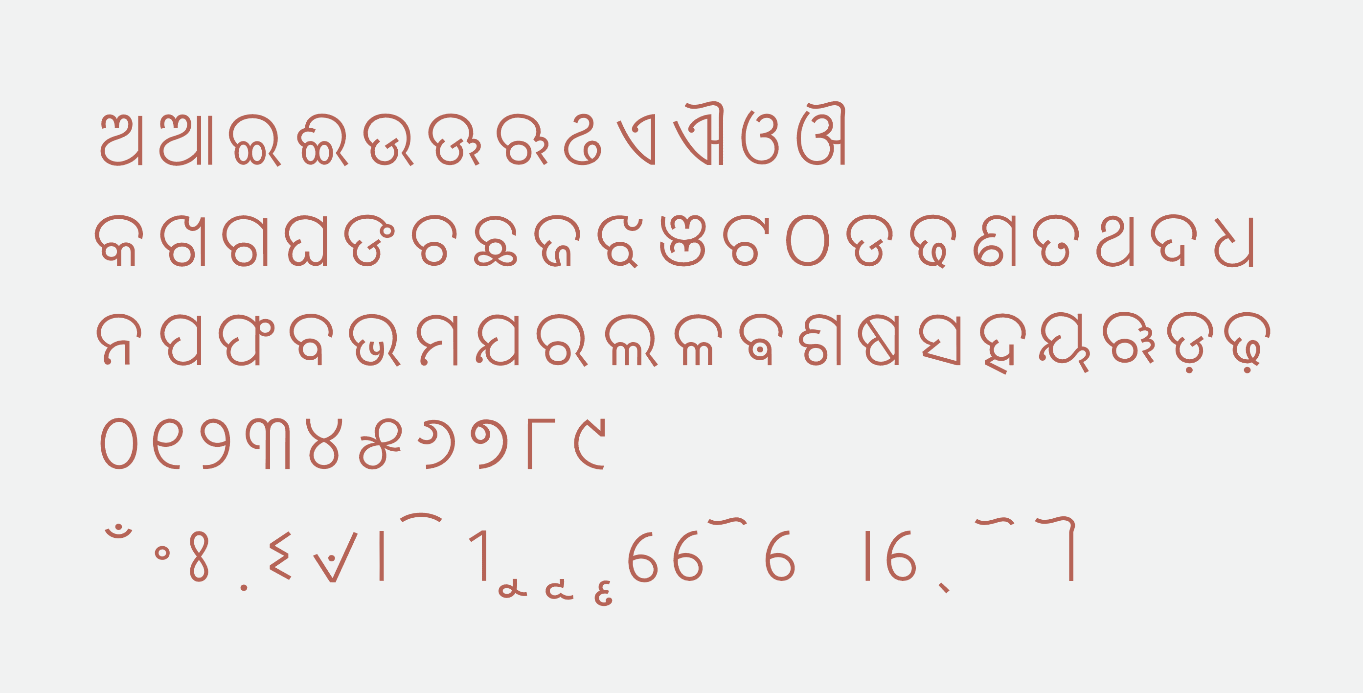
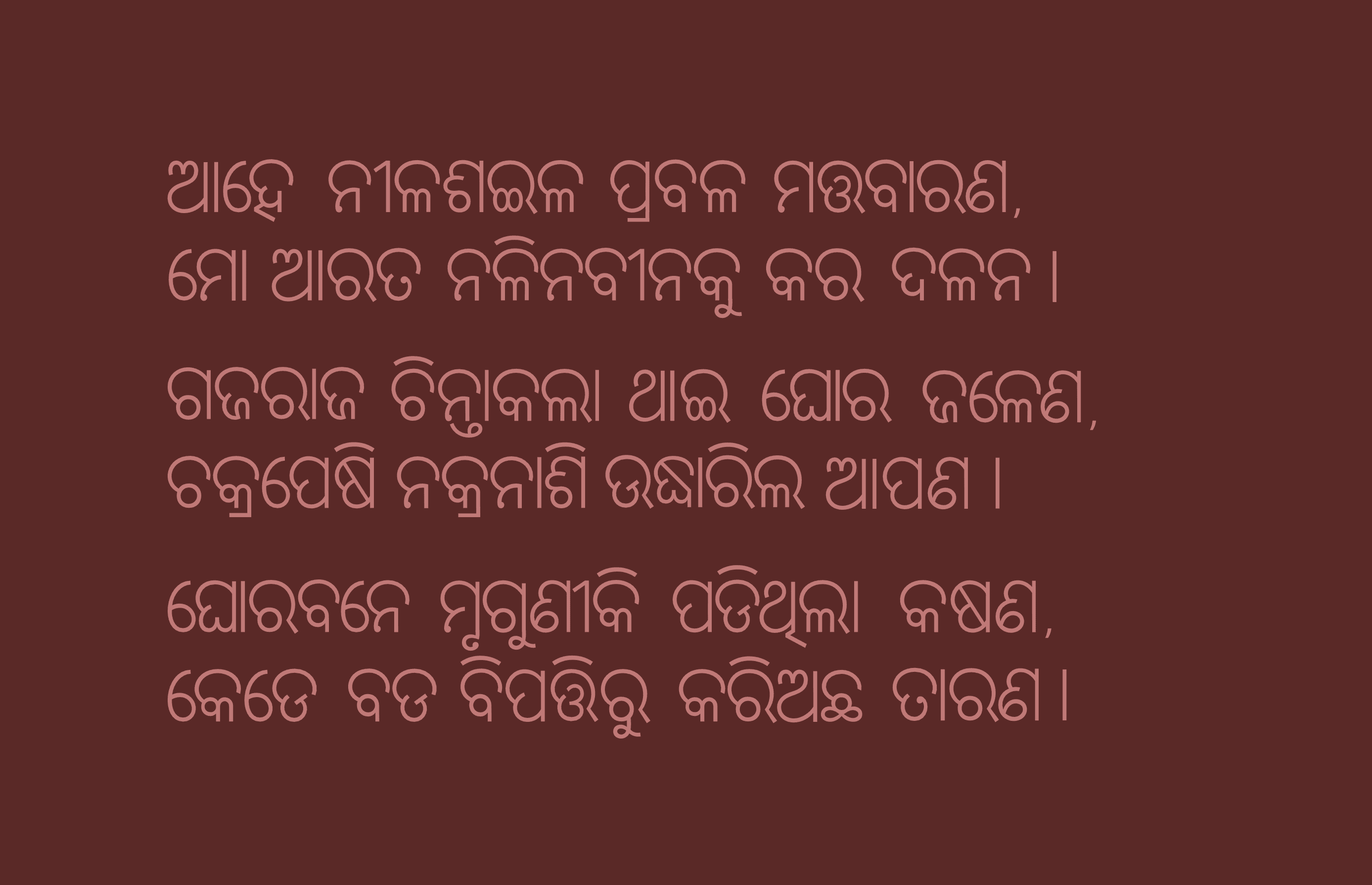
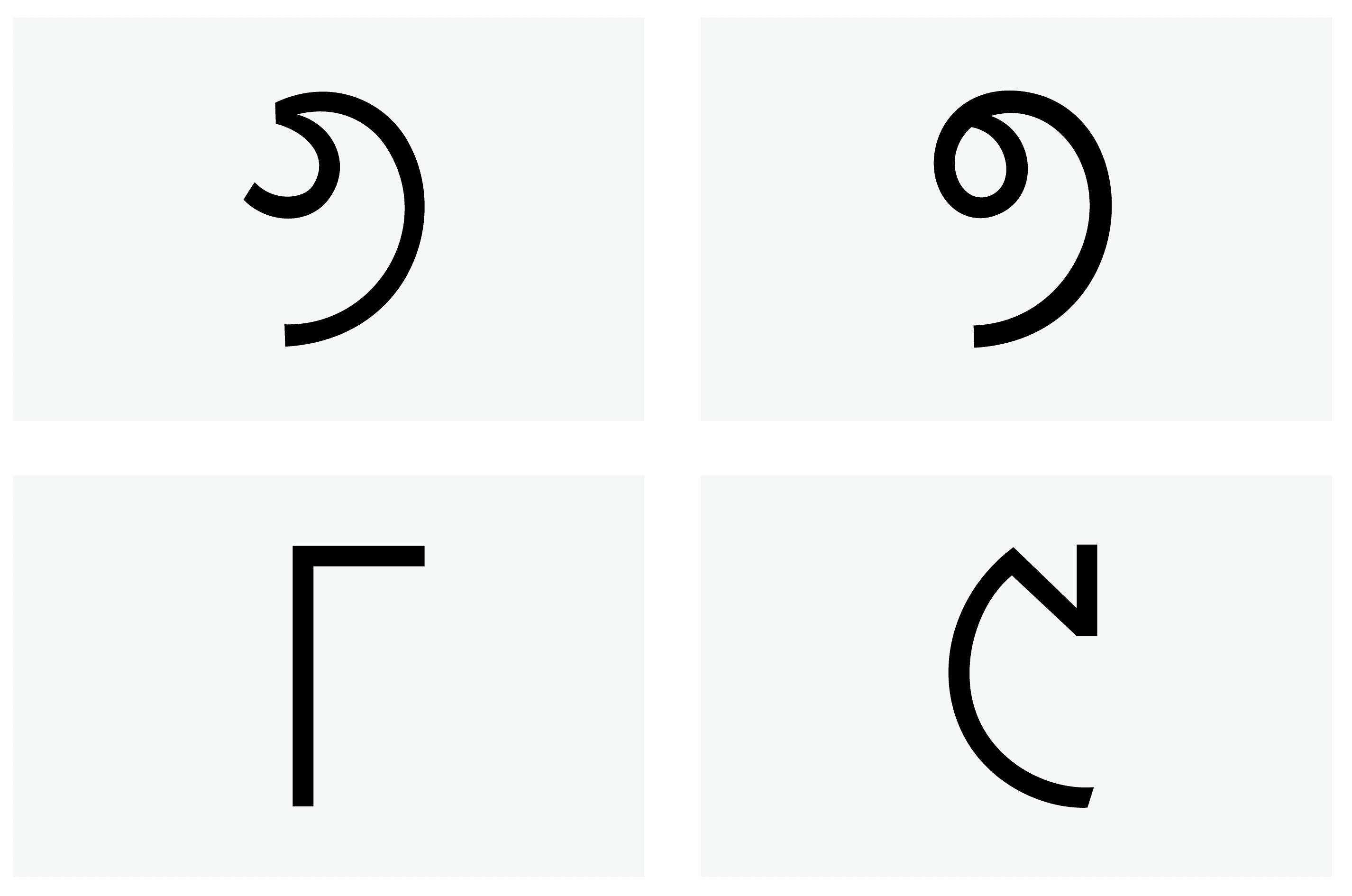
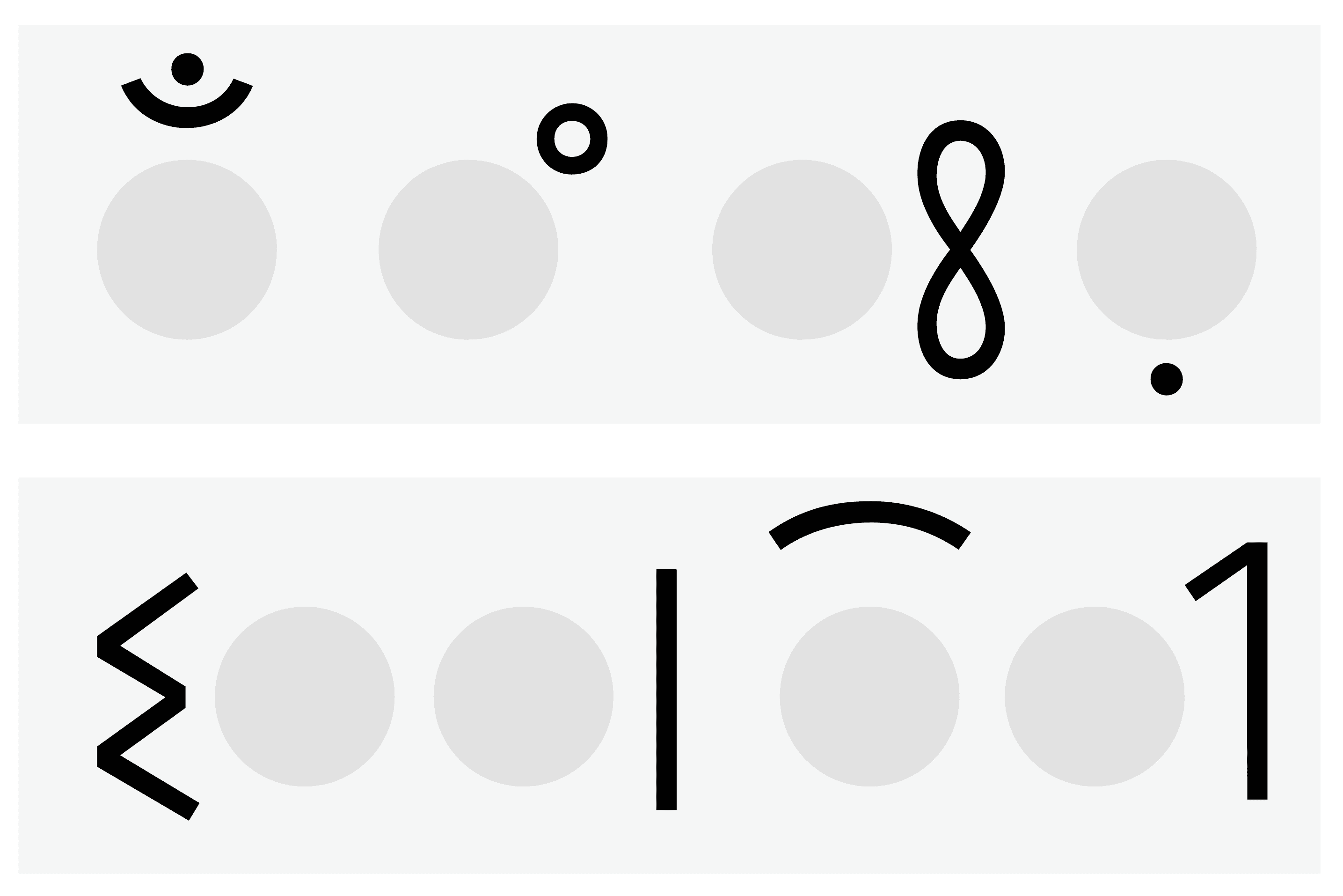
The image below shows the final glyphs which is followed by the diacritics usage and a poem composed in the designed font.
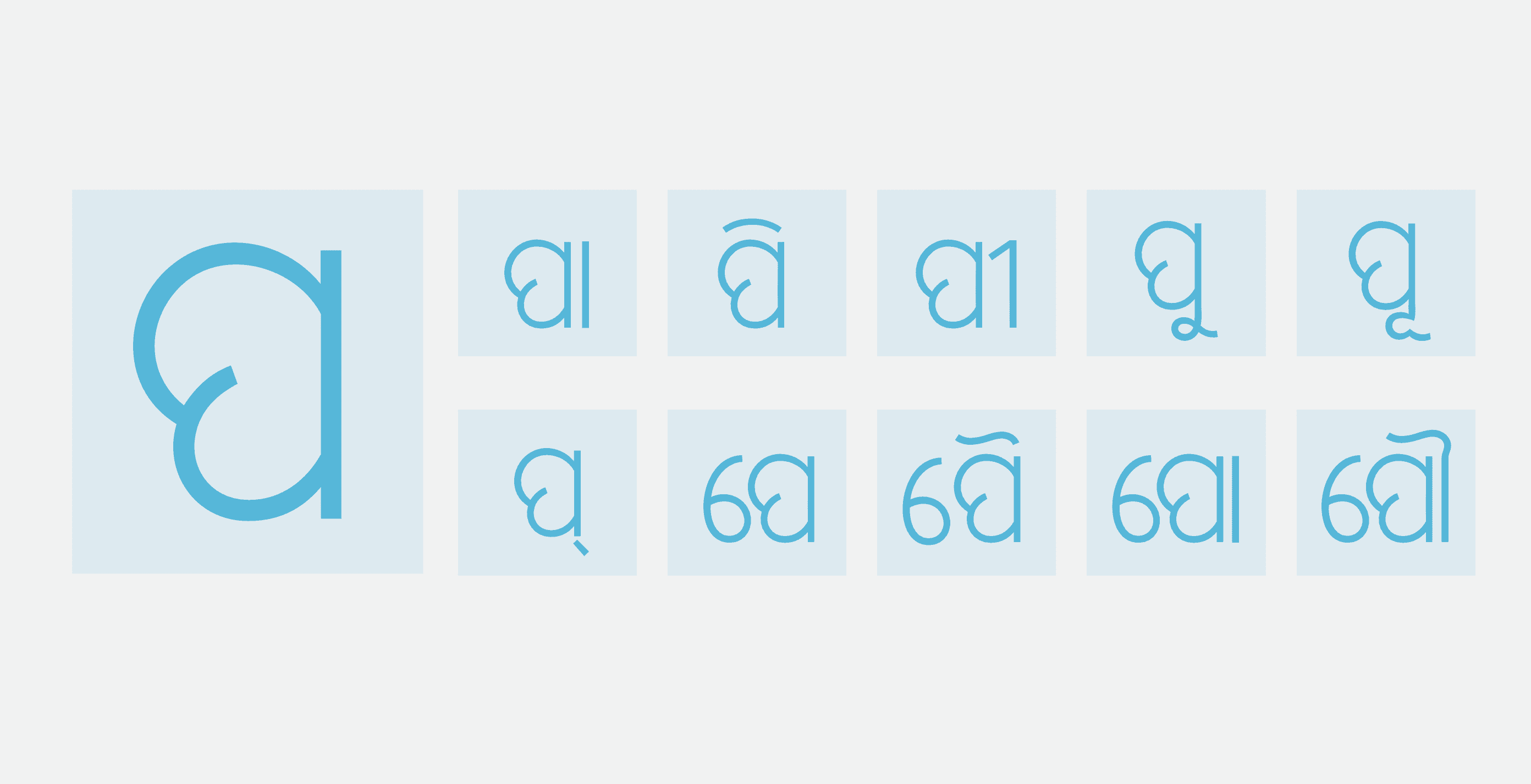
Odia letter ‘Pa’ is used to demonstrate all the matras designed for the particular typeface.

