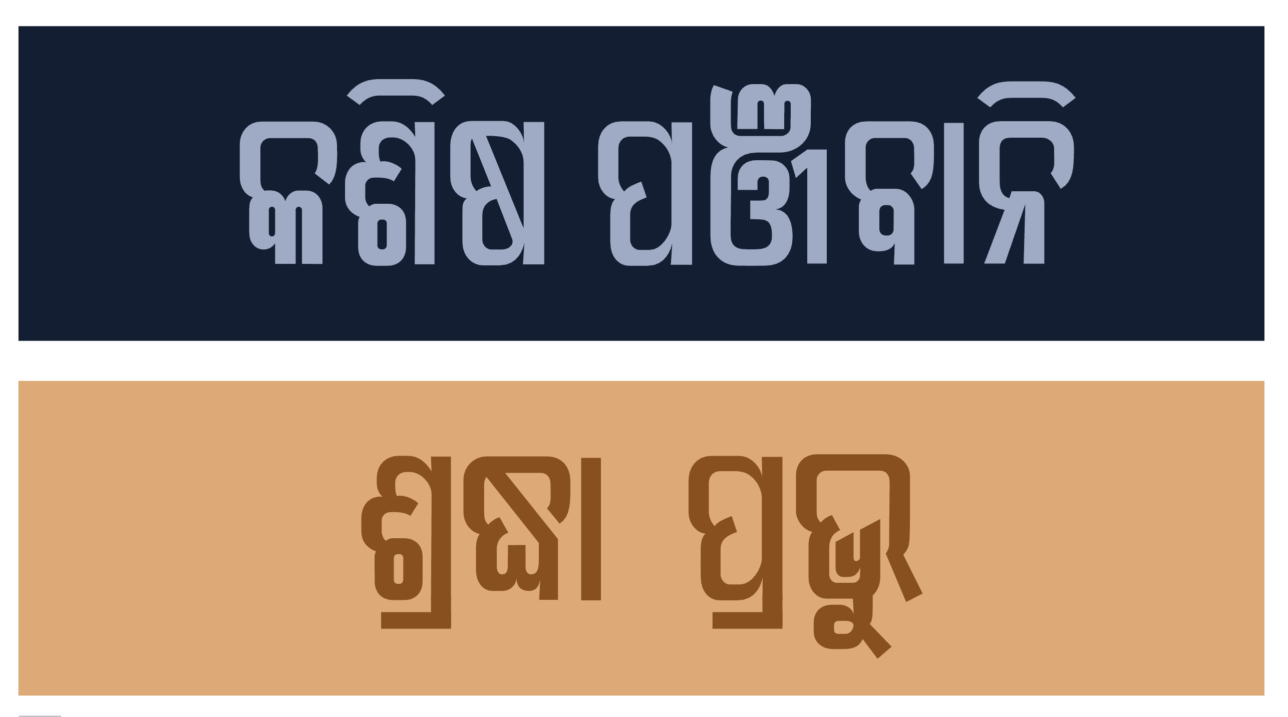
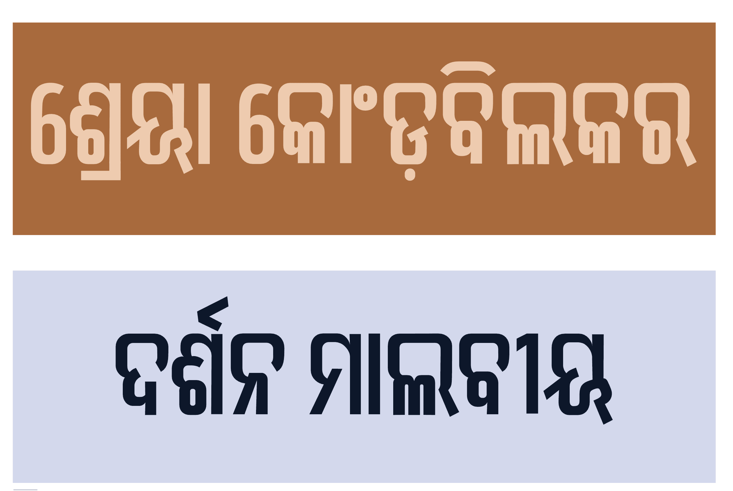
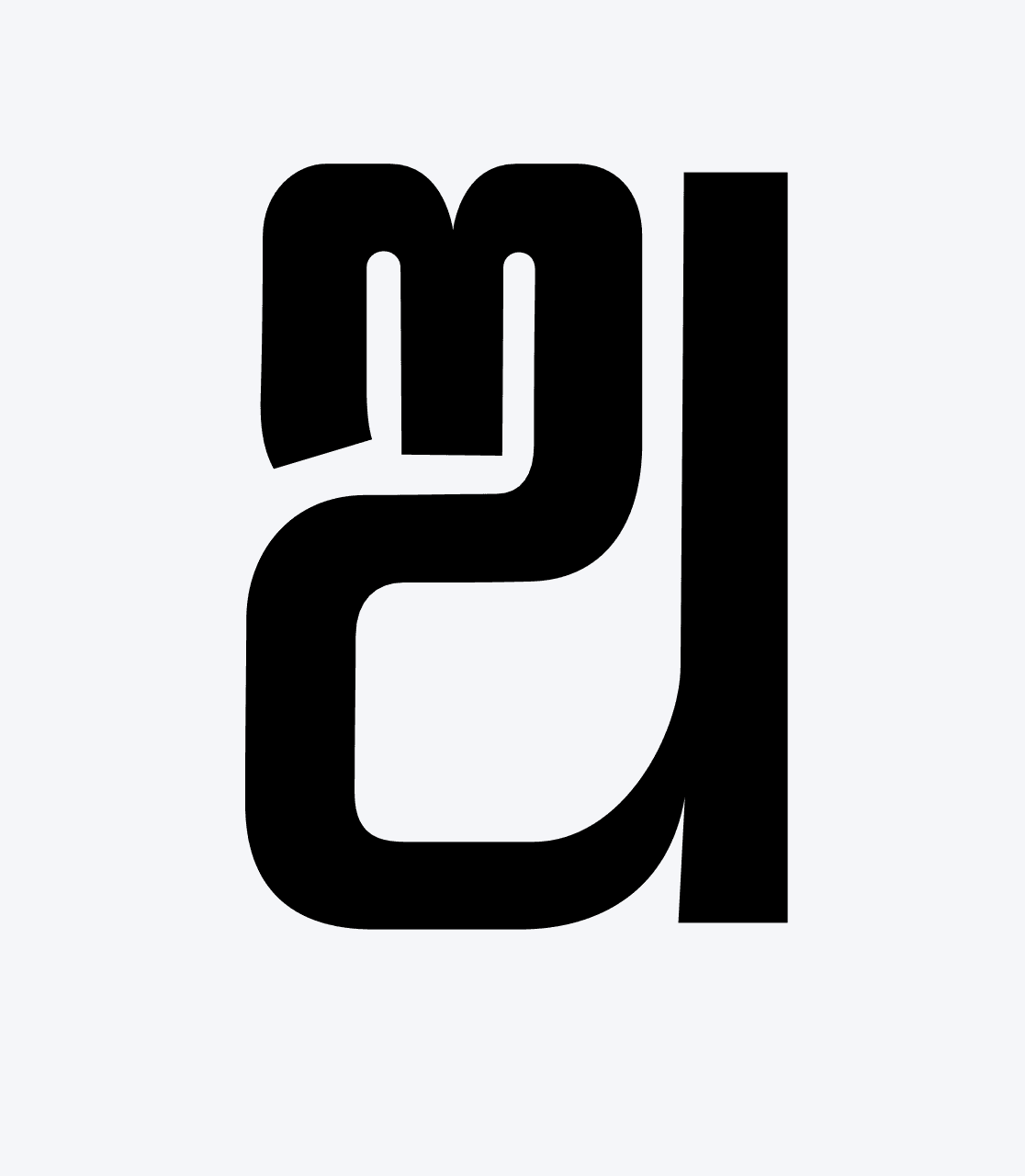
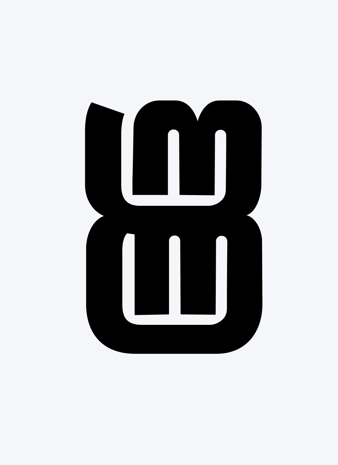
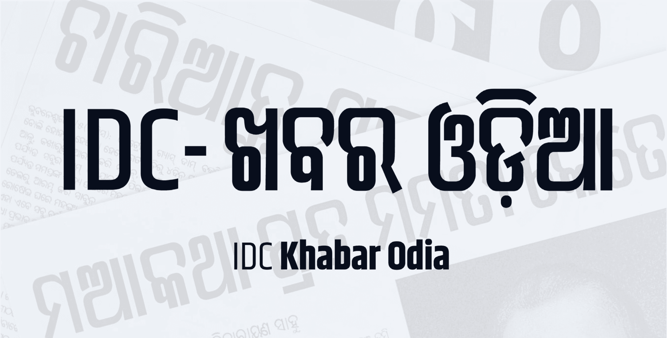
IDC Khabar Odia, Designing an Odia display font for headlines
The idea of this project was initiated during my previous font design project, where I designed a body font in Odia script. That project helped me overcome the barrier of getting into typeface design. I was able to achieve my primary objective to learn typeface design. While doing the project, I also was exposed to a few problem areas and potential cases where a new typeface can be introduced. One of which that interested me was headlines.
I was also designing the Odia typeface with an aim of providing an open-source font with open type features which would help in enriching the Odia content on web.
This project helped me extend the script knowledge and the knowledge gained about the optical illusions in type design during my research project.
Year
2022
Category
Academic
Duration
22 Weeks
Platform
Multi
What are headline fonts?
The main purpose of a headline font is to catch the attention of the reader. These are also present to set the tone of the entire piece of work, which creates intrigue and make the content appealing to the reader. Headlines have the capability of making the content look more urgent, relevant, essential and worth reading as shown in the figure below.
Headlines generally consist of a few words, the impact is supplemented by the headline font. The headline fonts are not excessively special but when used properly, they have the capabilities to create different sensation among the readers of the text.
Desired Characteristics of Odia Headline Font
Like an usual headline font, an Odia headline font have to catch the attention of the reader. It should have a character that is designed for their purpose.
It must be properly spaced or kerned properly and must be easily readable. It should show some level of contrast to help in creating emphasis. It should be designed in a way that would occupy the least amount of space if the space is limited.
It should have flexibility in terms of width to fit in certain limited space. It should also have sufficient amount of weight to make it distinguishable when used between long texts.
Analysing Odia headlines in use
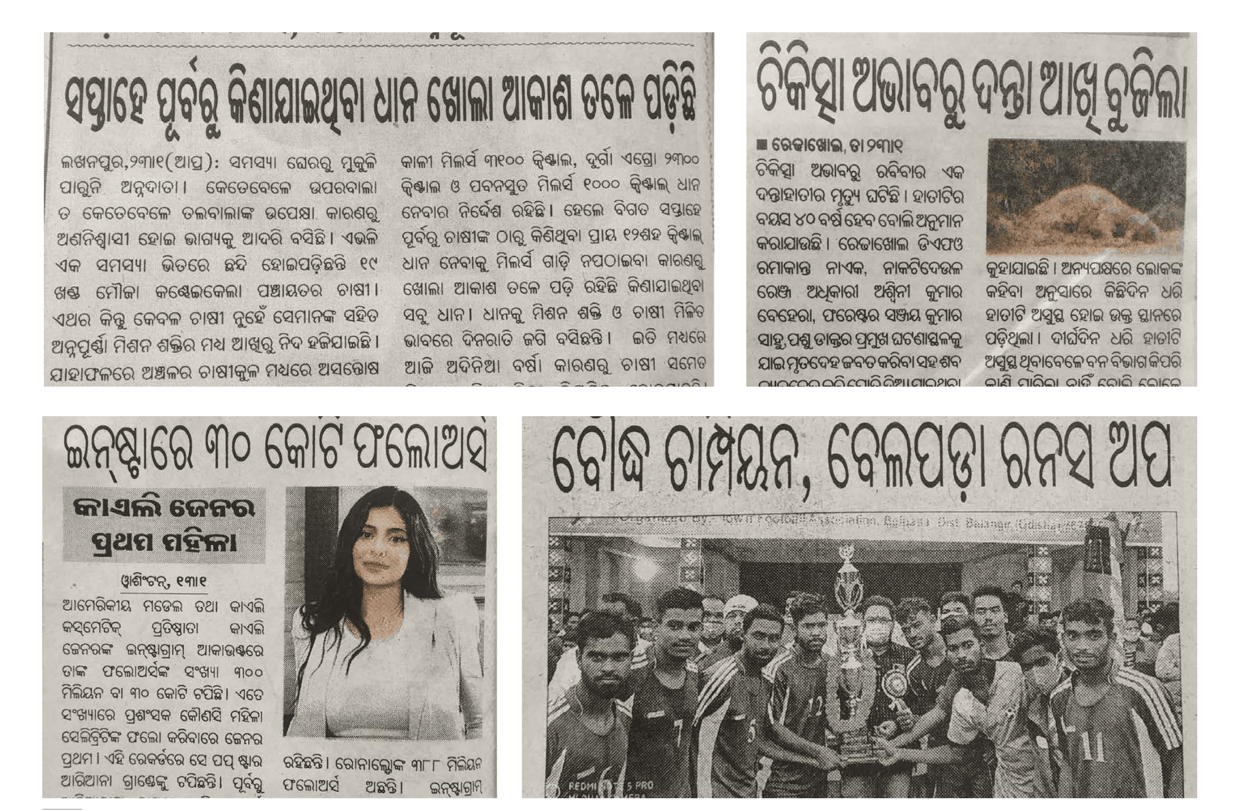
Odia newspapers have been an excellent source to analyze the headlines in Odia script as they provide vivid examples of use case scenarios of the script. The other reason why these news- papers are a great source is the limited space of the newspaper. This constraint factor makes the condition an idea use case scenario for the headline fonts.
For the purpose of this projects, headline samples from 5 different Odia newspapers have been collected, namely- ‘The Samaja’, ‘Sambad’, ‘Dharitri’, ‘Pragativadi’ and ‘Pramaya’
On Analysis it was found that- In most of the newspapers the same typeface was used for the body and for the headlines. The spaces in the newspapers are limited for the news articles as most of the revenue for these newspapers come from the advertisement and hence an ample amount of space is provided for them. Due to this space constraint the headlines are often stretched or skewed to fit in the available space which makes the font look distorted.
Most of the fonts used in the headlines for these newspapers doesn’t attain sufficient contrast to make them stand out and catch attention. As most of the news text has to be in black and white to make it cheap the headline contrast from the body text becomes important to grab attention. The headline fonts used in these samples mostly seem to have minimal or no width variations.
How width of a typeface affect the headline
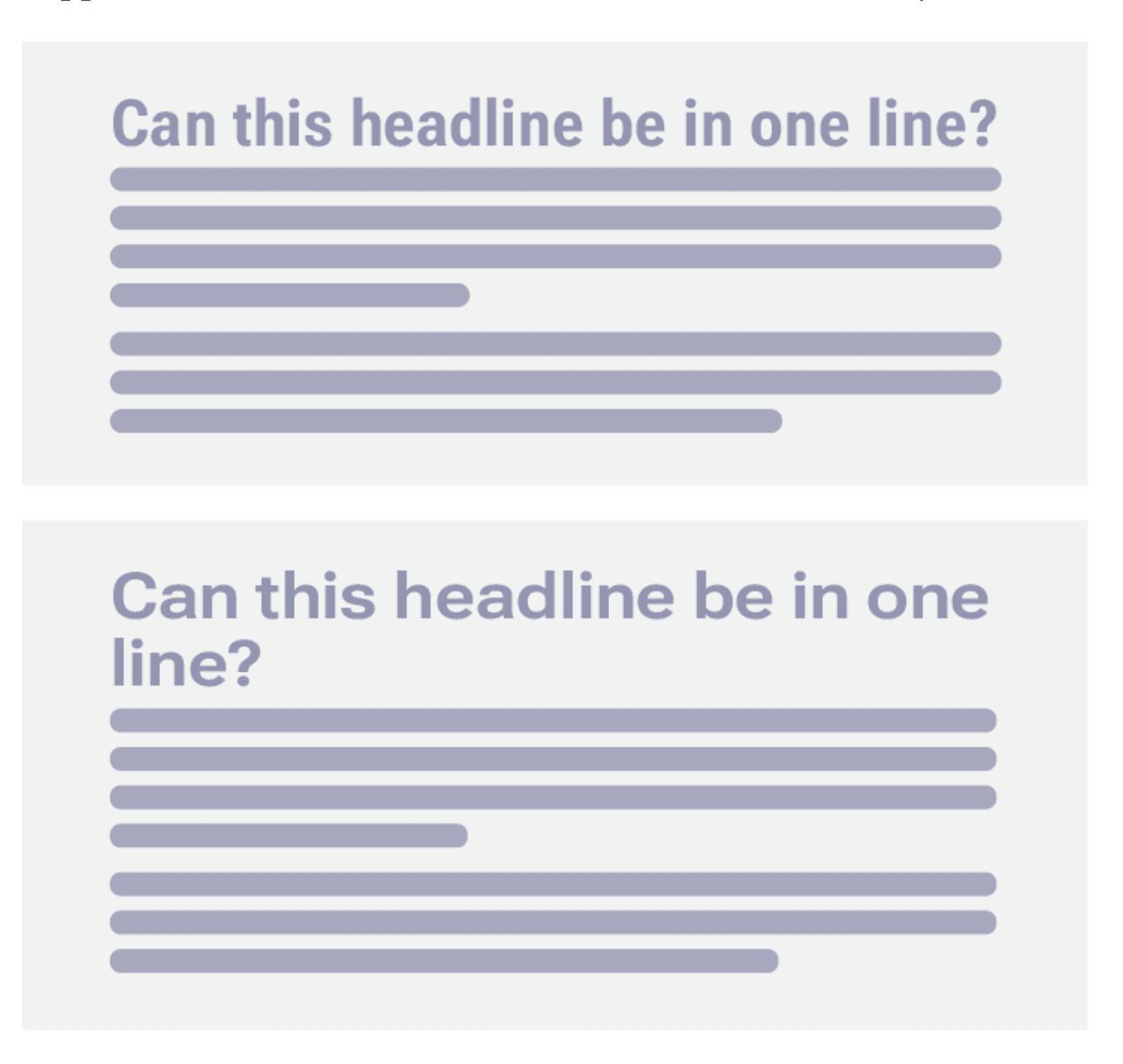
Newspaper, magazines, blogs have space constraints to minimise the production cost. In most of the cases, the width of the article column defines the width of the headline. It might happen at times the one word of the headline extends beyond the length of the article column width.
It becomes better to squeeze an extra word in the same line than keeping just one word in the other line which would be wasting a lot of space. This shows the importance of having some variations in thewidth of a headline font.
Saving Space with width variation
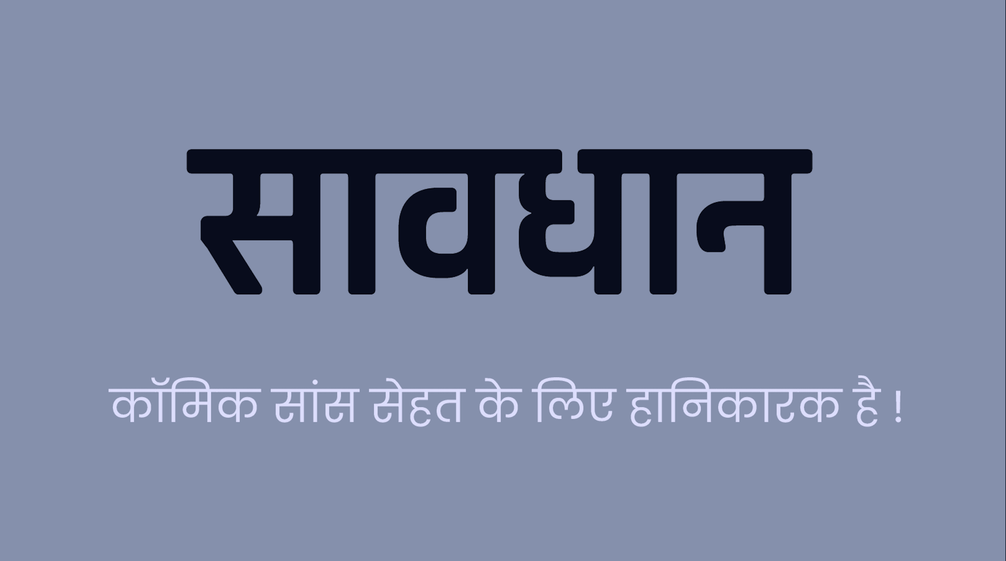
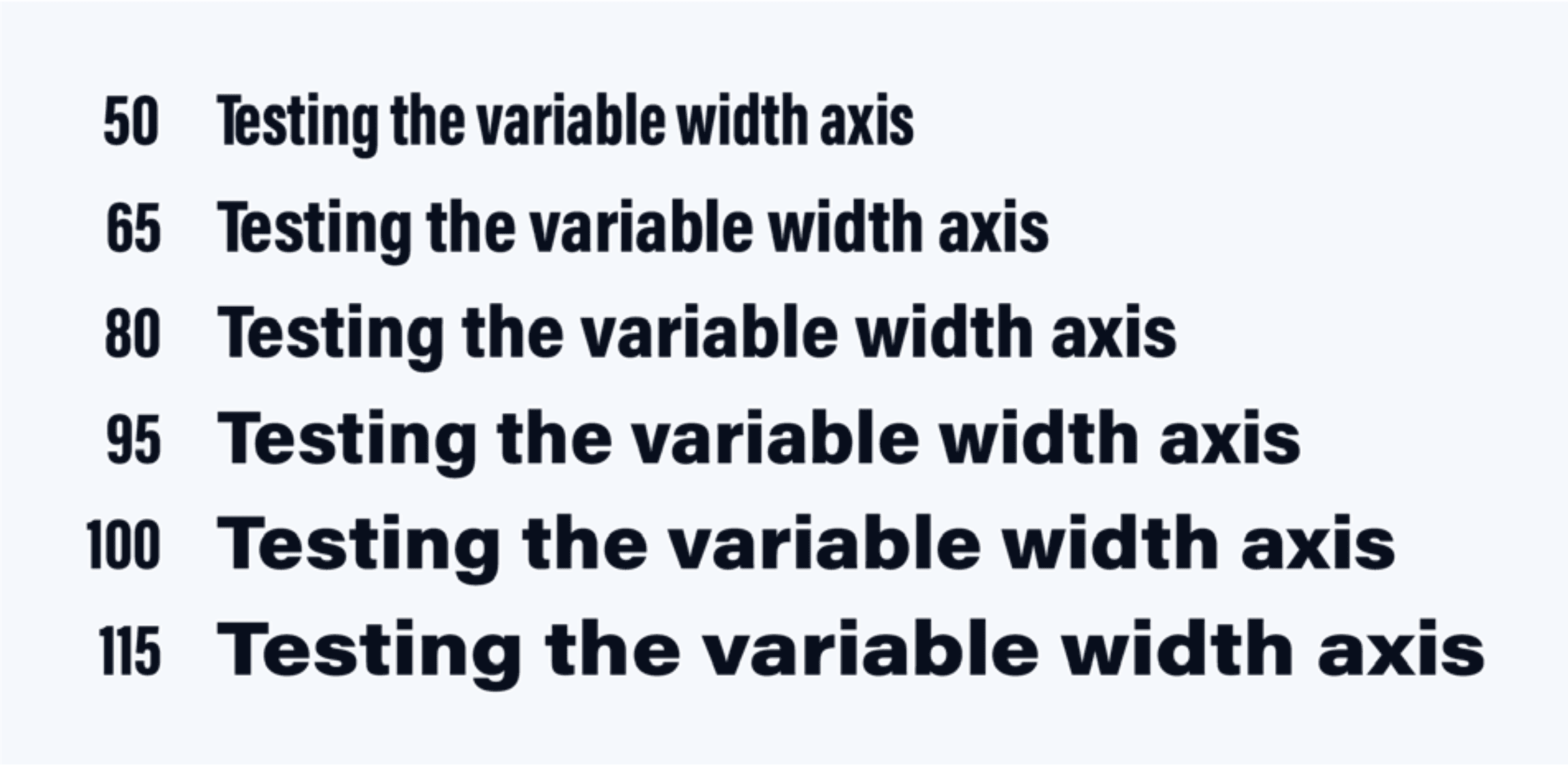
As seen in the newspaper sample analysis, the headlines are stretched or skewed to match the width of the column which distorts the sentence. The better way to do so is using a typeface that has a variable width axis. Tis would allow to have some variations along the width axis of the typeface.
As seen in the image above, the same sentence is composed in Acumin variable typeface . This allows the headline width to vary with the width of the column. The same is illustrated with the help of three different column widths in the following image.
Intricacies of the Odia script
Oriya has syllabic alphabets wherein all consonants have an inherent vowel embedded within. Diacritics, which can appear above, below, before or after the consonant they belong to, are used to change the form of the inherent vowel. When the diacritics appear at the beginning of a syllable, vowels are written as independent letters. Also, when certain consonants occur together, special conjunct symbols are used which combine the essential parts of each letter.
A limited number of ligatures are possible since all the consonants cannot be combined with all others. Vowels can either be independent or dependent upon a consonant or consonant cluster. A large number of “consonant + vowel” and “consonant + consonant” combinations have various alternative representations. A standard is perceived to be evolving.
Grouping letters based on the Form
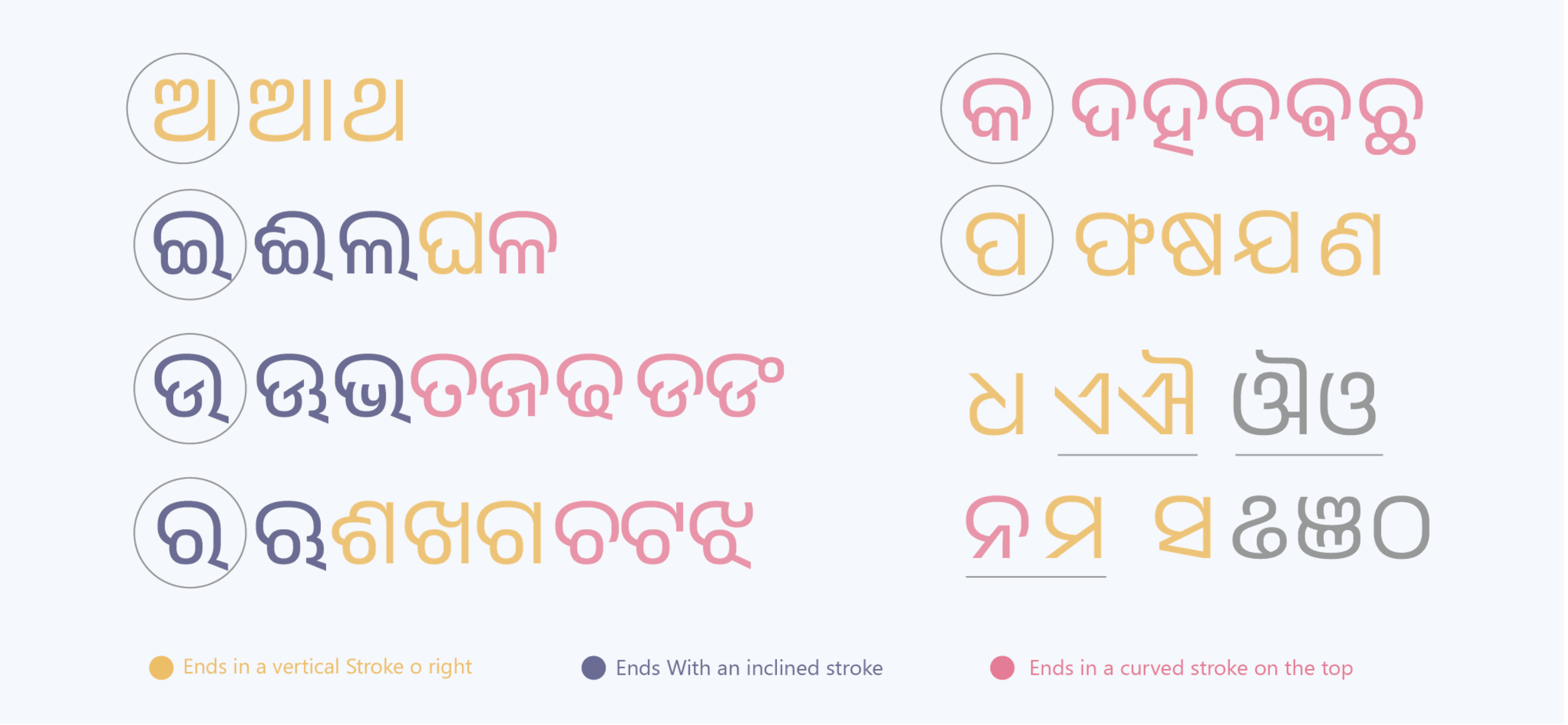
The Odia letters we grouped based on their visual form. In the image below the visually similar letters are places in similar groups which are then color coded based on their terminals.
It was found that there are majorly three types of endings i.e. ending with a vertical stroke like in the image below : Grouping Odia letters based on their visual characteristics letter ‘aa’ or the letter ‘m’ , the second category ending with an inclined stroke (generally an extension of a curved stroke) touching or even slightly extending the baseline like in the letters ‘ee’ or ‘la’ and the last where the letters end with a curved stroke like in the letters ‘ka’ or ‘va’.
‘Monolinear’ vs ‘Modulated’ Fonts
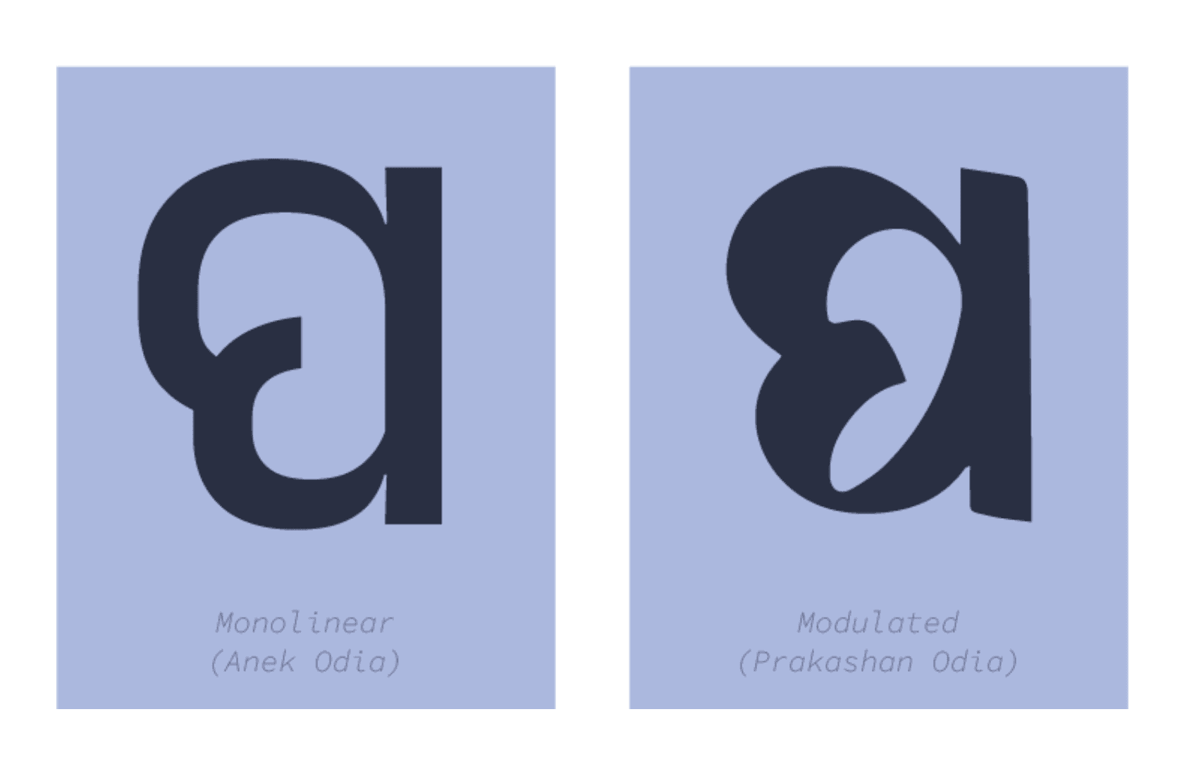
Based on the form, the typefaces could be broadly classified into two categories i.e. mono linear and modulated.
Monolinear typefaces are the ones which have or at least appear to have similar thickness of strokes. These includes many sans serif typefaces like Helvetica, Montserrat, Poppins, Futura, etc.
Modulated typefaces are the ones that have significant difference in their stroke thickness like Garamond. These have resemblance to the strokes that are produced from an angle cut/ chizeled writing tool.
The current project would be focusing on the monolinear type - Display font as the final outcome is intended to be used as a Display Headline to pair with the existing monolinear web fonts. The other reason for choosing to make a monolinear type is it’s better usability in limited space when the typeface is being used in a condensed version
Style exploration
After deciding upon the font type to be monolinear, a few styles were explored to get an idea of styles that would be suitable for an Odia headline.
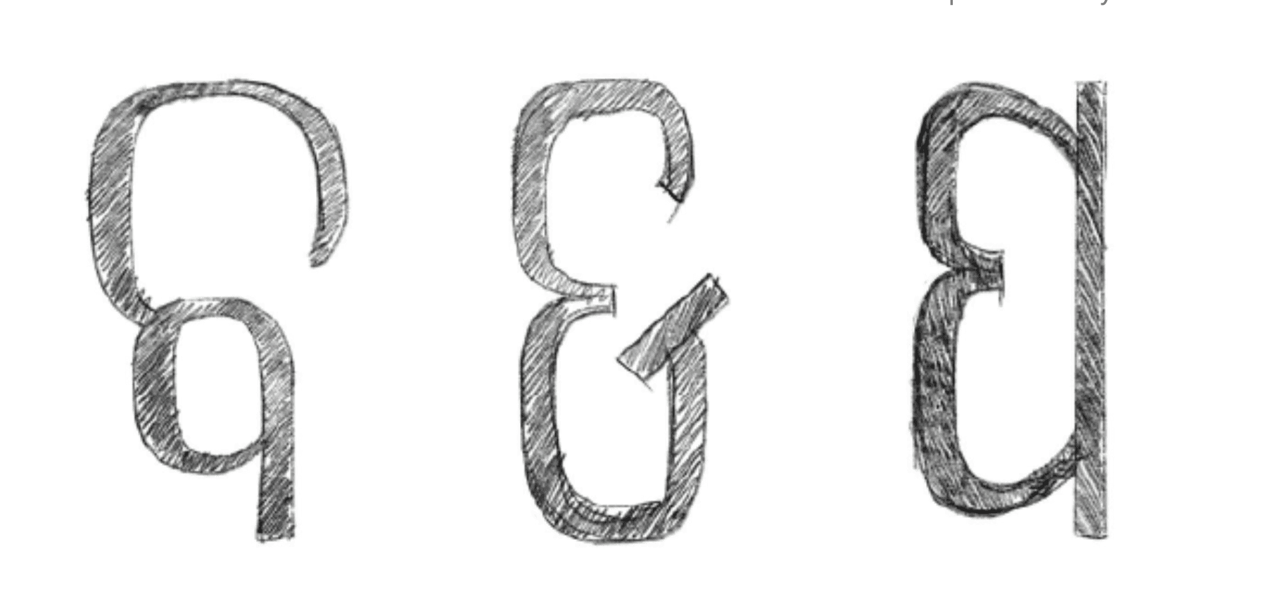
The ideas started with the images on the right, a version that would be condensed enough to serve the purpose of saving space in a headline. The inherited form of an Odia script is consisted of so many curves which eventually makes the script very wide with a lot of inter character spacing.
The initial sketches as seen in the images on the right tries to reduce the curved form in to a slightly rectangular one to help reduce the inter character spacing and make the words more compact in order to achieve the headline characteristics described in the previous chapter of this report.
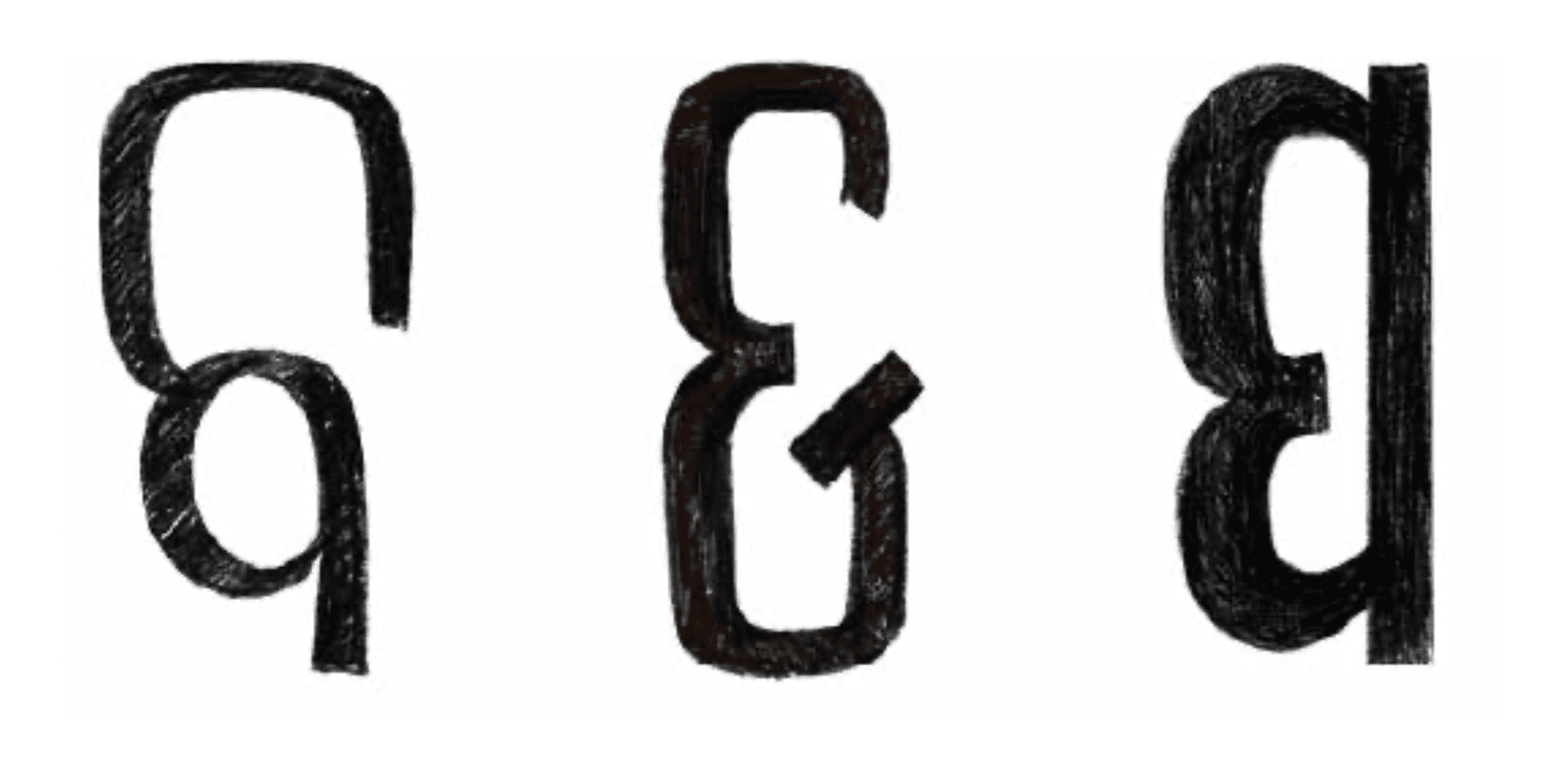
The first set of sketches tried to explore some change in proportion as well s weight of the letters but the time limitation allowed me to complete one instance of the typeface. This resulted into the exploration of a Bold version of the font. The images below show the same. It consists of the initial letters from each group after grouping the letters based on form in the previous section. The first set of letters were sketched in extra bold weight to get a sense of how they would fit into the head- lines. The second set were sketched in the same weight in an expanded version. These version of sketches fitted better to the headline category so further modifications were done on these to get the letters more compact for the further versions.
Font Design Process, glyph sketches
After the style exploration sketches the sketches were finally refined into a more condensed form. The letters were then hand drawn and corrected to achieve some consistency in form to match the final style. The images below are the first iterations of the sketches that would comprise the basic character set of the Odia script.
These sketches were drawn by drawing the first set of the letters of the group based on the form of these letters and then these letters were used for reference to draw the other letters of the subsequent groups with similar forms. All these letters were drawn with just the baseline and cap height to see how the proportions would work in a condensed form.
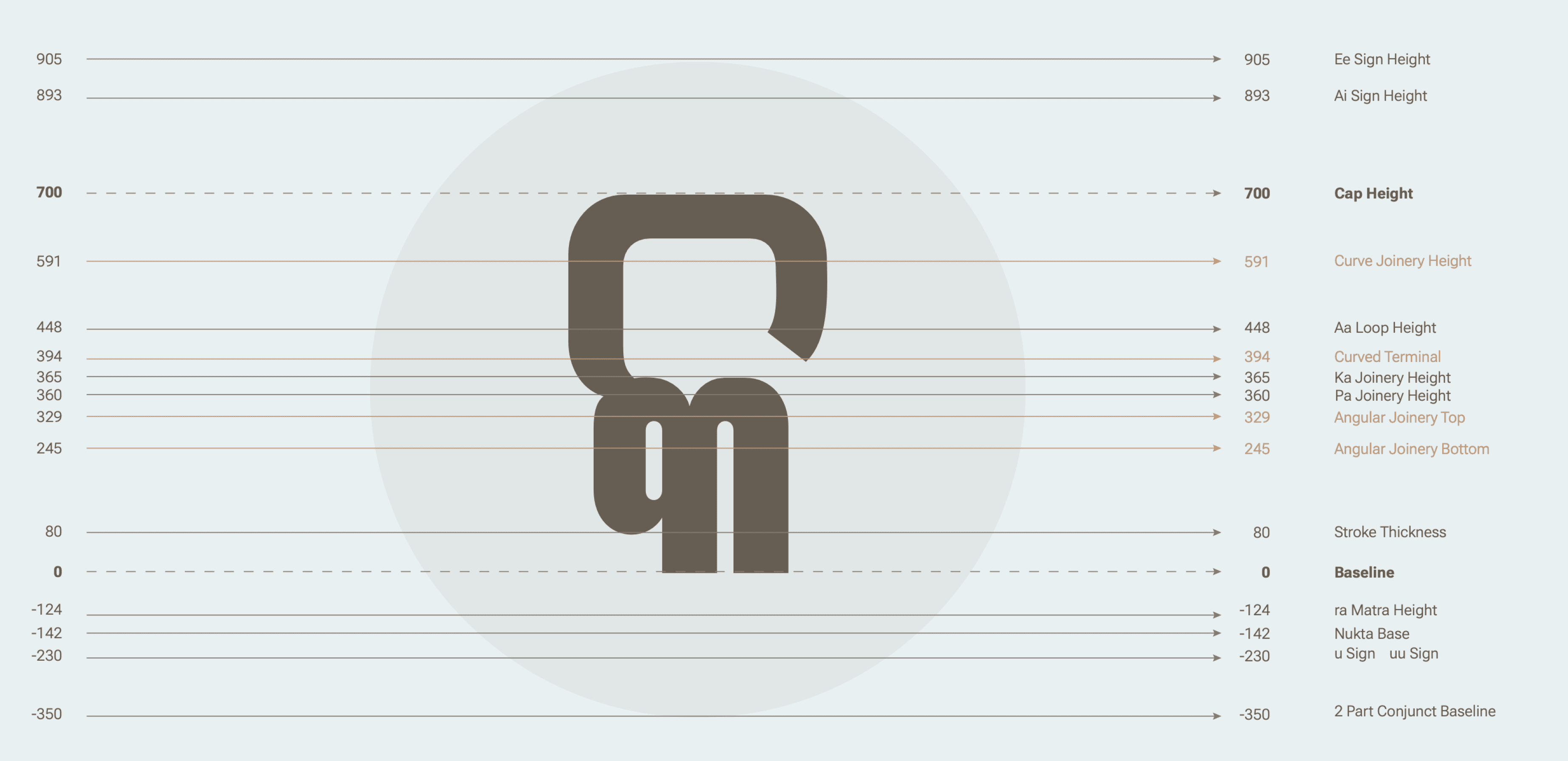
Vertical Grid for the font
After drawing the first set of letters the letters with distinct features were selected and then these letters were placed with the same baseline after which each distinct feature like the joinery or knot or terminal were marked with a horizontal line.
After drawing lines from each feature these were annotated with the name of the features to make a vertical grid as seen in the following image.
Composing words with sketches
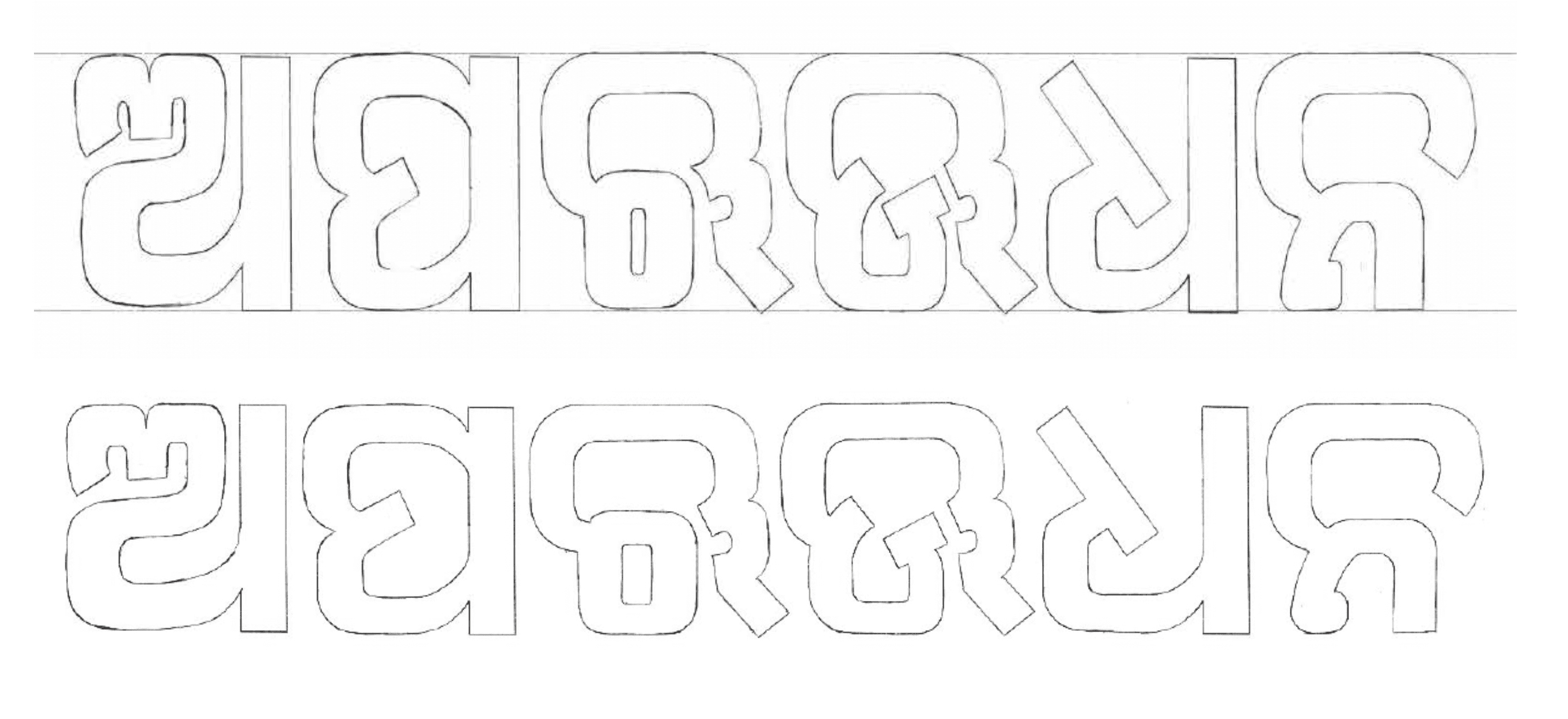
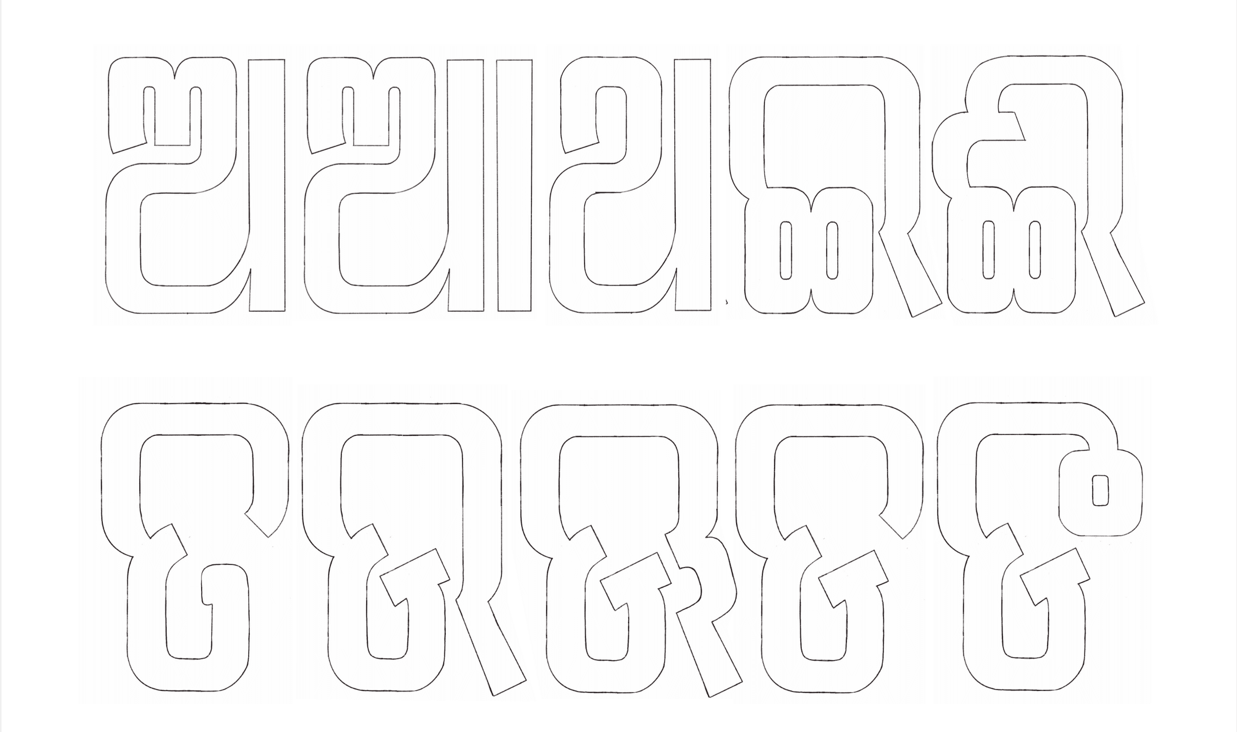
Before making the vector drawings, it was necessary to see the consistency of the letters and how the letters looked in the form of words. For the same a few names of my classmates were chosen and then these names were composed with the filled version of these sketches. Five of these composed names can be seen in the form of following images.
Vector Drawings of the Glyphs
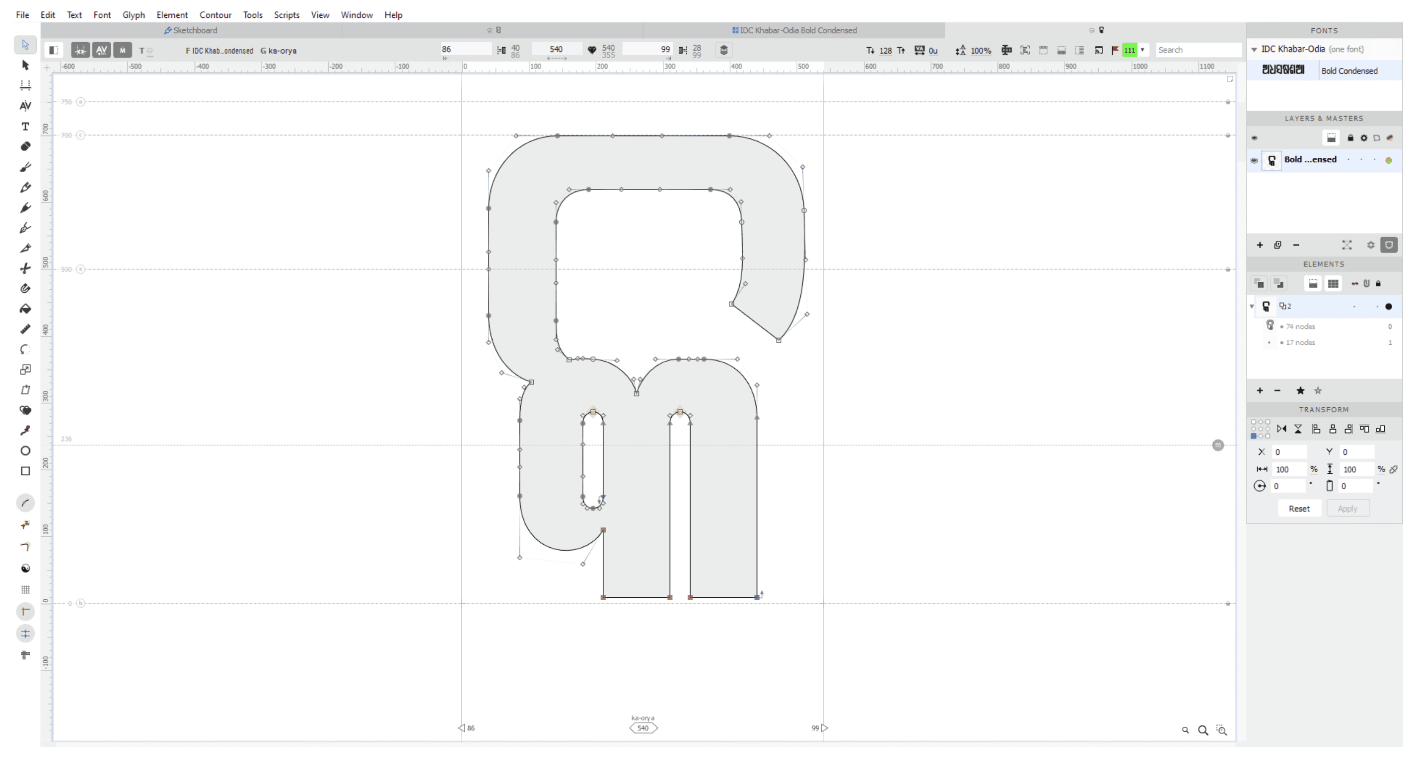
The outline sketches drawn earlier were used as a reference for starting the letter drawing process. Each sketch was imported in the masked background layer of the respective glyph. The letters were then drawn based on the decided vertical grid and the irregularities of the hand drawings were subsided digitally. The Following image shows the vector drawing in Fontlab Studio
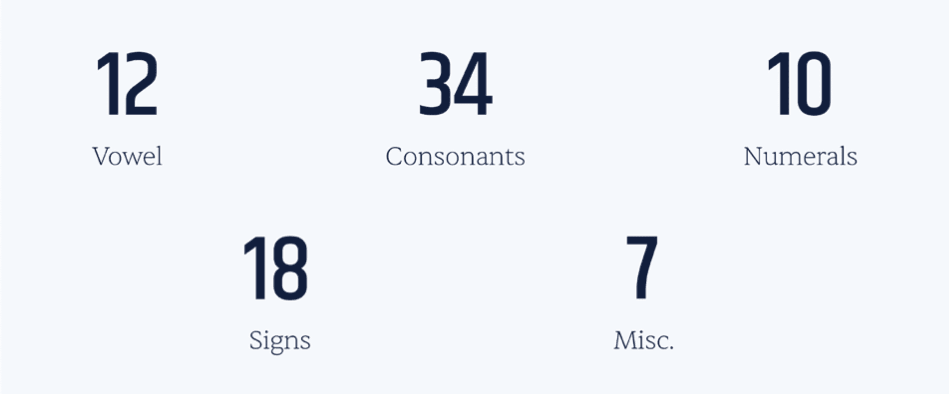
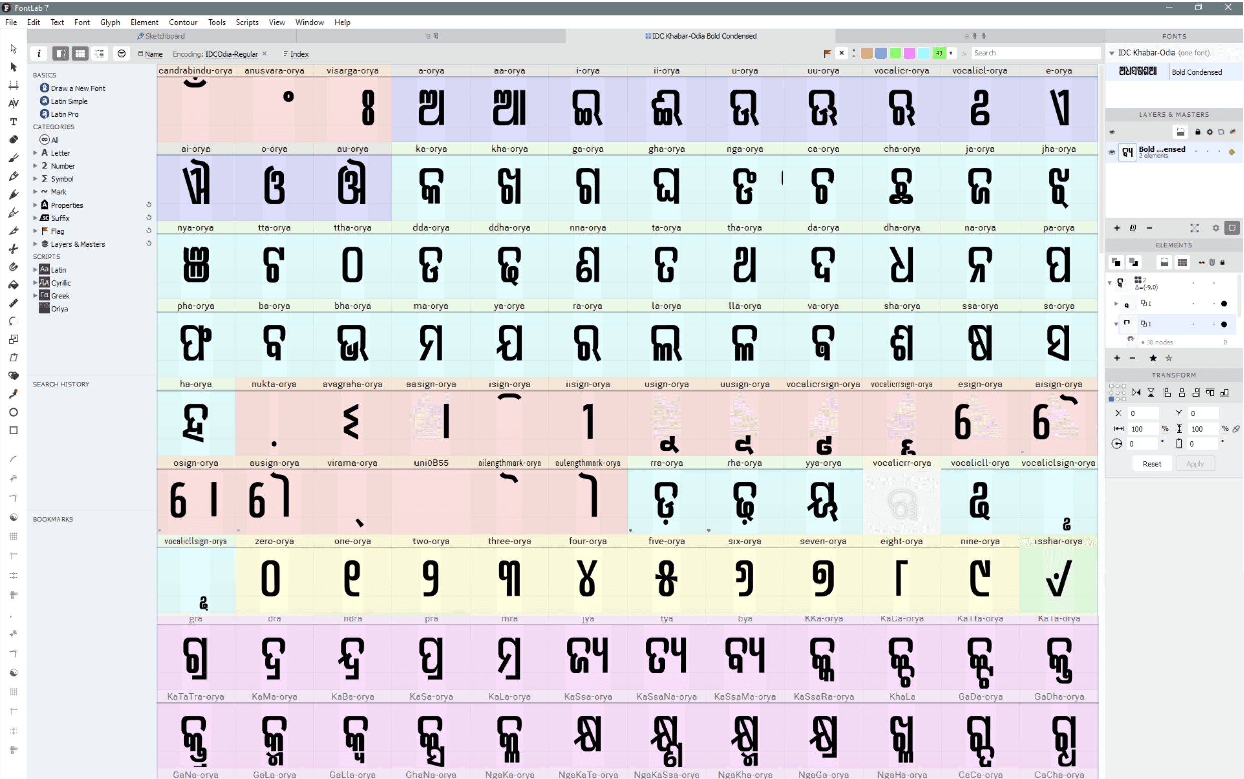
The images containing the glyphs show the categorisation of the glyphs as consonants, vowels, numbers and matras (diacritic marks).
Testing fonts with words
Before making the vector drawings, it was necessary to see the consistency of the letters and how the letters looked in the form of words. For the same a few names of my classmates were chosen and then these names were composed with the filled version of these sketches. Five of these composed names can be seen in the form of following images.
Headline simulation with the new font
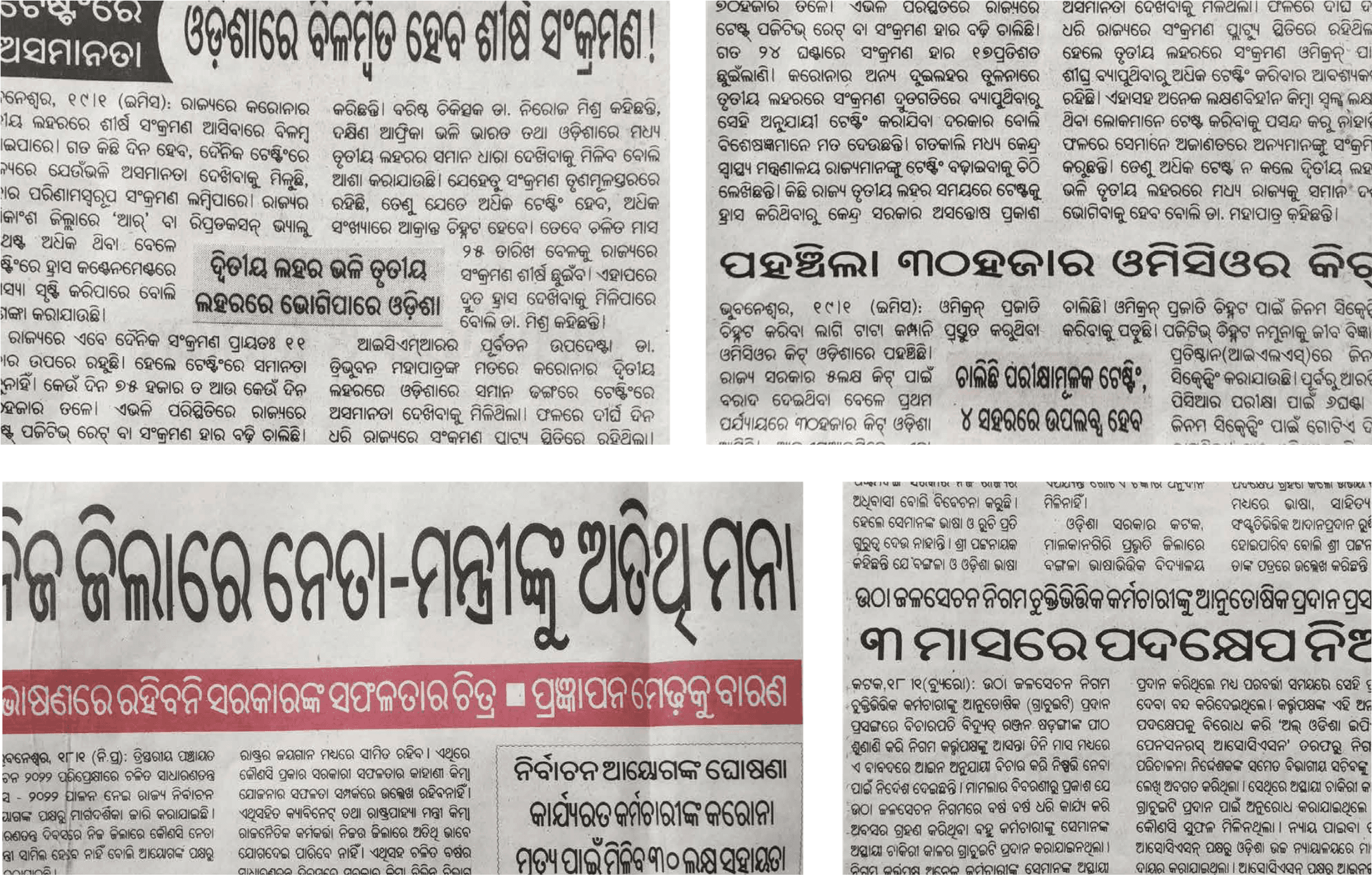
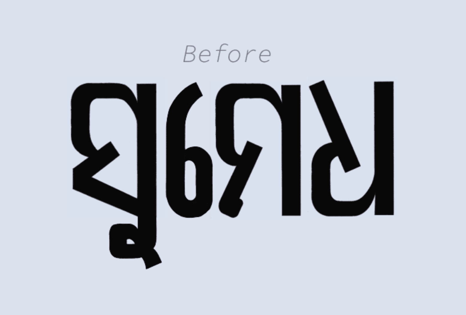
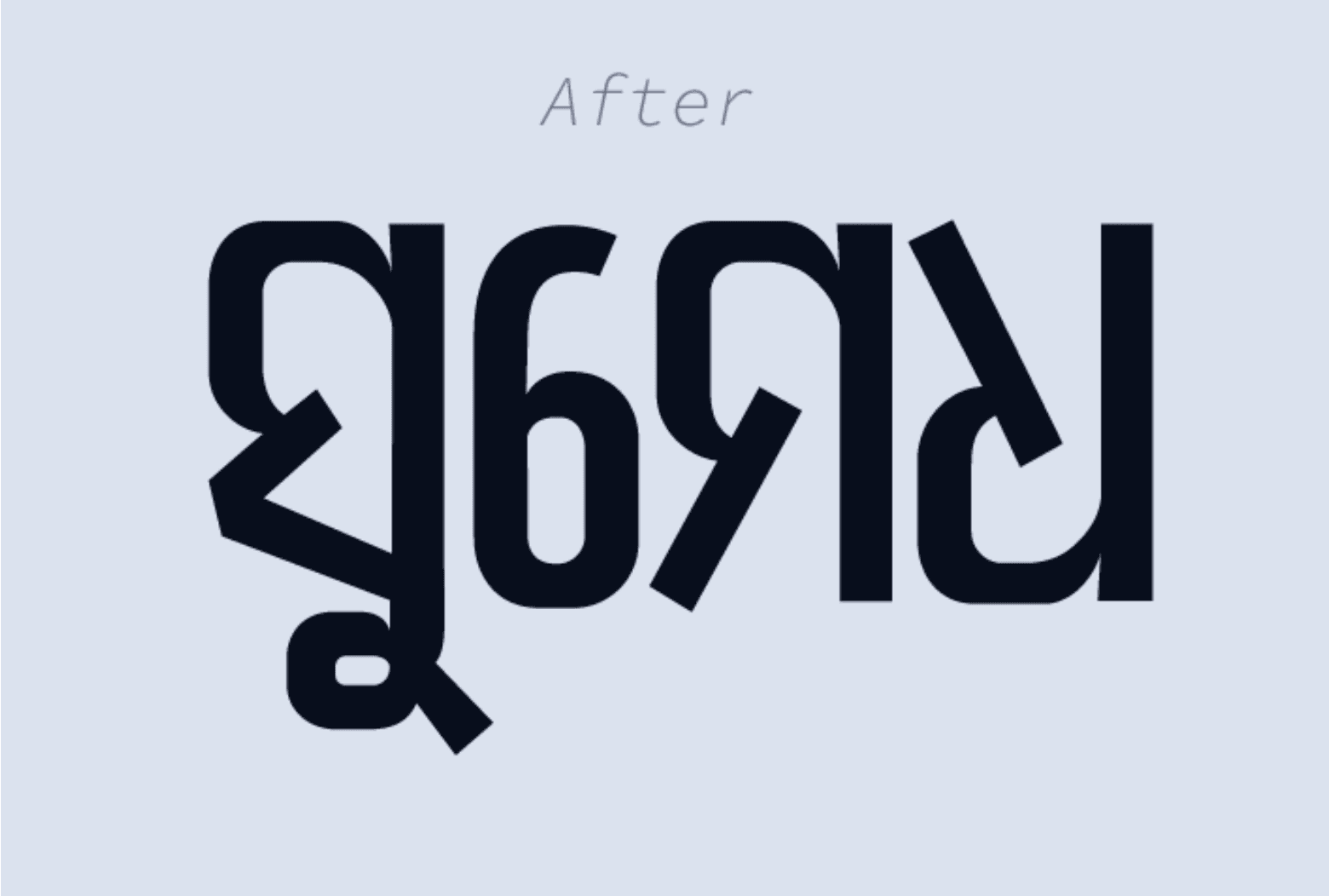
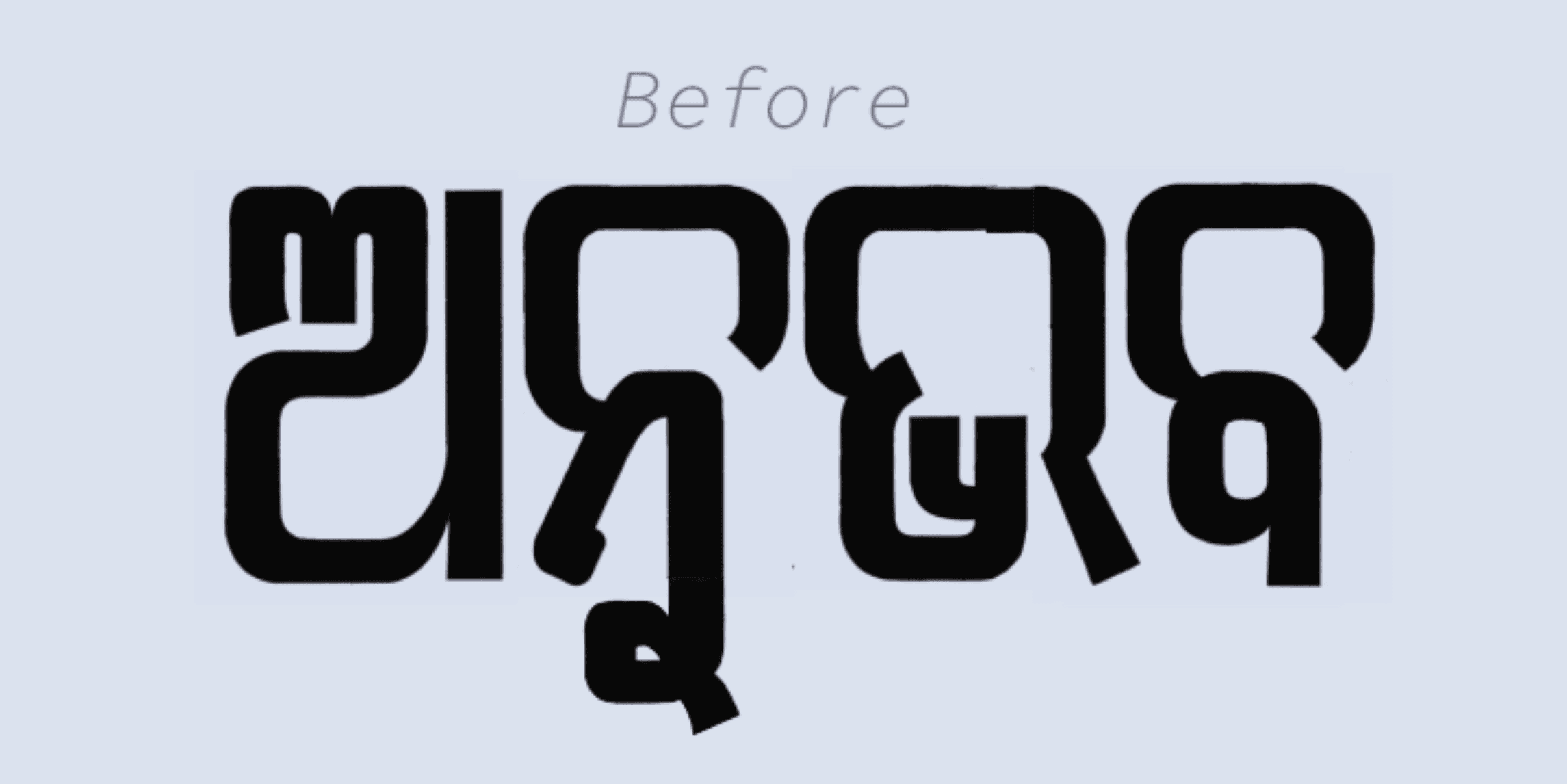
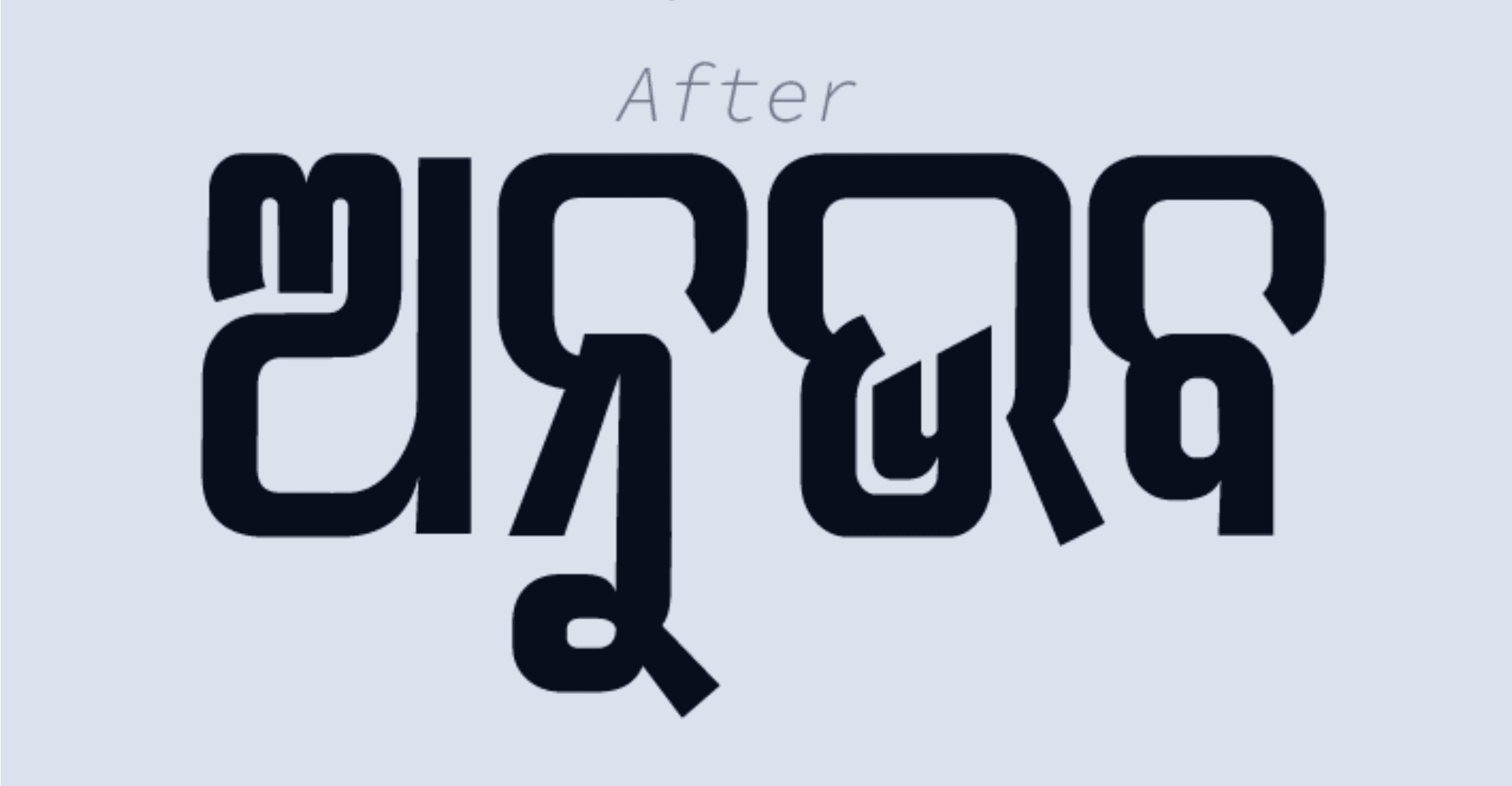
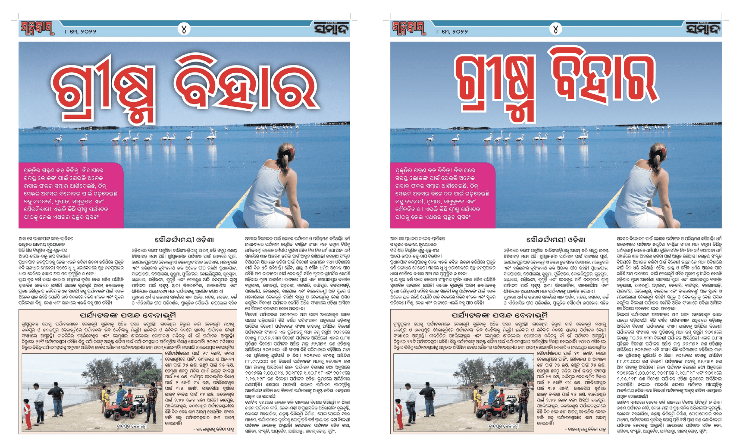
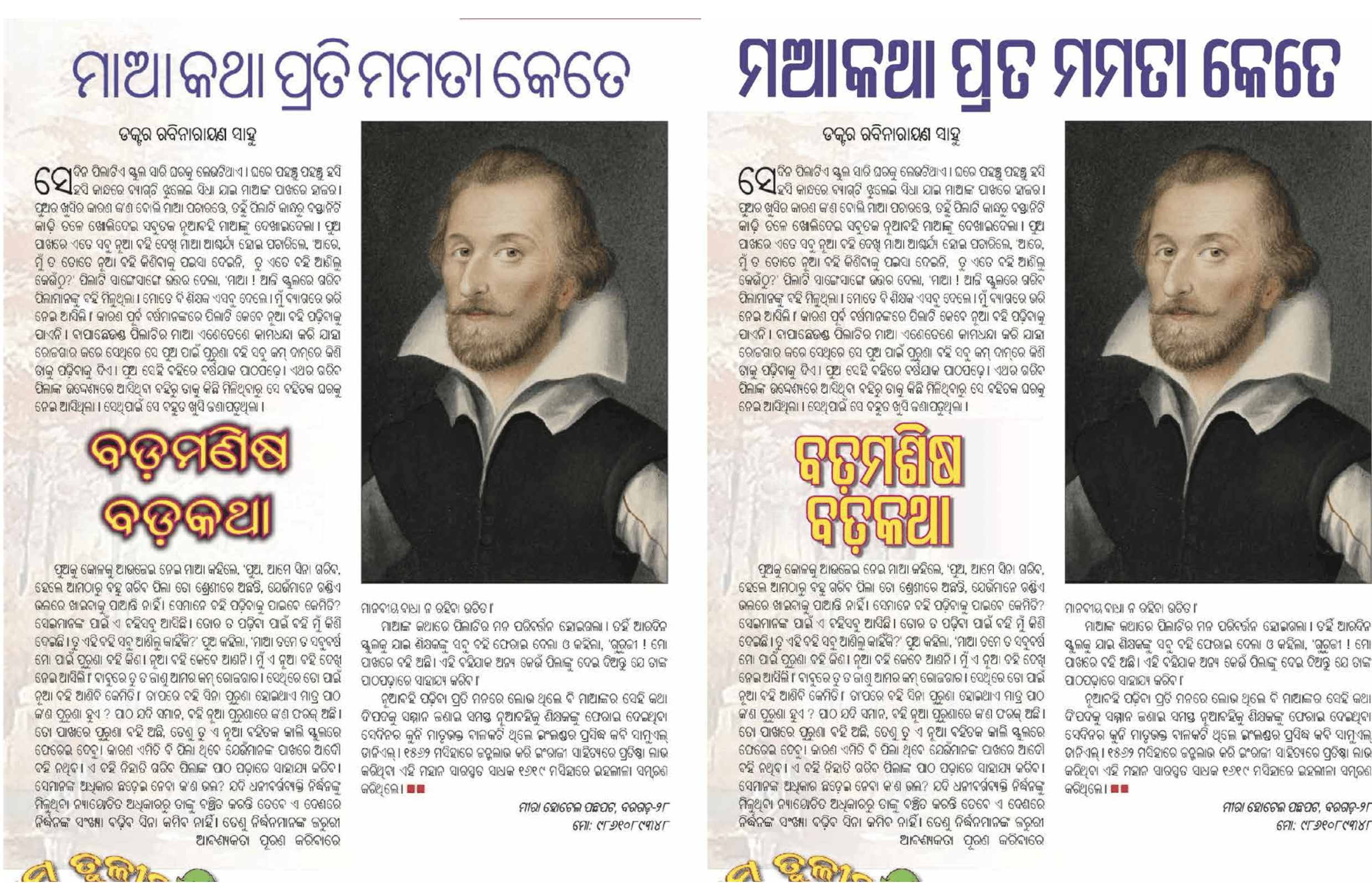
As IDC-Khabar Odia was designed for the headlines, some simulations were generated to see how the characters looked composed in the form of headlines. For the same a few articles were taken from the digital versions of the Odia newspapers ‘The Samaja‘ and ‘Sambada‘ and the orihina headlines were replaced with IDC-Khabar Odia. The following images show the original version on the left and the simulated version on the
right. The stylization were made same in order to make better comparison with original version.
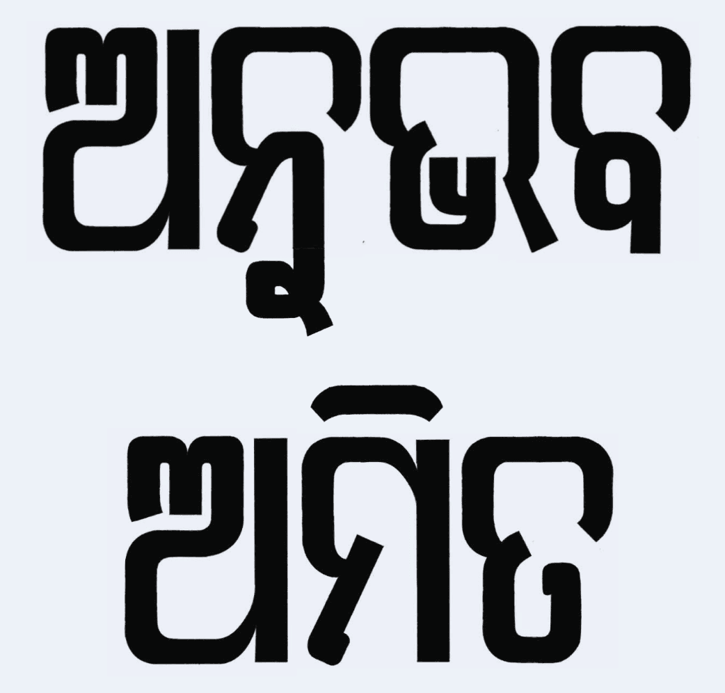
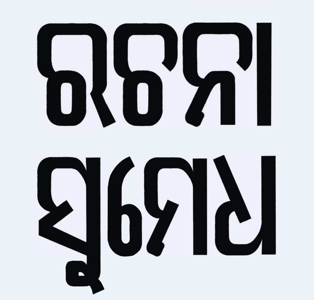
Composing Words
The second set of testing was done by composing words containing all types of characters. The following images shows the names of my classmates composed in IDC Khabar Odia to see how the font would work in real world scenario
Final glyphs
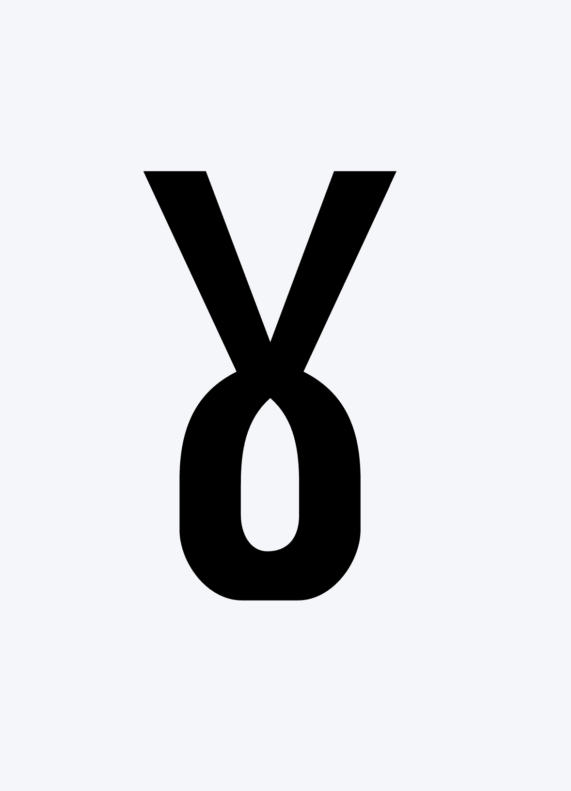
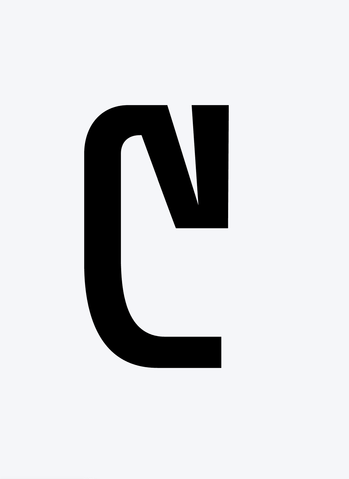
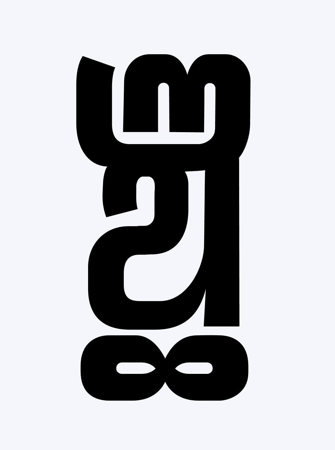
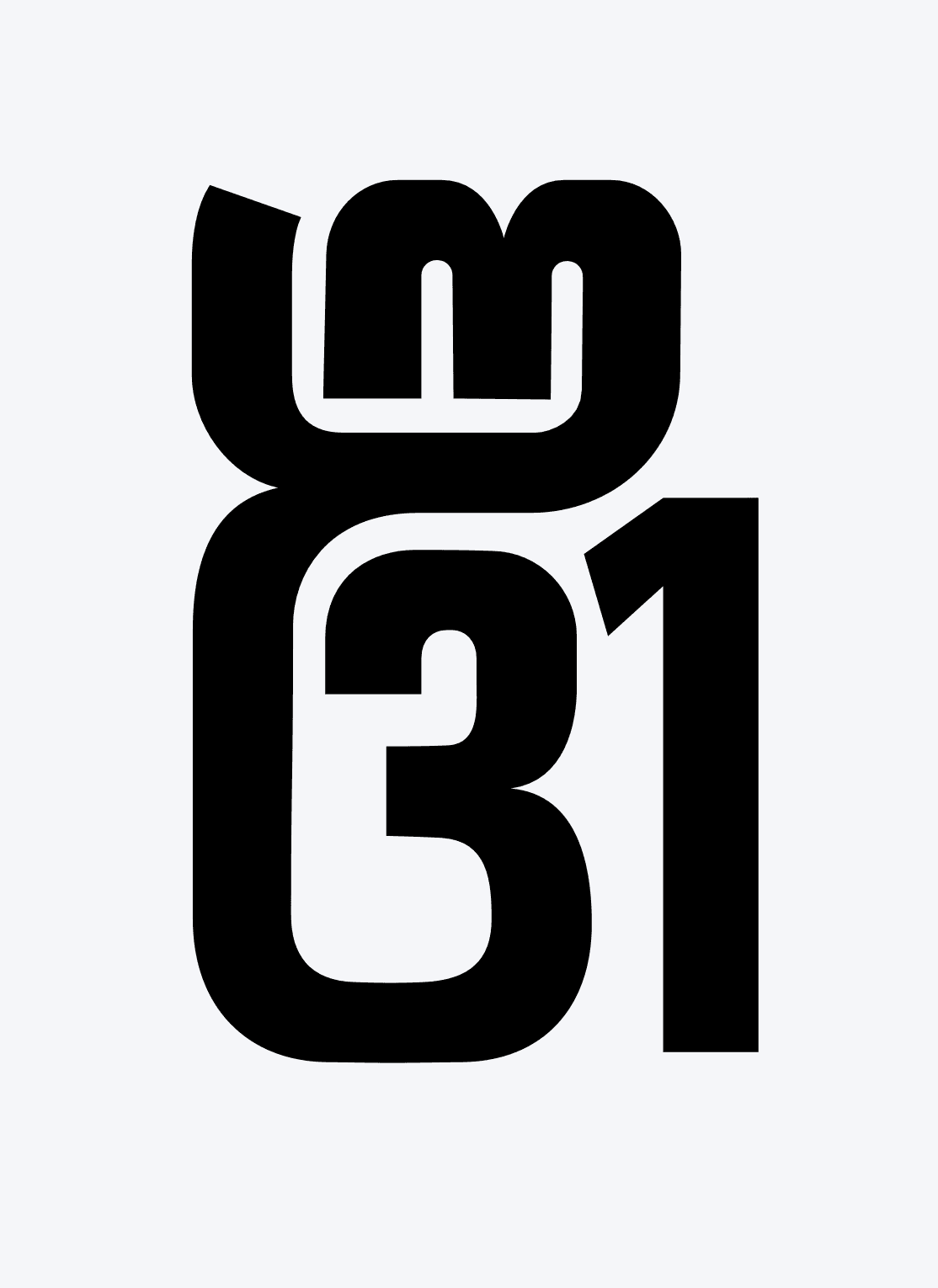
The following are the samples of vector sketches of the final glyphs of IDC Khabar Odia. The first set are the consonants and vowels. A total of 270+ glyphs were designed for this typeface.
The second set are the numbers.
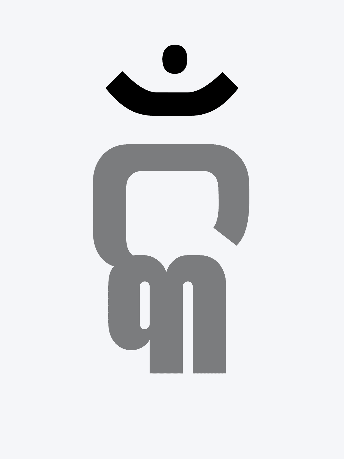
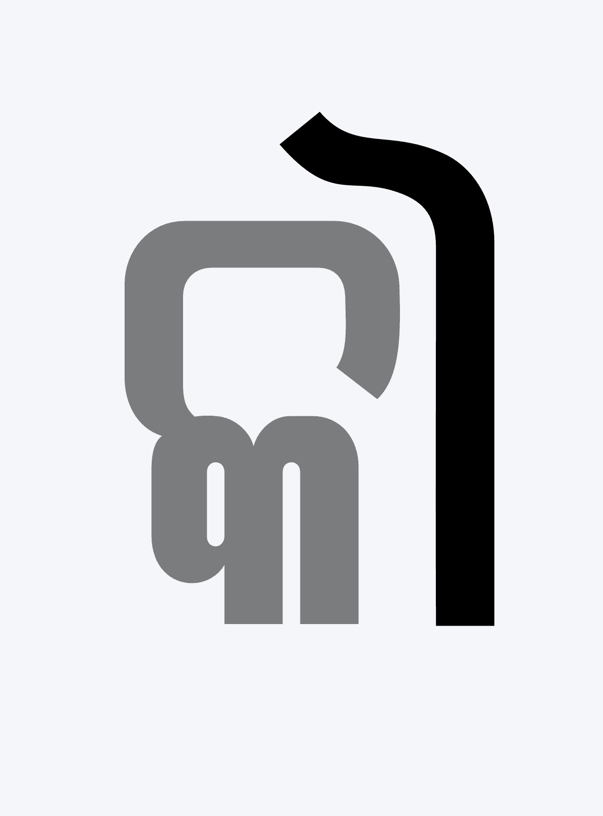
The third set are the matras.
The final set are the conjuncts.
IDC Khabar in use
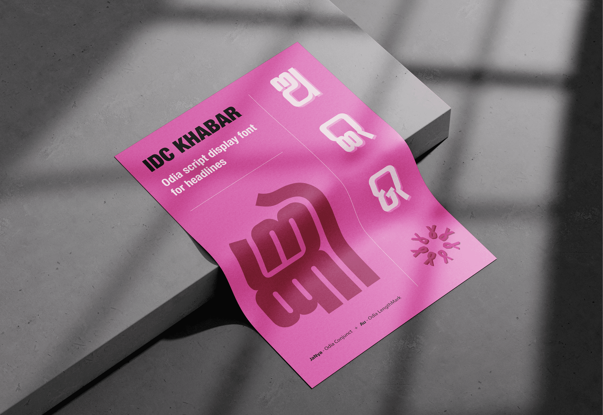
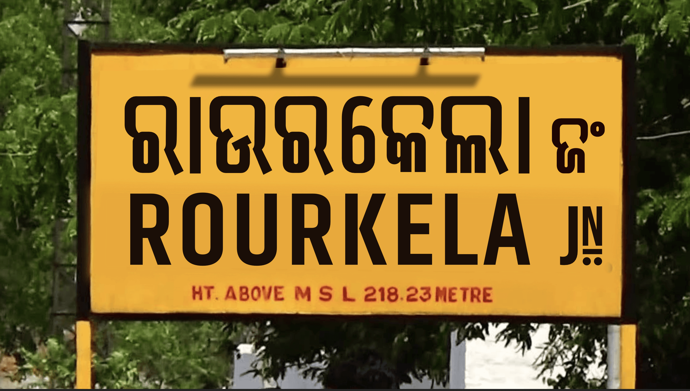
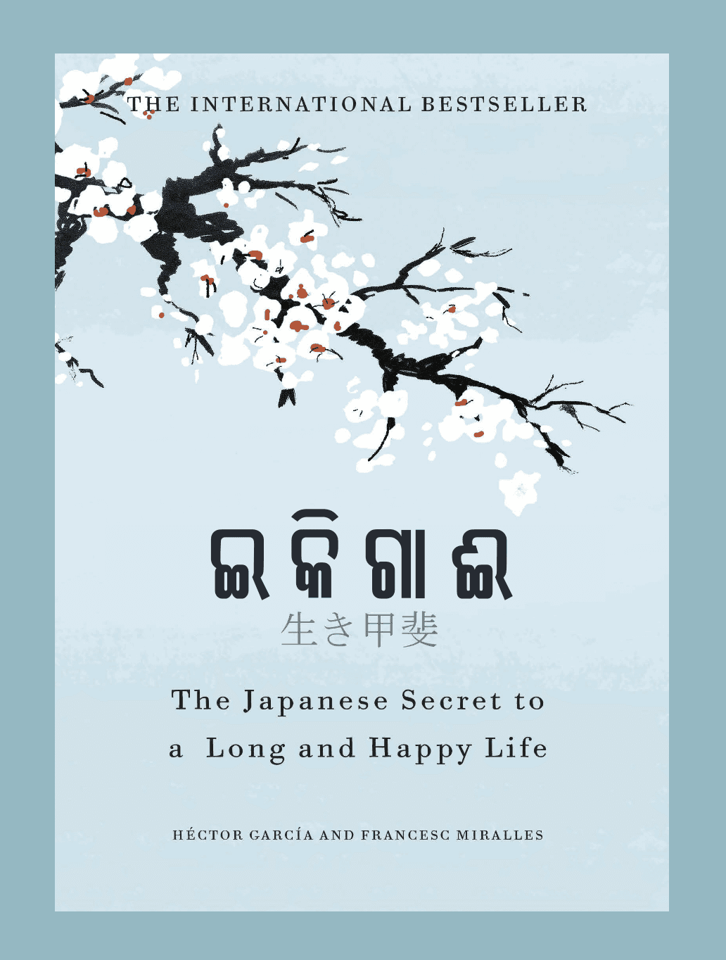
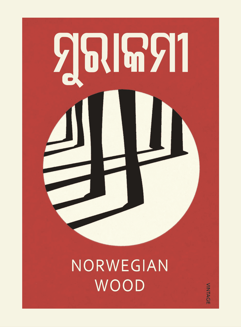
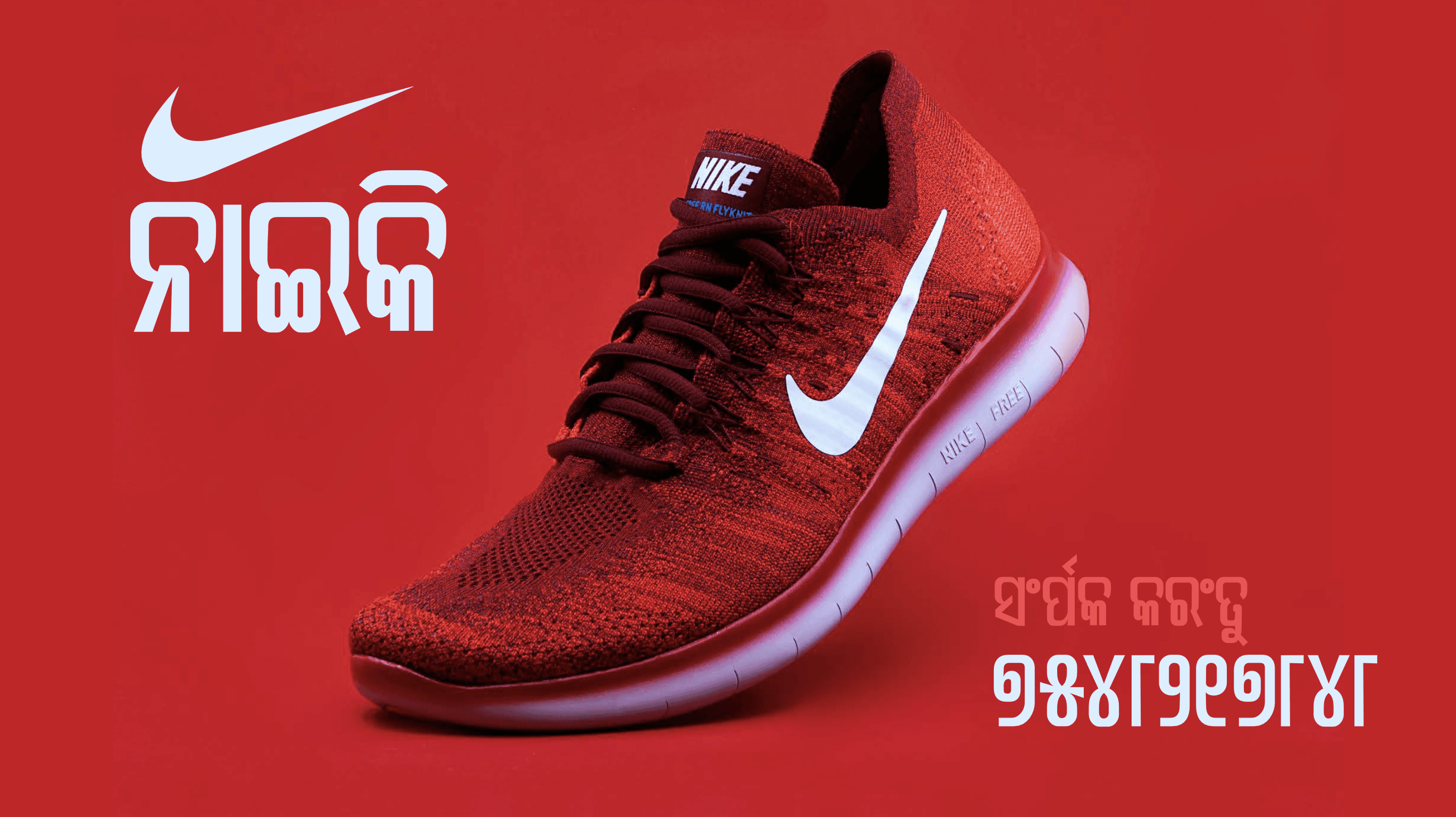
The finished font is demonstrated using some mocks to visualise the characteristics and use cases.
Naming the font
The font designed in this project has the main purpose to be used as headlines. One of the main use of headlines are news and hence the name ‘Khabar’ meaning news in Odia. As the font is being designed as a part of academic project in IDC School of Design, the prefi ‘IDC’ is being used in the name and it is called ‘IDC- Khabar Odia’.
