IDC Khabar Odia
Designing an Odia display typeface for headlines — built from scratch as a bold, condensed variable font, tested against real newspaper and magazine layouts.
Odia print media has always leaned on a handful of display faces for its headlines, most of them either adapted from body-text designs or borrowed wholesale from unrelated scripts. Khabar Odia is a bold, condensed display typeface designed specifically for headline use — where legibility at large sizes, a strong single-line silhouette, and a distinct voice matter more than the quiet, even texture a body font needs.
| Year | Category | Duration | Platform |
|---|---|---|---|
| Academic (IDC) | Type design | — | Variable font |
Why headline fonts matter
A headline's typeface does more than carry words — it sets the tone before a single word is read. The same sentence in a mismatched typeface can undercut its own message.
Researching Odia in the wild
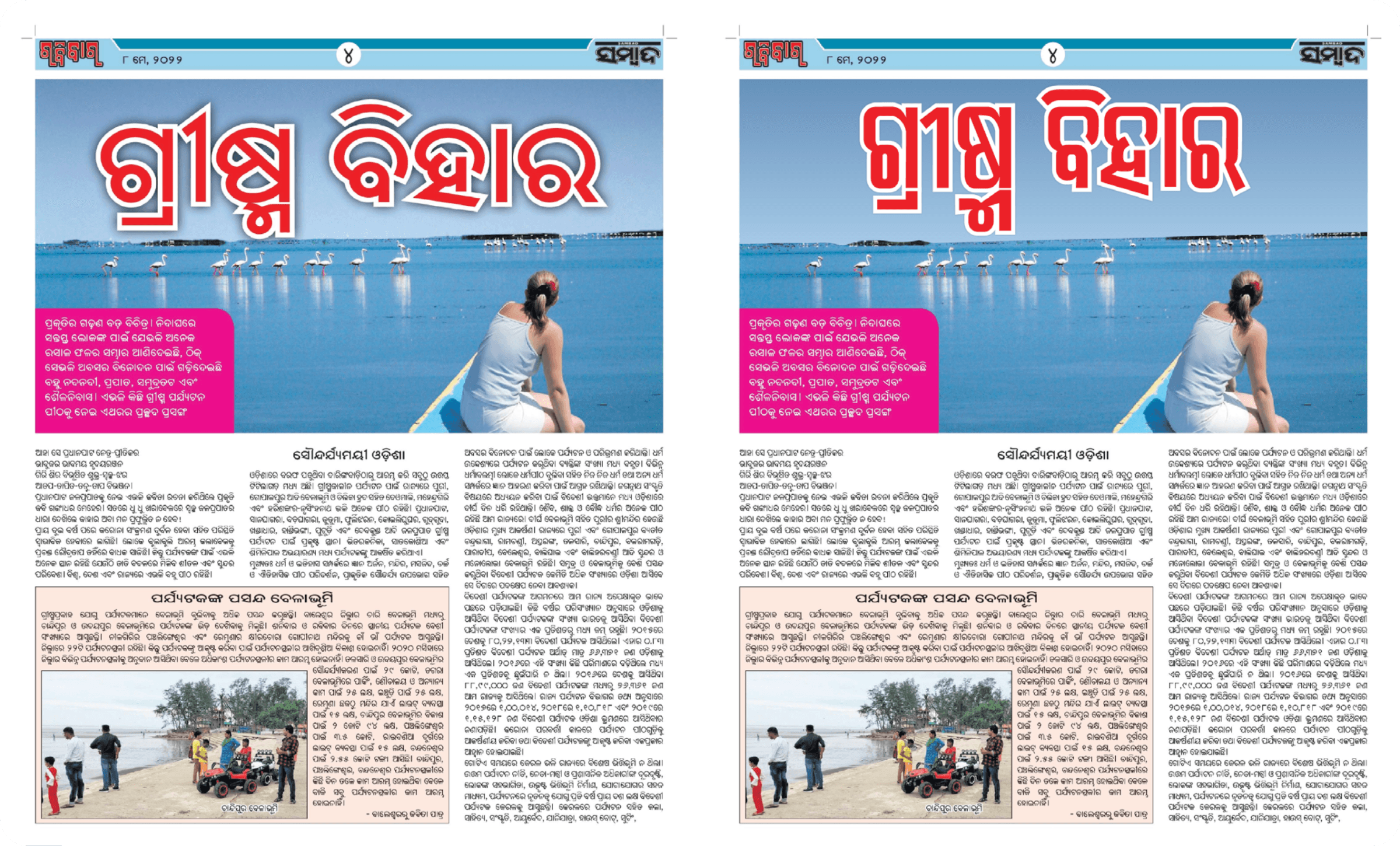
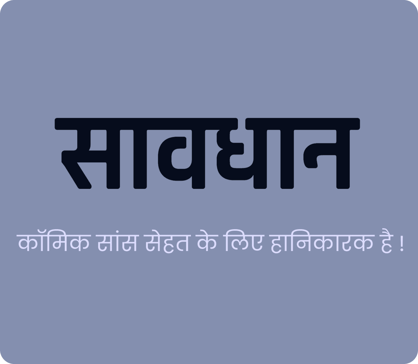
Before drawing a single letter, the project started with a survey of how Odia headlines actually get set today — in newspapers, magazines, and signage — to understand the conventions and constraints already in place.
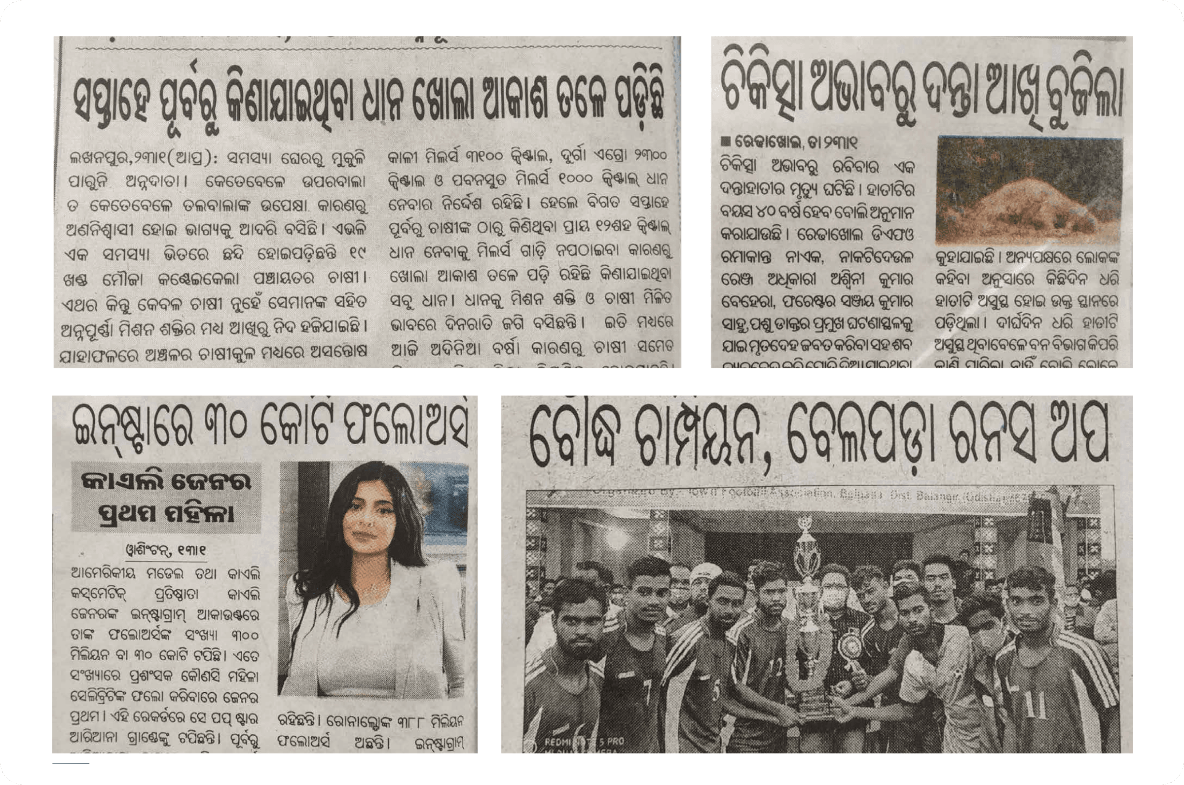
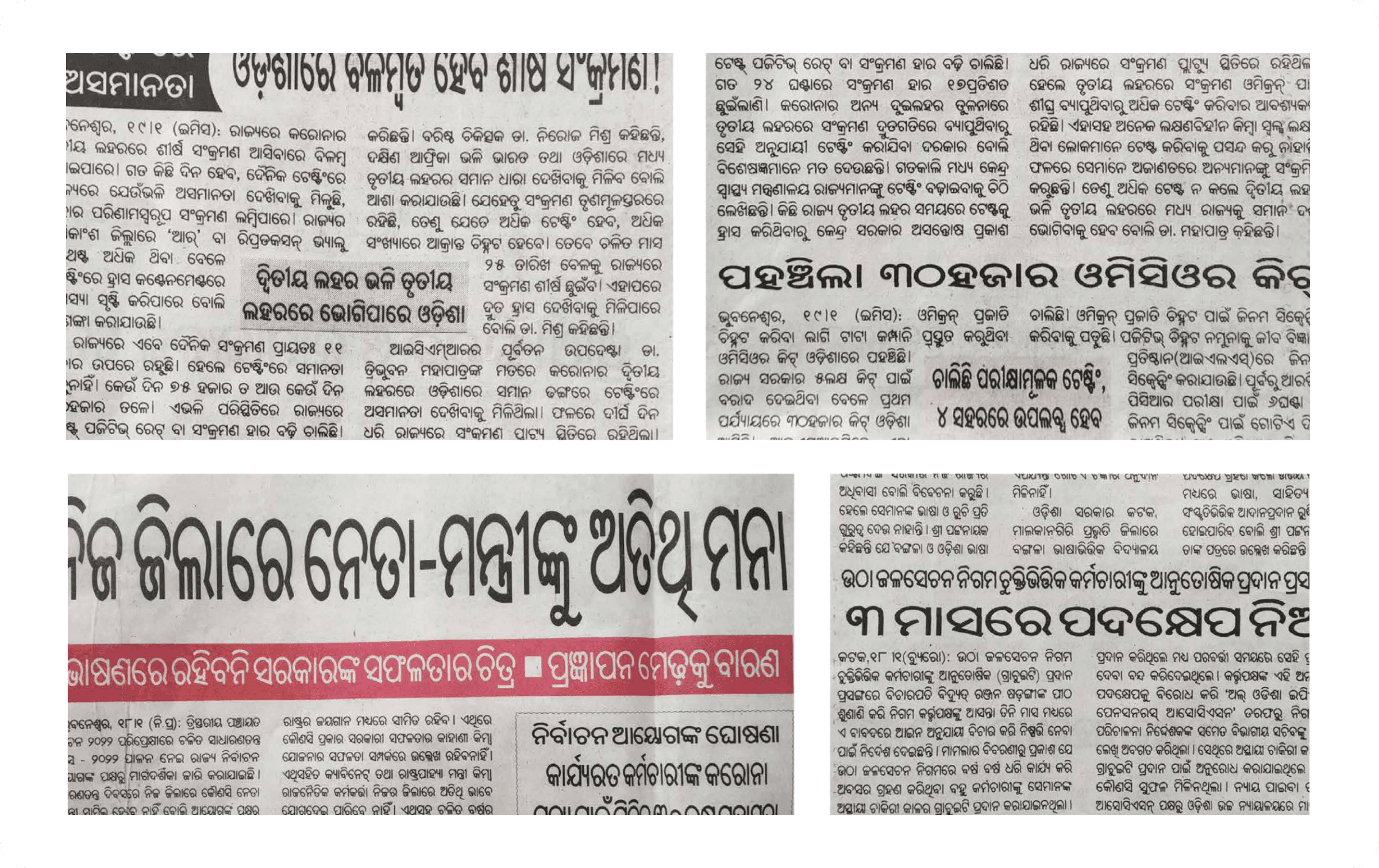
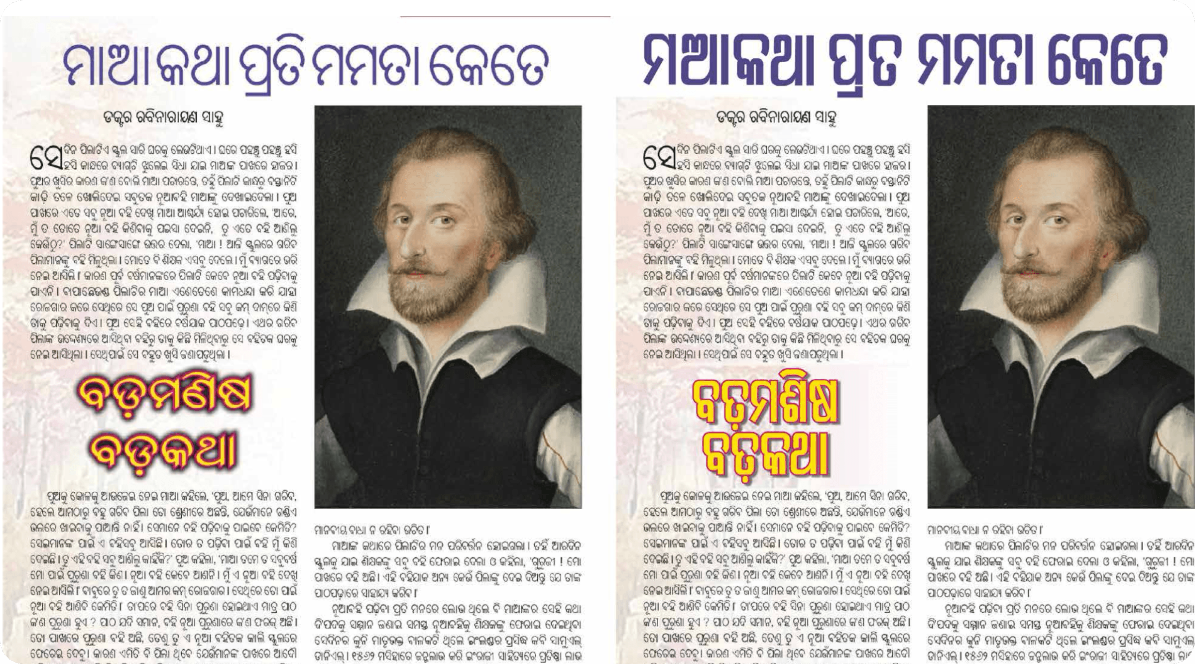
Existing Odia typefaces available for display use fell broadly into two camps: monolinear designs with a constant stroke weight, and modulated designs with the thick-thin contrast of a calligraphic hand. Both had trade-offs at headline sizes — monolinear forms held up better under condensation, but lost some of the character that comes from stroke contrast.

Defining the brief
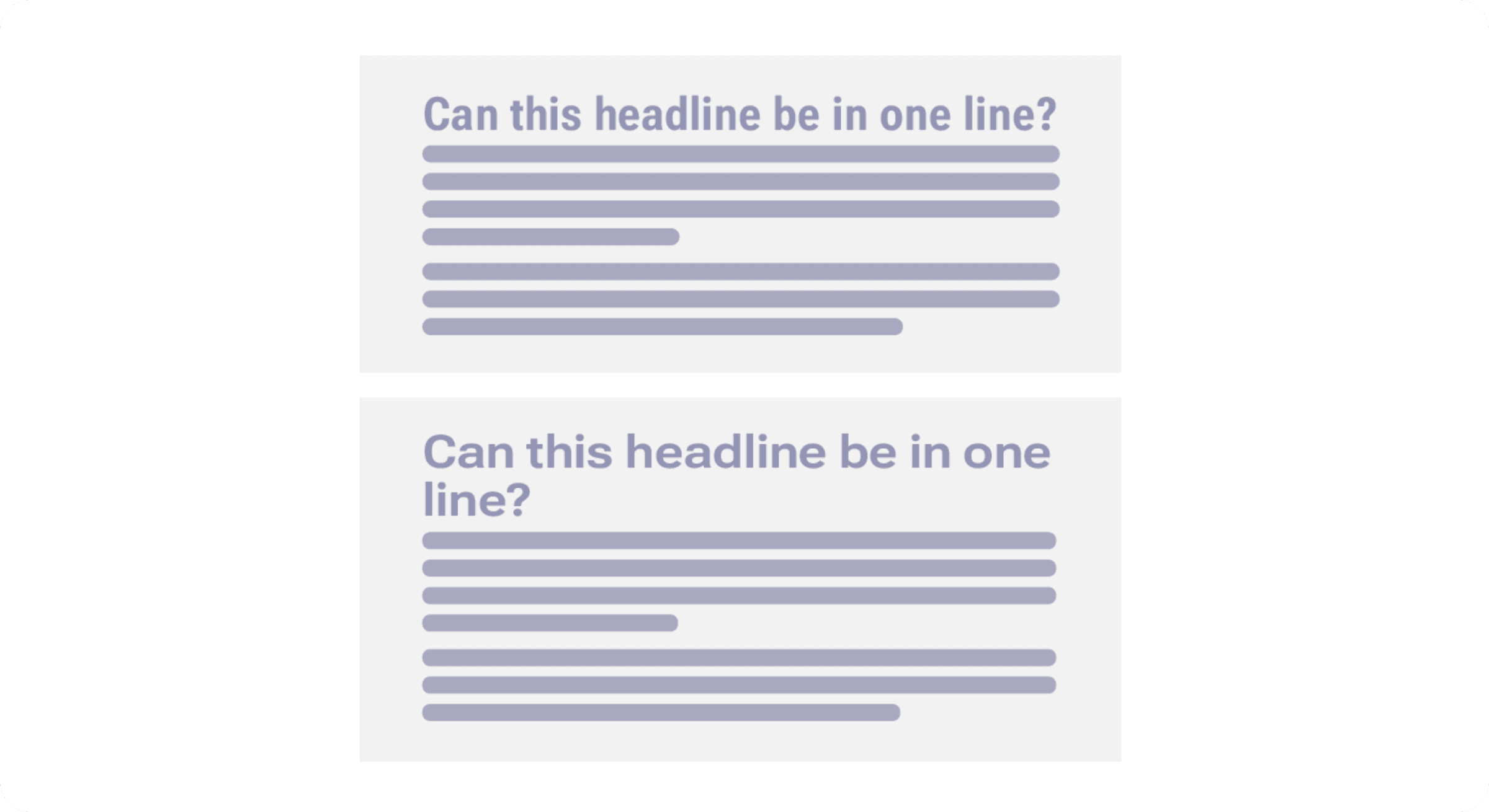
Headlines in Odia print are frequently squeezed into a single line across a column — a constraint that doesn't forgive a typeface with wide, generous proportions. Early testing focused on exactly this: how condensed could the letterforms get before legibility broke down.
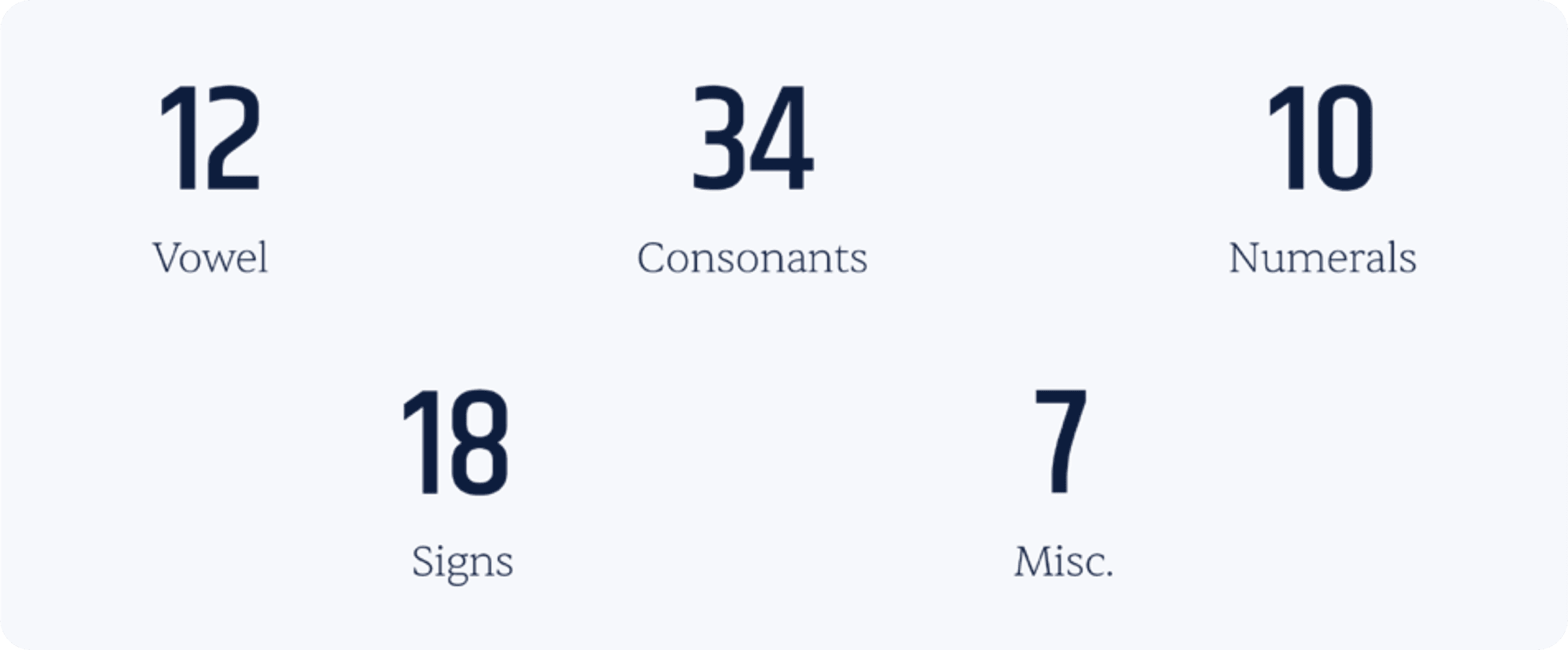
The scope of the character set was fixed early to keep the project focused on what a headline actually needs — the full modern Odia script, not an exhaustive legacy set: 12 vowels, 34 consonants, 10 numerals, 18 signs, and 7 miscellaneous characters.
Constructing the letterforms
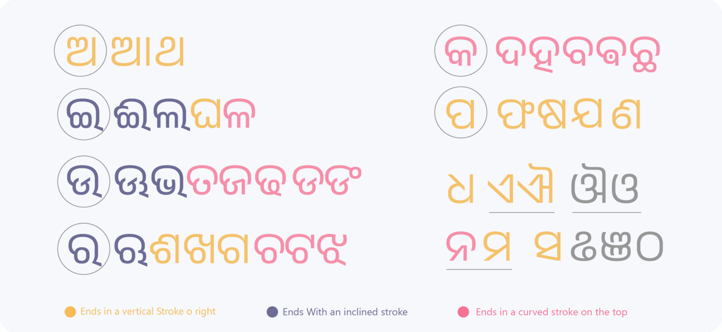
Odia letterforms end in one of a few characteristic ways — a vertical stroke, an inclined stroke, or a curved stroke along the top — and mapping every glyph against these terminal types early on kept the full set visually consistent as individual letters were drawn.
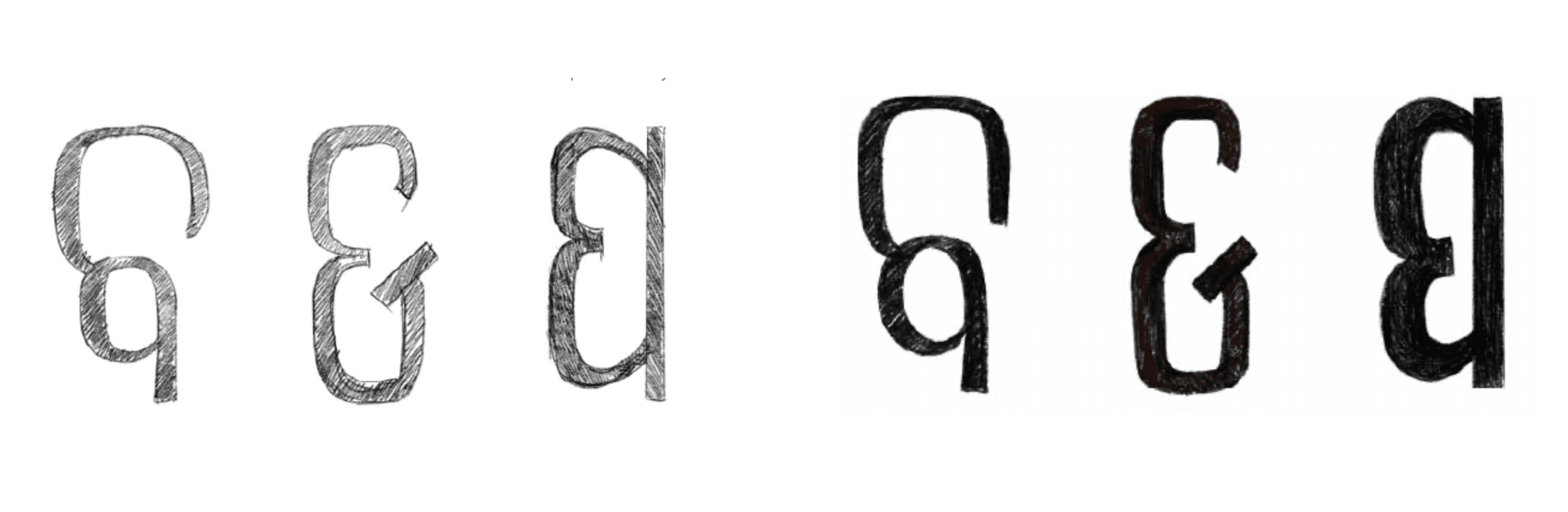
Construction started on paper. Rough pencil sketches of conjunct forms were inked over to lock in proportions before anything moved to a vector tool.
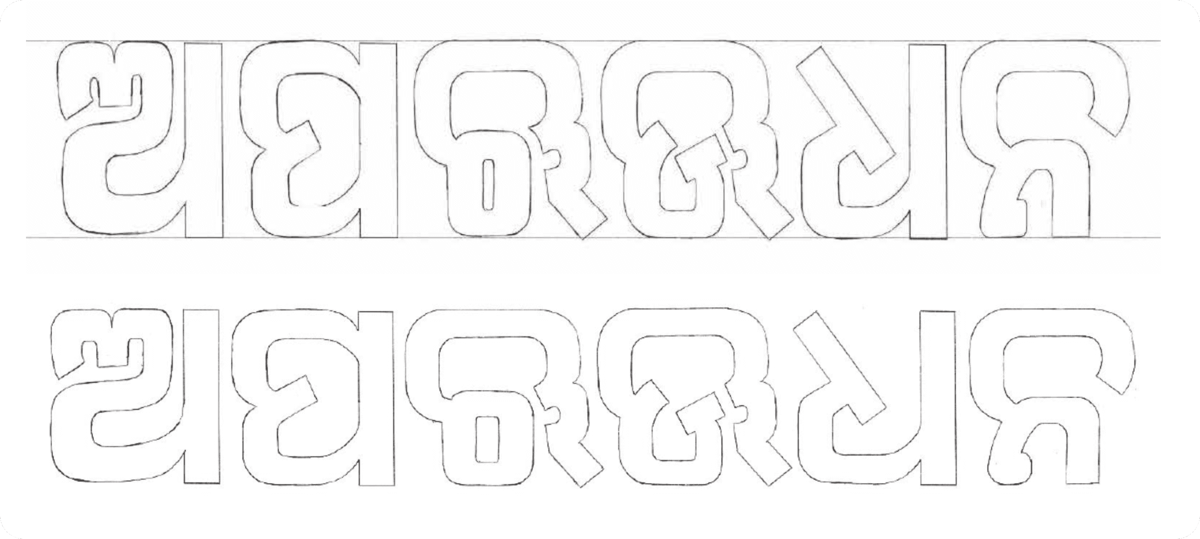
From there, glyphs were drawn out as vector outlines in rows, keeping consistent x-height, stroke width, and joinery across every letter in the set before moving into the type design software itself.
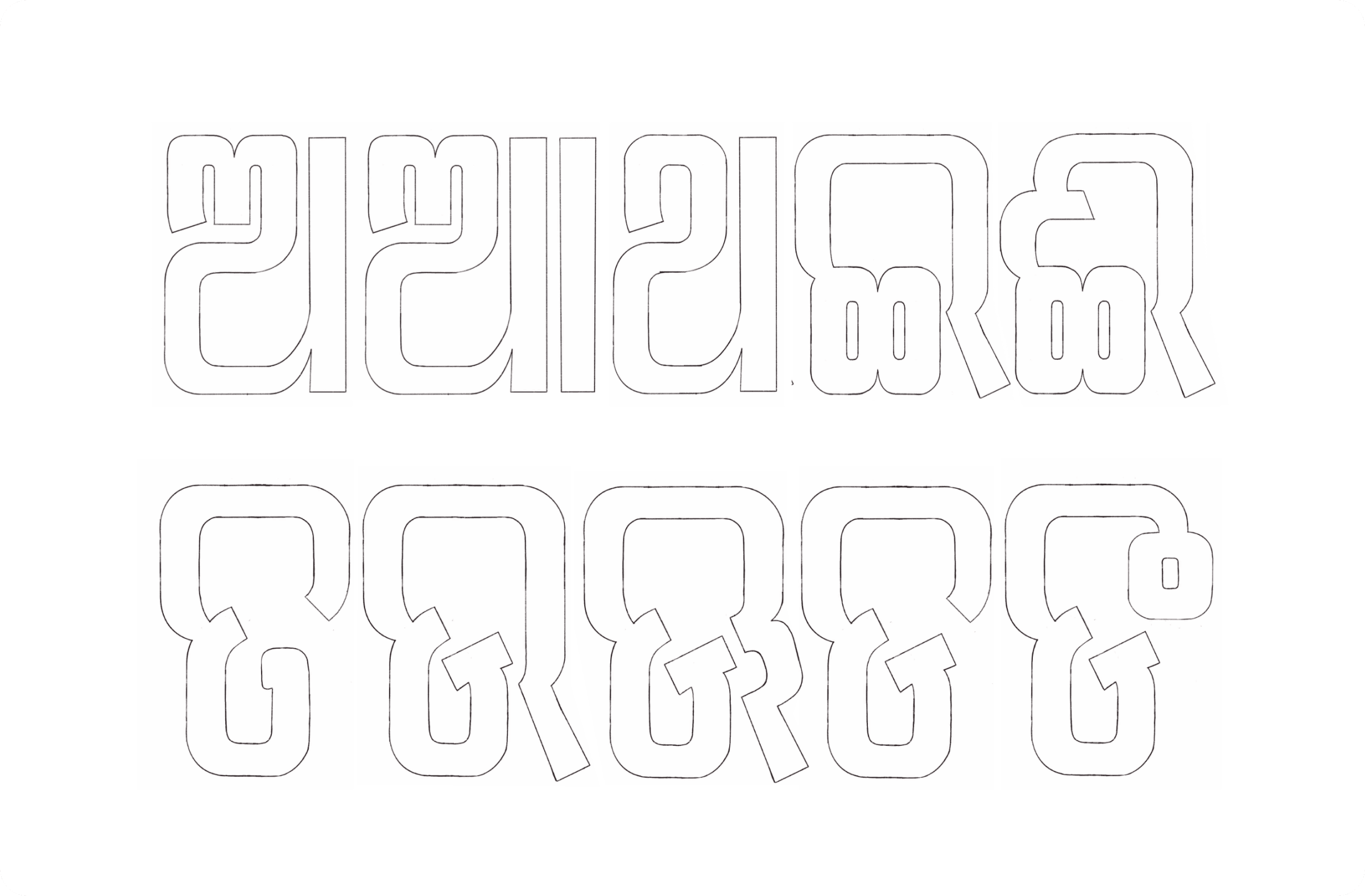
The full build happened in a dedicated type design tool, working glyph-by-glyph at the node level to get joinery and curve tension right.
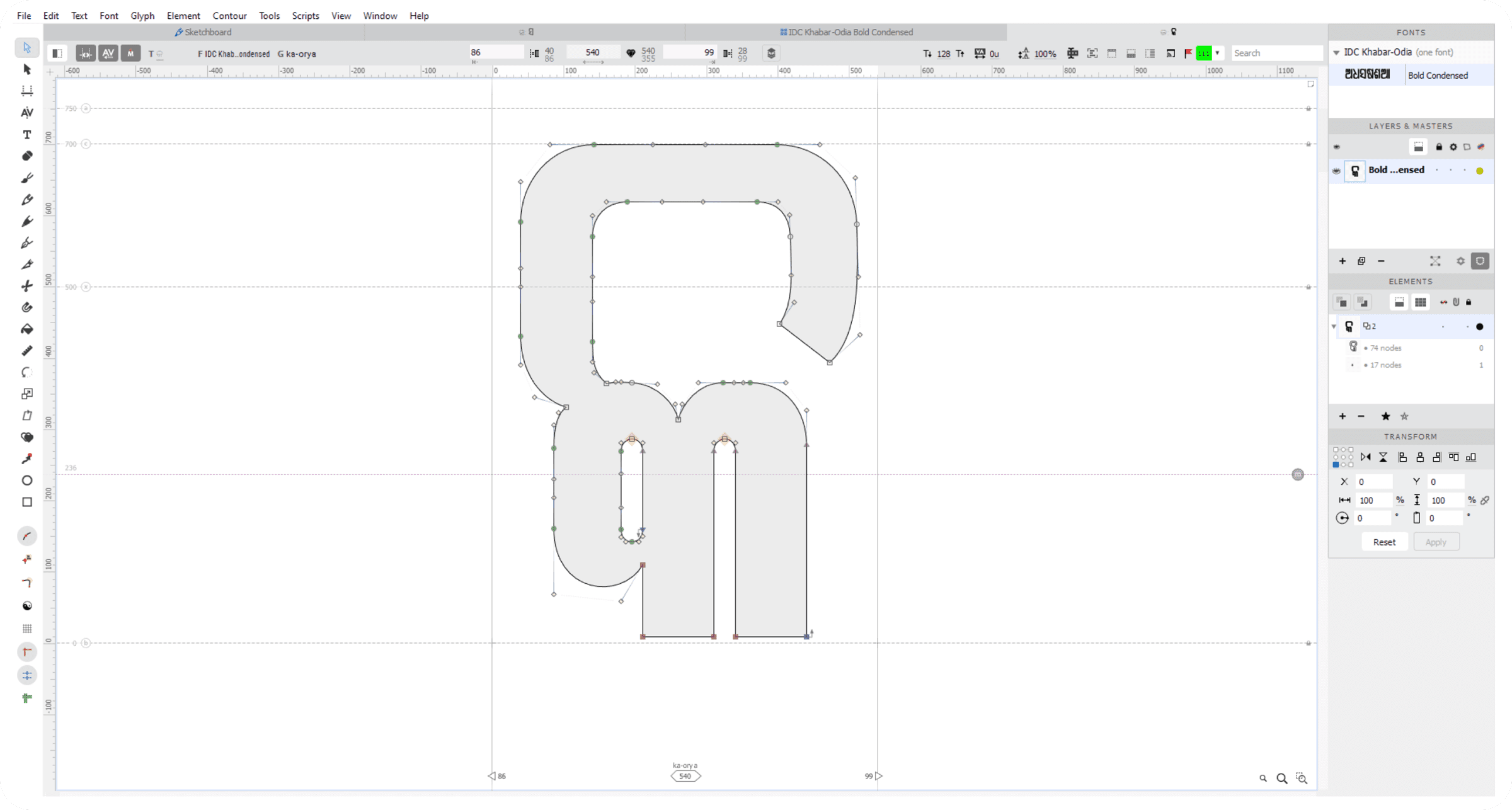
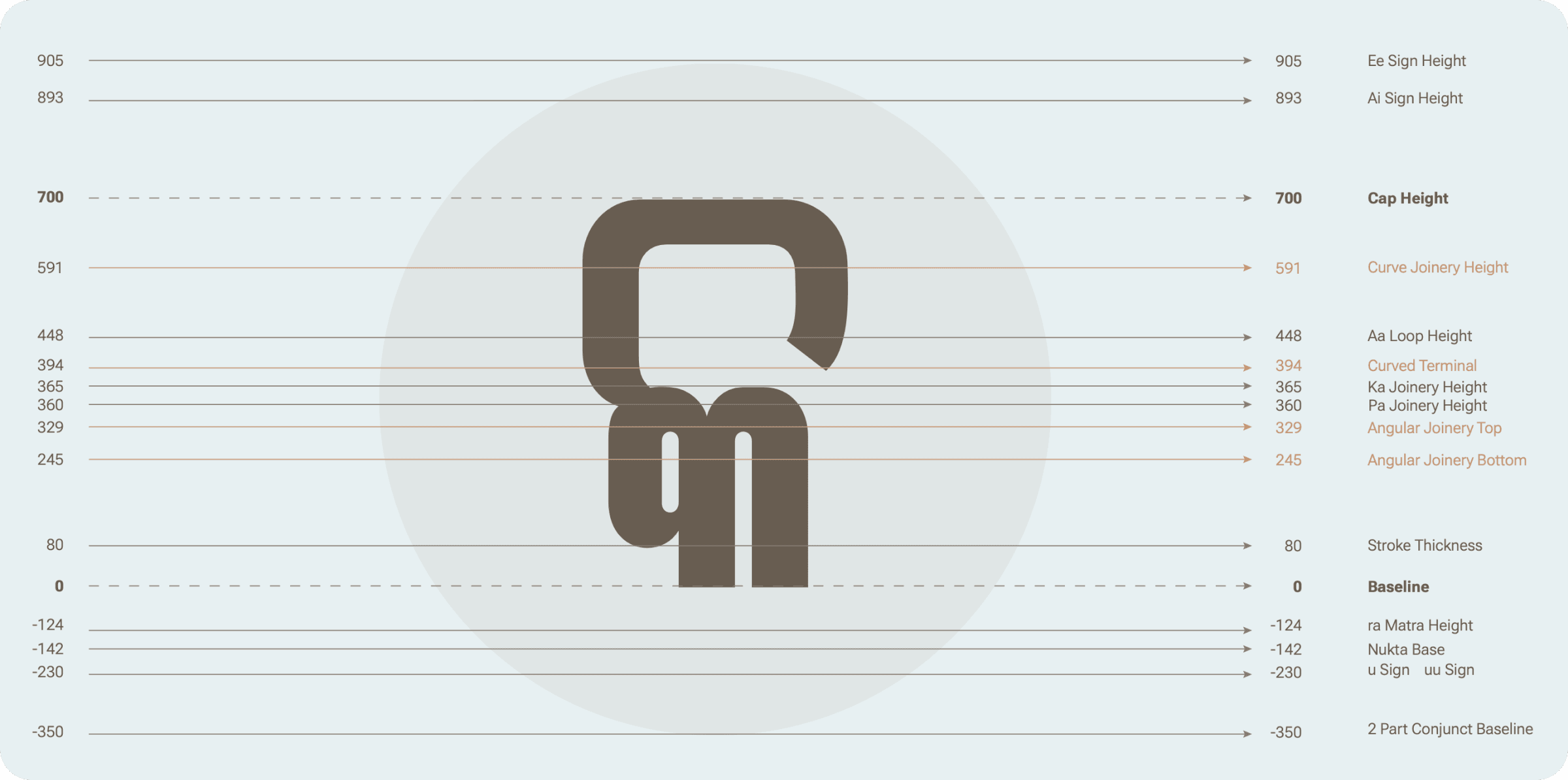
Every structural decision — cap height, stroke thickness, joinery heights for conjuncts, sign heights, baseline — was locked into a single measured system so it could be applied consistently across all 81 glyphs.
A variable width axis
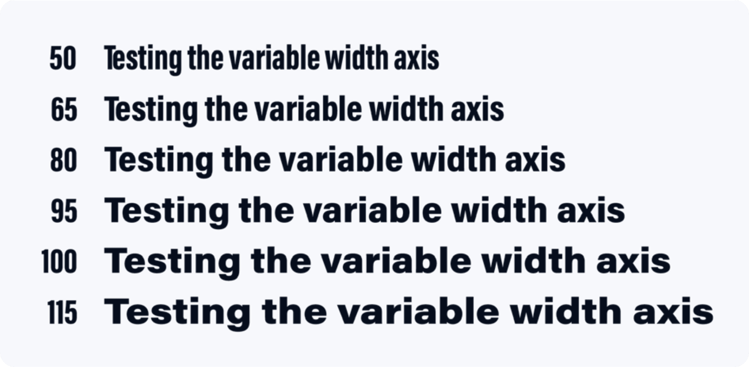
Headlines rarely get a fixed amount of space — a single-column headline and a full-width banner need different proportions from the same typeface. Rather than draw separate condensed and wide styles, Khabar Odia was built with a variable width axis, letting one underlying design stretch smoothly from a tightly condensed setting to a wider one.
Refining the letterforms
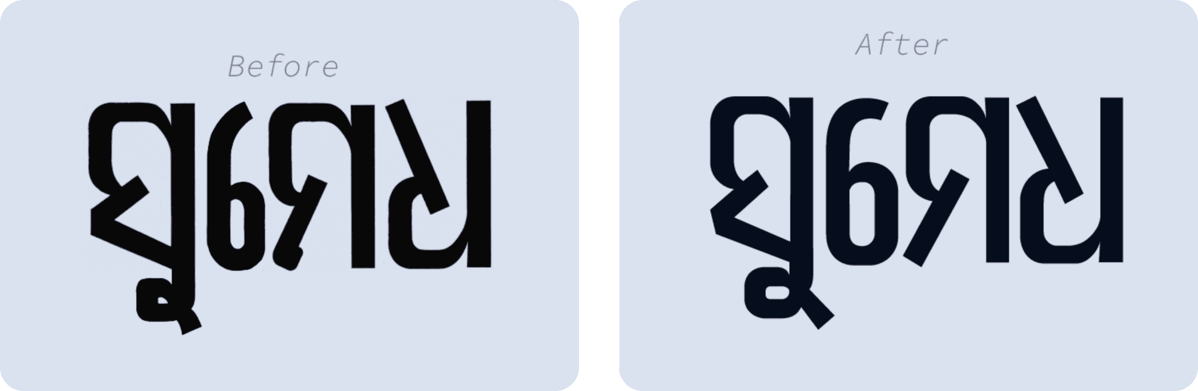
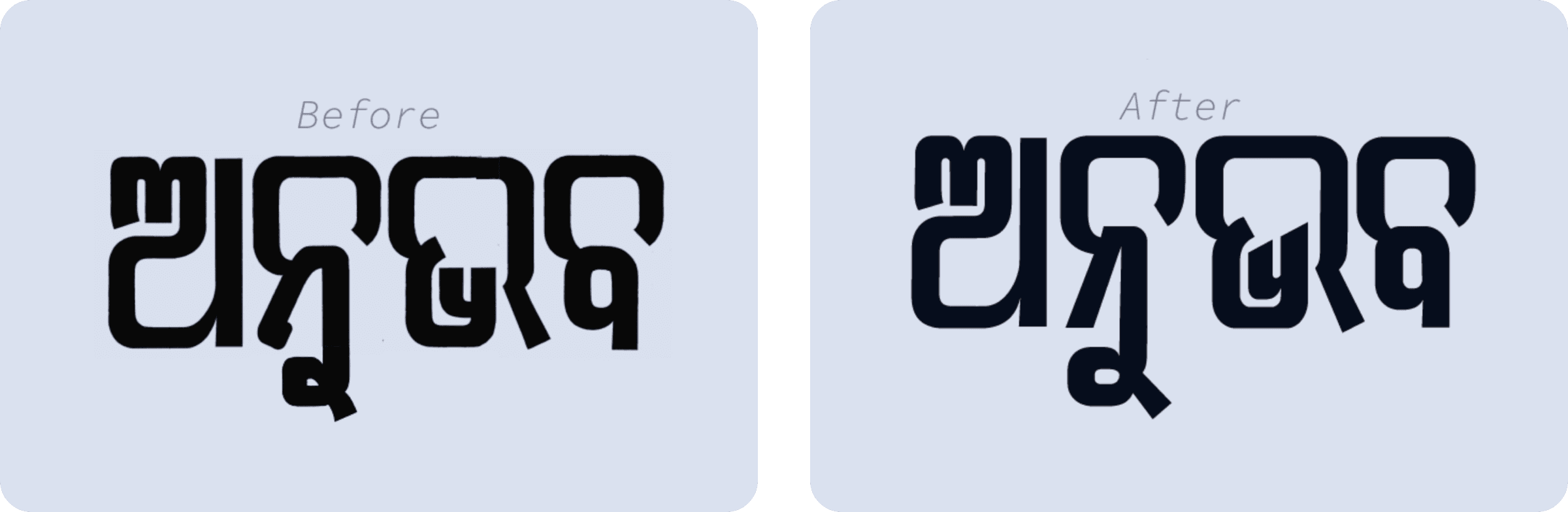
Early drafts were tested by setting real words and comparing them side by side against later revisions — catching awkward joins, inconsistent stroke terminals, and spacing issues that only show up once letters sit next to each other.
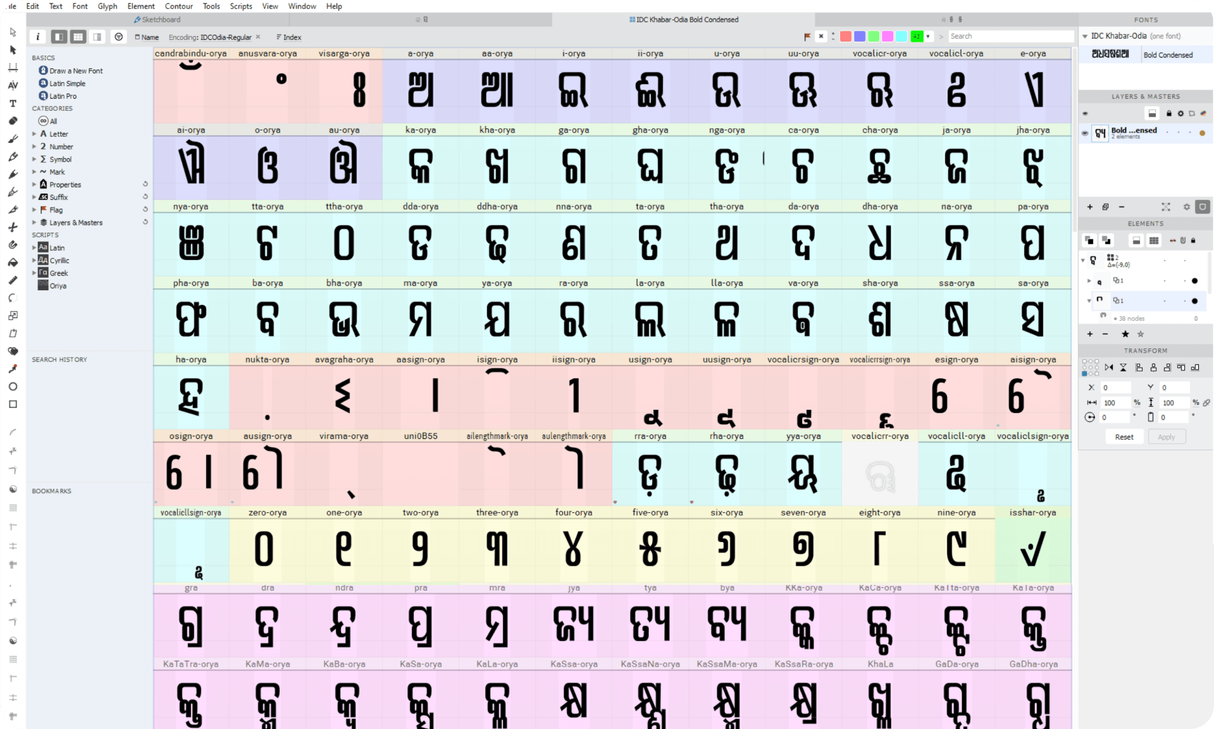
The complete character set
The finished character map covers the full modern Odia script — independent vowels, consonants, dependent vowel signs, conjuncts, numerals, and punctuation — laid out and named as a working font file.
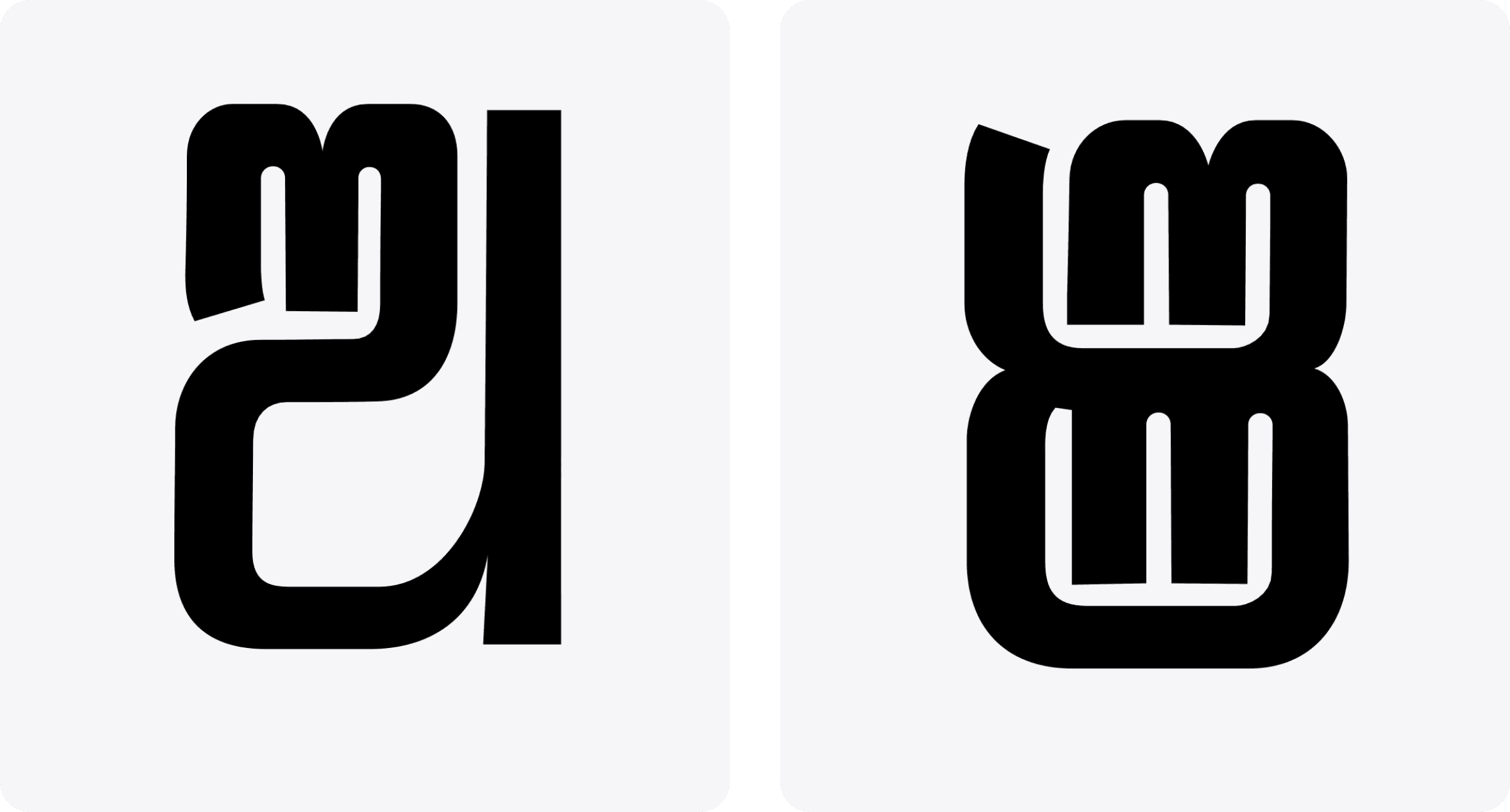
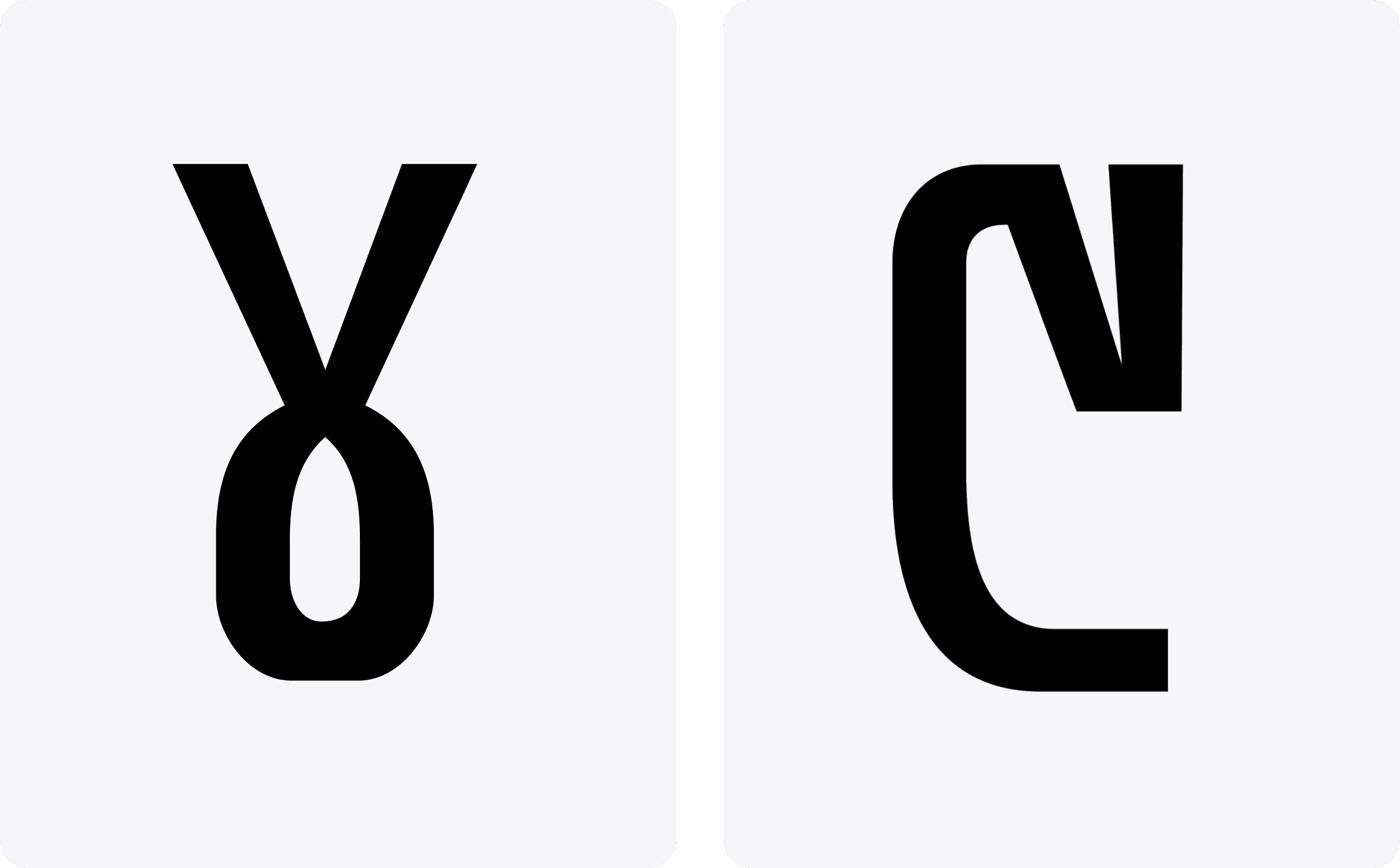
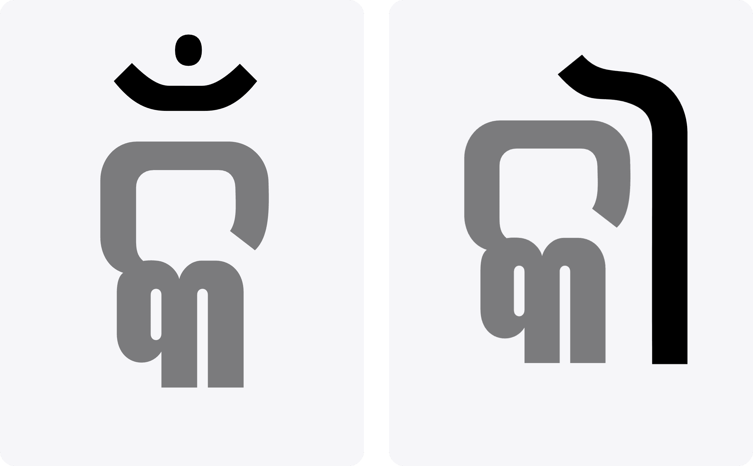
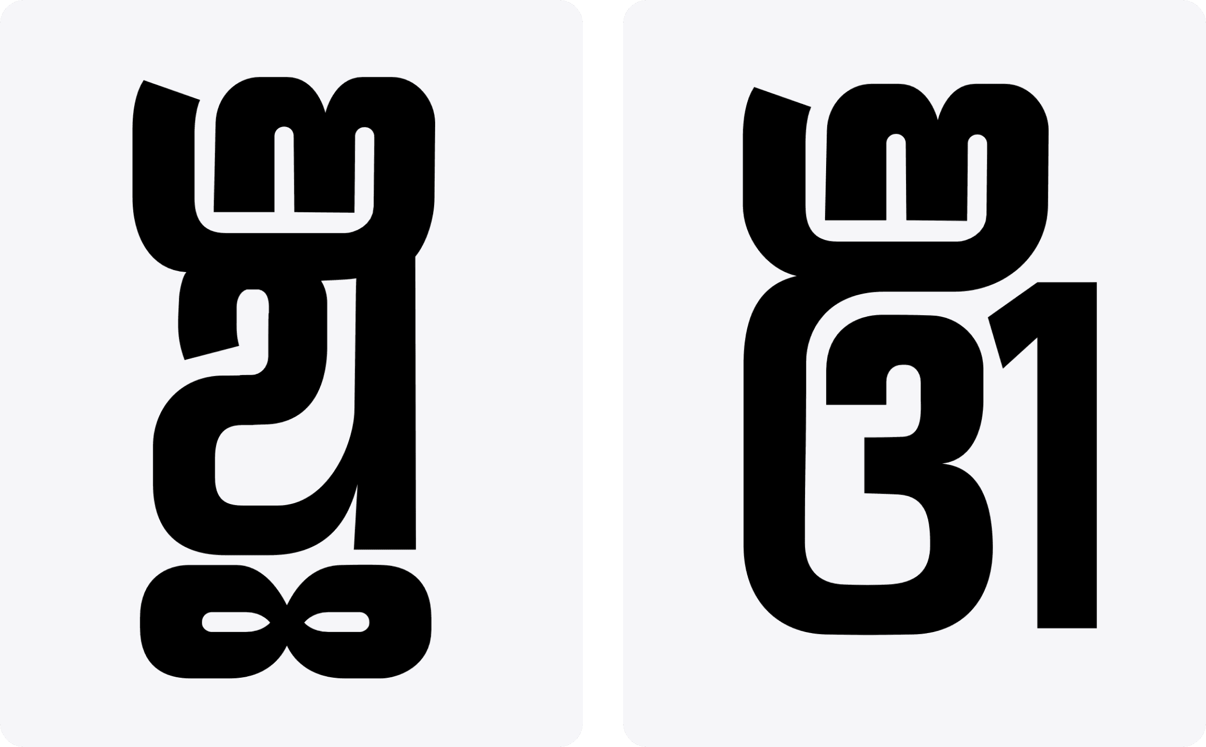
A handful of individual letterforms, shown larger, to see how the design's terminal logic and stroke contrast carry through at the level of a single glyph.
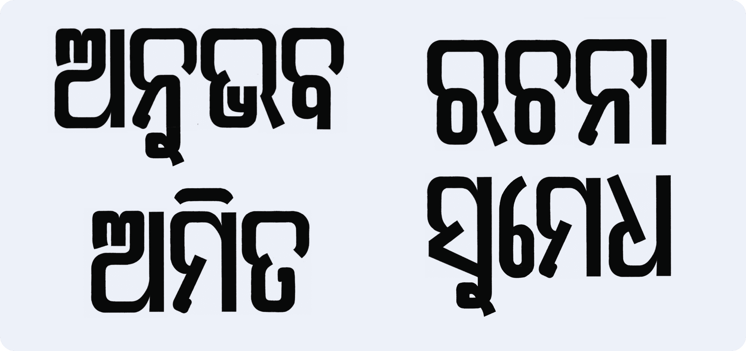
Setting full words in the finished typeface was the real test of whether the individual glyph decisions actually held together as connected text.
Bringing color into headlines
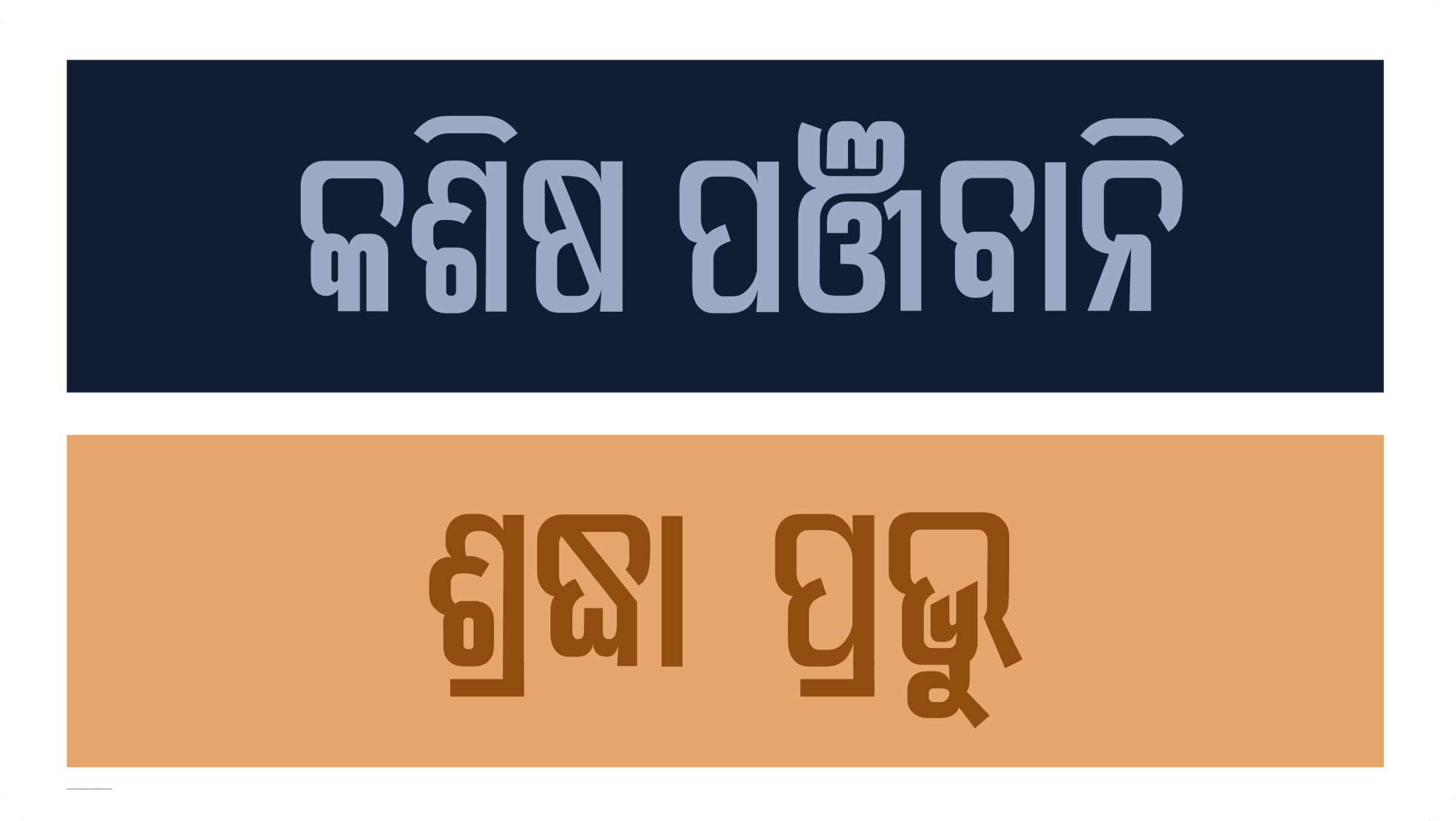
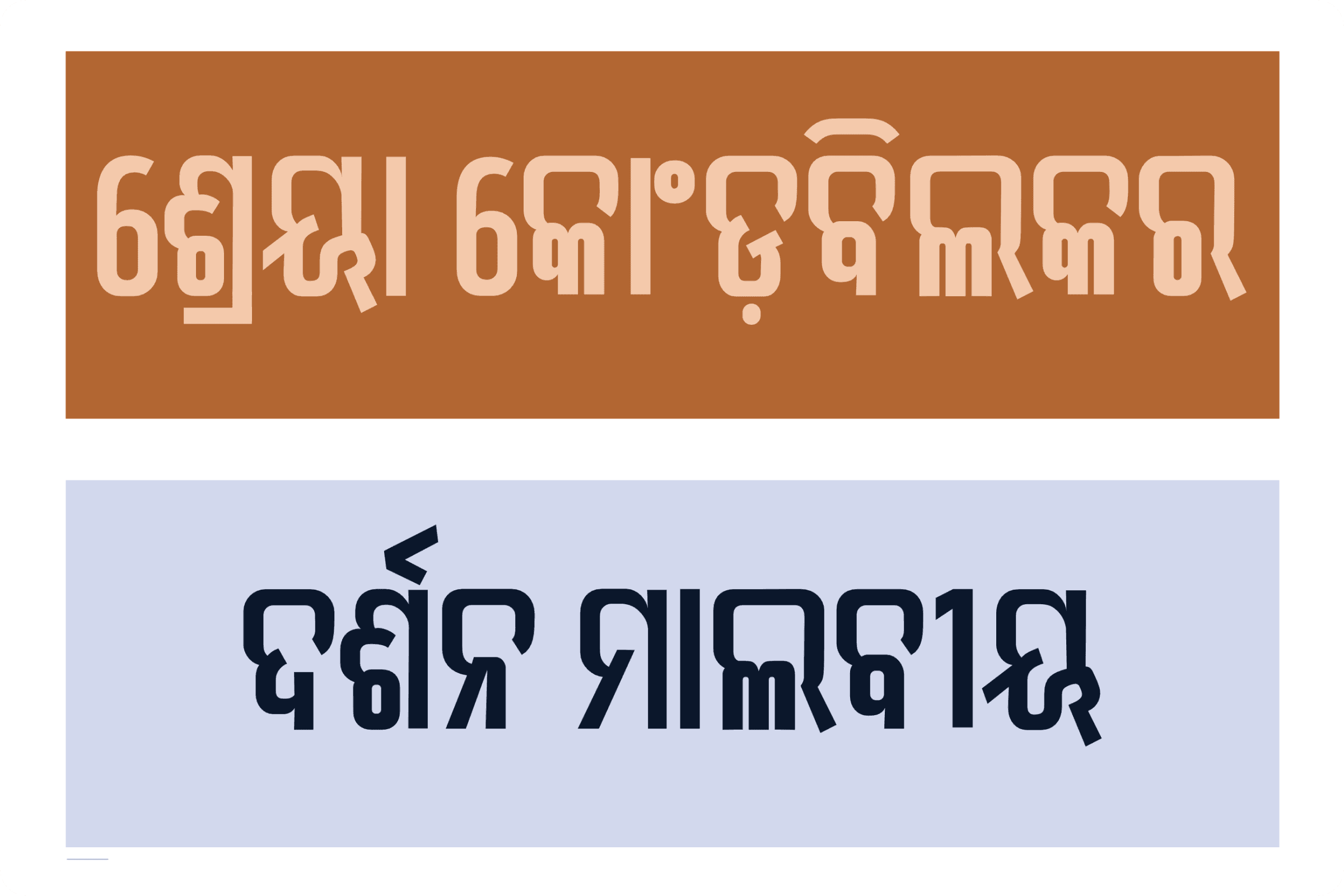
Beyond black-on-white, the typeface was tested against the kind of bold color pairings a real headline banner or pull-quote might use, to check contrast and legibility held up outside a plain type specimen.
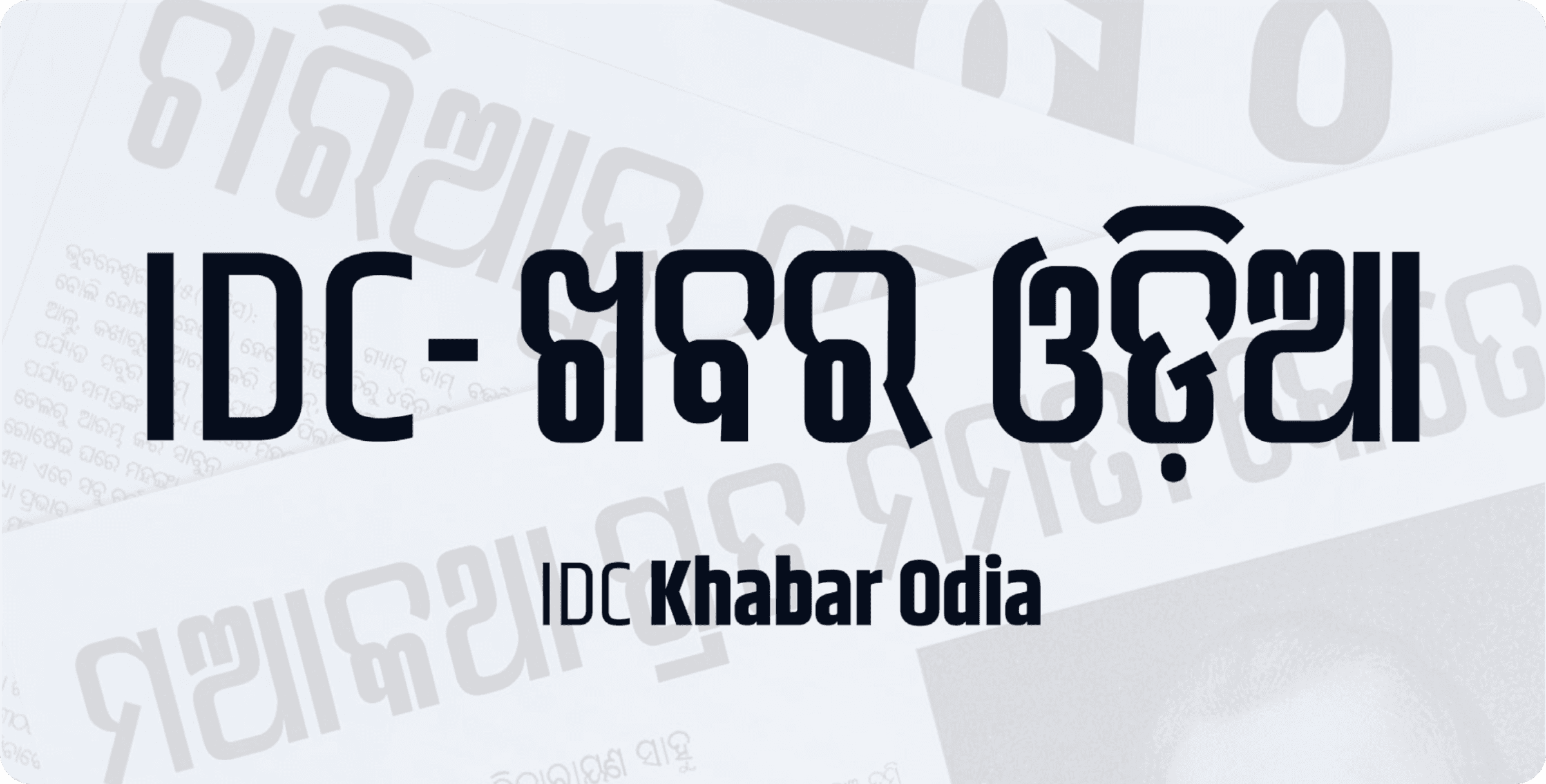
The finished wordmark brought the typeface's identity together — "IDC Khabar Odia" set in its own display face, layered over a texture of headlines set in the same design.
Seeing it in the wild
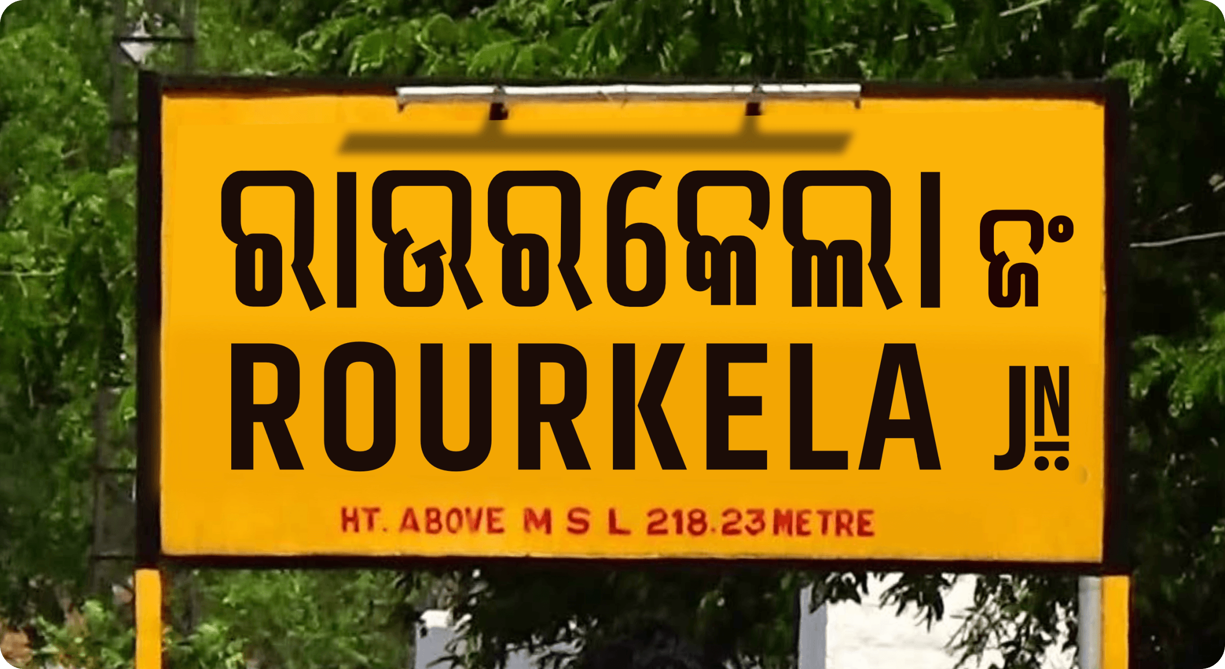
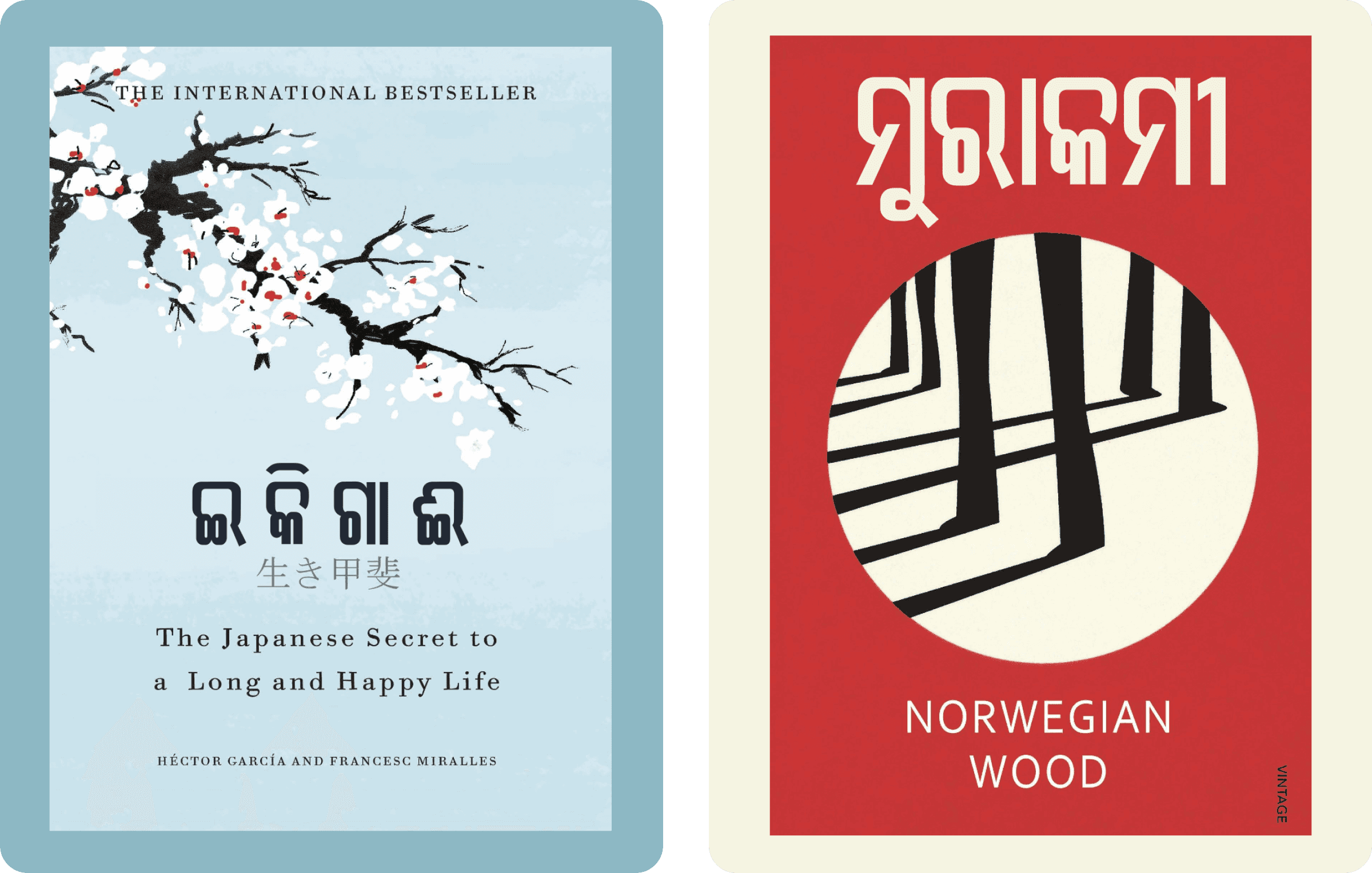
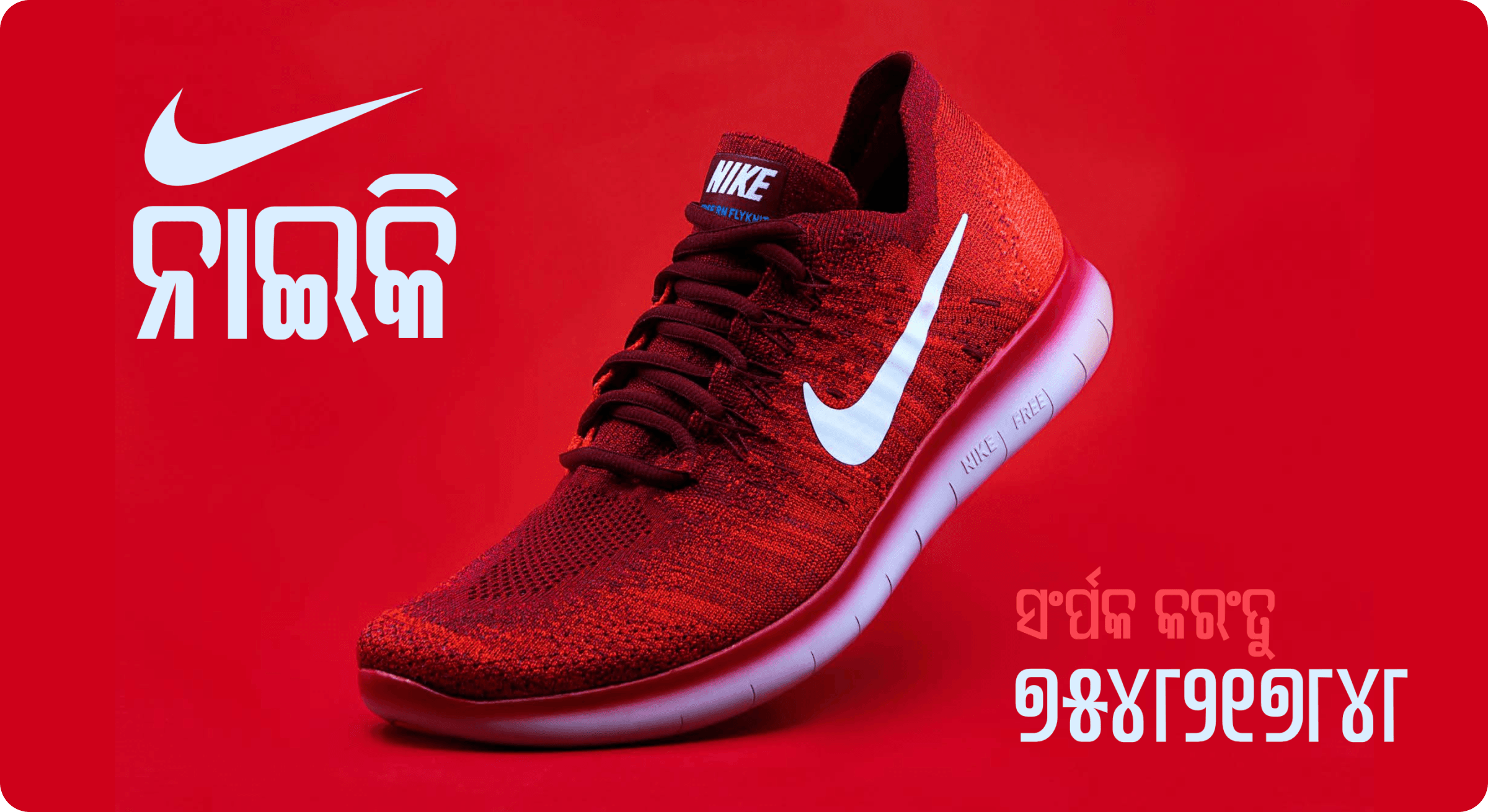
The last stage was mocking the typeface up in the kinds of places it was actually designed for — real newspaper layouts, signage, and branding — rather than leaving it as isolated specimens.