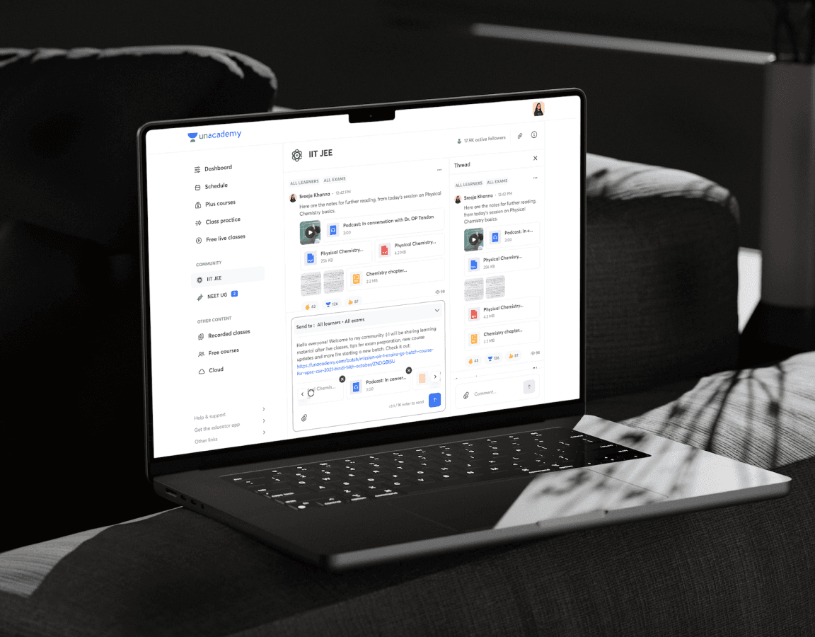
Free learner experience on Unacademy
A compilation of the design initiatives to enhance the experience for new and free learners on the Unacademy platform.
Unacademy's core education business has two major divisions:
- Online education, which was how it started and covers most of the offerings that the product provides.
- Offline business, introduced later, where the learner gets enrolled into a program where they learn at an offline centre.
| Year | Category | Duration | Platform |
|---|---|---|---|
| 2023-24 | Professional | 4 Weeks | Android |
Problem statement
The core UX of the existing Unacademy app was designed when Unacademy only had the online mode of learning. After the company ventured into the offline mode, there were many changes in the content consumption patterns of the learner.
Pre-login stage: Sign-up enhancements
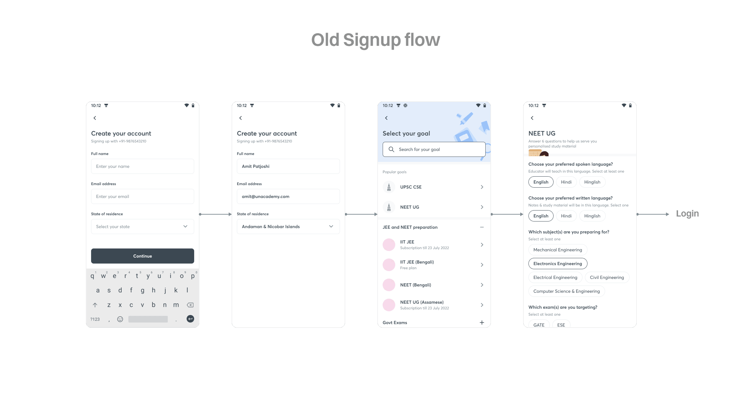
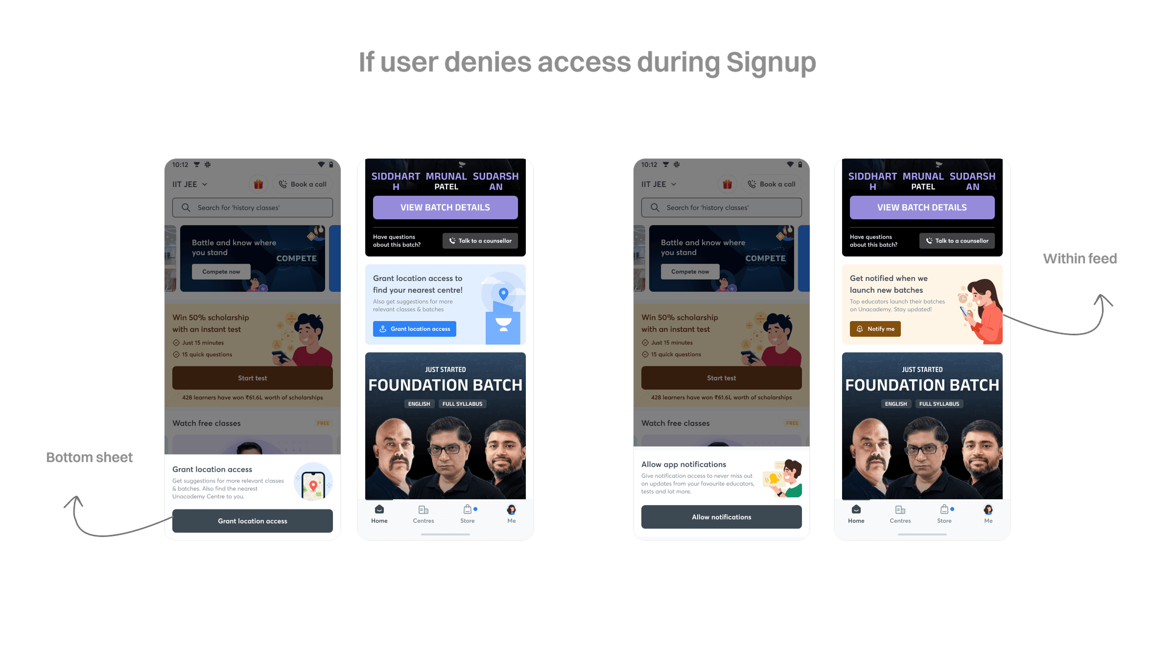
The existing signup screen had a long form for onboarding. So many questions were asked of learners before they were onboarded onto the app, which was causing a bottleneck in the app download → signup funnel. To fix this, we decided to reduce the onboarding process and keep the information limited to what was absolutely necessary for learners to get started with the Unacademy app.
This contained three main pieces of information: the goal the learner was trying to achieve (the exam they were preparing for), the language they wanted to study in, and their preferred mode of learning — online or offline.
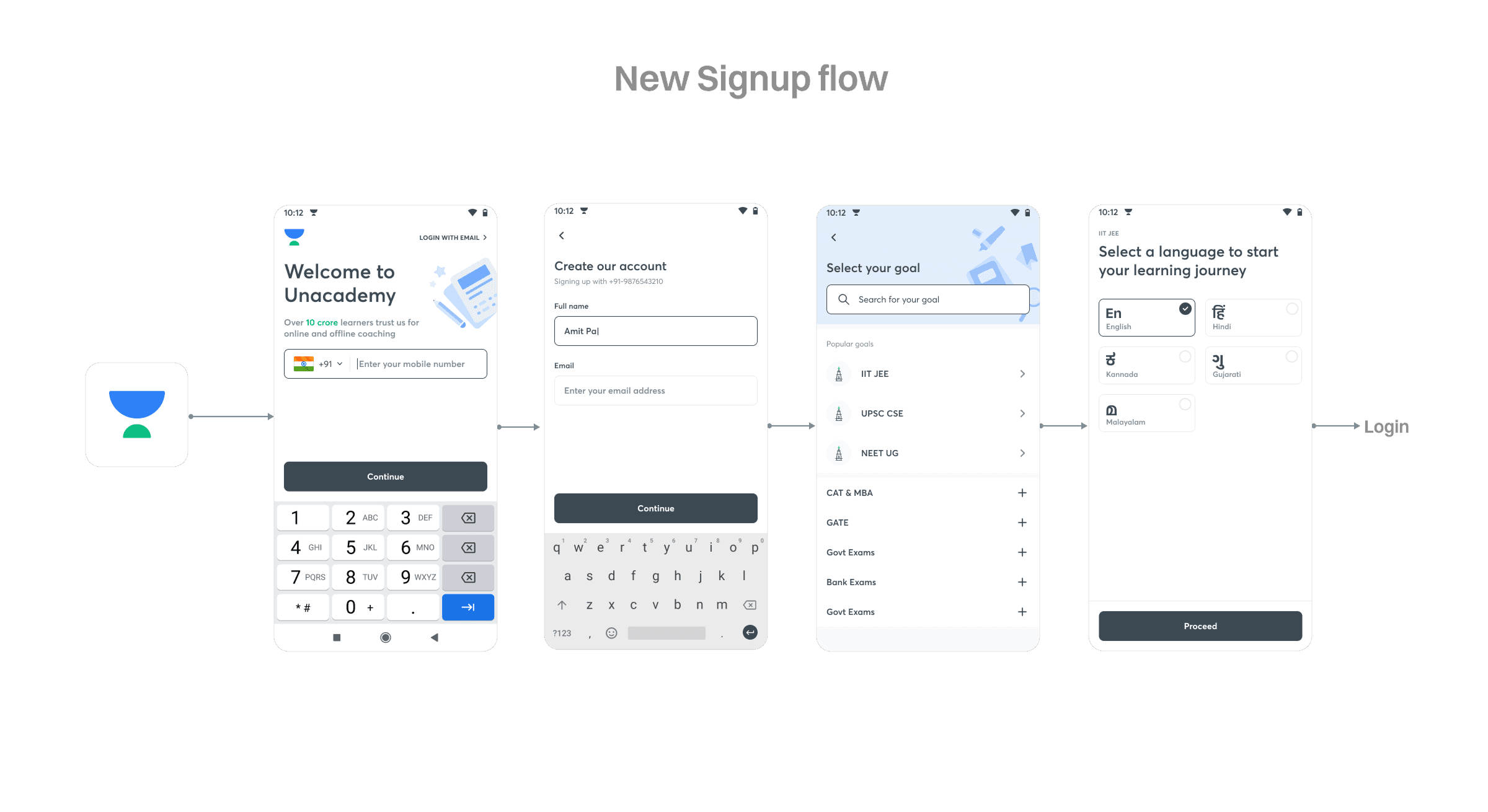
We noticed that just by making this change, we were able to bring down the drop-off percentage by 7.8%.
Apart from this reduction in the number of questions asked, we also had to ask for location and notification permission from the learner in order to suggest better content to them — explained further in the next section.
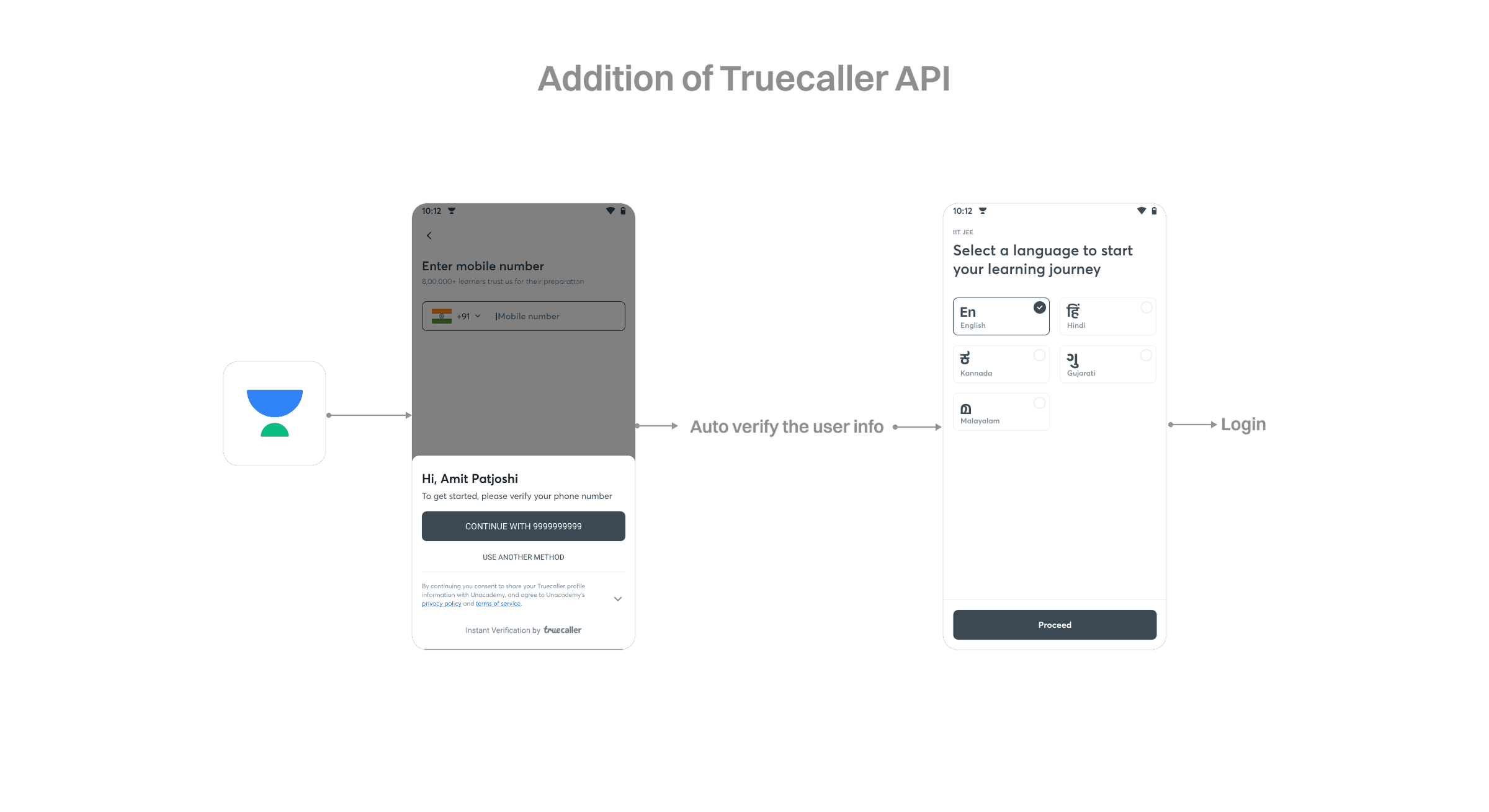
Apart from this change, we also included the Truecaller login API. This allowed a very quick login for learners who already had Truecaller on their device — the user doesn't have to verify an OTP. Instead, the Truecaller API verifies based on the login already active in the Truecaller app.
Case handling: location and notification access
Since Unacademy ventured into the offline business, it became important for us to know the location of users to suggest the most relevant centres when they wanted to learn offline. As offline SKUs were available only for 3 exams (IIT JEE, NEET UG, and UPSC), location permission was asked only of learners opting for one of those goals, since an extra step would impact the download → signup funnel.
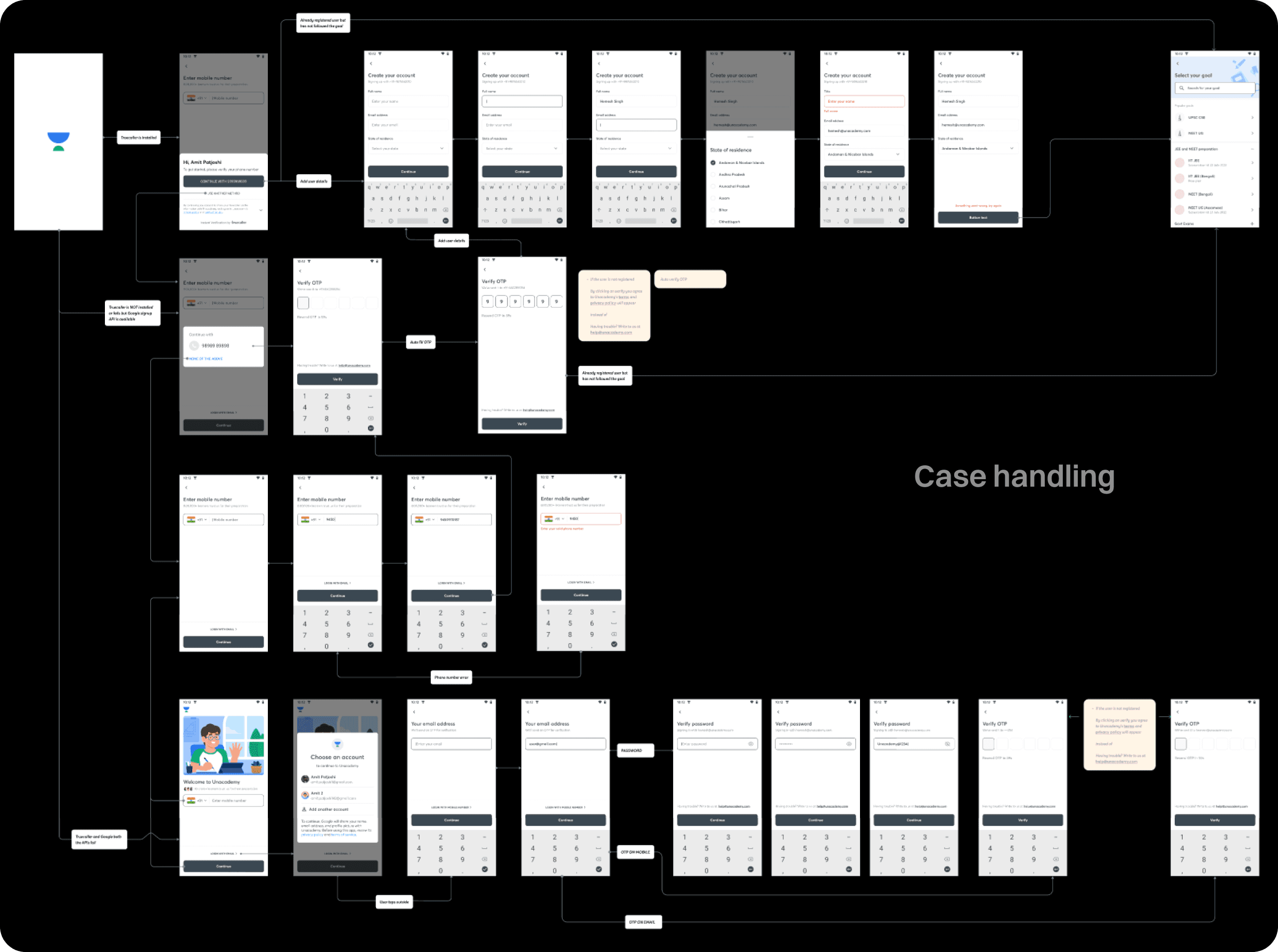
It was very important for us to have a value proposition for users before asking to access their location — a generic system popup during onboarding had a denial rate of 93%. After introducing the value proposition, we brought the denial rate down to 56%.
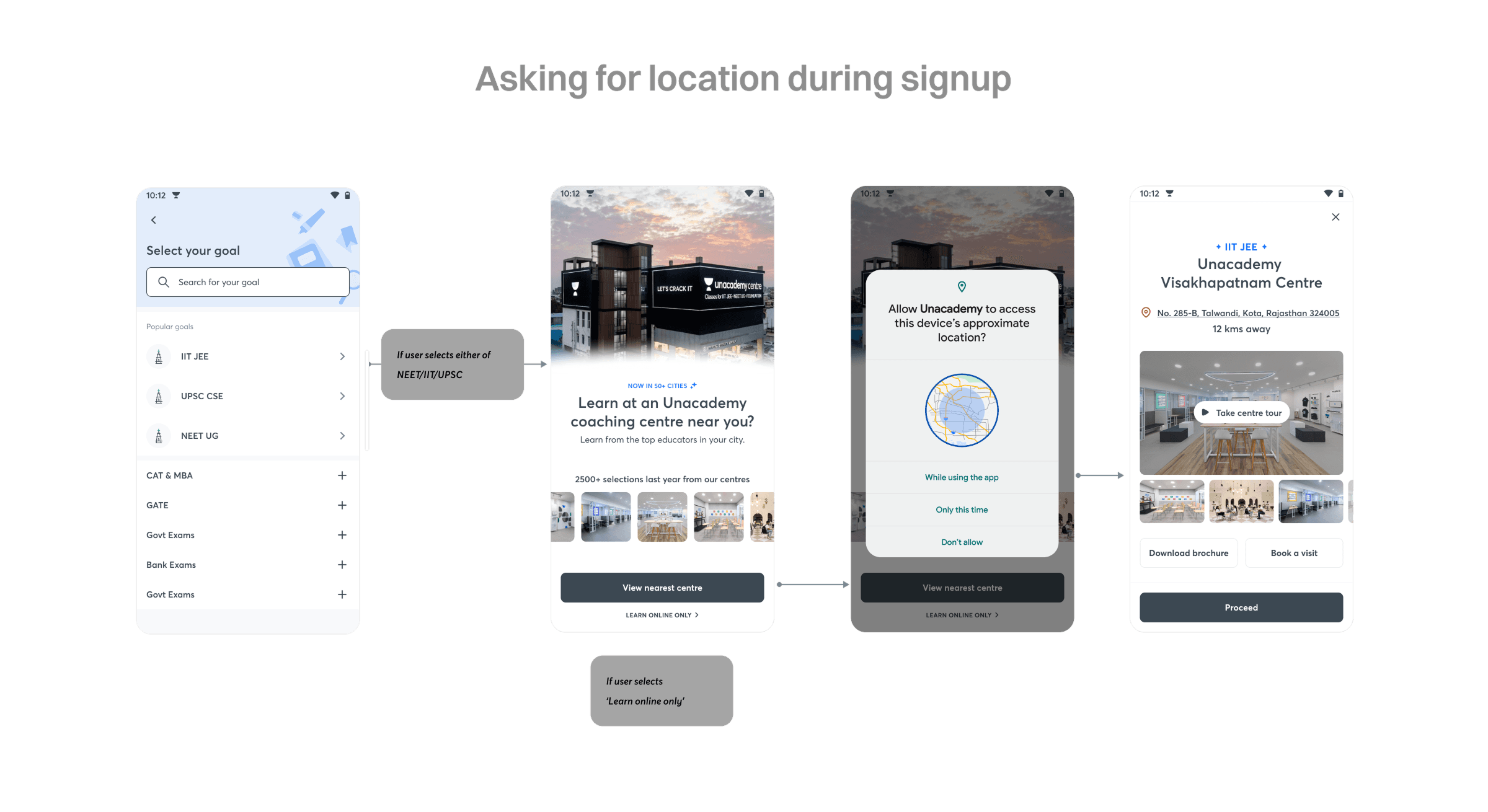
A similar improvement was seen for notification permissions in the onboarding flow after introducing educator photos for that goal — we added images of the three most popular educators from that goal to the onboarding screen when the permission was asked. We ran an A/B experiment between a screen with educators' images and one without, and the version with images saw 12.5% more users granting notification permissions.
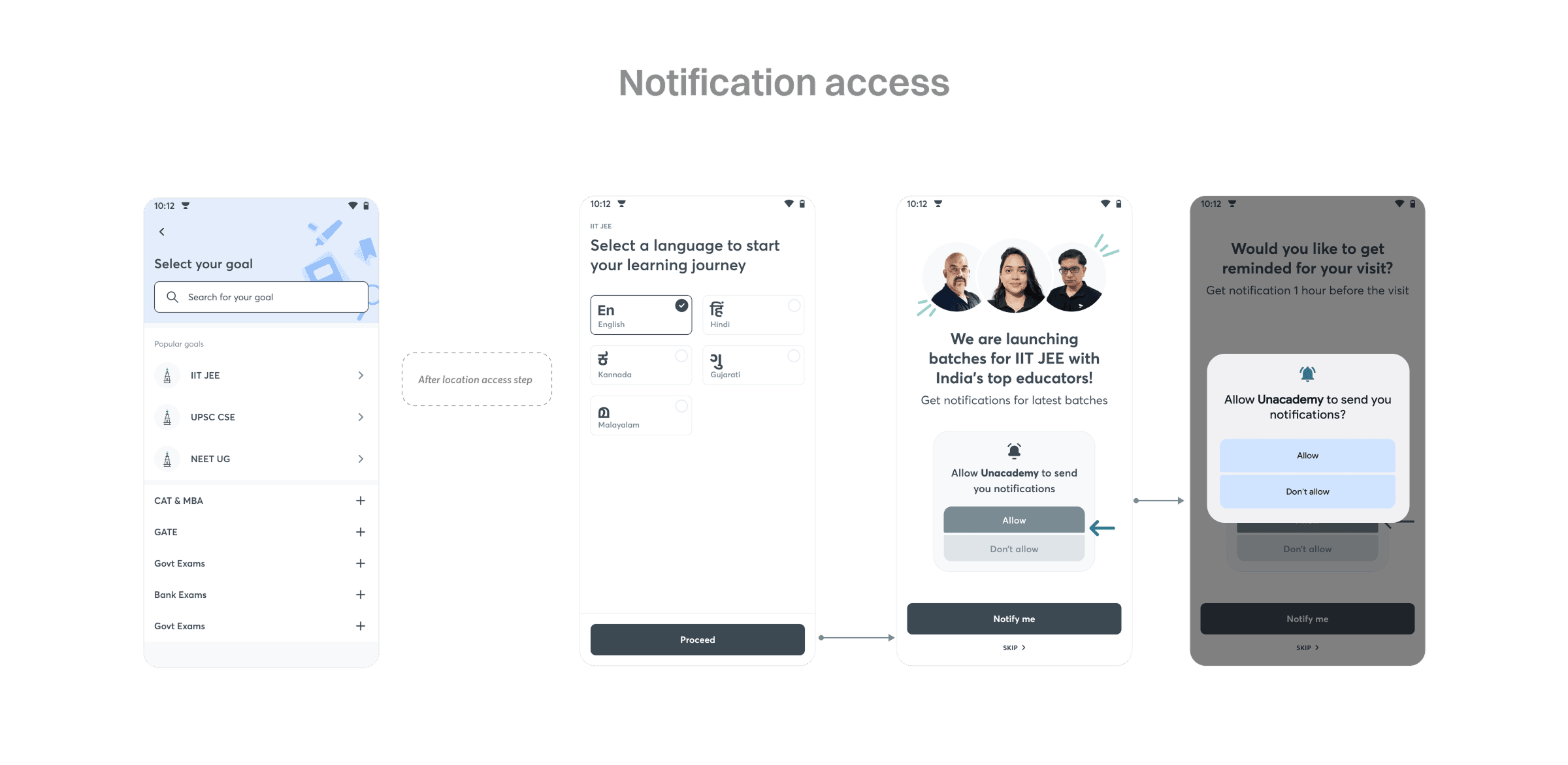
Since a relevant number of users didn't grant permission during onboarding, we had to cover the post-denial scenarios for these users. This mattered because of the permission setting changes introduced in Android 12, where if a user denies permission once, it's set to denied forever and the system popup can't be triggered again — the only way to revive it is for the user to manually go to the settings page.
Navigation changes
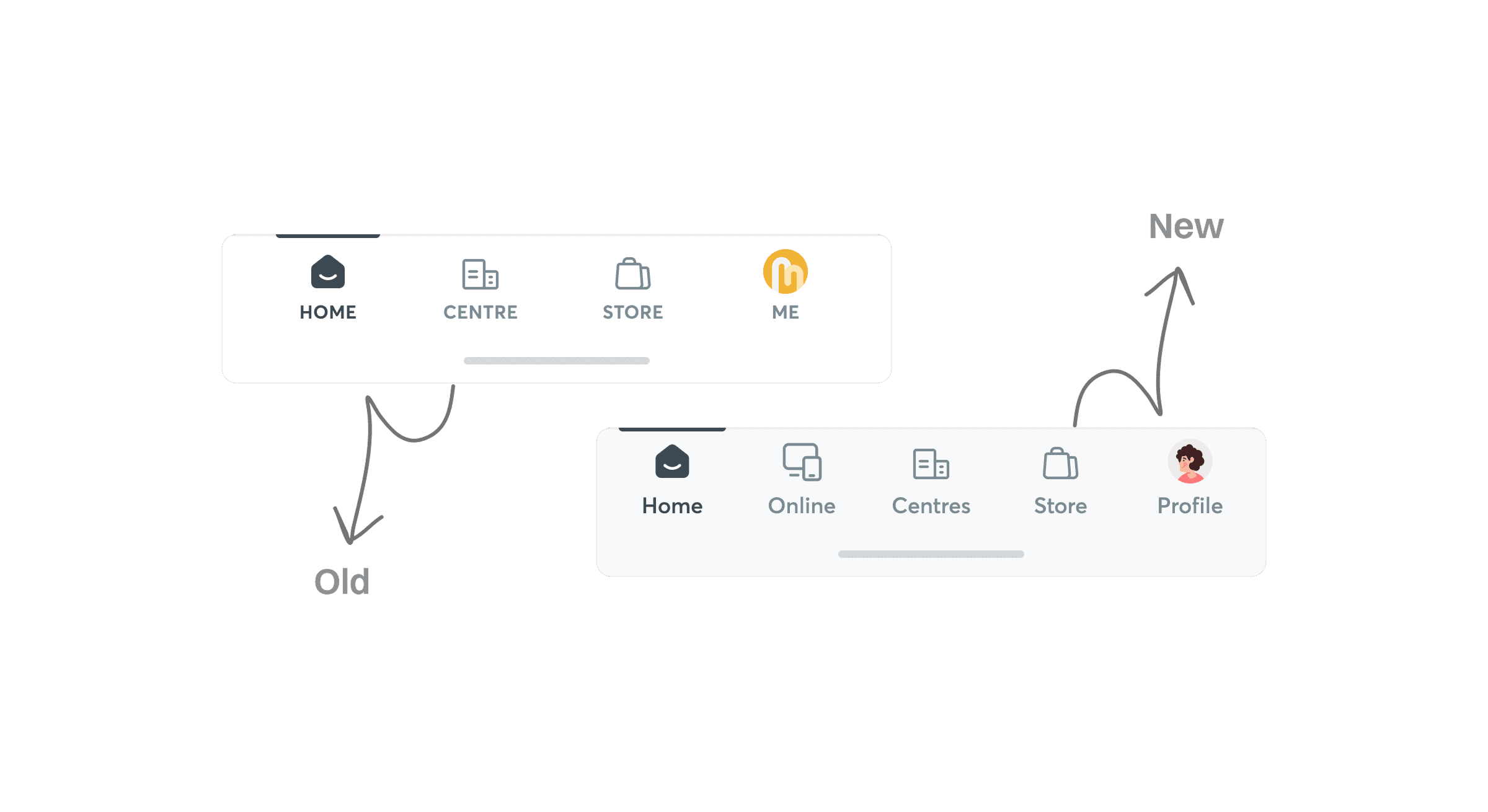
The existing bottom navigation had 4 tabs:
- Home — content for the learners already learning, upcoming classes, and a few other things.
- Centres — info related to offline centres and offerings in the offline mode of learning.
- Store — contents from Unacademy Store, containing smaller unbundled SKUs for learners.
- Me — the things related to the learner's profile, settings, and learning stats.
With the introduction of a new L0 selector for offline and online, we moved the content from the existing home tab into a new tab renamed "Online."
Home page change: online vs. offline mode
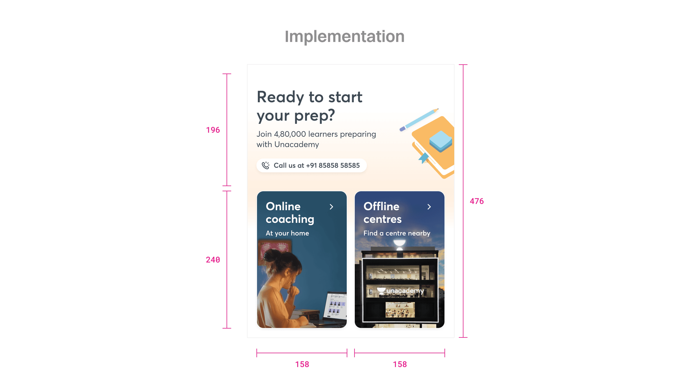
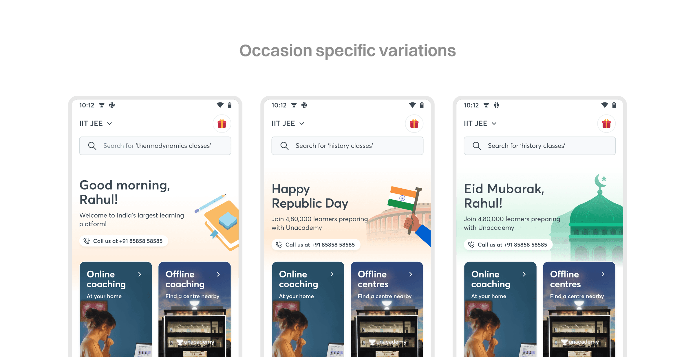
Since the journeys of learners choosing either online or offline modes are unique, we decided to have an L0 screen for the free learner to choose either based on their requirements. This was also important from the sales team's perspective, giving a much clearer idea of whether a learner needed an online or offline subscription. Since offline SKUs were limited to IIT JEE, NEET UG, and UPSC, so was this new L0 screen.
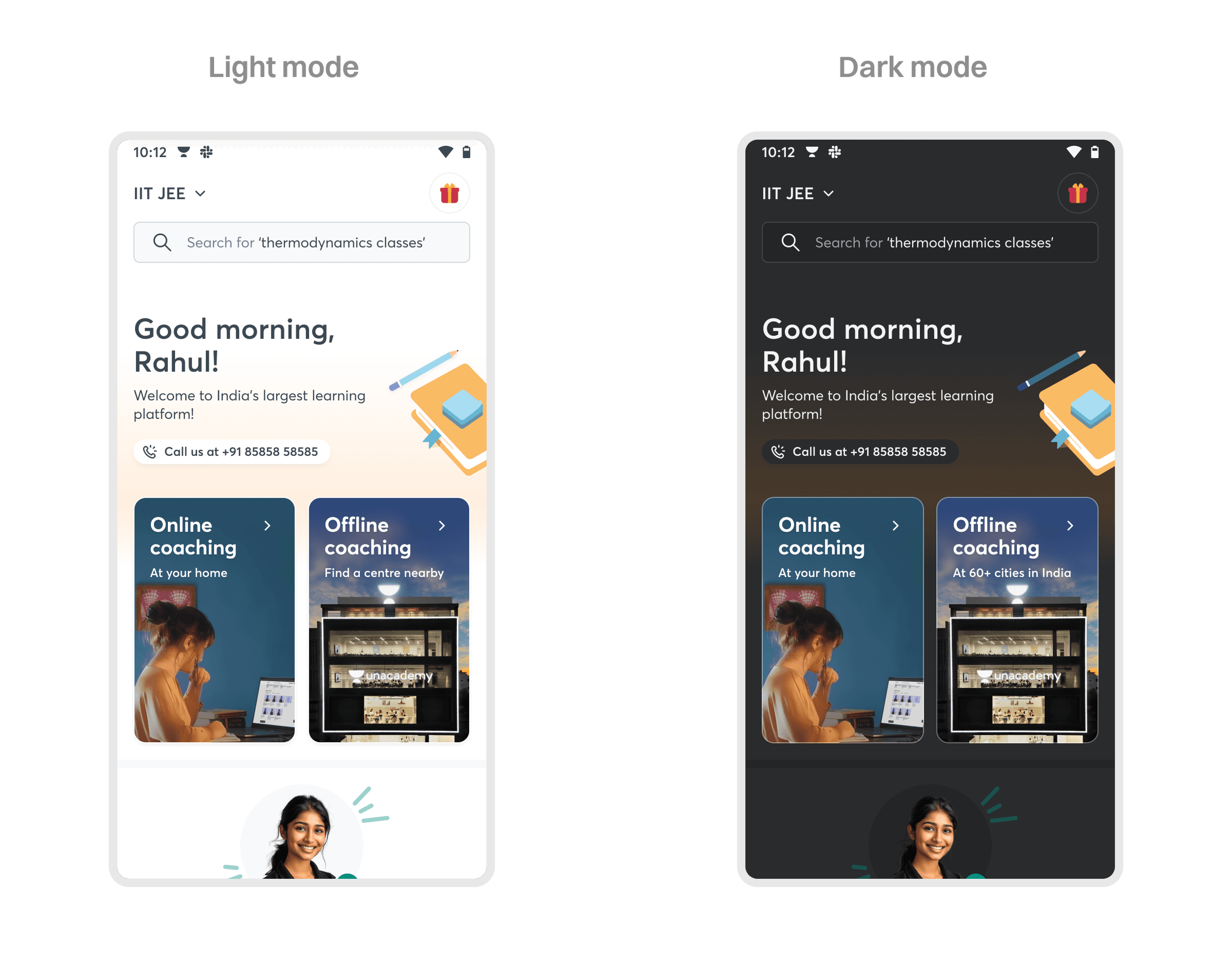
We kept the L0 screen limited to four things: a touchpoint to switch between online and offline, a space for a banner for important events or communications, some success stories from learners in previous years, and a touchpoint for learners to reach out for help.
Having a touchpoint for users to reach out
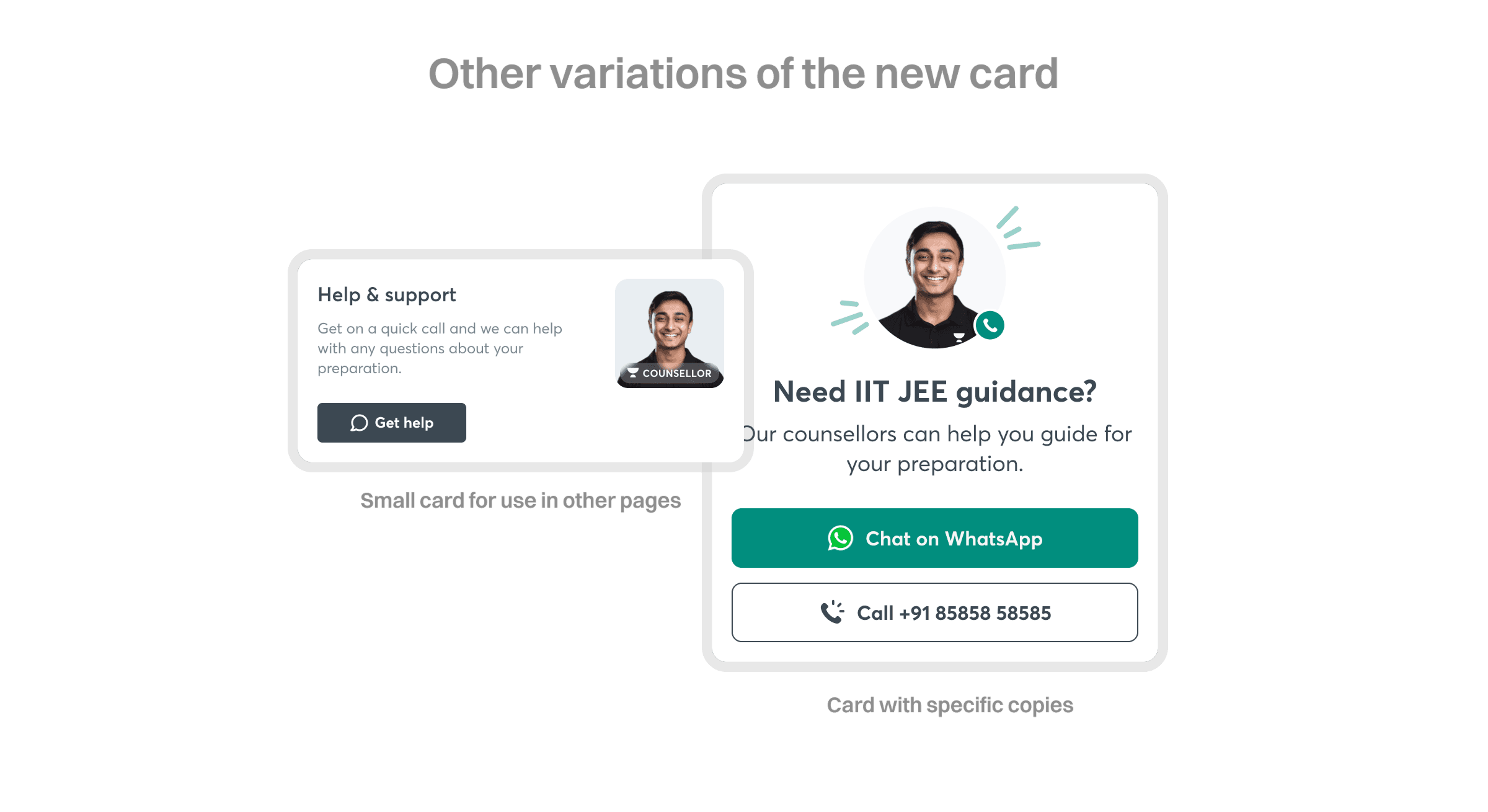
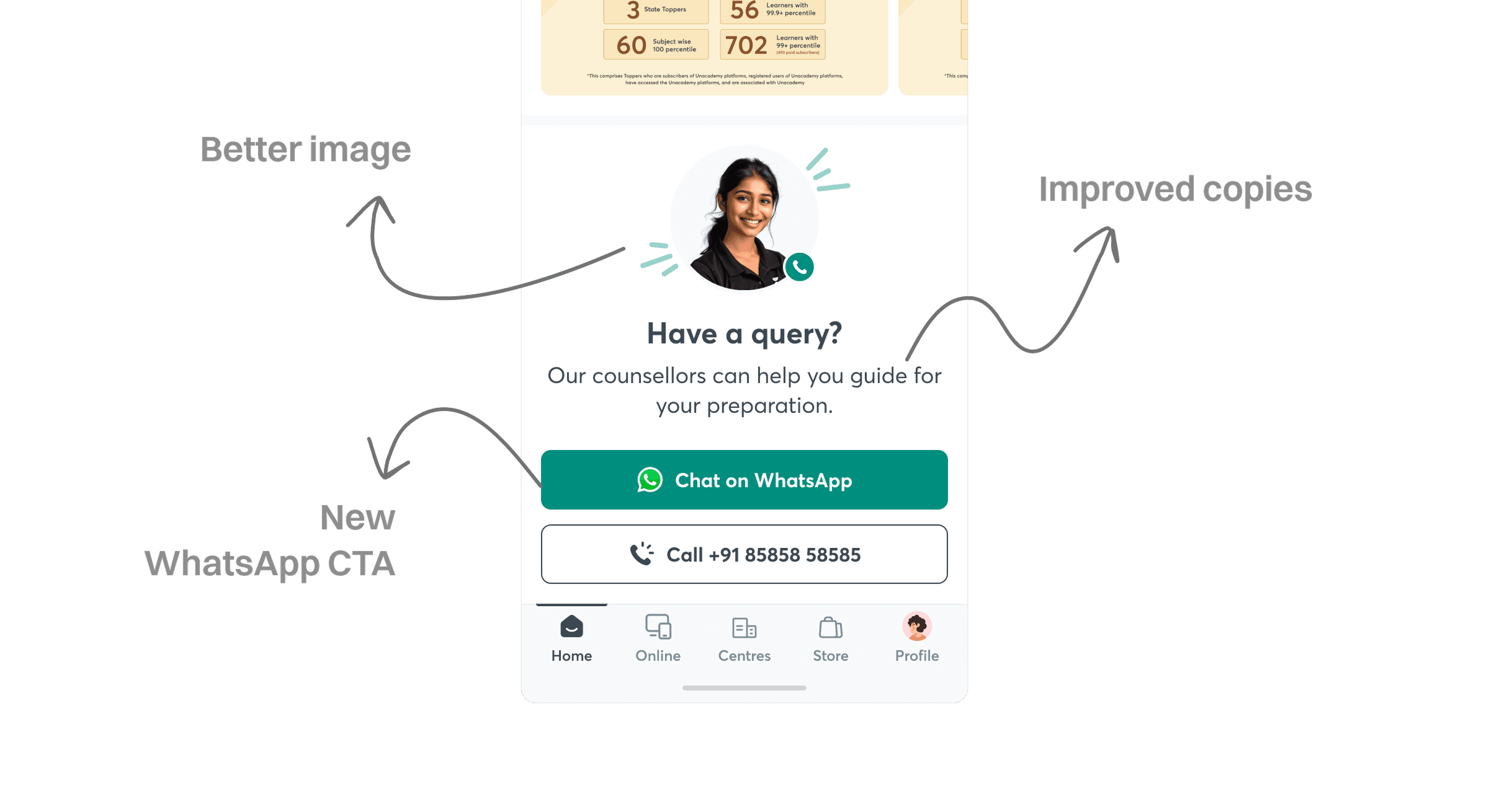
The TTU banner — the abbreviation for "Talk to us" — is a touchpoint for learners to reach out to the team or express interest in the product. For a user very new to the product, it becomes very important to have a go-to touchpoint to get in touch with the help desk.
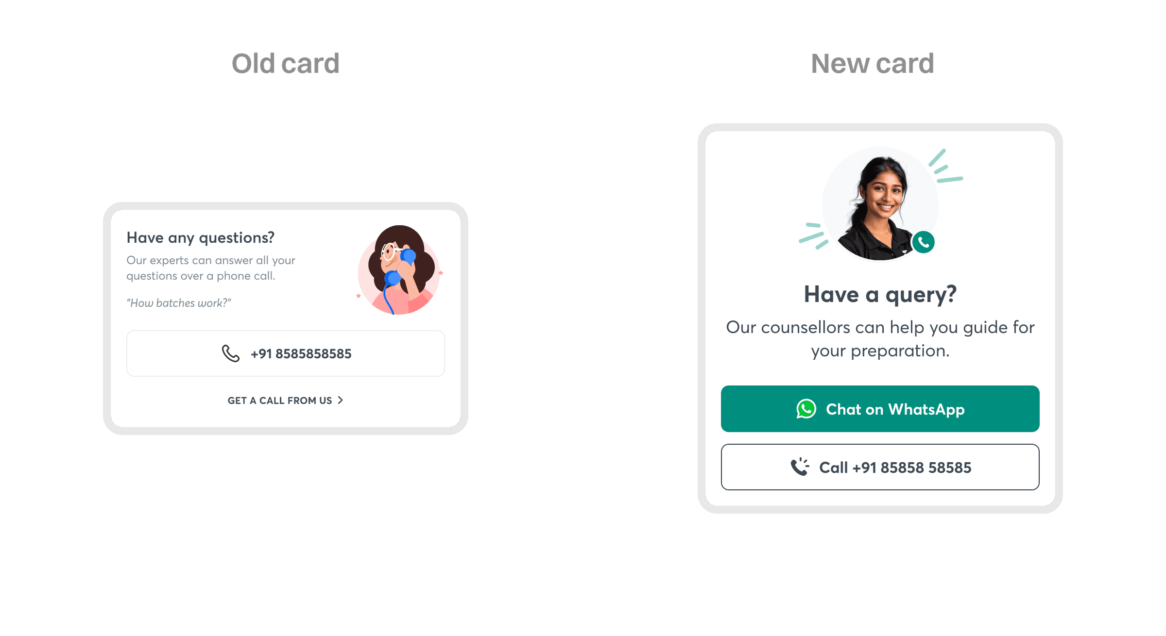
We had a TTU section in the previous version of the app, but the touchpoint was pretty small and had an illustration. Since this touchpoint served as a great indicator to capture lead intent, and the interaction that followed was human-to-human, we decided to replace the old illustration with an AI-generated picture resembling a counsellor.
Since we recently launched a WhatsApp integration feature on our CRM tool, we also introduced a CTA within the TTU banner so learners could reach out to executives for a text conversation if they didn't prefer calling. This was helpful because initiating a WhatsApp conversation from our side had restrictions based on Meta's policies — unlike when a learner initiates the message, which can start without a cooldown period or message template.
AI educator images
In earlier designs, we used real photos of some of our educators. Since the org structure changed — new educators came in and some old educators left — it became difficult to maintain the repository of educator images for use in design iteration.
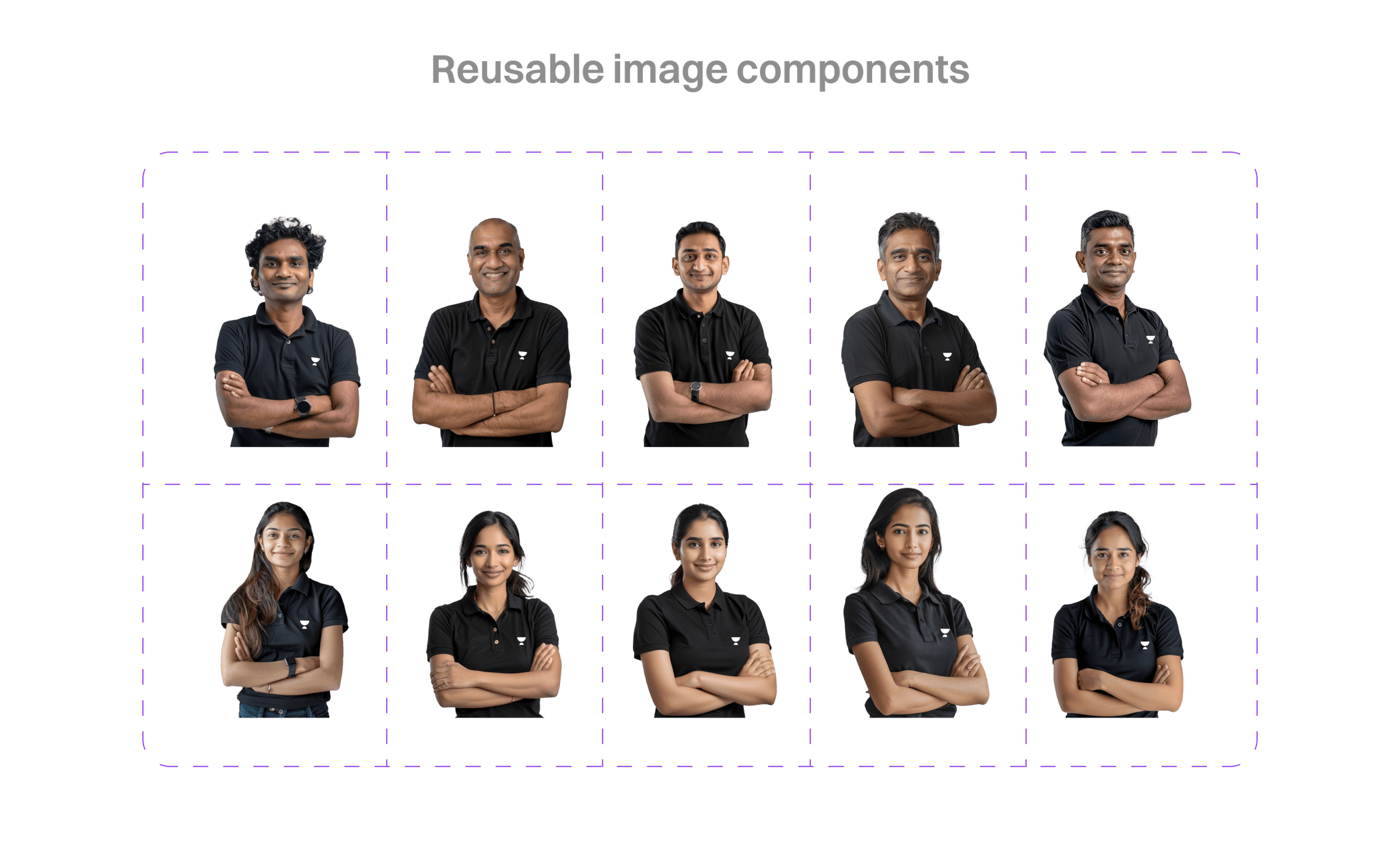
This is when we decided to create a repository of educator images using generative AI. The idea was simple, but it helped us make wireframing and prototyping slightly faster.
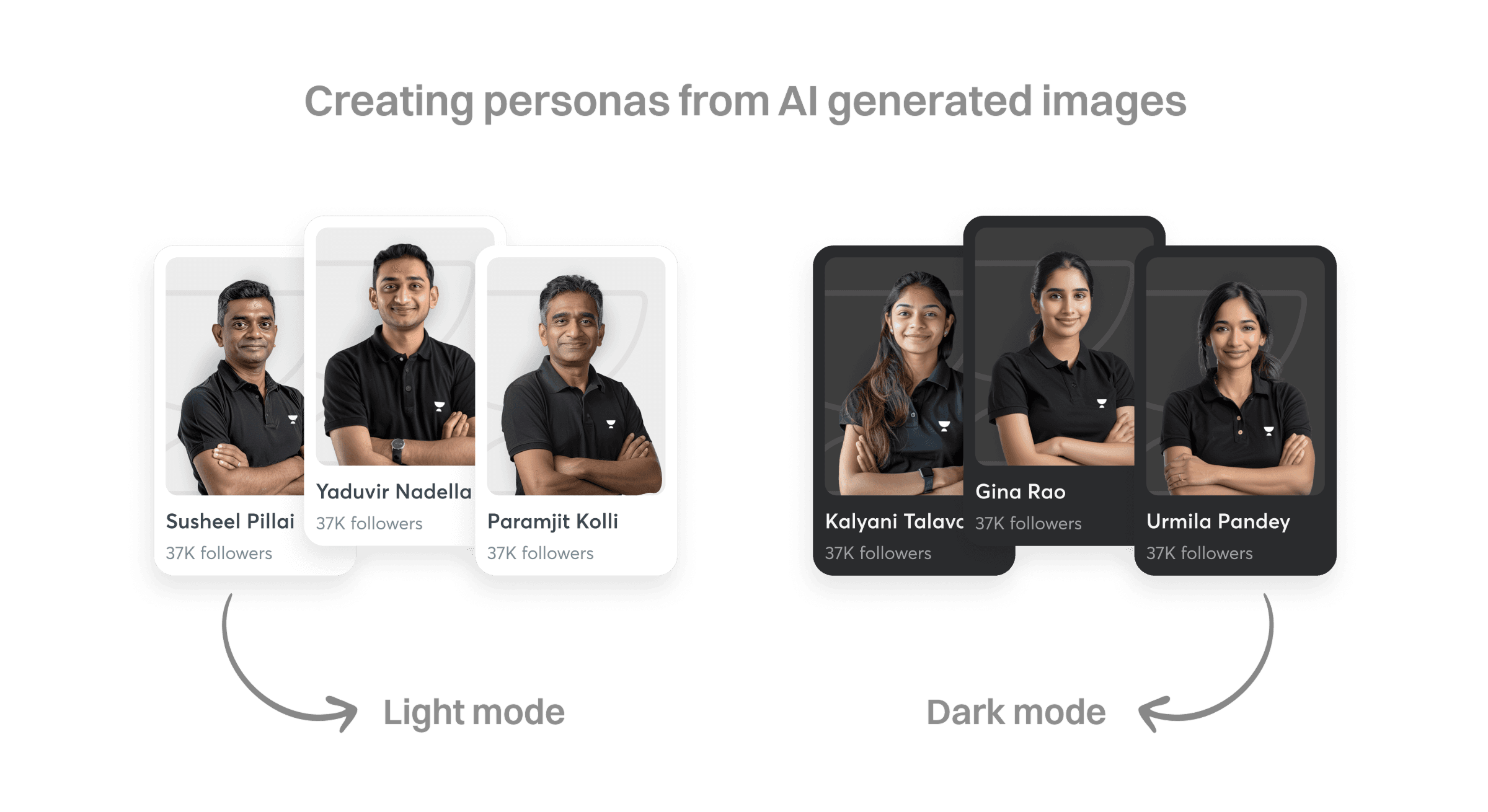
New cards for batches
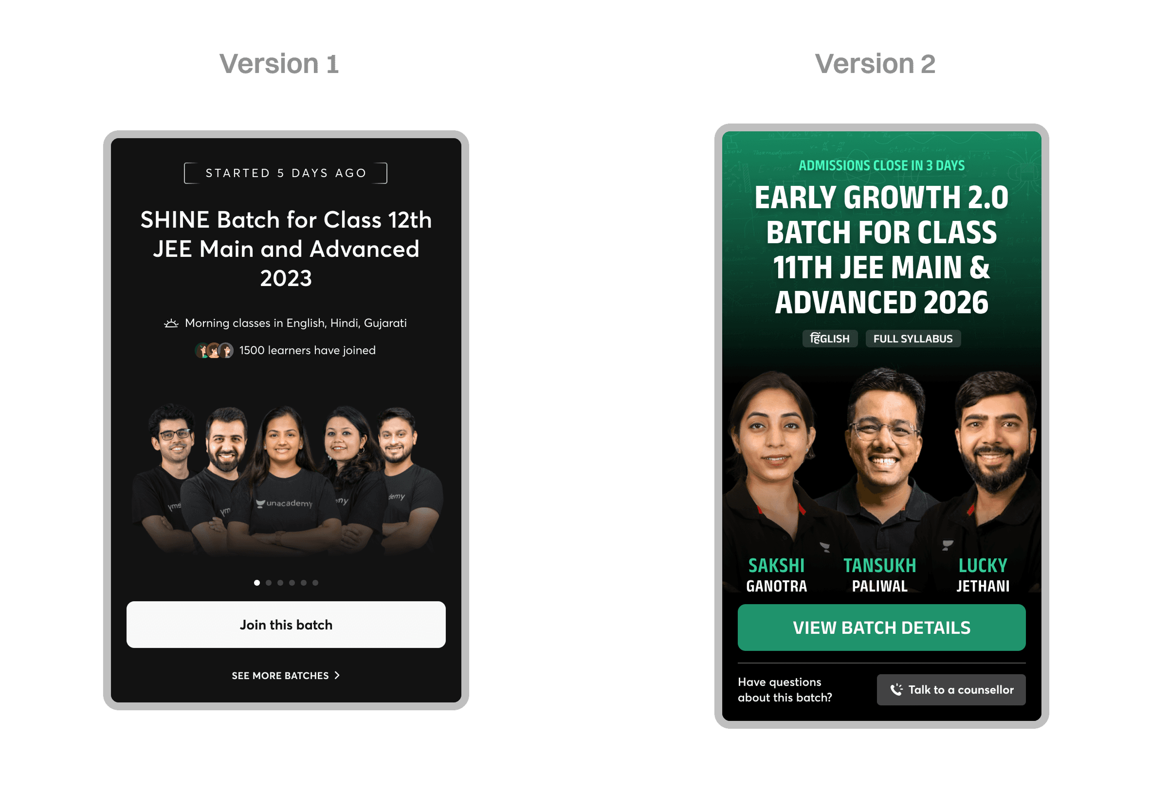
Our batch cards went through two iterations. The first version had issues with visual distinction between batches and looked outdated — educator images had to be uploaded separately by a team in two versions, one for vertical and one for horizontal layout, and it wasn't relevant to show images of 7 different educators if a batch had that many.
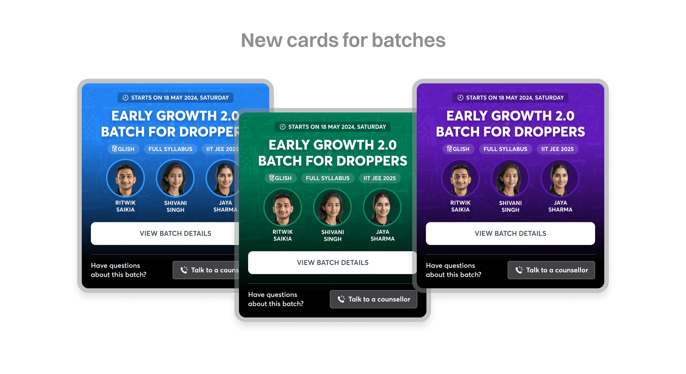
In the second version we solved the visual distinction issue, but ran into new problems: educator image quality control became a challenge with limited resources, and even after a few rounds of trial we couldn't achieve the quality we expected in production. The variability in card length would also have become a problem if we wanted to scale to the web, where cards appear in grids, and a horizontal scroll wouldn't have worked with inconsistent lengths.
In the third version, we took the learnings from the second and made a few changes: we added educator images within a container so that, despite differences in image quality and lighting, they'd look more even, and we fixed the card height to make cards slightly shorter — usable in a horizontal scroll if ever needed.
Tabs and segmented control
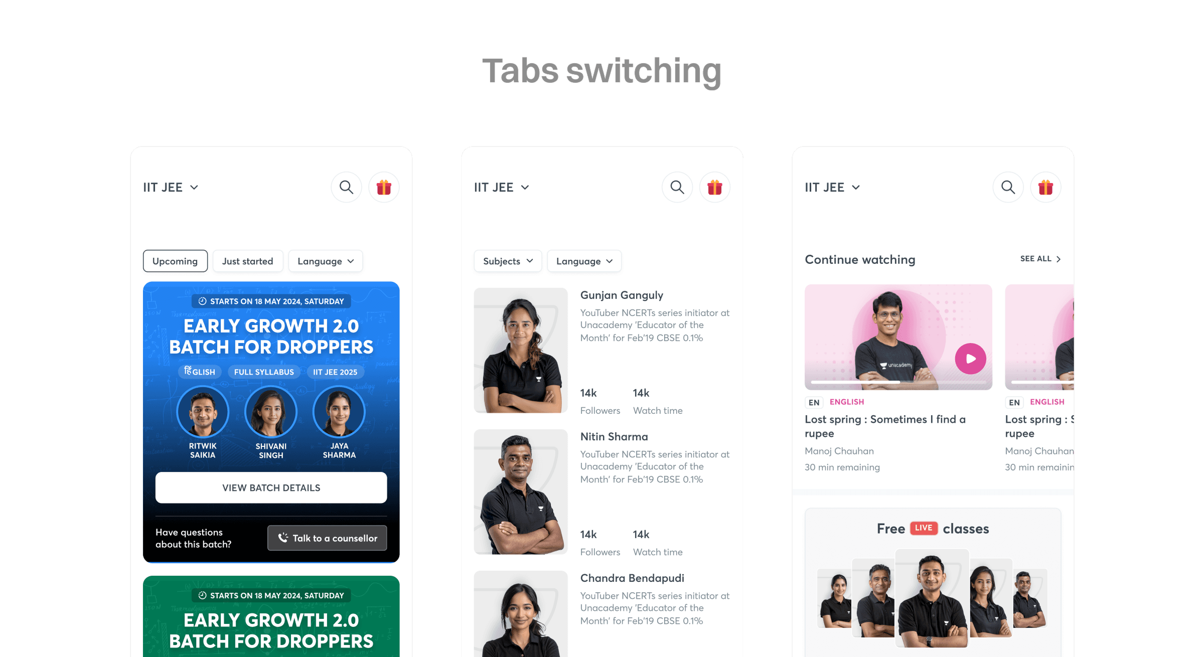
In the existing designs, users had to take a lot of steps to reach a certain feature, which caused a loss of context and hampered discoverability of features and content — for example, classes. The greatest benefit of a tab structure was that it became very easy to access most, if not all, of our content without changing screens. Tabs also allowed quick filtering — for example, batches have two filter types: whether the batch is ongoing or upcoming, and the language of the batch.
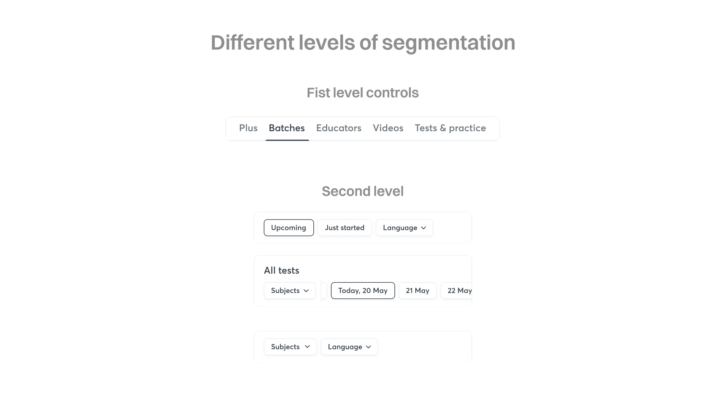
In the earlier design, finding all upcoming batches in Hindi meant going into batches, then into a three-dot menu, to apply a filter. In the current design, the user can select the Batches tab within the Online section and apply a quick filter by tapping the second level of filtering just below the tabs — reducing the number of steps for a learner to discover content using the new segmented control.
Impact
- Onboarding drop-off reduced by 7.8% after trimming the signup form to the essentials.
- Location permission denial rate dropped from 93% to 56% after introducing a value proposition before the OS prompt.
- Notification permission grants increased by 12.5% in an A/B test that added educator photos to the permission-request screen.