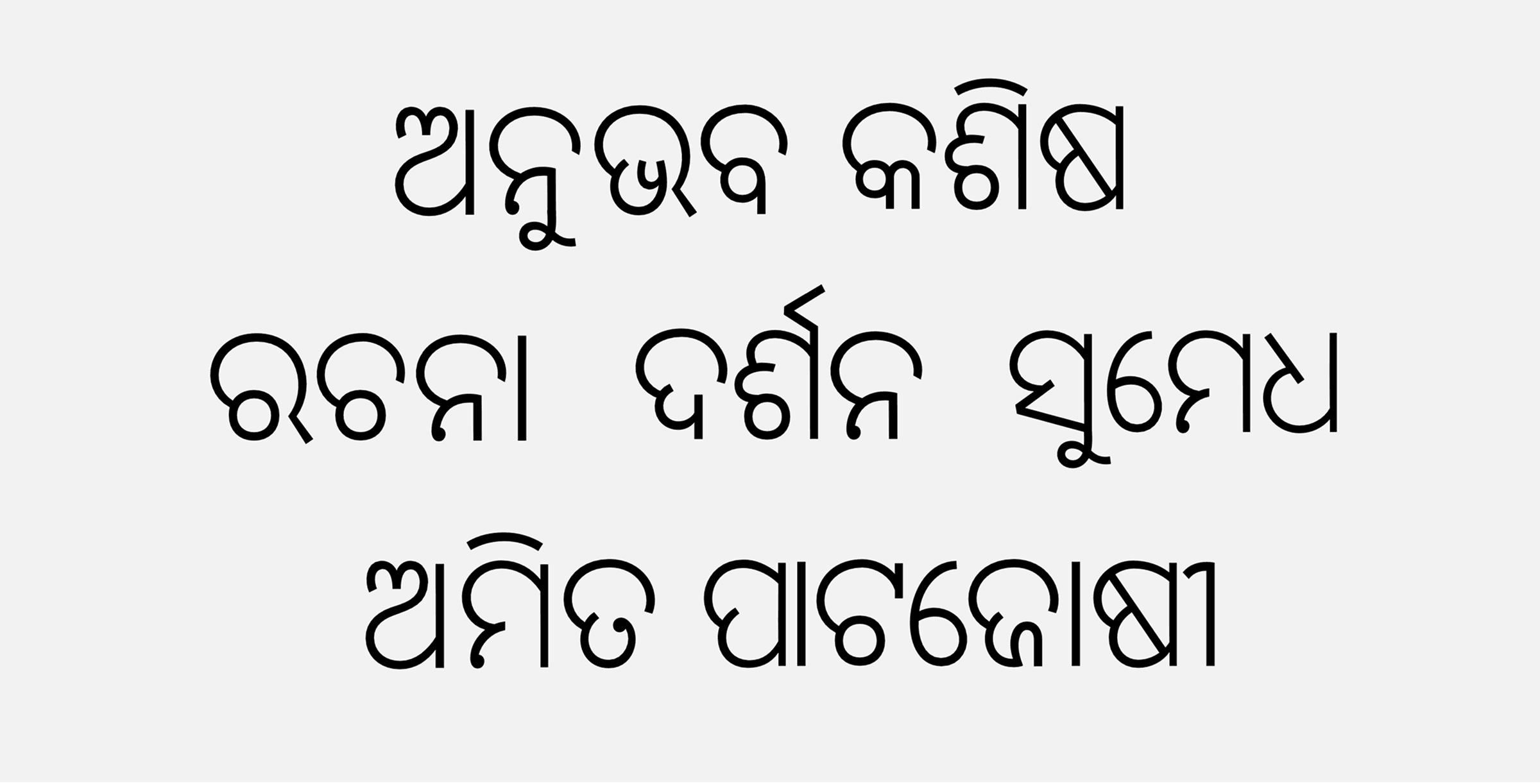
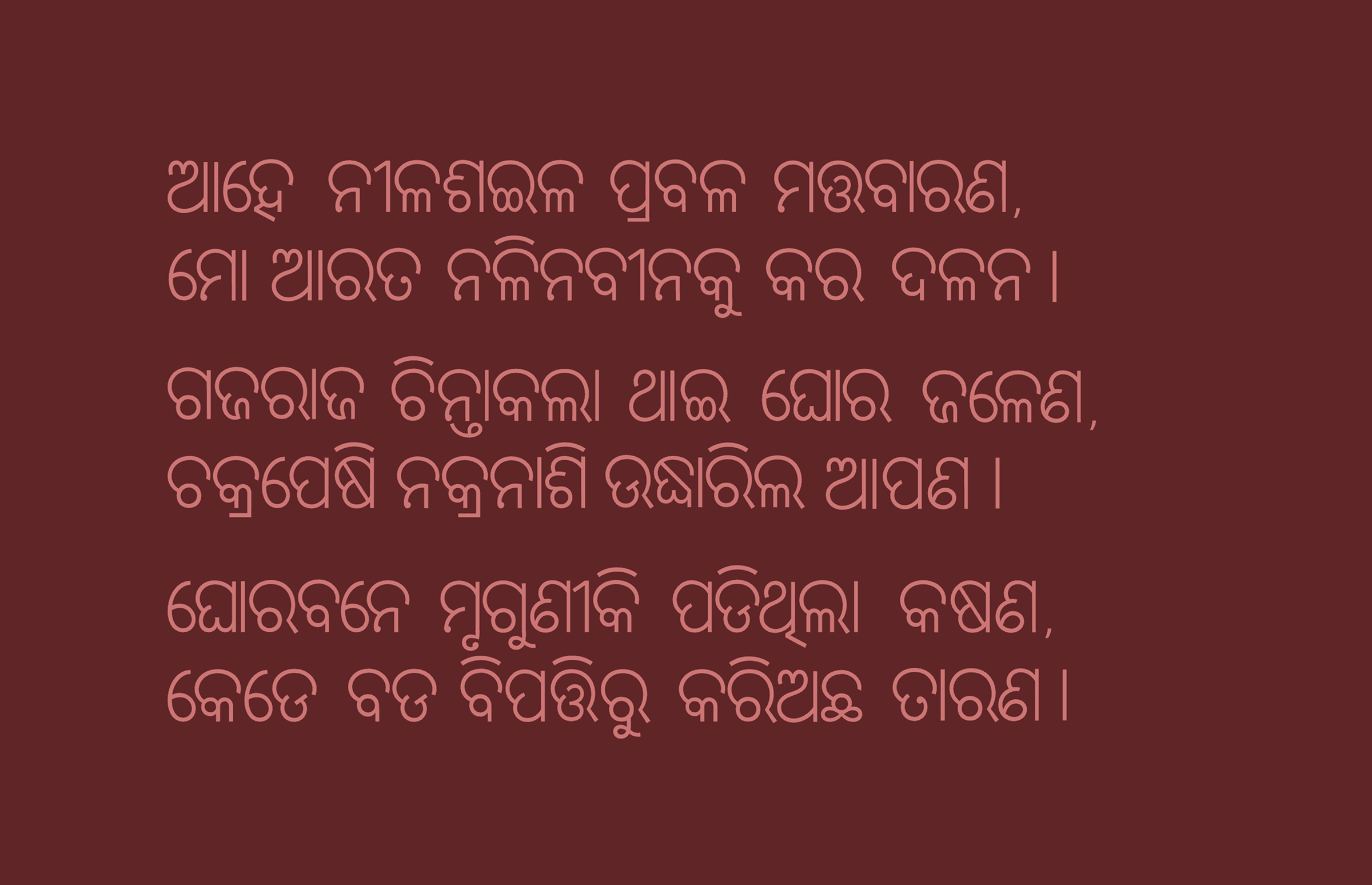
IDC Aasada
An Odia script typeface designed for body copy and long-form text — where legibility across small sizes and dense paragraphs matters more than headline drama.
Most Odia typefaces available today were designed for headlines, branding, or as general-purpose UI fonts adapted after the fact for body text. Aasada takes the opposite starting point: it was designed specifically to be read in long, dense paragraphs, at the sizes real reading actually happens at.
| Year | Category |
|---|---|
| Academic (IDC) | Type design |
Why Odia needs a dedicated body-copy font
The starting question was simple: how is Odia actually being set today, in the places people read it most? The answer was newspapers.
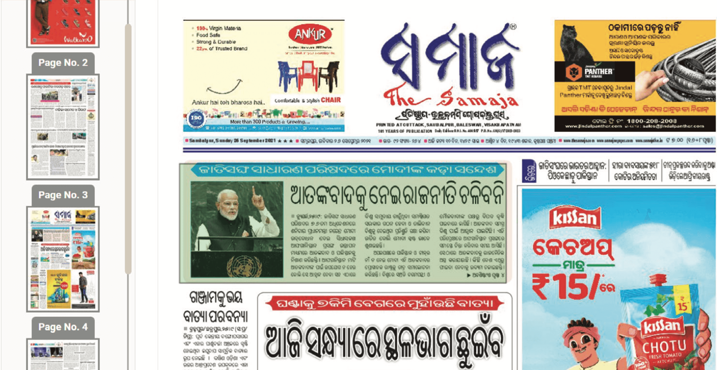
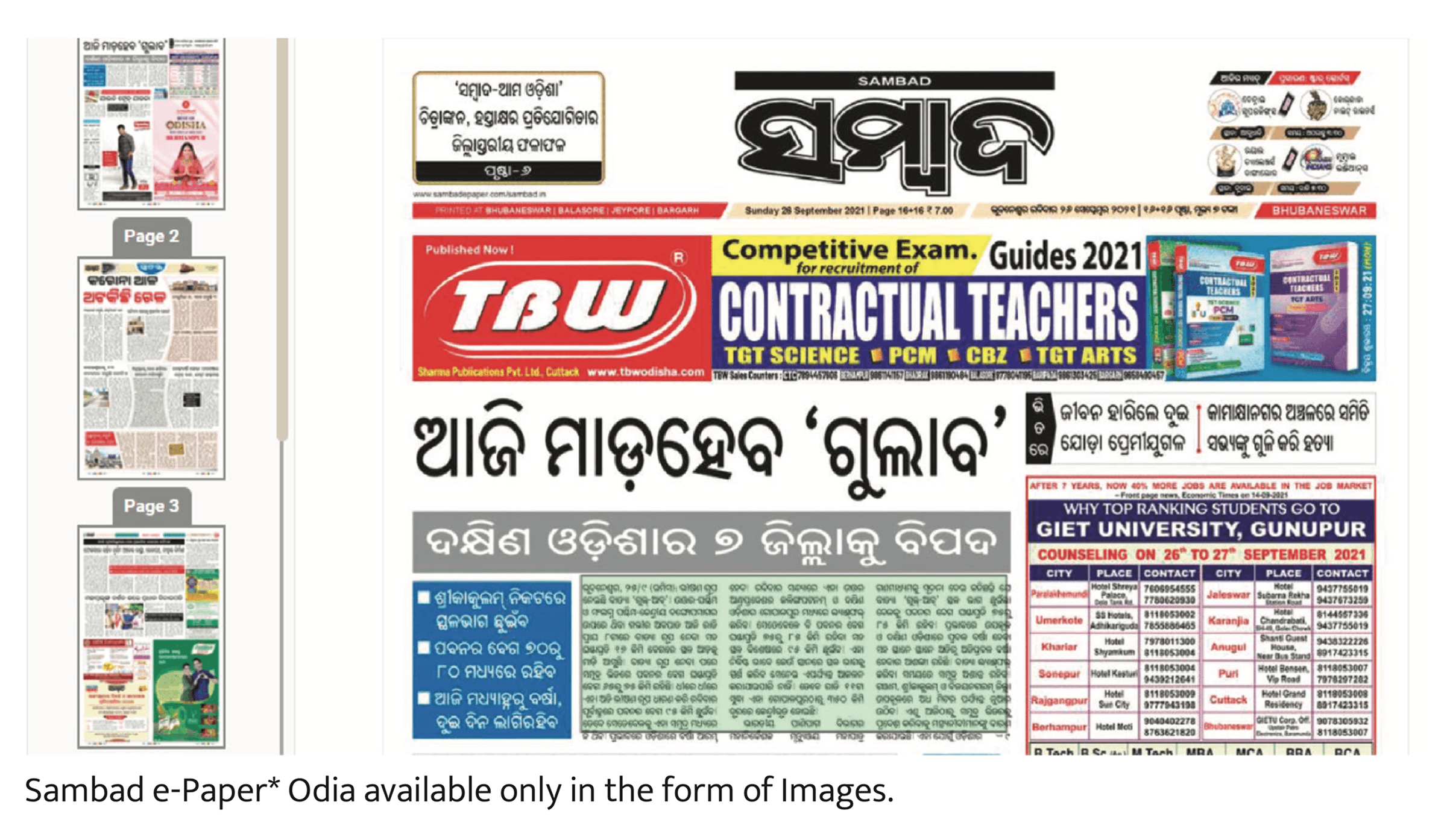
That note about Sambad's e-paper turned out to matter: a significant share of Odia's daily readership consumes text that isn't even real digital text, just a scanned image of a page — a sign of how far behind Odia's digital type infrastructure still is.
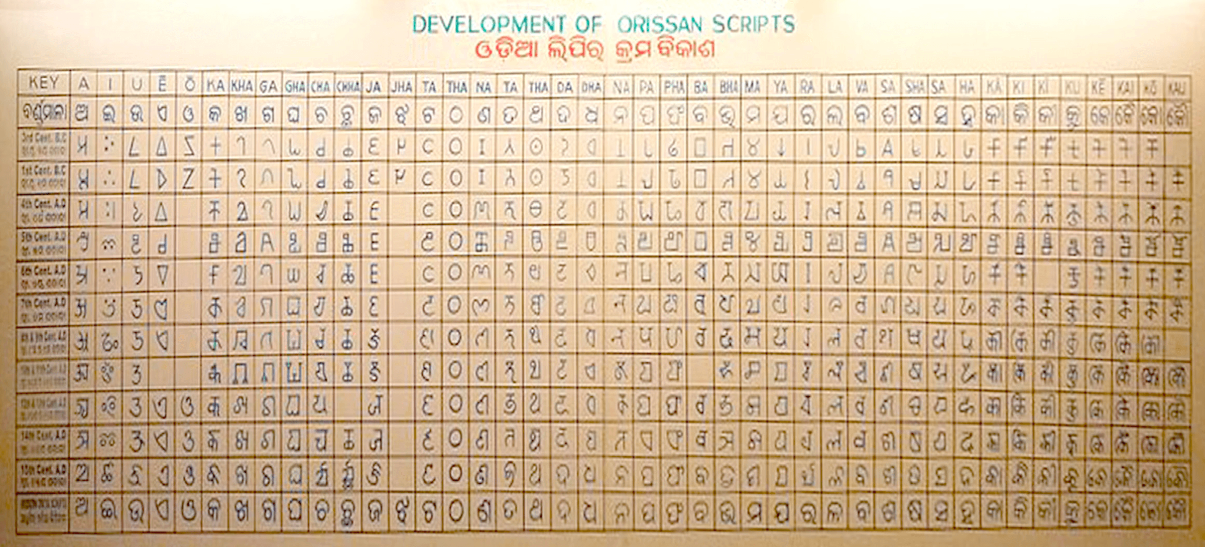
Tracing the script's history
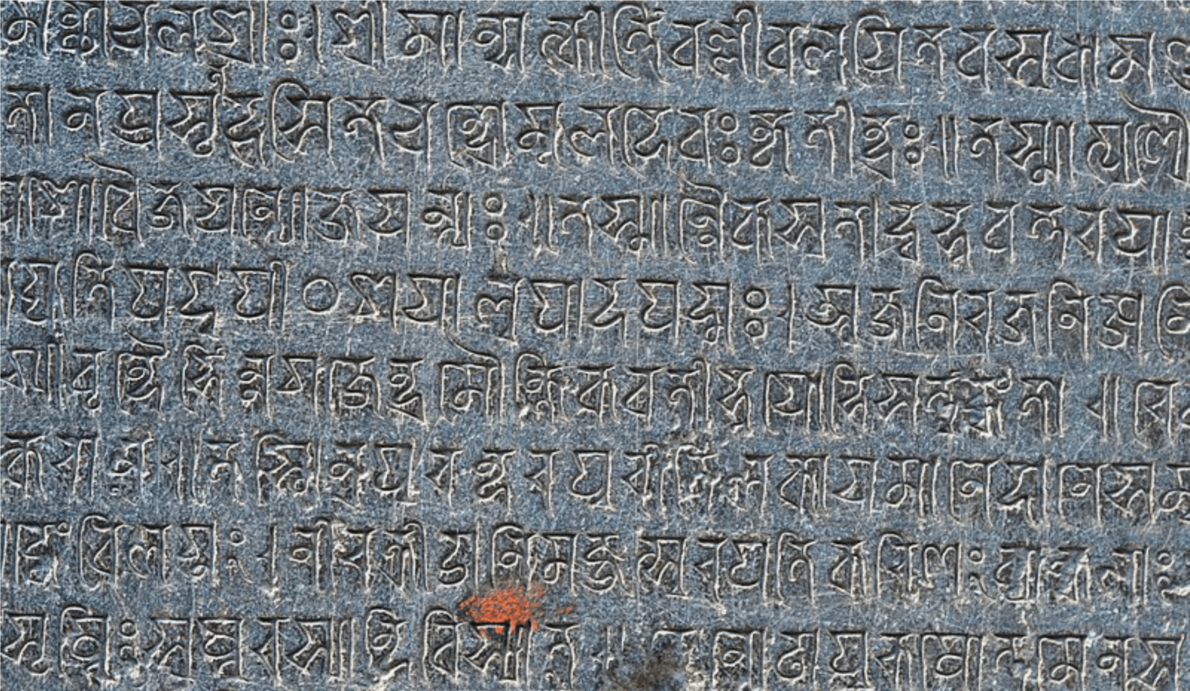
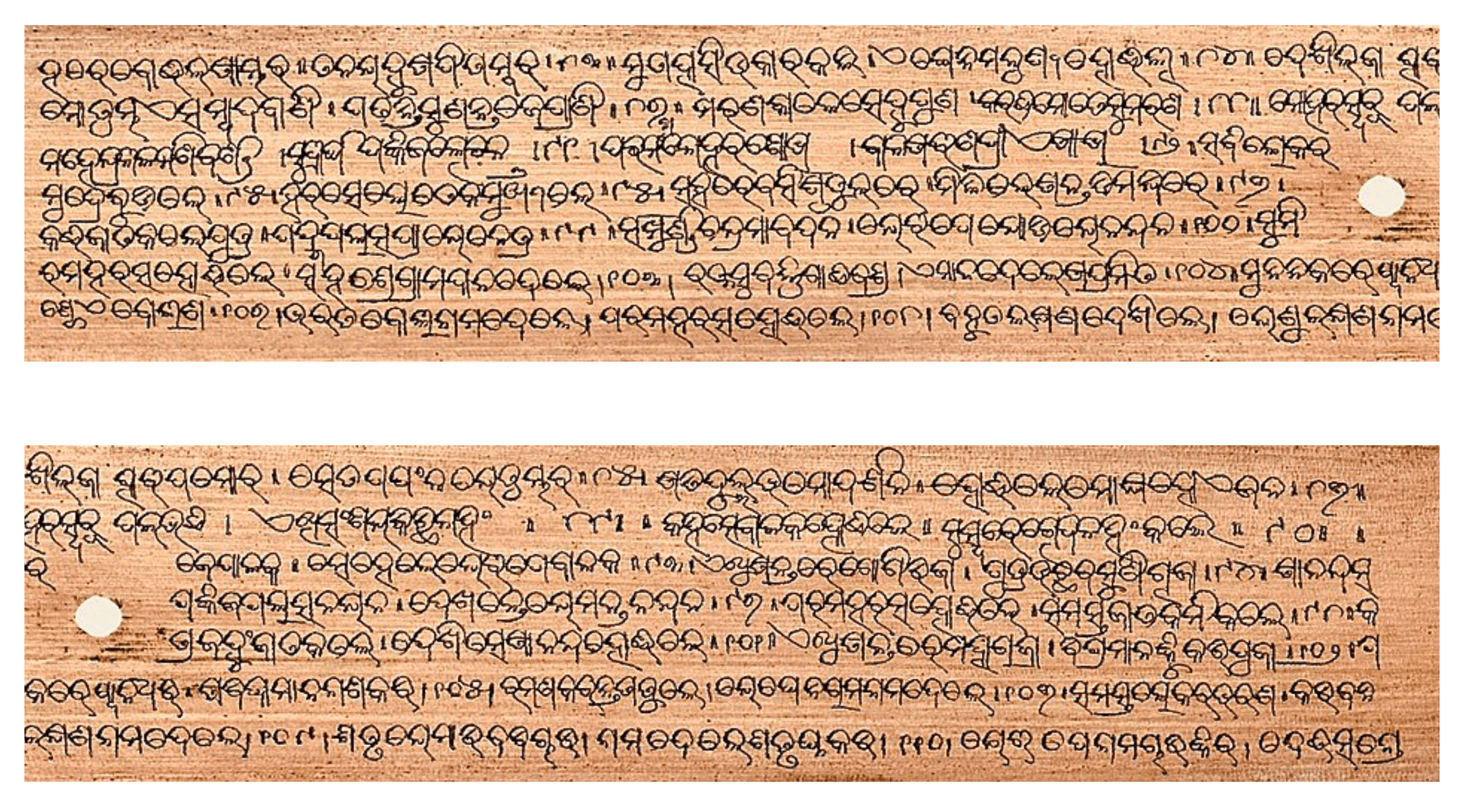
Before designing new letterforms, it helped to understand where Odia's rounded, loop-heavy shapes actually came from. The script's curves trace back to writing on palm leaves, where a straight stroke would tear the leaf along its grain — so letters evolved to be drawn mostly in curves.
Researching existing digital typefaces
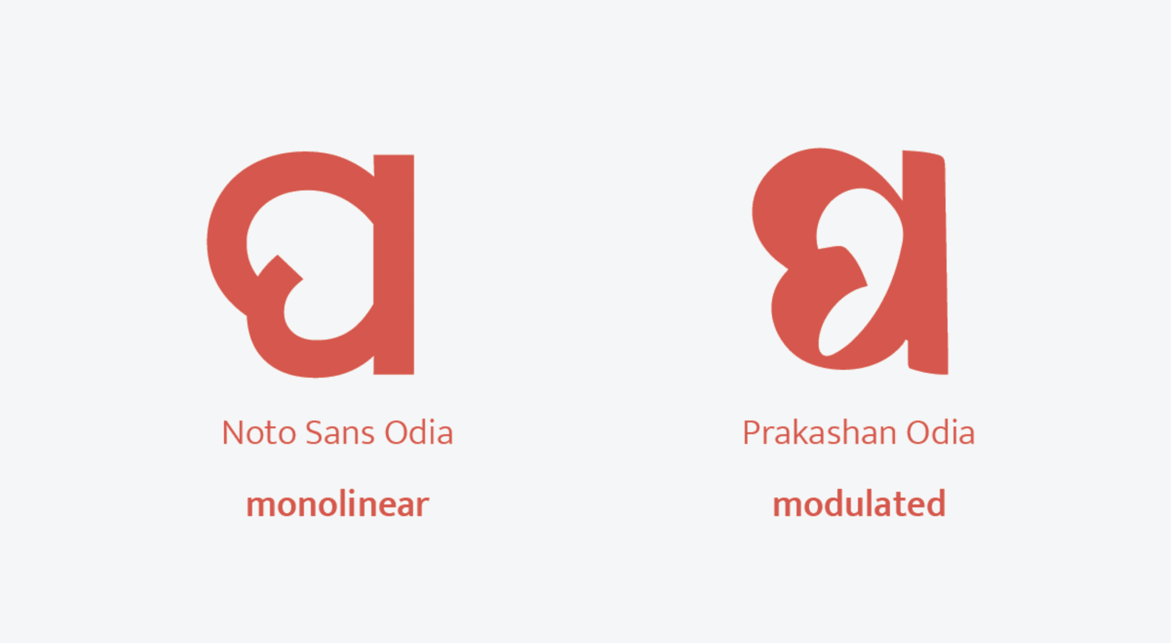
Existing Odia typefaces split into two broad families: monolinear designs with a constant stroke weight, and modulated designs carrying calligraphic thick-thin contrast.
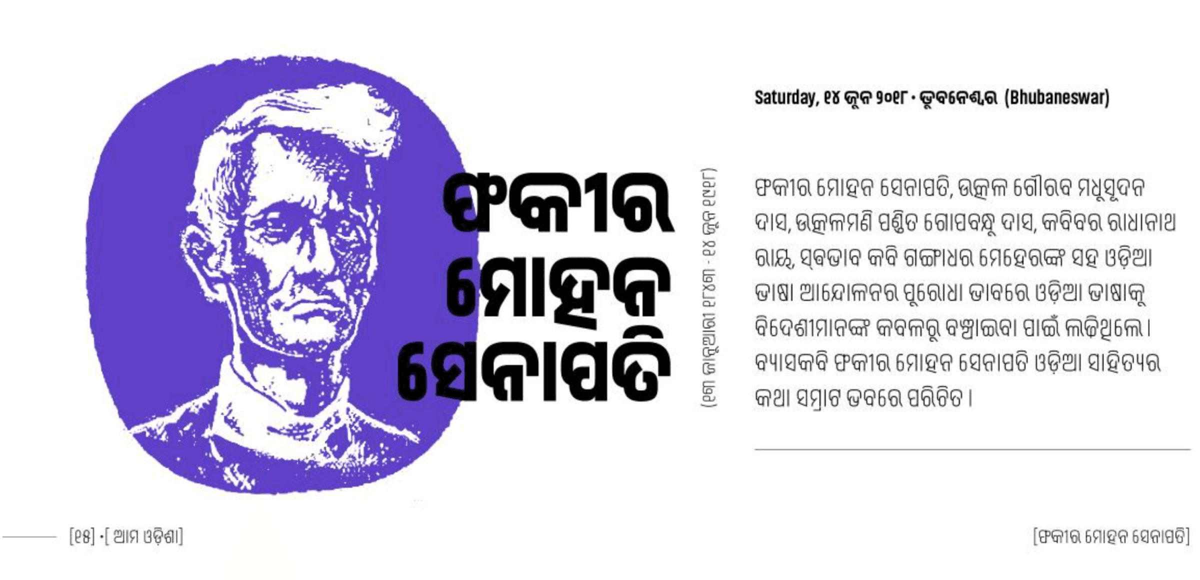
Looking at how Odia actually renders across the web today — this article page about the Odia writer Fakir Mohan Senapati is a typical example — most sites lean on whatever system font happens to render Odia at all, rather than something considered for the script specifically.
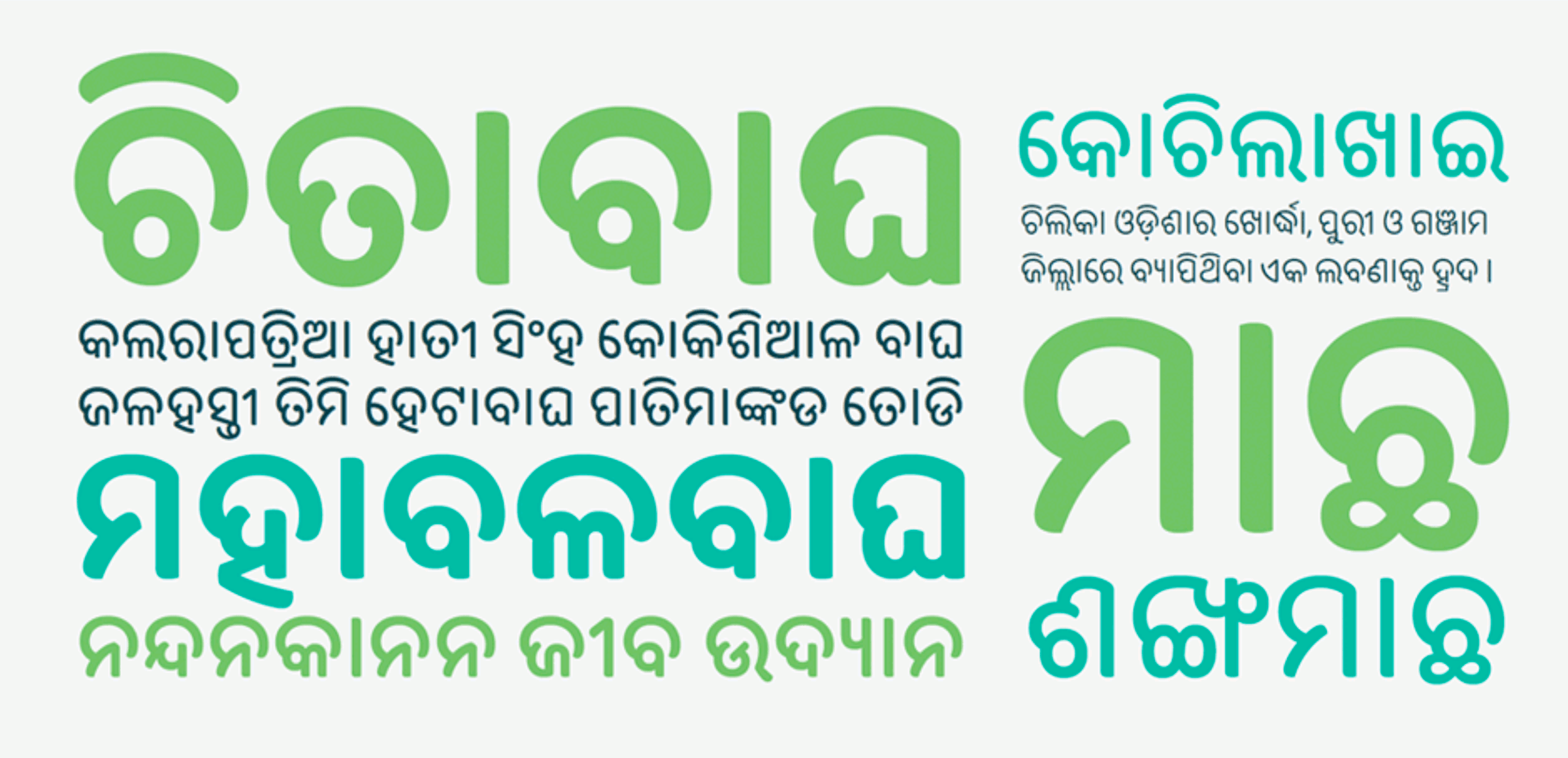
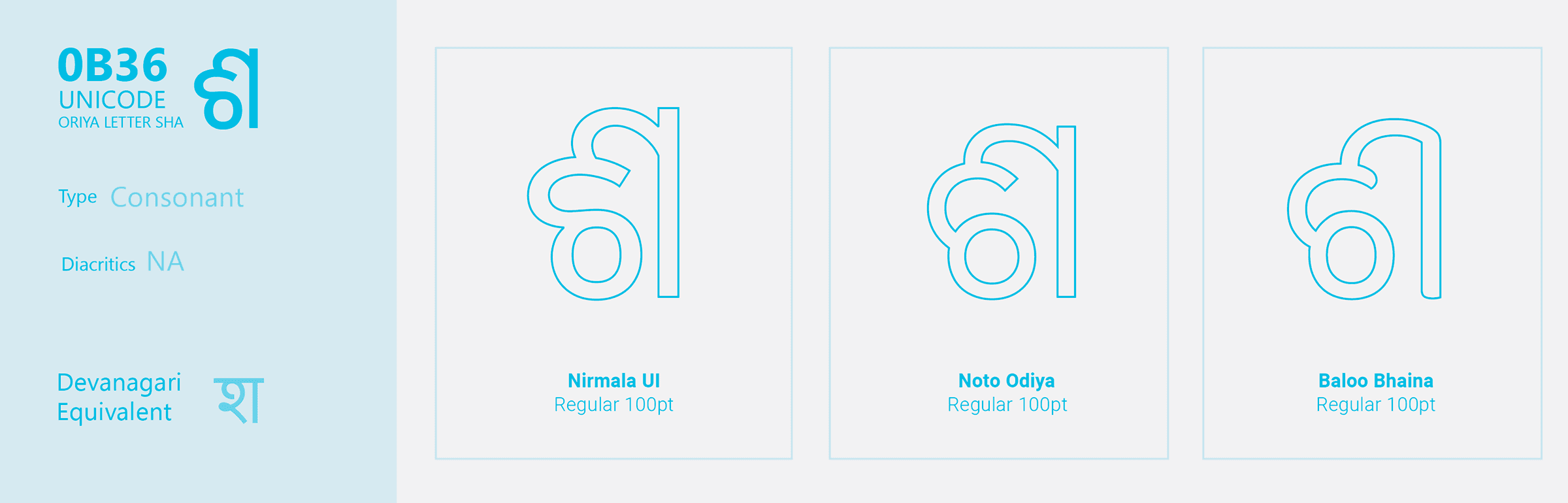
Even a single glyph varies wildly across the existing typefaces already shipping on most devices — the same letter, "SHA," looks structurally different in Nirmala UI, Noto Odiya, and Baloo Bhaina, with no real consensus on proportions.
Categorizing letterforms by structure
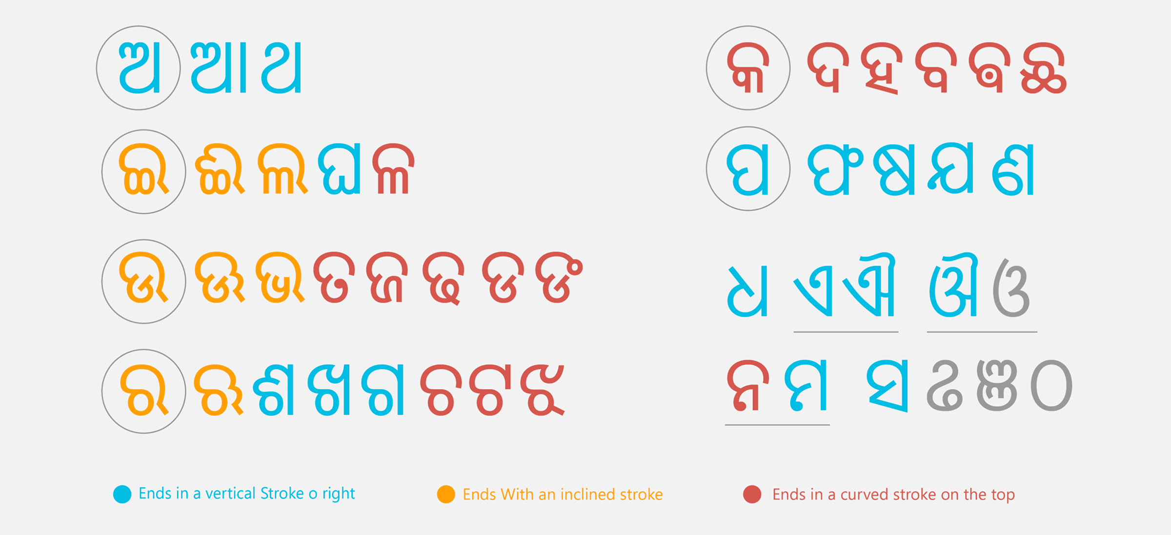
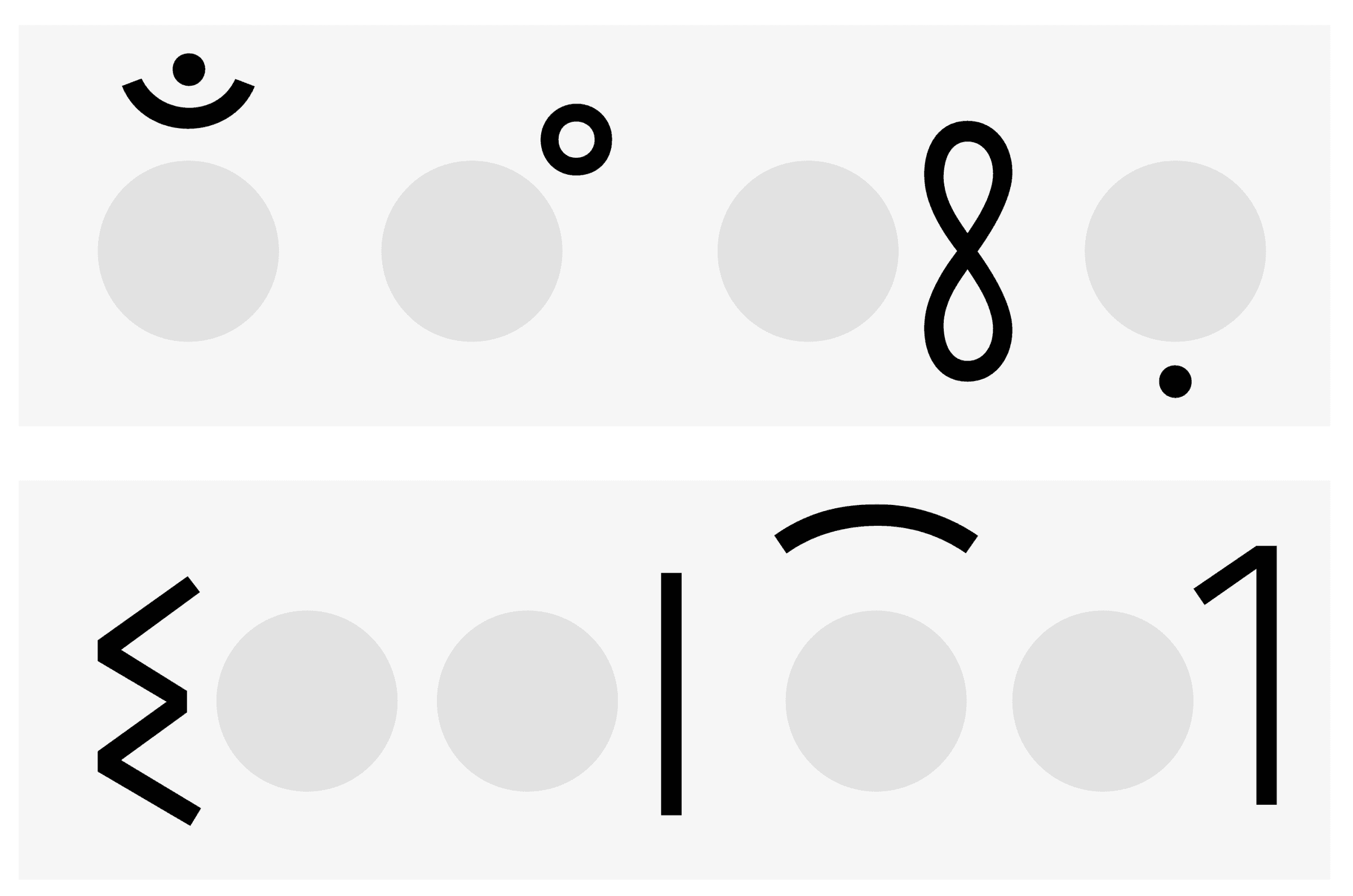
To design a large, consistent glyph set, every letter first got mapped by how its strokes terminate — ending in a vertical stroke, an inclined stroke, or a curve — so related letters could share consistent terminal treatment.
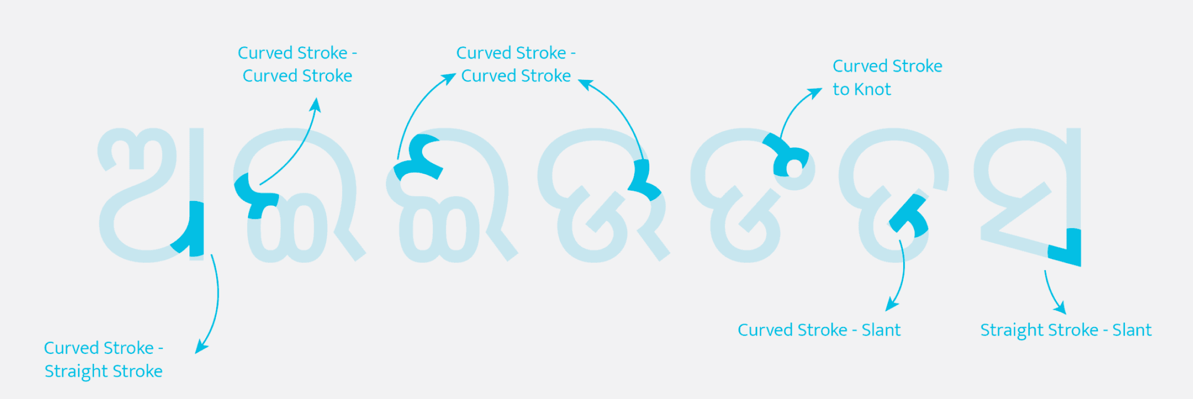
A second pass mapped how strokes join where two curves, a curve and a straight line, or a curve and a knot meet — the small decisions that make a typeface's joins feel like one coherent system rather than independently drawn letters.
Early exploration
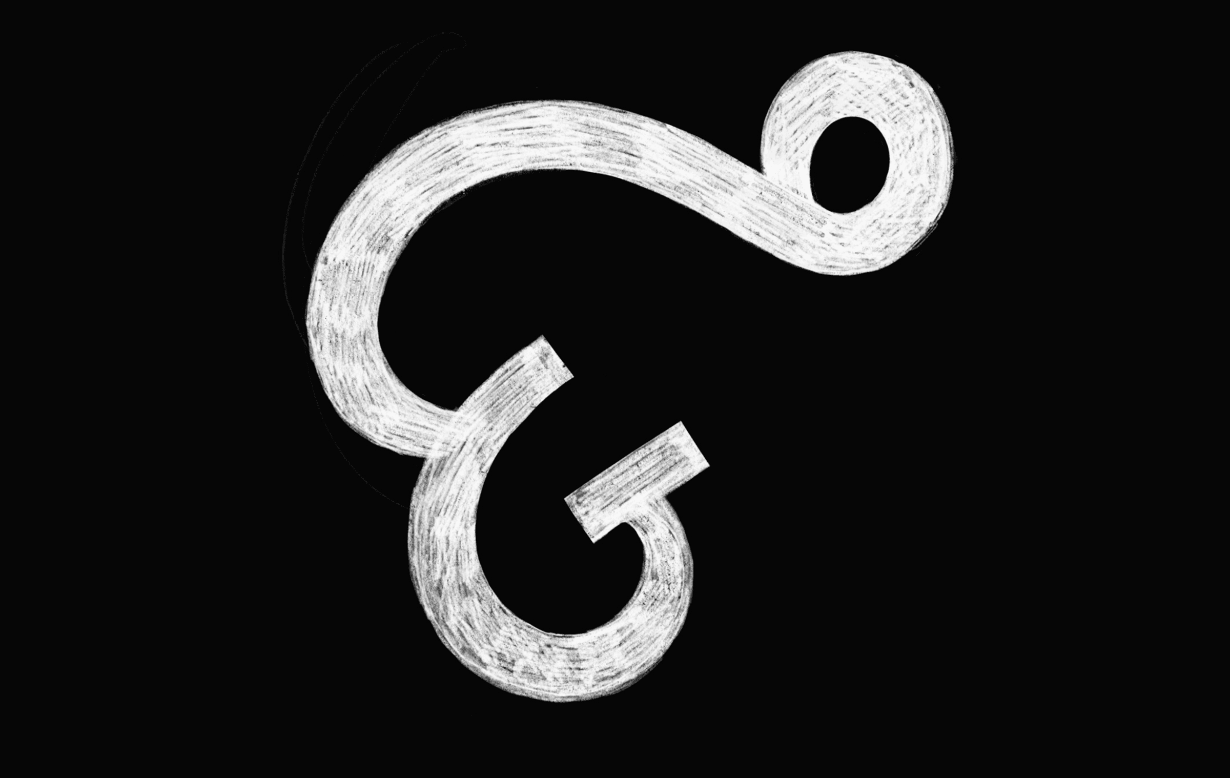
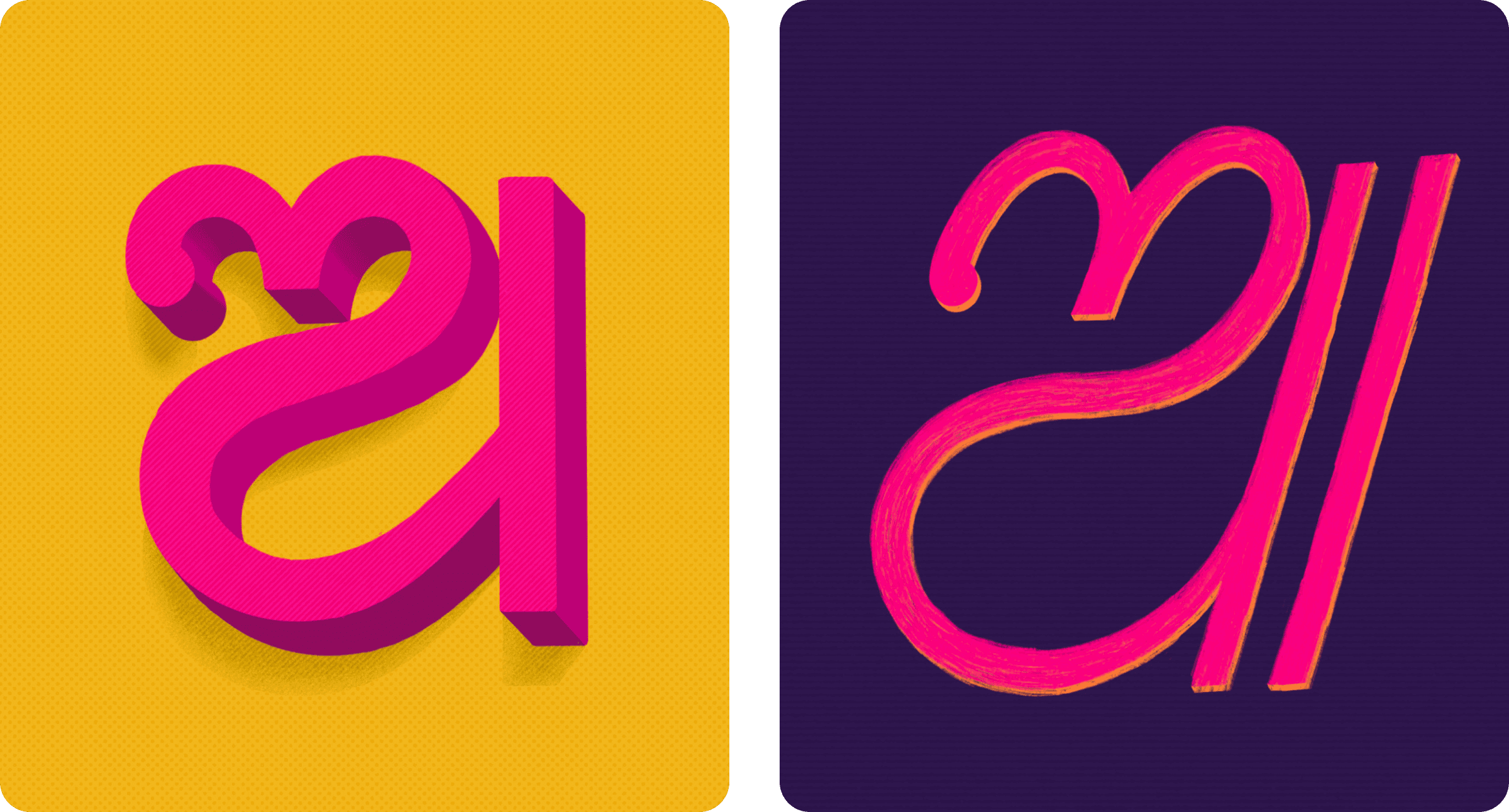
Before settling on a direction, early exploration ranged widely — from bold, dimensional letterforms to loose, calligraphic scripts — to understand what register felt right for a script this curve-heavy.

Refining the letterforms
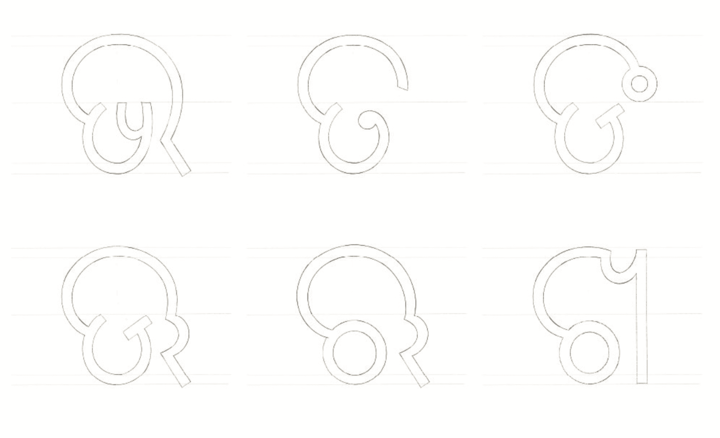
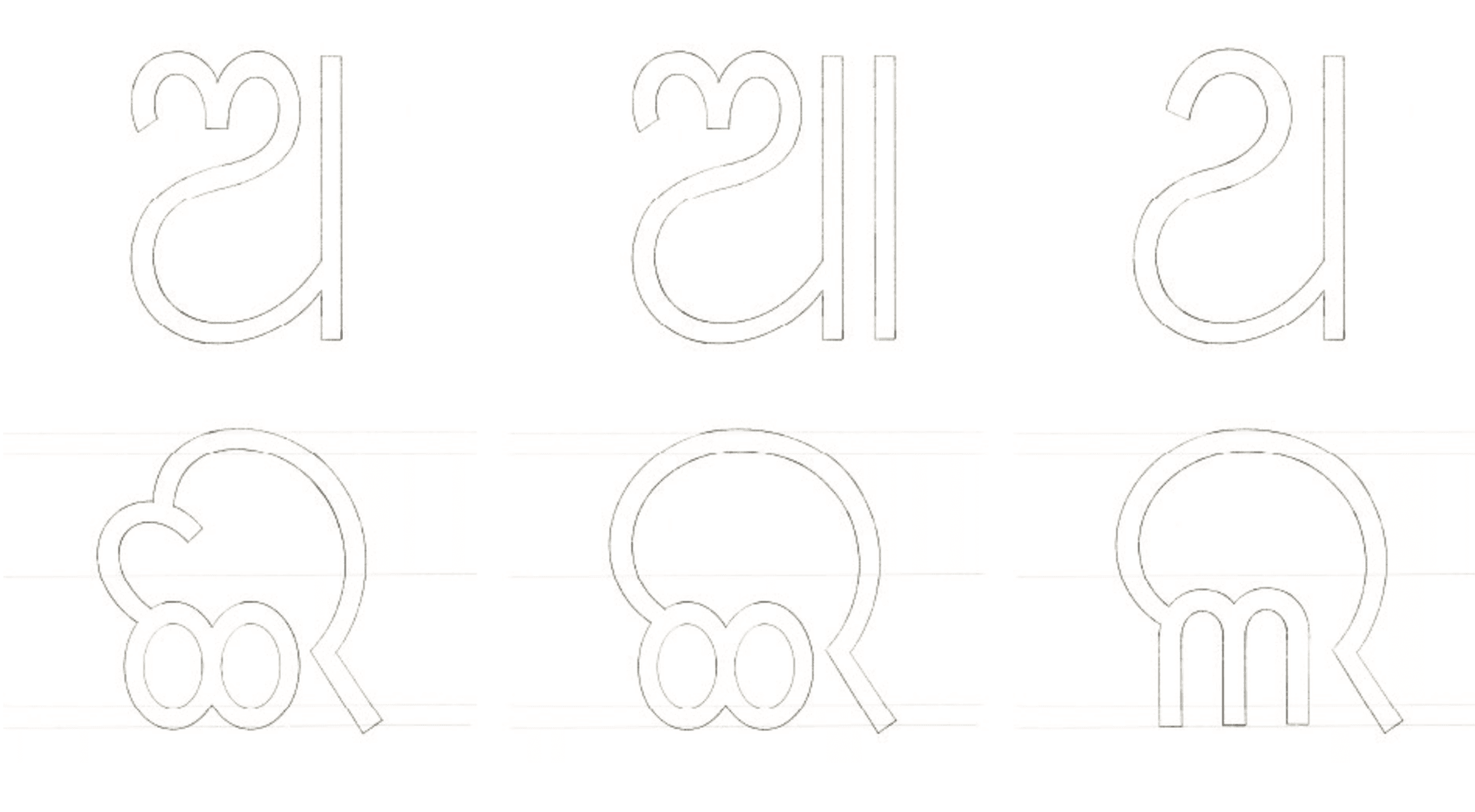
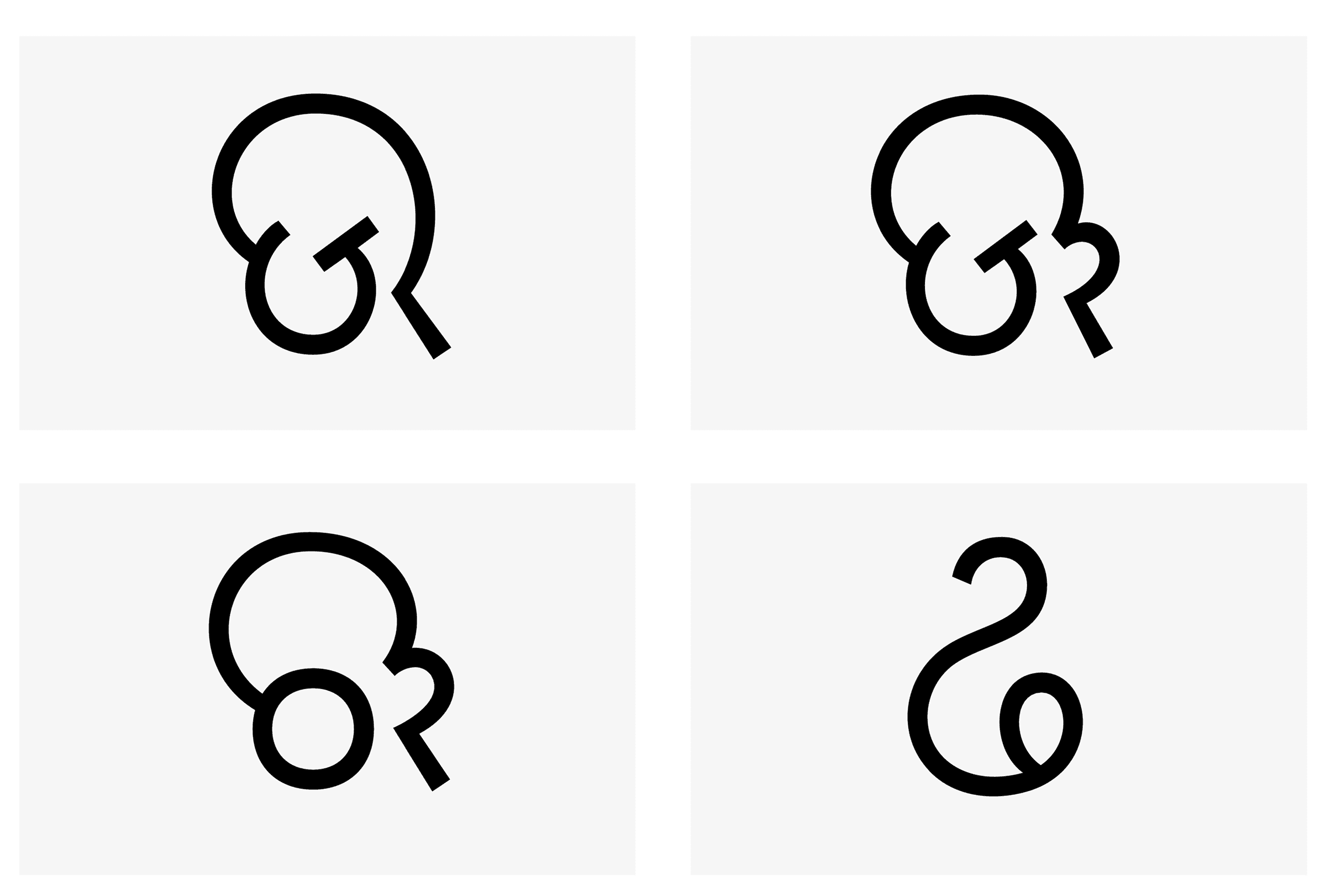
Once the direction narrowed to something quieter and more suited to body text, refinement became about small, deliberate variations — testing different terminal treatments on the same base letterform side by side.
Building the metrics system
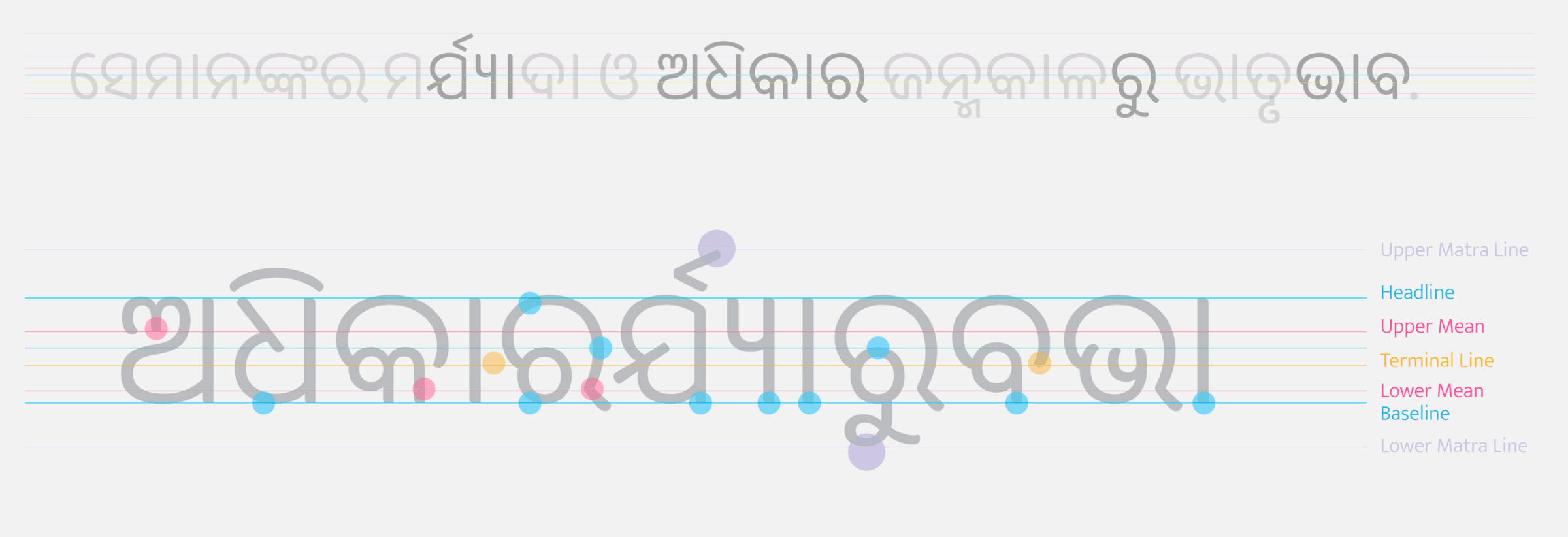
A body-copy font lives or dies on its vertical metrics — the relationship between cap height, x-height, and the matra lines above and below each letter needs to hold steady across the entire set for text to feel even at paragraph size.
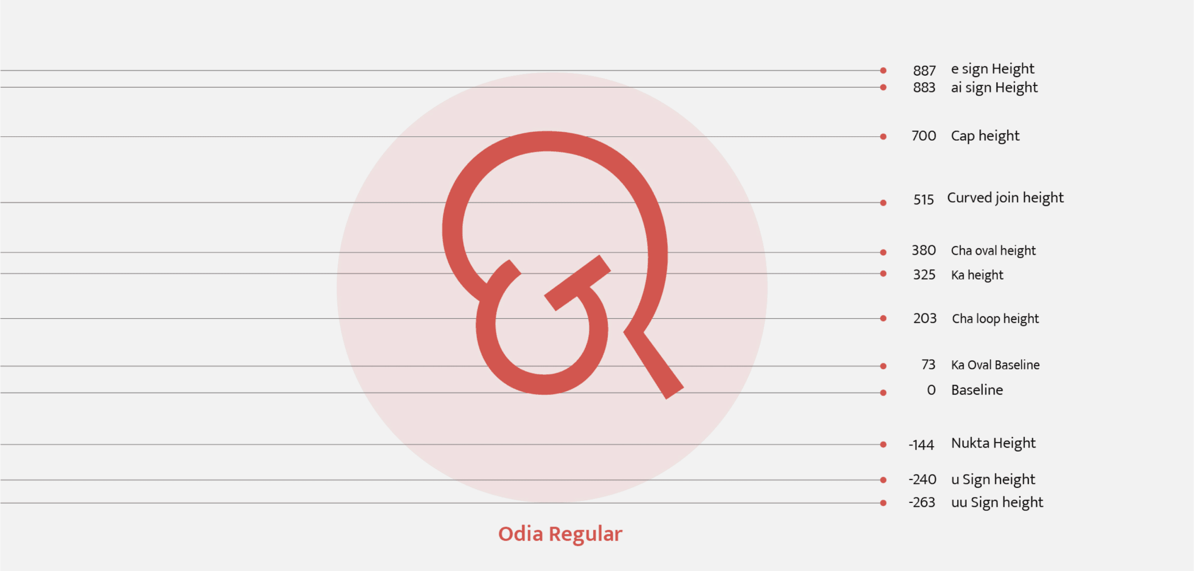
Every one of those lines was then locked to a specific value — cap height at 700, baseline at 0, with vowel signs extending as far as 887 above and -263 below — so every glyph in the set measures against the same fixed system.
Constructing the glyphs
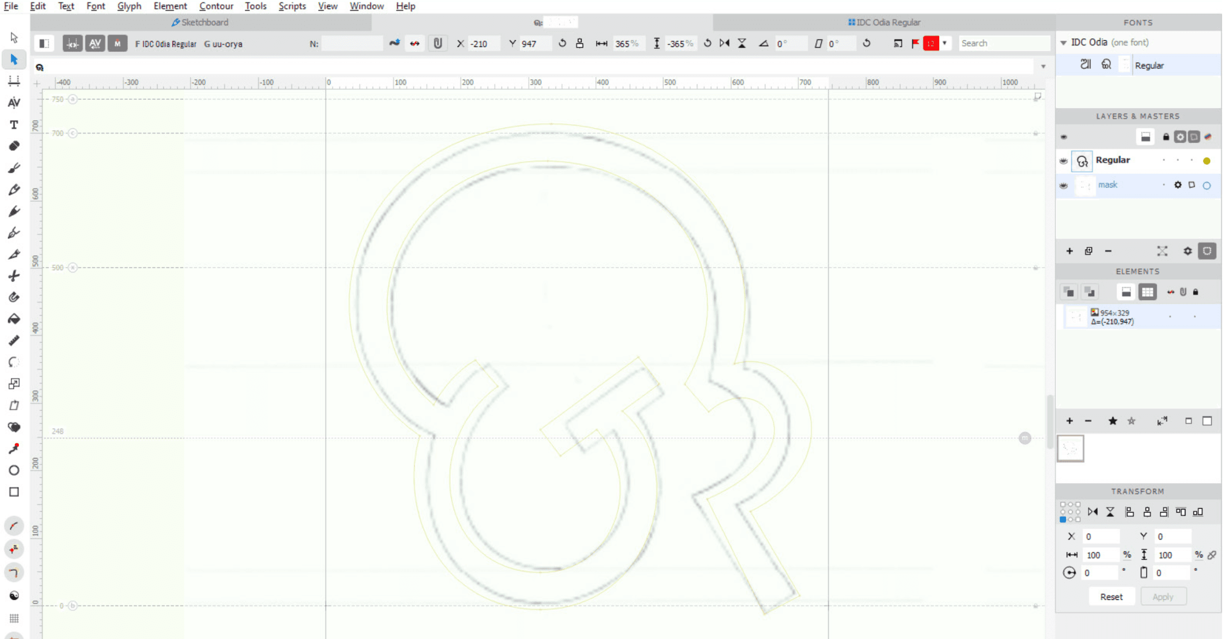
Construction happened glyph-by-glyph inside a type design application, often tracing directly over a scanned sketch placed as a background reference to keep the vector outline faithful to the original hand-drawn proportions.
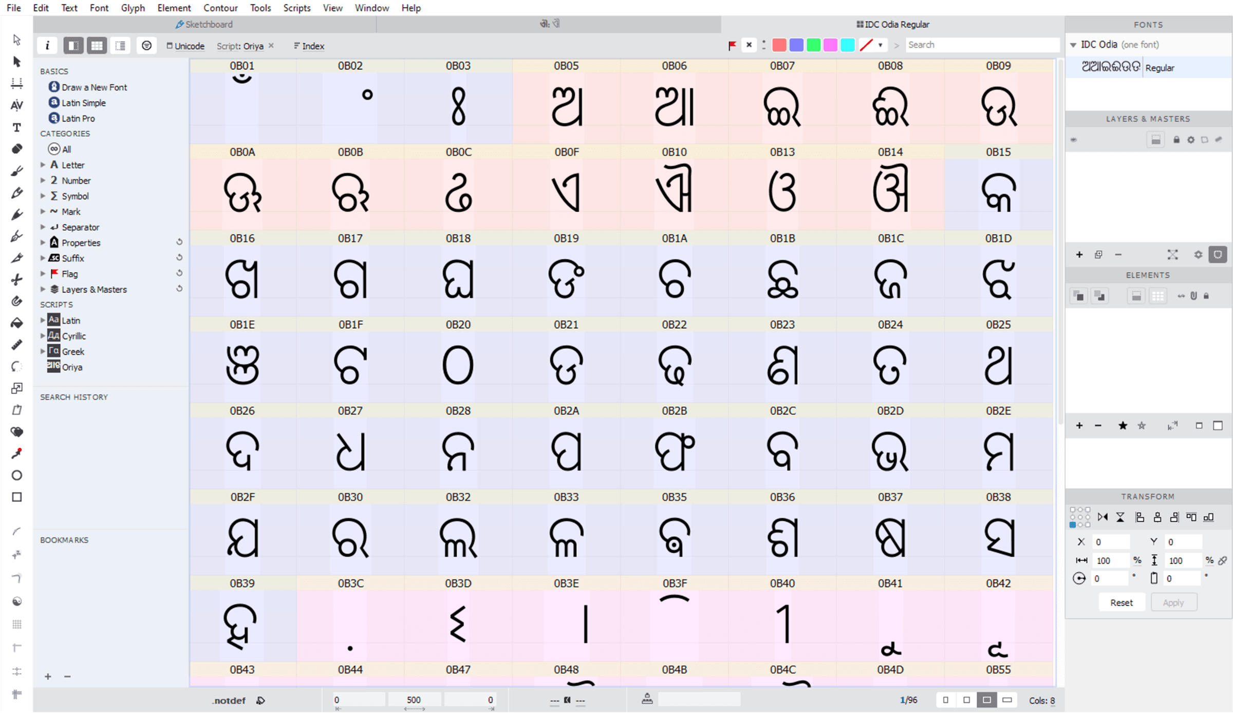
The full character map — vowels, consonants, conjuncts, numerals, and signs — took shape as a working font file, organized by Unicode code point.
Testing conjuncts and matra combinations
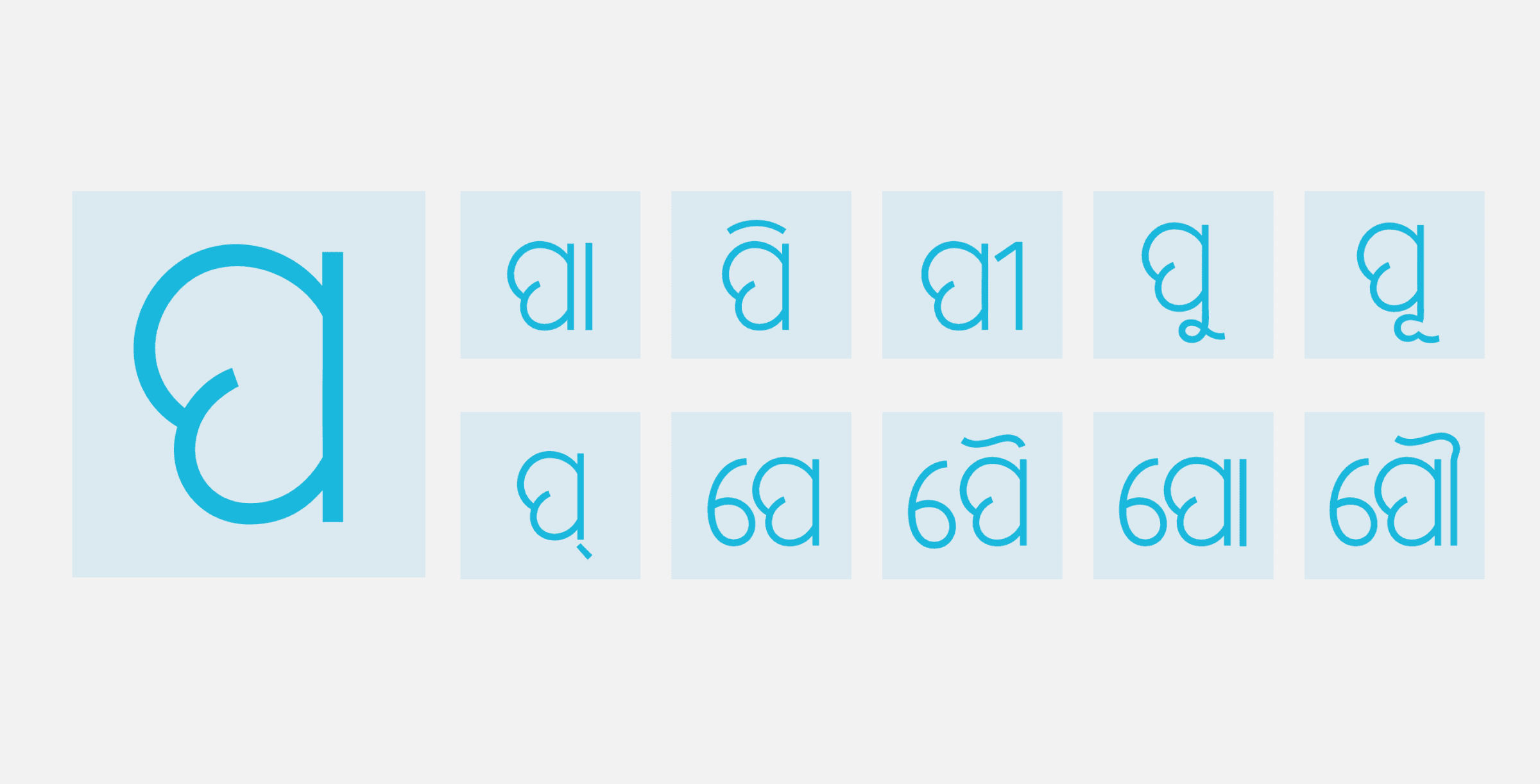
Odia consonants combine with a wide range of vowel signs (matras), and each combination needs to read cleanly without the matra colliding with the base letter. Testing a single consonant against its full set of matra combinations surfaces spacing problems that a glyph in isolation never would.
The complete character set
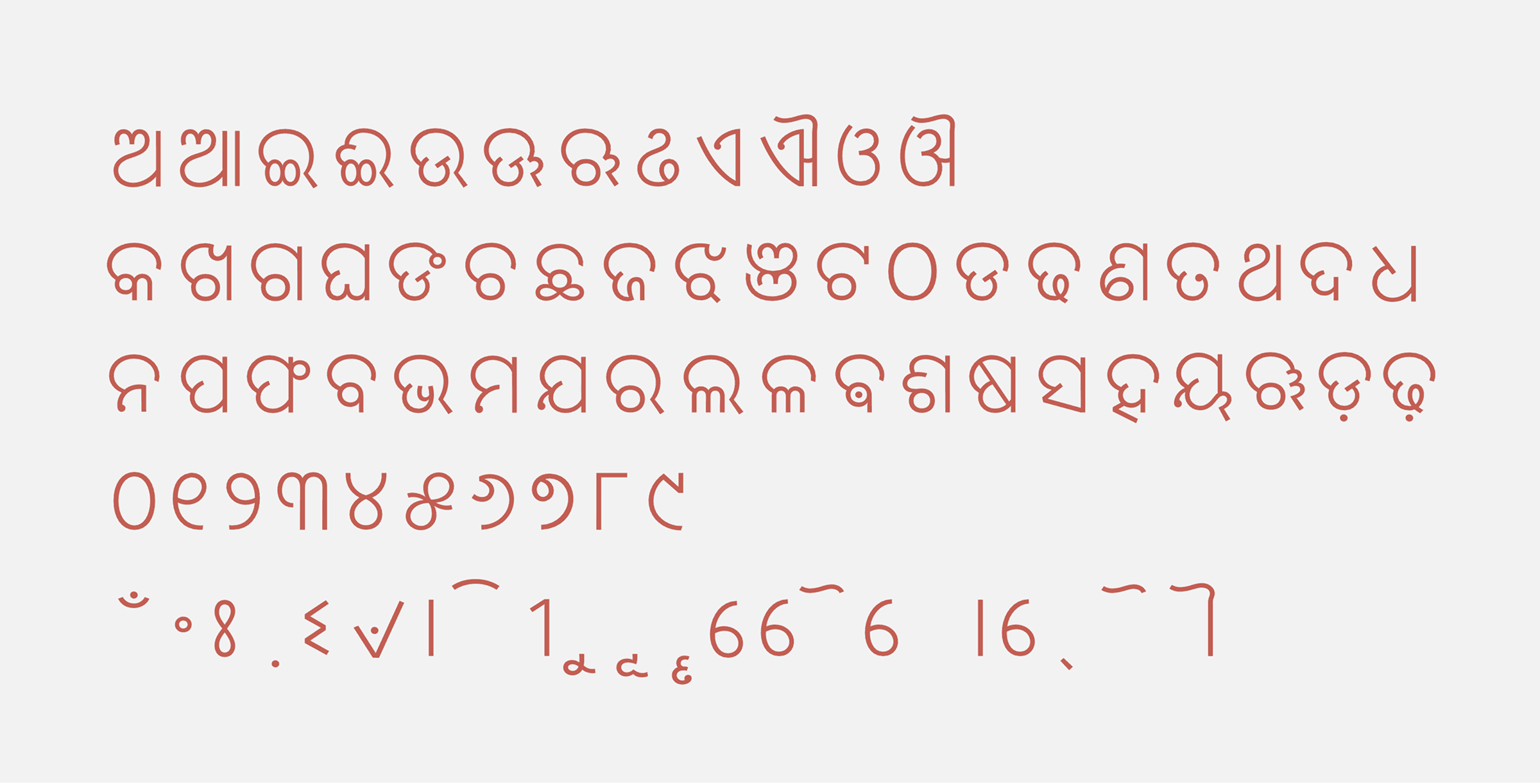
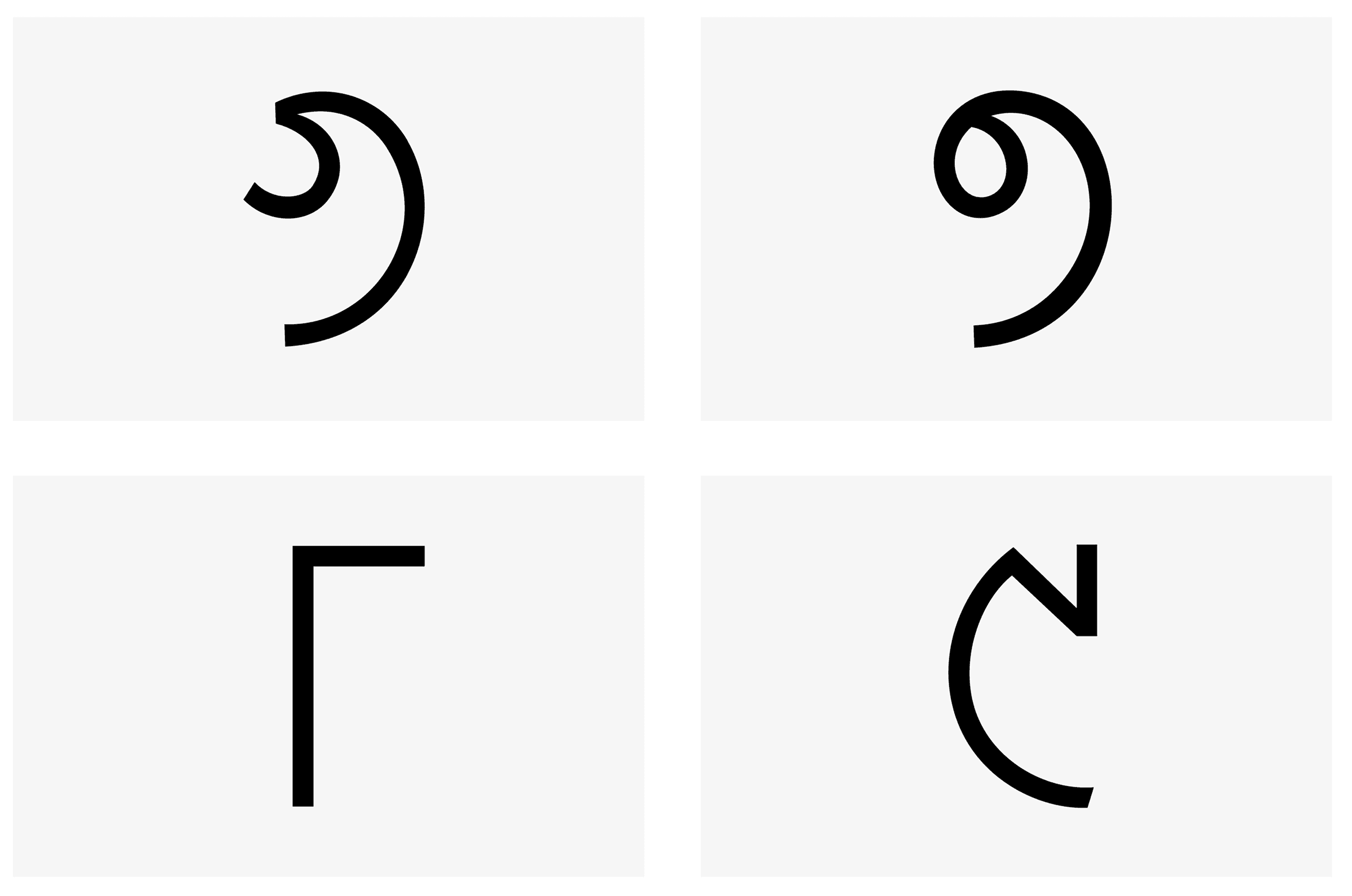
The finished set covers the modern Odia script end to end — vowels, consonants, numerals, and signs, laid out as a full specimen.
Seeing it in use
The real test of a body-copy typeface is a paragraph, not a specimen sheet — first with a short name set as a simple line of text, then with real running text at the size and density the font was actually designed for.